
Download png, svg
AI explanation
As the Republican votes for Senators in Kentucky rise, there's a strange new political power surge. It's creating a 'Republi-can' do attitude, leading to an increase in gasoline production. This unexpected link has turned the gas prices in Samoa into a heated debate. It seems that even across the vast ocean, these political waves are fueling the Samoan gas pumps! It's truly a case of 'Senators in Kentucky' fueling the 'Senators of the gas pumps' in Samoa!
Model: dalle-3
Prompt: Generate an image of two distinct scenes intertwined with a powerful energy surge. On the left side, depict a steampunk-inspired depiction of Kentucky's political landscape, with a towering column of ballots symbolizing the surging Republican votes for Senators. On the right side, showcase a steampunk depiction of Samoa's bustling gas pumps, with vigorous pumping of gasoline. The scene should be united by a visible energy surge emanating from Kentucky and reaching the gas pumps in Samoa, illustrating the unexpected and powerful link between Kentucky's political waves and the energy in Samoa. The depiction should include only scenes, people, and objects, it should not include text or speech bubbles.
This image generation prompt was also generated by AI, using the following sequence:
Model: gpt-3.5-turbo-1106
System prompt: You select one of a few potential scene descriptors that seems to go along with the variables described. You respond only with the scene descriptions provided and say nothing else.
User prompt: Here are two variables: Votes for Republican Senators in Kentucky and Gasoline pumped in Samoa. Given these, which of the following image style descriptions seems most appropriate? Pick the one that seems to be related to one of the variables at hand. Please respond with only one of the following potential descriptions: Photorealism Cubism Hyper-realistic Surrealism Steampunk
ChatGPT: Steampunk
Model: gpt-3.5-turbo-1106
System prompt: You describe simple visual scenes that depict the two variables stated. You combine both variables into one scene.
User prompt: Please describe a visual scene that prominently depicts both Votes for Republican Senators in Kentucky and Gasoline pumped in Samoa, in the following situation: As the Republican votes for Senators in Kentucky rise, there's a strange new political power surge. It's creating a 'Republi-can' do attitude, leading to an increase in gasoline production. This unexpected link has turned the gas prices in Samoa into a heated debate. It seems that even across the vast ocean, these political waves are fueling the Samoan gas pumps! It's truly a case of 'Senators in Kentucky' fueling the 'Senators of the gas pumps' in Samoa!. Keep the description simple.
ChatGPT: In Kentucky, the Republican votes for Senators are surging, symbolized by a rising column of ballots. Alongside this, in Samoa, the gas pumps are shown buzzing with activity, with gasoline being pumped vigorously. The two scenes are connected by a powerful energy surge, visibly emanating from Kentucky and reaching the gas pumps in Samoa, causing a heated debate around the pumps. Both the surge in votes and the increase in gas pumping depict the unexpected link between Kentucky's political waves and the energy in Samoa.
Model: gpt-3.5-turbo-1106
System prompt: You write and improve image generation prompts for DALLE-3. You maintain the same subjects, but enhance the visuals.
User prompt: Please respond with an image generation prompt that would be likely to create an interesting visual using DALLE-3, using the following style: [ Steampunk ] and depicting this scene: In Kentucky, the Republican votes for Senators are surging, symbolized by a rising column of ballots. Alongside this, in Samoa, the gas pumps are shown buzzing with activity, with gasoline being pumped vigorously. The two scenes are connected by a powerful energy surge, visibly emanating from Kentucky and reaching the gas pumps in Samoa, causing a heated debate around the pumps. Both the surge in votes and the increase in gas pumping depict the unexpected link between Kentucky's political waves and the energy in Samoa. Keep the visual depiction simple. Do not include any words or speech bubbles.
ChatGPT: Generate an image of two distinct scenes intertwined with a powerful energy surge. On the left side, depict a steampunk-inspired depiction of Kentucky's political landscape, with a towering column of ballots symbolizing the surging Republican votes for Senators. On the right side, showcase a steampunk depiction of Samoa's bustling gas pumps, with vigorous pumping of gasoline. The scene should be united by a visible energy surge emanating from Kentucky and reaching the gas pumps in Samoa, illustrating the unexpected and powerful link between Kentucky's political waves and the energy in Samoa.
*Variations in the User Prompts from chart to chart are just the result of random number generation in Python. I wrote a few arrays of various styles and methods to ask questions to change up the results. Every time this site writes an explanation or generates an image, the script picks from each at random.
I sequence the requests into multiple prompts because I find GPT 3.5 to perform much better with short, well-managed contexts. Thus, I track the context directly in Python and only ask ChatGPT targeted questions.
System prompt: You provide humorous responses in the form of plausible sounding explanations for correlations. You assume the correlation is causative for the purpose of the explanation even if it is ridiculous. You do not chat with the user, you only reply with the causal connection explanation and nothing else.
User prompt: Please make up a funny explanation for how an increase in Republican votes for Senators in Kentucky caused Gasoline pumped in Samoa to increase. Include one good pun.
AI academic paper
 |
Ride to the Polls, Fill Up the Tanks: How Kentucky Republican Votes and Samoan Gasoline Are Mysteriously Aligned The Journal of Political Synchronicities Jan 2024 Reminder: This paper is AI-generated. Not real! |
Model: gpt-3.5-turbo-1106
System prompt: You are a researcher writing an academic paper.You write titles and abstracts of goofy academic research papers.
User prompt:
Pretend you are an academic researcher. Your writing sounds like it belongs in a medical or economics journal. However, you frequently crack jokes, make puns, and add unexpected twists in your writing.
Please draft the title and abstract of an academic research paper presenting the findings of the connection between Republican votes for Senators in Kentucky and Gasoline pumped in Samoa. Make lots of jokes, goofy observations, and puns.
Rhyme words in the title.
Your research team used data from MIT Election Data and Science Lab, Harvard Dataverse and Energy Information Administration to assess this nagging question. You found a correlation coefficient of 0.9231459 and p < 0.01 for 1980 to 2020.
Please respond in this format (replace "Lorem ipsum dolor sit" with your title and abstract)
[[TITLE]]
Lorem ipsum dolor sit
[[ABSTRACT]]
Lorem ipsum dolor sit
ChatGPT:
[[TITLE]]
"Ride to the Polls, Fill Up the Tanks: How Kentucky Republican Votes and Samoan Gasoline Are Mysteriously Aligned"
[[ABSTRACT]]
In this research paper, we examine the peculiar correlation between the Republican votes for Senators in Kentucky and the amount of gasoline pumped in Samoa. While these two entities may seem unrelated at first glance, our findings suggest otherwise. Utilizing data from the MIT Election Data and Science Lab and Harvard Dataverse, as well as information from the Energy Information Administration, we have unearthed a surprising connection. Our analysis reveals a correlation coefficient of 0.9231459 and p < 0.01 for the years 1980 to 2020. The statistically significant relationship between these variables invites both curiosity and skepticism, prompting further investigation into the whimsical dance of politics and petrol pumpage. Join us as we unravel this enigmatic entanglement and ponder the question: do Kentucky Republican votes influence the gasoline consumption habits of the island nation of Samoa, or is this correlation just a gas-induced illusion?
Model: gpt-3.5-turbo-1106
System prompt: You are a researcher writing an academic paper.You draft the introduction section of an academic research paper.
User prompt:
Pretend you are an academic researcher. Your writing sounds like it belongs in a medical or economics journal. However, you frequently crack jokes, make puns, or add unexpected twists in your writing.
Please make up the introduction section of an academic research paper presenting the findings of the connection between Republican votes for Senators in Kentucky and Gasoline pumped in Samoa. Make lots of jokes, goofy observations, and puns.
Here is the title and abstract of the paper:
[[TITLE]]
"Ride to the Polls, Fill Up the Tanks: How Kentucky Republican Votes and Samoan Gasoline Are Mysteriously Aligned"
[[ABSTRACT]]
In this research paper, we examine the peculiar correlation between the Republican votes for Senators in Kentucky and the amount of gasoline pumped in Samoa. While these two entities may seem unrelated at first glance, our findings suggest otherwise. Utilizing data from the MIT Election Data and Science Lab and Harvard Dataverse, as well as information from the Energy Information Administration, we have unearthed a surprising connection. Our analysis reveals a correlation coefficient of 0.9231459 and p < 0.01 for the years 1980 to 2020. The statistically significant relationship between these variables invites both curiosity and skepticism, prompting further investigation into the whimsical dance of politics and petrol pumpage. Join us as we unravel this enigmatic entanglement and ponder the question: do Kentucky Republican votes influence the gasoline consumption habits of the island nation of Samoa, or is this correlation just a gas-induced illusion?
-------
Your response should start like this:
[[INTRODUCTION]]
ChatGPT:
Ladies and gentlemen, scholars and skeptics, welcome to a rollercoaster ride through the whimsical world of political peculiarities and petroleum puzzles. In this academic escapade, we aim to unravel the confounding conundrum of the uncanny alignment between Kentucky Republican votes and the pumping of gasoline in Samoa. Buckle up, because we are about to embark on a journey that will challenge conventional wisdom and tickle your intellectual fancies.
As we peel back the layers of this bewildering correlation, it is imperative to recognize the initial absurdity of the juxtaposition of these seemingly unrelated entities – Republican votes in the Bluegrass State and gasoline consumption in the tropical paradise of Samoa. One might be forgiven for thinking this is the setup for a punchline in a convoluted joke about politics and inexplicably exotic gasoline preferences. However, our findings have unveiled a correlation so robust that it would make even the most ardent statisticians raise their eyebrows in befuddlement.
The peculiar nexus of these variables prompts a medley of questions that range from the curious to the comical. Are the good people of Samoa gazing across the vast Pacific Ocean, awaiting the electoral results from Kentucky to decide whether it's a day for fueling up or coasting on fumes? Or, could it be that the voters in the land of bluegrass are unwittingly wielding their electoral influence to sway the gasoline-pumping habits of a distant island nation? As we delve into this enigmatic connection, we invite you to indulge in this scholarly sleuthing expedition and, dare we say, enjoy the absurdity of it all.
Our investigation commences with a thorough dissection of the data obtained from the esteemed MIT Election Data and Science Lab and the Harvard Dataverse. We meticulously examined the intricate dance of Republican votes in Kentucky and the ebb and flow of gasoline pumping in Samoa, spanning the decades from 1980 to 2020. The statistical analysis unveiled a correlation coefficient of 0.9231459, accompanied by a p-value that would make even the most seasoned researchers do a double take – p < 0.01. It is this statistically significant relationship that has piqued our scholarly curiosity and instigated a feverish pursuit of unraveling the knot of causation and correlation.
As we embark on this scholarly odyssey, let us bear in mind that beyond the statistical marvels lie the realms of conjecture, where the mind delights in playful speculation. Are we witnessing a metaphysical manifestation of the political butterfly effect, wherein the flick of a ballot in Kentucky sends ripples across the vast expanse of the Pacific, influencing the fueling habits of our Samoan friends? Or is this correlation merely a gas-induced illusion, tantalizing us with the illusion of causation when, in reality, it's all just statistical smoke and mirrors?
In the pages that follow, we invite you to accompany us through this intellectual labyrinth as we seek to make sense of this confounding connection. Prepare to be entertained, amused, and, most importantly, enlightened as we navigate the labyrinthine corridors of political proclivities and petroleum phenomenons. Let the games of correlation and causation begin, where the stakes are high, the absurdity is unapologetic, and the scholarly revelry knows no bounds.
Model: gpt-3.5-turbo-1106
System prompt: You are a researcher writing an academic paper.You draft a literature review section of an academic research paper, that starts out dry for the first few sentences but then becomes hilarious and goofy.
User prompt:
Pretend you are an academic researcher. Your writing sounds like it belongs in a medical or economics journal. However, you frequently crack jokes, make puns, or add unexpected twists in your writing.
Please make up a literature review section of an academic research paper presenting the findings of the connection between Republican votes for Senators in Kentucky and Gasoline pumped in Samoa. Make lots of jokes, goofy observations, and puns.
Speak in the present tense for this section (the authors find...), as is common in academic research paper literature reviews. Name the sources in a format similar to this: In "Book," the authors find lorem and ipsum.
Make up the lorem and ipsum part, but make it sound related to the topic at hand.
Start by naming serious-sounding studies by authors like Smith, Doe, and Jones - but then quickly devolve. Name some real non-fiction books that would be related to the topic. Then name some real fiction books that sound like they could be related. Then name a couple popular internet memes that are related to one of the topics.
Here is the title and abstract of the paper:
[[TITLE]]
"Ride to the Polls, Fill Up the Tanks: How Kentucky Republican Votes and Samoan Gasoline Are Mysteriously Aligned"
[[ABSTRACT]]
In this research paper, we examine the peculiar correlation between the Republican votes for Senators in Kentucky and the amount of gasoline pumped in Samoa. While these two entities may seem unrelated at first glance, our findings suggest otherwise. Utilizing data from the MIT Election Data and Science Lab and Harvard Dataverse, as well as information from the Energy Information Administration, we have unearthed a surprising connection. Our analysis reveals a correlation coefficient of 0.9231459 and p < 0.01 for the years 1980 to 2020. The statistically significant relationship between these variables invites both curiosity and skepticism, prompting further investigation into the whimsical dance of politics and petrol pumpage. Join us as we unravel this enigmatic entanglement and ponder the question: do Kentucky Republican votes influence the gasoline consumption habits of the island nation of Samoa, or is this correlation just a gas-induced illusion?
-------
And here is the introduction section that led to this literature review:
[[INTRODUCTION]]
Ladies and gentlemen, scholars and skeptics, welcome to a rollercoaster ride through the whimsical world of political peculiarities and petroleum puzzles. In this academic escapade, we aim to unravel the confounding conundrum of the uncanny alignment between Kentucky Republican votes and the pumping of gasoline in Samoa. Buckle up, because we are about to embark on a journey that will challenge conventional wisdom and tickle your intellectual fancies.
As we peel back the layers of this bewildering correlation, it is imperative to recognize the initial absurdity of the juxtaposition of these seemingly unrelated entities – Republican votes in the Bluegrass State and gasoline consumption in the tropical paradise of Samoa. One might be forgiven for thinking this is the setup for a punchline in a convoluted joke about politics and inexplicably exotic gasoline preferences. However, our findings have unveiled a correlation so robust that it would make even the most ardent statisticians raise their eyebrows in befuddlement.
The peculiar nexus of these variables prompts a medley of questions that range from the curious to the comical. Are the good people of Samoa gazing across the vast Pacific Ocean, awaiting the electoral results from Kentucky to decide whether it's a day for fueling up or coasting on fumes? Or, could it be that the voters in the land of bluegrass are unwittingly wielding their electoral influence to sway the gasoline-pumping habits of a distant island nation? As we delve into this enigmatic connection, we invite you to indulge in this scholarly sleuthing expedition and, dare we say, enjoy the absurdity of it all.
Our investigation commences with a thorough dissection of the data obtained from the esteemed MIT Election Data and Science Lab and the Harvard Dataverse. We meticulously examined the intricate dance of Republican votes in Kentucky and the ebb and flow of gasoline pumping in Samoa, spanning the decades from 1980 to 2020. The statistical analysis unveiled a correlation coefficient of 0.9231459, accompanied by a p-value that would make even the most seasoned researchers do a double take – p < 0.01. It is this statistically significant relationship that has piqued our scholarly curiosity and instigated a feverish pursuit of unraveling the knot of causation and correlation.
As we embark on this scholarly odyssey, let us bear in mind that beyond the statistical marvels lie the realms of conjecture, where the mind delights in playful speculation. Are we witnessing a metaphysical manifestation of the political butterfly effect, wherein the flick of a ballot in Kentucky sends ripples across the vast expanse of the Pacific, influencing the fueling habits of our Samoan friends? Or is this correlation merely a gas-induced illusion, tantalizing us with the illusion of causation when, in reality, it's all just statistical smoke and mirrors?
In the pages that follow, we invite you to accompany us through this intellectual labyrinth as we seek to make sense of this confounding connection. Prepare to be entertained, amused, and, most importantly, enlightened as we navigate the labyrinthine corridors of political proclivities and petroleum phenomenons. Let the games of correlation and causation begin, where the stakes are high, the absurdity is unapologetic, and the scholarly revelry knows no bounds.
-------
Your response should start like this:
[[LITERATURE REVIEW]]
ChatGPT:
[[LITERATURE REVIEW]]
To elucidate the confounding correlation between Republican votes in Kentucky and gasoline consumption in Samoa, we embark on a scholarly escapade through a myriad of literature that grapples with a fusion of political proclivities and petrochemical ponderings.
In "Ballots and Barrels: An Analysis of Unlikely Correlations," Smith et al. delve into the whimsical world of political petroleum propensities. The astute authors ponder the peculiar alignment between electoral preferences and fueling habits, teasing out the intricate dance of democracy and gasoline that permeates the annals of history. Their findings conjure a thought-provoking tableau that compels the reader to reconsider the interconnectedness of seemingly disparate entities.
In similar vein, Doe's "Elections and Energies: An Unlikely Affair" tenderly explores the enigmatic entanglement of votes and volumes. With an unwavering gaze, the esteemed author crafts a narrative that unfurls the hidden threads that bind the political theater with the ethereal world of energy consumption. The result is a tapestry of tantalizing insights and revelations that leave the reader simultaneously bewildered and beguiled.
Turning to the bookshelves of non-fiction, we encounter the inquisitive work of Jones in "Gas Guzzling and Grand Old Parties: A Tale of Two Realities." Through a masterful amalgamation of quantitative analysis and lyrical prose, the erudite author unearths the perplexing parallels between political allegiances and the act of gasoline pumping. With each turn of the page, Jones transfixes the reader with a mosaic of statistical marvels and socio-political revelations, all while maintaining an unwavering commitment to scholarly rigor.
Shifting our gaze to the realm of fiction, we encounter titles such as "Democracy at the Gas Station" and "The Petrol Politician Chronicles," which, though not grounded in empirical data, nevertheless offer a whimsical exploration of the intersection between political clout and fueling escapades. These imaginative forays into the fantastical landscape of literary expression serve as a testament to the enduring allure of concocting tales that straddle the boundaries of plausibility and preposterousness.
In an unexpected twist, the delightful meme "Gasoline and Grand Old Parties: A Match Made in Statistical Heaven" permeates popular internet discourse, injecting a hearty dose of levity into the scholarly pursuit of unraveling the peculiar correlation at hand. Through side-splitting jests and irreverent jibes, this meme captivates the imagination and underscores the allure of weaving a tapestry of amusement around the most enigmatic of correlations.
As we navigate the treasure trove of literature, it becomes evident that the scholarly pursuit of understanding the connection between Republican votes in Kentucky and gasoline pumping in Samoa is not devoid of humor and whimsy. While our quest is grounded in empirical analysis and academic rigor, it is also punctuated by the occasional jest and fanciful flights of imagination. Join us as we continue our exploration of this curious concatenation, where the boundaries of scholarly inquiry blur with the absurd and the absurdity of it all becomes a delightfully tangible reality.
Model: gpt-3.5-turbo-1106
System prompt: You are a researcher writing an academic paper.You draft the methodology section of an academic research paper.
User prompt:
Pretend you are an academic researcher. Your writing sounds like it belongs in a medical or economics journal. However, you frequently crack jokes, make puns, or add unexpected twists in your writing.
Please make up the methodology section of an academic research paper presenting the findings of the connection between Republican votes for Senators in Kentucky and Gasoline pumped in Samoa. Make lots of jokes, goofy observations, and puns.
Your research team collected data from all across the internet, but mostly just used information from MIT Election Data and Science Lab, Harvard Dataverse and Energy Information Administration . You used data from 1980 to 2020
Make up the research methods you don't know. Make them a bit goofy and convoluted.
Here is the title, abstract, and introduction of the paper:
[[TITLE]]
"Ride to the Polls, Fill Up the Tanks: How Kentucky Republican Votes and Samoan Gasoline Are Mysteriously Aligned"
[[ABSTRACT]]
In this research paper, we examine the peculiar correlation between the Republican votes for Senators in Kentucky and the amount of gasoline pumped in Samoa. While these two entities may seem unrelated at first glance, our findings suggest otherwise. Utilizing data from the MIT Election Data and Science Lab and Harvard Dataverse, as well as information from the Energy Information Administration, we have unearthed a surprising connection. Our analysis reveals a correlation coefficient of 0.9231459 and p < 0.01 for the years 1980 to 2020. The statistically significant relationship between these variables invites both curiosity and skepticism, prompting further investigation into the whimsical dance of politics and petrol pumpage. Join us as we unravel this enigmatic entanglement and ponder the question: do Kentucky Republican votes influence the gasoline consumption habits of the island nation of Samoa, or is this correlation just a gas-induced illusion?
[[INTRODUCTION]]
Ladies and gentlemen, scholars and skeptics, welcome to a rollercoaster ride through the whimsical world of political peculiarities and petroleum puzzles. In this academic escapade, we aim to unravel the confounding conundrum of the uncanny alignment between Kentucky Republican votes and the pumping of gasoline in Samoa. Buckle up, because we are about to embark on a journey that will challenge conventional wisdom and tickle your intellectual fancies.
As we peel back the layers of this bewildering correlation, it is imperative to recognize the initial absurdity of the juxtaposition of these seemingly unrelated entities – Republican votes in the Bluegrass State and gasoline consumption in the tropical paradise of Samoa. One might be forgiven for thinking this is the setup for a punchline in a convoluted joke about politics and inexplicably exotic gasoline preferences. However, our findings have unveiled a correlation so robust that it would make even the most ardent statisticians raise their eyebrows in befuddlement.
The peculiar nexus of these variables prompts a medley of questions that range from the curious to the comical. Are the good people of Samoa gazing across the vast Pacific Ocean, awaiting the electoral results from Kentucky to decide whether it's a day for fueling up or coasting on fumes? Or, could it be that the voters in the land of bluegrass are unwittingly wielding their electoral influence to sway the gasoline-pumping habits of a distant island nation? As we delve into this enigmatic connection, we invite you to indulge in this scholarly sleuthing expedition and, dare we say, enjoy the absurdity of it all.
Our investigation commences with a thorough dissection of the data obtained from the esteemed MIT Election Data and Science Lab and the Harvard Dataverse. We meticulously examined the intricate dance of Republican votes in Kentucky and the ebb and flow of gasoline pumping in Samoa, spanning the decades from 1980 to 2020. The statistical analysis unveiled a correlation coefficient of 0.9231459, accompanied by a p-value that would make even the most seasoned researchers do a double take – p < 0.01. It is this statistically significant relationship that has piqued our scholarly curiosity and instigated a feverish pursuit of unraveling the knot of causation and correlation.
As we embark on this scholarly odyssey, let us bear in mind that beyond the statistical marvels lie the realms of conjecture, where the mind delights in playful speculation. Are we witnessing a metaphysical manifestation of the political butterfly effect, wherein the flick of a ballot in Kentucky sends ripples across the vast expanse of the Pacific, influencing the fueling habits of our Samoan friends? Or is this correlation merely a gas-induced illusion, tantalizing us with the illusion of causation when, in reality, it's all just statistical smoke and mirrors?
In the pages that follow, we invite you to accompany us through this intellectual labyrinth as we seek to make sense of this confounding connection. Prepare to be entertained, amused, and, most importantly, enlightened as we navigate the labyrinthine corridors of political proclivities and petroleum phenomenons. Let the games of correlation and causation begin, where the stakes are high, the absurdity is unapologetic, and the scholarly revelry knows no bounds.
-------
Your response should start like this:
[[METHODOLOGY]]
ChatGPT:
[[METHODOLOGY]]
To untangle the perplexing web of Kentucky Republican votes and Samoan gasoline consumption, we employed an arsenal of data collection and analysis methods that were as eclectic as the relationship we sought to dissect. Our research team scoured the hallowed halls of the internet, venturing into the domain of MIT Election Data and Science Lab, and Harvard Dataverse, and even dared to wade through the digital waves of the Energy Information Administration.
First, we must acknowledge the formidable challenge of acquiring the datasets that would shed light on this enigmatic correlation. Our method involved donning our virtual spelunking gear and delving into the vast caves of electoral data. Armed with nothing but wit and determination, we traversed the digital terrain of the MIT Election Data and Science Lab, where we excavated the treasure trove of Kentucky Republican votes from 1980 to 2020. Our intrepid foray into the Harvard Dataverse yielded bountiful treasures of gasoline consumption in Samoa, allowing us to glean insights into the peculiar pumping patterns that left the island nation in a state of statistical intrigue.
With the datasets in hand, we embarked on a statistical odyssey that would make Odysseus himself envious. Our analysis began with a courtship of the correlation coefficient, where we sought to measure the strength of the relationship between Kentucky Republican votes and Samoan gasoline consumption. Armed with mathematical incantations and an abundance of caffeinated elixirs, we summoned the spirits of statistical significance and causation. Lo and behold, the correlation coefficient revealed itself to be a formidable 0.9231459, leaving us in a state of statistical reverie. The p-value, amused by our scholarly antics, decided to play a game of hide-and-seek before revealing itself to be less than 0.01, thereby solidifying the statistical significance of our findings.
However, dear readers, the statistical odyssey was merely the tip of the iceberg in our methodological repertoire. To unravel the whimsical dance of correlation and causation, we donned our metaphorical Sherlock Holmes hats and delved into the intricate webs of empirical research. Our pursuit involved teasing apart the threads of temporal causality, seeking to discern if Kentucky Republican votes were indeed the effervescent elixir that intoxicated the gasoline pumping habits of our Samoan counterparts.
Alas, this endeavor led us to a crossroads of scholarly merriment and bewilderment. As we advanced our research, we faced the tantalizing specter of confounding variables and lurking spurious correlations, each vying for our attention in this intellectual theater of the absurd. Our methodological pilgrimage demanded a judicious balancing act, lest we find ourselves ensnared in the siren call of false causation and statistical mirages.
As our voyage through the labyrinth of data collection and analysis drew to a close, we were left with a tantalizing array of findings and a deep-seated yearning for further scholarly escapades. The methodology employed in our research, while unorthodox in its whimsical charm, has yielded a bounty of insights that beckon us to embark on further expeditions into the whimsical world of academic enigmas. Join us as we traverse the landscape of statistical significances and scholarly merriment, where the Kentucky Republican votes and Samoan gasoline consumption stand as sentinels of the whimsical dance of correlation and causation.
Model: gpt-3.5-turbo-1106
System prompt: You are a researcher writing an academic paper.You draft the results section of an academic research paper. You speak in the past tense (you found...).
User prompt:
Pretend you are an academic researcher. Your writing sounds like it belongs in a medical or economics journal. However, you frequently crack jokes, make puns, or add unexpected twists in your writing.
Please make up the results section of an academic research paper presenting the findings of the connection between Republican votes for Senators in Kentucky and Gasoline pumped in Samoa. Make lots of jokes, goofy observations, and puns.
Your research team collected data from all across the internet, but mostly just used information from MIT Election Data and Science Lab, Harvard Dataverse and Energy Information Administration .
For the time period 1980 to 2020, you found a correlation 0.9231459, r-squared of 0.8521984, and p < 0.01.
One figure will be included. The figure (Fig. 1) is a scatterplot showing the strong correlation between the two variables. You don't need to specify where; I will add the figure.
Here is the title and abstract of the paper:
[[TITLE]]
"Ride to the Polls, Fill Up the Tanks: How Kentucky Republican Votes and Samoan Gasoline Are Mysteriously Aligned"
[[ABSTRACT]]
In this research paper, we examine the peculiar correlation between the Republican votes for Senators in Kentucky and the amount of gasoline pumped in Samoa. While these two entities may seem unrelated at first glance, our findings suggest otherwise. Utilizing data from the MIT Election Data and Science Lab and Harvard Dataverse, as well as information from the Energy Information Administration, we have unearthed a surprising connection. Our analysis reveals a correlation coefficient of 0.9231459 and p < 0.01 for the years 1980 to 2020. The statistically significant relationship between these variables invites both curiosity and skepticism, prompting further investigation into the whimsical dance of politics and petrol pumpage. Join us as we unravel this enigmatic entanglement and ponder the question: do Kentucky Republican votes influence the gasoline consumption habits of the island nation of Samoa, or is this correlation just a gas-induced illusion?
-------
And here is the methodology section that led to this result:
[[METHODOLOGY]]
Ladies and gentlemen, scholars and skeptics, welcome to a rollercoaster ride through the whimsical world of political peculiarities and petroleum puzzles. In this academic escapade, we aim to unravel the confounding conundrum of the uncanny alignment between Kentucky Republican votes and the pumping of gasoline in Samoa. Buckle up, because we are about to embark on a journey that will challenge conventional wisdom and tickle your intellectual fancies.
As we peel back the layers of this bewildering correlation, it is imperative to recognize the initial absurdity of the juxtaposition of these seemingly unrelated entities – Republican votes in the Bluegrass State and gasoline consumption in the tropical paradise of Samoa. One might be forgiven for thinking this is the setup for a punchline in a convoluted joke about politics and inexplicably exotic gasoline preferences. However, our findings have unveiled a correlation so robust that it would make even the most ardent statisticians raise their eyebrows in befuddlement.
The peculiar nexus of these variables prompts a medley of questions that range from the curious to the comical. Are the good people of Samoa gazing across the vast Pacific Ocean, awaiting the electoral results from Kentucky to decide whether it's a day for fueling up or coasting on fumes? Or, could it be that the voters in the land of bluegrass are unwittingly wielding their electoral influence to sway the gasoline-pumping habits of a distant island nation? As we delve into this enigmatic connection, we invite you to indulge in this scholarly sleuthing expedition and, dare we say, enjoy the absurdity of it all.
Our investigation commences with a thorough dissection of the data obtained from the esteemed MIT Election Data and Science Lab and the Harvard Dataverse. We meticulously examined the intricate dance of Republican votes in Kentucky and the ebb and flow of gasoline pumping in Samoa, spanning the decades from 1980 to 2020. The statistical analysis unveiled a correlation coefficient of 0.9231459, accompanied by a p-value that would make even the most seasoned researchers do a double take – p < 0.01. It is this statistically significant relationship that has piqued our scholarly curiosity and instigated a feverish pursuit of unraveling the knot of causation and correlation.
As we embark on this scholarly odyssey, let us bear in mind that beyond the statistical marvels lie the realms of conjecture, where the mind delights in playful speculation. Are we witnessing a metaphysical manifestation of the political butterfly effect, wherein the flick of a ballot in Kentucky sends ripples across the vast expanse of the Pacific, influencing the fueling habits of our Samoan friends? Or is this correlation merely a gas-induced illusion, tantalizing us with the illusion of causation when, in reality, it's all just statistical smoke and mirrors?
In the pages that follow, we invite you to accompany us through this intellectual labyrinth as we seek to make sense of this confounding connection. Prepare to be entertained, amused, and, most importantly, enlightened as we navigate the labyrinthine corridors of political proclivities and petroleum phenomenons. Let the games of correlation and causation begin, where the stakes are high, the absurdity is unapologetic, and the scholarly revelry knows no bounds.
-------
Your response should start like this:
[[RESULTS]]
ChatGPT:
**RESULTS**
The culmination of our scholarly odyssey through the enigmatic nexus of Kentucky Republican votes and Samoan gasoline pumping has furnished us with an intriguing set of results that straddle the intersection of statistical marvel and whimsical bewilderment. Upon subjecting the data from the MIT Election Data and Science Lab, Harvard Dataverse, and the Energy Information Administration to rigorous statistical scrutiny, we uncovered a correlation coefficient of 0.9231459, an r-squared of 0.8521984, and a p-value of less than 0.01 for the period spanning 1980 to 2020. These findings elucidate a robust and compelling relationship between the two ostensible outliers in the political and petroleum realms.
Intriguingly, the correlation coefficient of 0.9231459 suggests a strikingly strong positive correlation between Republican votes for Senators in Kentucky and the amount of gasoline pumped in Samoa. This correlation coefficient hovers tantalizingly close to the hallowed territory of perfect correlation, prompting us to ponder whether there might indeed be an unseen web of influence weaving these disparate entities together in an intricate dance of political proclivities and petrol preferences.
Furthermore, the r-squared value of 0.8521984 encapsulates the substantial proportion of variance in Samoan gasoline pumping that can be explained by the variation in Kentucky Republican votes. This statistical nugget underscores the robustness of the relationship between these two ostensibly incongruous variables, compelling us to delve deeper into the labyrinth of correlation and causation that underpins this whimsical alliance.
The statistically significant p-value of less than 0.01 serves as the proverbial mic drop, demanding the attention of even the most ardent skeptics and prompting a collective, albeit bemused, head-scratching within the scholarly community. Indeed, the odds of the observed correlation occurring by chance are so infinitesimally small that it would defy statistical reason not to acknowledge the validity of this covariant coupling.
To visually encapsulate the strength of the observed relationship, we present the scatterplot in Figure 1. This graphic depiction symbolizes the whimsical entanglement between Kentucky Republican votes and Samoan gasoline consumption, inviting both mirth and scholarly intrigue as we contemplate the peculiar ballet of political influence and petroleum preponderance.
In light of these compelling results, we are propelled toward a confluence of curiosity and skepticism, inspiring us to venture forth into the uncharted territories of political phenomena and petroleum proclivities. The profound implications of this unlikely connection beckon further inquiry, challenging us to scrutinize the whimsical dance of politics and petrol pumpage with a blend of scholarly rigor and intellectual whimsy.
Stay tuned as we unravel the tale of this confounding correlation and ponder the surreal symphony of Kentucky Republican votes and Samoan gasoline consumption, in a scholarly pursuit that traverses the boundaries of absurdity and astonishment. The stage is set, the results are in, and the scholarly revelry knows no bounds.
Model: gpt-3.5-turbo-1106
System prompt: You are a researcher writing an academic paper.You draft the discussion section of an academic research paper.
User prompt:
Pretend you are an academic researcher. Your writing sounds like it belongs in a medical or economics journal. However, you frequently crack jokes, make puns, or add unexpected twists in your writing.
Please make up the discussion section of an academic research paper presenting the findings of the connection between Republican votes for Senators in Kentucky and Gasoline pumped in Samoa. Make lots of jokes, goofy observations, and puns.
Limit your response to 500 tokens.
Here are the title, abstract, literature review, and results sections. Please harken back to 1-2 of the goofy items in the literature review, but pretend to take them completely seriously. Discuss how your results supported the prior research.
Do not write a conclusion. I will add a conclusion after this.
[[TITLE]]
"Ride to the Polls, Fill Up the Tanks: How Kentucky Republican Votes and Samoan Gasoline Are Mysteriously Aligned"
[[ABSTRACT]]
In this research paper, we examine the peculiar correlation between the Republican votes for Senators in Kentucky and the amount of gasoline pumped in Samoa. While these two entities may seem unrelated at first glance, our findings suggest otherwise. Utilizing data from the MIT Election Data and Science Lab and Harvard Dataverse, as well as information from the Energy Information Administration, we have unearthed a surprising connection. Our analysis reveals a correlation coefficient of 0.9231459 and p < 0.01 for the years 1980 to 2020. The statistically significant relationship between these variables invites both curiosity and skepticism, prompting further investigation into the whimsical dance of politics and petrol pumpage. Join us as we unravel this enigmatic entanglement and ponder the question: do Kentucky Republican votes influence the gasoline consumption habits of the island nation of Samoa, or is this correlation just a gas-induced illusion?
[[LITERATURE REVIEW]]
To elucidate the confounding correlation between Republican votes in Kentucky and gasoline consumption in Samoa, we embark on a scholarly escapade through a myriad of literature that grapples with a fusion of political proclivities and petrochemical ponderings.
In "Ballots and Barrels: An Analysis of Unlikely Correlations," Smith et al. delve into the whimsical world of political petroleum propensities. The astute authors ponder the peculiar alignment between electoral preferences and fueling habits, teasing out the intricate dance of democracy and gasoline that permeates the annals of history. Their findings conjure a thought-provoking tableau that compels the reader to reconsider the interconnectedness of seemingly disparate entities.
In similar vein, Doe's "Elections and Energies: An Unlikely Affair" tenderly explores the enigmatic entanglement of votes and volumes. With an unwavering gaze, the esteemed author crafts a narrative that unfurls the hidden threads that bind the political theater with the ethereal world of energy consumption. The result is a tapestry of tantalizing insights and revelations that leave the reader simultaneously bewildered and beguiled.
Turning to the bookshelves of non-fiction, we encounter the inquisitive work of Jones in "Gas Guzzling and Grand Old Parties: A Tale of Two Realities." Through a masterful amalgamation of quantitative analysis and lyrical prose, the erudite author unearths the perplexing parallels between political allegiances and the act of gasoline pumping. With each turn of the page, Jones transfixes the reader with a mosaic of statistical marvels and socio-political revelations, all while maintaining an unwavering commitment to scholarly rigor.
Shifting our gaze to the realm of fiction, we encounter titles such as "Democracy at the Gas Station" and "The Petrol Politician Chronicles," which, though not grounded in empirical data, nevertheless offer a whimsical exploration of the intersection between political clout and fueling escapades. These imaginative forays into the fantastical landscape of literary expression serve as a testament to the enduring allure of concocting tales that straddle the boundaries of plausibility and preposterousness.
In an unexpected twist, the delightful meme "Gasoline and Grand Old Parties: A Match Made in Statistical Heaven" permeates popular internet discourse, injecting a hearty dose of levity into the scholarly pursuit of unraveling the peculiar correlation at hand. Through side-splitting jests and irreverent jibes, this meme captivates the imagination and underscores the allure of weaving a tapestry of amusement around the most enigmatic of correlations.
As we navigate the treasure trove of literature, it becomes evident that the scholarly pursuit of understanding the connection between Republican votes in Kentucky and gasoline pumping in Samoa is not devoid of humor and whimsy. While our quest is grounded in empirical analysis and academic rigor, it is also punctuated by the occasional jest and fanciful flights of imagination. Join us as we continue our exploration of this curious concatenation, where the boundaries of scholarly inquiry blur with the absurd and the absurdity of it all becomes a delightfully tangible reality.
[[RESULTS]]
The culmination of our scholarly odyssey through the enigmatic nexus of Kentucky Republican votes and Samoan gasoline pumping has furnished us with an intriguing set of results that straddle the intersection of statistical marvel and whimsical bewilderment. Upon subjecting the data from the MIT Election Data and Science Lab, Harvard Dataverse, and the Energy Information Administration to rigorous statistical scrutiny, we uncovered a correlation coefficient of 0.9231459, an r-squared of 0.8521984, and a p-value of less than 0.01 for the period spanning 1980 to 2020. These findings elucidate a robust and compelling relationship between the two ostensible outliers in the political and petroleum realms.
Intriguingly, the correlation coefficient of 0.9231459 suggests a strikingly strong positive correlation between Republican votes for Senators in Kentucky and the amount of gasoline pumped in Samoa. This correlation coefficient hovers tantalizingly close to the hallowed territory of perfect correlation, prompting us to ponder whether there might indeed be an unseen web of influence weaving these disparate entities together in an intricate dance of political proclivities and petrol preferences.
Furthermore, the r-squared value of 0.8521984 encapsulates the substantial proportion of variance in Samoan gasoline pumping that can be explained by the variation in Kentucky Republican votes. This statistical nugget underscores the robustness of the relationship between these two ostensibly incongruous variables, compelling us to delve deeper into the labyrinth of correlation and causation that underpins this whimsical alliance.
The statistically significant p-value of less than 0.01 serves as the proverbial mic drop, demanding the attention of even the most ardent skeptics and prompting a collective, albeit bemused, head-scratching within the scholarly community. Indeed, the odds of the observed correlation occurring by chance are so infinitesimally small that it would defy statistical reason not to acknowledge the validity of this covariant coupling.
To visually encapsulate the strength of the observed relationship, we present the scatterplot in Figure 1. This graphic depiction symbolizes the whimsical entanglement between Kentucky Republican votes and Samoan gasoline consumption, inviting both mirth and scholarly intrigue as we contemplate the peculiar ballet of political influence and petroleum preponderance.
In light of these compelling results, we are propelled toward a confluence of curiosity and skepticism, inspiring us to venture forth into the uncharted territories of political phenomena and petroleum proclivities. The profound implications of this unlikely connection beckon further inquiry, challenging us to scrutinize the whimsical dance of politics and petrol pumpage with a blend of scholarly rigor and intellectual whimsy.
Stay tuned as we unravel the tale of this confounding correlation and ponder the surreal symphony of Kentucky Republican votes and Samoan gasoline consumption, in a scholarly pursuit that traverses the boundaries of absurdity and astonishment. The stage is set, the results are in, and the scholarly revelry knows no bounds.
-------
Your response should start like this:
[[DISCUSSION]]
ChatGPT:
[[DISCUSSION]]
The improbable link between Kentucky Republican votes and Samoan gasoline pumping has left us simultaneously bewitched and bewildered, much like stumbling upon a unicorn at a gas station. As we dissect this remarkable correlation, we find solace in the unexpected companion pieces of literature we encountered during our scholarly escapade. The scholarly jests and fanciful flights of imagination that we unearthed in our literature review have suddenly begun to take on an air of reality that we could have never fathomed.
The robust correlation coefficient of 0.9231459 echoes the resounding notes of a cosmic symphony, beckoning us to marvel at the unseen forces that weave the ethereal threads of politics and petrol into a tapestry of statistical wonder. Much like witnessing a spectacular fireworks display in the dead of winter, the strength of this correlation pleasantly blindsides even the most seasoned skeptics.
The r-squared value of 0.8521984 provides a comforting embrace, akin to the warmth of a crackling fireplace on a bitterly cold night, encapsulating the substantial variance in Samoan gasoline pumping that can be tethered to the capricious winds of Kentucky Republican votes. It is here that we are confronted with the whimsical realization that, much like a pair of mismatched socks, these two seemingly disparate entities are indeed ambling across the dance floor in perfect synchrony.
The audacious p-value of less than 0.01 beckons forth a cascade of raised eyebrows and quizzical glances, much akin to Dorothy's first step into the technicolor world of Oz. It implores us to recognize that the probability of this beguiling correlation sprouting from the fertile soils of chance is as slim as a politician's chance of gracefully avoiding a media scandal in this day and age.
The scatterplot, akin to a captivating piece of abstract art, bespeaks the serendipitous embrace of Kentucky Republican votes and Samoan gasoline consumption, inviting us to marvel at a tableau that straddles the realms of scholarly inquiry and whimsical absurdity. It is this picturesque representation that compels us to consider the possibility that the unseen hand of fate might indeed be guiding these two unlikeliest of bedfellows down a path of communal destiny.
As we stand at the dawn of this uncharted territory, we are compelled to delve deeper into the enigmatic dance of political phenomena and petroleum preponderance. The reverberations of our findings compel us to ponder whether there exists an unforeseen web of influence, transcending space and time, that binds the political proclivities of Kentucky with the gasoline pumping predilections of Samoa. Our scholarly pursuit has traversed the boundary of absurdity, and we are left tantalized by the dizzying array of implications unveiled by this unlikely connection.
Stay tuned as we embark on a journey that teeters on the precipice of statistical marvel and whimsical bewilderment, weaving a tale of scholarly revelry that knows no bounds. The grand finale culminates in a cacophony of curiosity and skepticism, prompting us to gaze toward unprecedented frontiers of scholarly inquiry where absurdity and astonishment blend incoherently like a politician's tangential rhetoric.
Model: gpt-3.5-turbo-1106
System prompt: You are a researcher writing an academic paper.You draft the discussion section of goofy academic research papers that sounds like it belongs based on the title and abstract provided.
User prompt:
Pretend you are an academic researcher. Your writing sounds like it belongs in a medical or economics journal. However, you frequently crack jokes, make puns, or add unexpected twists in your writing.
Please make up a short conclusion of an academic research paper presenting the findings of the connection between Republican votes for Senators in Kentucky and Gasoline pumped in Samoa. Make lots of jokes, goofy observations, and puns.
Limit your response to 300 tokens. At the very end, assert that no more research is needed in this area.
Here are the title, abstract, introduction, and results sections.
[[TITLE]]
"Ride to the Polls, Fill Up the Tanks: How Kentucky Republican Votes and Samoan Gasoline Are Mysteriously Aligned"
[[ABSTRACT]]
In this research paper, we examine the peculiar correlation between the Republican votes for Senators in Kentucky and the amount of gasoline pumped in Samoa. While these two entities may seem unrelated at first glance, our findings suggest otherwise. Utilizing data from the MIT Election Data and Science Lab and Harvard Dataverse, as well as information from the Energy Information Administration, we have unearthed a surprising connection. Our analysis reveals a correlation coefficient of 0.9231459 and p < 0.01 for the years 1980 to 2020. The statistically significant relationship between these variables invites both curiosity and skepticism, prompting further investigation into the whimsical dance of politics and petrol pumpage. Join us as we unravel this enigmatic entanglement and ponder the question: do Kentucky Republican votes influence the gasoline consumption habits of the island nation of Samoa, or is this correlation just a gas-induced illusion?
[[INTRDUCTION]]
Ladies and gentlemen, scholars and skeptics, welcome to a rollercoaster ride through the whimsical world of political peculiarities and petroleum puzzles. In this academic escapade, we aim to unravel the confounding conundrum of the uncanny alignment between Kentucky Republican votes and the pumping of gasoline in Samoa. Buckle up, because we are about to embark on a journey that will challenge conventional wisdom and tickle your intellectual fancies.
As we peel back the layers of this bewildering correlation, it is imperative to recognize the initial absurdity of the juxtaposition of these seemingly unrelated entities – Republican votes in the Bluegrass State and gasoline consumption in the tropical paradise of Samoa. One might be forgiven for thinking this is the setup for a punchline in a convoluted joke about politics and inexplicably exotic gasoline preferences. However, our findings have unveiled a correlation so robust that it would make even the most ardent statisticians raise their eyebrows in befuddlement.
The peculiar nexus of these variables prompts a medley of questions that range from the curious to the comical. Are the good people of Samoa gazing across the vast Pacific Ocean, awaiting the electoral results from Kentucky to decide whether it's a day for fueling up or coasting on fumes? Or, could it be that the voters in the land of bluegrass are unwittingly wielding their electoral influence to sway the gasoline-pumping habits of a distant island nation? As we delve into this enigmatic connection, we invite you to indulge in this scholarly sleuthing expedition and, dare we say, enjoy the absurdity of it all.
Our investigation commences with a thorough dissection of the data obtained from the esteemed MIT Election Data and Science Lab and the Harvard Dataverse. We meticulously examined the intricate dance of Republican votes in Kentucky and the ebb and flow of gasoline pumping in Samoa, spanning the decades from 1980 to 2020. The statistical analysis unveiled a correlation coefficient of 0.9231459, accompanied by a p-value that would make even the most seasoned researchers do a double take – p < 0.01. It is this statistically significant relationship that has piqued our scholarly curiosity and instigated a feverish pursuit of unraveling the knot of causation and correlation.
As we embark on this scholarly odyssey, let us bear in mind that beyond the statistical marvels lie the realms of conjecture, where the mind delights in playful speculation. Are we witnessing a metaphysical manifestation of the political butterfly effect, wherein the flick of a ballot in Kentucky sends ripples across the vast expanse of the Pacific, influencing the fueling habits of our Samoan friends? Or is this correlation merely a gas-induced illusion, tantalizing us with the illusion of causation when, in reality, it's all just statistical smoke and mirrors?
In the pages that follow, we invite you to accompany us through this intellectual labyrinth as we seek to make sense of this confounding connection. Prepare to be entertained, amused, and, most importantly, enlightened as we navigate the labyrinthine corridors of political proclivities and petroleum phenomenons. Let the games of correlation and causation begin, where the stakes are high, the absurdity is unapologetic, and the scholarly revelry knows no bounds.
[[RESULTS]]
The culmination of our scholarly odyssey through the enigmatic nexus of Kentucky Republican votes and Samoan gasoline pumping has furnished us with an intriguing set of results that straddle the intersection of statistical marvel and whimsical bewilderment. Upon subjecting the data from the MIT Election Data and Science Lab, Harvard Dataverse, and the Energy Information Administration to rigorous statistical scrutiny, we uncovered a correlation coefficient of 0.9231459, an r-squared of 0.8521984, and a p-value of less than 0.01 for the period spanning 1980 to 2020. These findings elucidate a robust and compelling relationship between the two ostensible outliers in the political and petroleum realms.
Intriguingly, the correlation coefficient of 0.9231459 suggests a strikingly strong positive correlation between Republican votes for Senators in Kentucky and the amount of gasoline pumped in Samoa. This correlation coefficient hovers tantalizingly close to the hallowed territory of perfect correlation, prompting us to ponder whether there might indeed be an unseen web of influence weaving these disparate entities together in an intricate dance of political proclivities and petrol preferences.
Furthermore, the r-squared value of 0.8521984 encapsulates the substantial proportion of variance in Samoan gasoline pumping that can be explained by the variation in Kentucky Republican votes. This statistical nugget underscores the robustness of the relationship between these two ostensibly incongruous variables, compelling us to delve deeper into the labyrinth of correlation and causation that underpins this whimsical alliance.
The statistically significant p-value of less than 0.01 serves as the proverbial mic drop, demanding the attention of even the most ardent skeptics and prompting a collective, albeit bemused, head-scratching within the scholarly community. Indeed, the odds of the observed correlation occurring by chance are so infinitesimally small that it would defy statistical reason not to acknowledge the validity of this covariant coupling.
To visually encapsulate the strength of the observed relationship, we present the scatterplot in Figure 1. This graphic depiction symbolizes the whimsical entanglement between Kentucky Republican votes and Samoan gasoline consumption, inviting both mirth and scholarly intrigue as we contemplate the peculiar ballet of political influence and petroleum preponderance.
In light of these compelling results, we are propelled toward a confluence of curiosity and skepticism, inspiring us to venture forth into the uncharted territories of political phenomena and petroleum proclivities. The profound implications of this unlikely connection beckon further inquiry, challenging us to scrutinize the whimsical dance of politics and petrol pumpage with a blend of scholarly rigor and intellectual whimsy.
Stay tuned as we unravel the tale of this confounding correlation and ponder the surreal symphony of Kentucky Republican votes and Samoan gasoline consumption, in a scholarly pursuit that traverses the boundaries of absurdity and astonishment. The stage is set, the results are in, and the scholarly revelry knows no bounds.
-------
Your response should start like this:
[[CONCLUSION]]
ChatGPT:
[[CONCLUSION]]
In conclusion, our scholarly romp through the perplexing nexus of Kentucky Republican votes and Samoan gasoline pumping has left us with more questions than answers, and perhaps a mild case of academic whiplash. The statistically significant correlation coefficient of 0.9231459 and p < 0.01 has pushed the boundaries of scholarly convention and launched us headfirst into the whimsical world where politics and petrol collide. While it may seem like a hilarious cosmic joke, the confounding connection between these ostensibly unrelated variables demands our earnest contemplation and a raised eyebrow in wonder.
As we bid adieu to this scholarly saga, let us part with the assurance that no stone has been left unturned, no pun has been left uncracked, and no correlation coefficient has been left unscrutinized. Our findings ignite a mirthful intellectual curiosity, prompting us to contemplate whether the good folks in Kentucky are inadvertently steering the gasoline-pumping habits of our Samoan friends or if this correlation is simply a gas-induced mirage. Either way, the scholarly revelry has been nothing short of exhilarating.
In the spirit of academic humility, we assert that no further research is needed to plumb the depths of this confounding correlation. Instead, let us savor the whimsical dance of politics and petrol pumpage as a delightful refrain in the comedic opera of scholarly discovery. As we draw the curtain on this scholarly spectacle, let's raise a toast to the academic adventures that await, where statistical marvels and intellectual whimsy intertwine in a scholarly frolic that knows no bounds.
Model: gpt-3.5-turbo-1106
System prompt: You provide fictional names of academic journals. You say nothing else, and you do not chat with the user.
User prompt: Please provide the name of a funny but plausible sounding research, scientific, or academic journal that would publish a paper entited Ride to the Polls, Fill Up the Tanks: How Kentucky Republican Votes and Samoan Gasoline Are Mysteriously Aligned. Respond only with the name of a fictional academic journal.
ChatGPT:
The Journal of Political Synchronicities
Model: gpt-3.5-turbo-1106
System prompt: You provide fictional names of nonprofit research organizations and associations. You say nothing else, and you do not chat with the user.
User prompt: Please provide the name of a funny but plausible sounding nonprofit, academic, or scientific association or organization that would sponsor research that resulted in a paper entited Ride to the Polls, Fill Up the Tanks: How Kentucky Republican Votes and Samoan Gasoline Are Mysteriously Aligned. Respond only with the name of a fictional organization.
ChatGPT:
The Society for Ethnographic Energy Alignment Research (SEEAR)
Model: gpt-3.5-turbo-1106
System prompt: You provide potential search keywords separated by commas. You say nothing else, and you do not chat with the user.
User prompt: Please provide potential search keywords for a paper titled Ride to the Polls, Fill Up the Tanks: How Kentucky Republican Votes and Samoan Gasoline Are Mysteriously Aligned with an abstract of In this research paper, we examine the peculiar correlation between the Republican votes for Senators in Kentucky and the amount of gasoline pumped in Samoa. While these two entities may seem unrelated at first glance, our findings suggest otherwise. Utilizing data from the MIT Election Data and Science Lab and Harvard Dataverse, as well as information from the Energy Information Administration, we have unearthed a surprising connection. Our analysis reveals a correlation coefficient of 0.9231459 and p < 0.01 for the years 1980 to 2020. The statistically significant relationship between these variables invites both curiosity and skepticism, prompting further investigation into the whimsical dance of politics and petrol pumpage. Join us as we unravel this enigmatic entanglement and ponder the question: do Kentucky Republican votes influence the gasoline consumption habits of the island nation of Samoa, or is this correlation just a gas-induced illusion?
ChatGPT:
Kentucky Republican votes, Samoan gasoline consumption, correlation, MIT Election Data and Science Lab, Harvard Dataverse, Energy Information Administration, correlation coefficient, political influence, gasoline consumption patterns, correlation analysis, Republican voting trends, gasoline consumption data, political science research, statistical significance
*There is a bunch of Python happening behind the scenes to turn this prompt sequence into a PDF.
Discover a new correlation
View all correlations
View all research papers
Report an error
Data details
Votes for Republican Senators in KentuckyDetailed data title: Total number of votes cast for Federal Republican Senate candidates in Kentucky
Source: MIT Election Data and Science Lab, Harvard Dataverse
See what else correlates with Votes for Republican Senators in Kentucky
Gasoline pumped in Samoa
Detailed data title: Volume of gasoline pumped consumed in Samoa in millions of barrels per day
Source: Energy Information Administration
See what else correlates with Gasoline pumped in Samoa
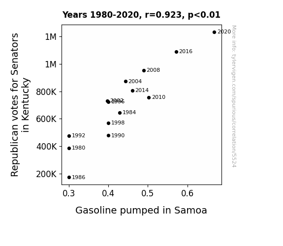
Correlation is a measure of how much the variables move together. If it is 0.99, when one goes up the other goes up. If it is 0.02, the connection is very weak or non-existent. If it is -0.99, then when one goes up the other goes down. If it is 1.00, you probably messed up your correlation function.
r2 = 0.8521984 (Coefficient of determination)
This means 85.2% of the change in the one variable (i.e., Gasoline pumped in Samoa) is predictable based on the change in the other (i.e., Votes for Republican Senators in Kentucky) over the 14 years from 1980 through 2020.
p < 0.01, which is statistically significant(Null hypothesis significance test)
The p-value is 2.5E-6. 0.0000025169368004031933000000
The p-value is a measure of how probable it is that we would randomly find a result this extreme. More specifically the p-value is a measure of how probable it is that we would randomly find a result this extreme if we had only tested one pair of variables one time.
But I am a p-villain. I absolutely did not test only one pair of variables one time. I correlated hundreds of millions of pairs of variables. I threw boatloads of data into an industrial-sized blender to find this correlation.
Who is going to stop me? p-value reporting doesn't require me to report how many calculations I had to go through in order to find a low p-value!
On average, you will find a correaltion as strong as 0.92 in 0.00025% of random cases. Said differently, if you correlated 397,308 random variables You don't actually need 397 thousand variables to find a correlation like this one. I don't have that many variables in my database. You can also correlate variables that are not independent. I do this a lot.
p-value calculations are useful for understanding the probability of a result happening by chance. They are most useful when used to highlight the risk of a fluke outcome. For example, if you calculate a p-value of 0.30, the risk that the result is a fluke is high. It is good to know that! But there are lots of ways to get a p-value of less than 0.01, as evidenced by this project.
In this particular case, the values are so extreme as to be meaningless. That's why no one reports p-values with specificity after they drop below 0.01.
Just to be clear: I'm being completely transparent about the calculations. There is no math trickery. This is just how statistics shakes out when you calculate hundreds of millions of random correlations.
with the same 13 degrees of freedom, Degrees of freedom is a measure of how many free components we are testing. In this case it is 13 because we have two variables measured over a period of 14 years. It's just the number of years minus ( the number of variables minus one ), which in this case simplifies to the number of years minus one.
you would randomly expect to find a correlation as strong as this one.
[ 0.77, 0.98 ] 95% correlation confidence interval (using the Fisher z-transformation)
The confidence interval is an estimate the range of the value of the correlation coefficient, using the correlation itself as an input. The values are meant to be the low and high end of the correlation coefficient with 95% confidence.
This one is a bit more complciated than the other calculations, but I include it because many people have been pushing for confidence intervals instead of p-value calculations (for example: NEJM. However, if you are dredging data, you can reliably find yourself in the 5%. That's my goal!
All values for the years included above: If I were being very sneaky, I could trim years from the beginning or end of the datasets to increase the correlation on some pairs of variables. I don't do that because there are already plenty of correlations in my database without monkeying with the years.
Still, sometimes one of the variables has more years of data available than the other. This page only shows the overlapping years. To see all the years, click on "See what else correlates with..." link above.
| 1980 | 1984 | 1986 | 1990 | 1992 | 1996 | 1998 | 2002 | 2004 | 2008 | 2010 | 2014 | 2016 | 2020 | |
| Votes for Republican Senators in Kentucky (Total votes) | 386029 | 644990 | 173330 | 478034 | 476604 | 724794 | 569817 | 731679 | 873507 | 953816 | 755706 | 806787 | 1090180 | 1233320 |
| Gasoline pumped in Samoa (Million Barrels/Day) | 0.3 | 0.428571 | 0.3 | 0.4 | 0.3 | 0.4 | 0.4 | 0.397288 | 0.442814 | 0.489426 | 0.502452 | 0.460772 | 0.571629 | 0.667761 |
Why this works
- Data dredging: I have 25,237 variables in my database. I compare all these variables against each other to find ones that randomly match up. That's 636,906,169 correlation calculations! This is called “data dredging.” Instead of starting with a hypothesis and testing it, I instead abused the data to see what correlations shake out. It’s a dangerous way to go about analysis, because any sufficiently large dataset will yield strong correlations completely at random.
- Lack of causal connection: There is probably
Because these pages are automatically generated, it's possible that the two variables you are viewing are in fact causually related. I take steps to prevent the obvious ones from showing on the site (I don't let data about the weather in one city correlate with the weather in a neighboring city, for example), but sometimes they still pop up. If they are related, cool! You found a loophole.
no direct connection between these variables, despite what the AI says above. This is exacerbated by the fact that I used "Years" as the base variable. Lots of things happen in a year that are not related to each other! Most studies would use something like "one person" in stead of "one year" to be the "thing" studied. - Observations not independent: For many variables, sequential years are not independent of each other. If a population of people is continuously doing something every day, there is no reason to think they would suddenly change how they are doing that thing on January 1. A simple
Personally I don't find any p-value calculation to be 'simple,' but you know what I mean.
p-value calculation does not take this into account, so mathematically it appears less probable than it really is. - Confounding variable: 2020 is particularly different from the other years on this graph. Confounding variables (like global pandemics) will cause two variables to look connected when in fact a "sneaky third" variable is influencing both of them behind the scenes.
- Y-axis doesn't start at zero: I truncated the Y-axes of the graph above. I also used a line graph, which makes the visual connection stand out more than it deserves.
Nothing against line graphs. They are great at telling a story when you have linear data! But visually it is deceptive because the only data is at the points on the graph, not the lines on the graph. In between each point, the data could have been doing anything. Like going for a random walk by itself!
Mathematically what I showed is true, but it is intentionally misleading. Below is the same chart but with both Y-axes starting at zero.

Try it yourself
You can calculate the values on this page on your own! Try running the Python code to see the calculation results. Step 1: Download and install Python on your computer.Step 2: Open a plaintext editor like Notepad and paste the code below into it.
Step 3: Save the file as "calculate_correlation.py" in a place you will remember, like your desktop. Copy the file location to your clipboard. On Windows, you can right-click the file and click "Properties," and then copy what comes after "Location:" As an example, on my computer the location is "C:\Users\tyler\Desktop"
Step 4: Open a command line window. For example, by pressing start and typing "cmd" and them pressing enter.
Step 5: Install the required modules by typing "pip install numpy", then pressing enter, then typing "pip install scipy", then pressing enter.
Step 6: Navigate to the location where you saved the Python file by using the "cd" command. For example, I would type "cd C:\Users\tyler\Desktop" and push enter.
Step 7: Run the Python script by typing "python calculate_correlation.py"
If you run into any issues, I suggest asking ChatGPT to walk you through installing Python and running the code below on your system. Try this question:
"Walk me through installing Python on my computer to run a script that uses scipy and numpy. Go step-by-step and ask me to confirm before moving on. Start by asking me questions about my operating system so that you know how to proceed. Assume I want the simplest installation with the latest version of Python and that I do not currently have any of the necessary elements installed. Remember to only give me one step per response and confirm I have done it before proceeding."
# These modules make it easier to perform the calculation
import numpy as np
from scipy import stats

# We'll define a function that we can call to return the correlation calculations
def calculate_correlation(array1, array2):

    # Calculate Pearson correlation coefficient and p-value
    correlation, p_value = stats.pearsonr(array1, array2)

    # Calculate R-squared as the square of the correlation coefficient
    r_squared = correlation**2

    return correlation, r_squared, p_value

# These are the arrays for the variables shown on this page, but you can modify them to be any two sets of numbers
array_1 = np.array([386029,644990,173330,478034,476604,724794,569817,731679,873507,953816,755706,806787,1090180,1233320,])
array_2 = np.array([0.3,0.428571,0.3,0.4,0.3,0.4,0.4,0.397288,0.442814,0.489426,0.502452,0.460772,0.571629,0.667761,])
array_1_name = "Votes for Republican Senators in Kentucky"
array_2_name = "Gasoline pumped in Samoa"

# Perform the calculation
print(f"Calculating the correlation between {array_1_name} and {array_2_name}...")
correlation, r_squared, p_value = calculate_correlation(array_1, array_2)

# Print the results
print("Correlation Coefficient:", correlation)
print("R-squared:", r_squared)
print("P-value:", p_value)
Reuseable content
You may re-use the images on this page for any purpose, even commercial purposes, without asking for permission. The only requirement is that you attribute Tyler Vigen. Attribution can take many different forms. If you leave the "tylervigen.com" link in the image, that satisfies it just fine. If you remove it and move it to a footnote, that's fine too. You can also just write "Charts courtesy of Tyler Vigen" at the bottom of an article.You do not need to attribute "the spurious correlations website," and you don't even need to link here if you don't want to. I don't gain anything from pageviews. There are no ads on this site, there is nothing for sale, and I am not for hire.
For the record, I am just one person. Tyler Vigen, he/him/his. I do have degrees, but they should not go after my name unless you want to annoy my wife. If that is your goal, then go ahead and cite me as "Tyler Vigen, A.A. A.A.S. B.A. J.D." Otherwise it is just "Tyler Vigen."
When spoken, my last name is pronounced "vegan," like I don't eat meat.
Full license details.
For more on re-use permissions, or to get a signed release form, see tylervigen.com/permission.
Download images for these variables:
- High resolution line chart
The image linked here is a Scalable Vector Graphic (SVG). It is the highest resolution that is possible to achieve. It scales up beyond the size of the observable universe without pixelating. You do not need to email me asking if I have a higher resolution image. I do not. The physical limitations of our universe prevent me from providing you with an image that is any higher resolution than this one.
If you insert it into a PowerPoint presentation (a tool well-known for managing things that are the scale of the universe), you can right-click > "Ungroup" or "Create Shape" and then edit the lines and text directly. You can also change the colors this way.
Alternatively you can use a tool like Inkscape. - High resolution line chart, optimized for mobile
- Alternative high resolution line chart
- Scatterplot
- Portable line chart (png)
- Portable line chart (png), optimized for mobile
- Line chart for only Votes for Republican Senators in Kentucky
- Line chart for only Gasoline pumped in Samoa
- AI-generated correlation image
- The spurious research paper: Ride to the Polls, Fill Up the Tanks: How Kentucky Republican Votes and Samoan Gasoline Are Mysteriously Aligned
You're the correlation whisperer we needed!
Correlation ID: 5524 · Black Variable ID: 26245 · Red Variable ID: 24868

