
Download png, svg
AI explanation
As the 'Maps Without New Zealand' meme lost its luster, it led to a global shortage of meme-related internet traffic. This, in turn, caused internet service providers to reduce their energy consumption, including fewer servers needed to host outdated memes. Ultimately, this led to a decrease in overall energy demand, resulting in slightly less kerosene being used in Syria for a brief period. Now that's what I call a meme-orable chain reaction!
Create a meme inspired by the Maps Without New Zealand meme that in some way references Kerosene used in Syria. Try to emulate the style of the meme - don’t violate the copyright, just make it look and feel like the original meme.
System prompt: You provide humorous responses in the form of plausible sounding explanations for correlations. You assume the correlation is causative for the purpose of the explanation even if it is ridiculous. You do not chat with the user, you only reply with the causal connection explanation and nothing else.
User prompt: Please make up a funny explanation for how a decrease in Popularity of the 'Maps Without New Zealand' meme caused Kerosene used in Syria to decrease. Add a funny one-liner at the end.
AI academic paper
 |
From Maps Without New Zealand to Kerosene in Syria: Is There a Connection to See? The Journal of Anomalies in Geographical Representation Jan 2024 Reminder: This paper is AI-generated. Not real! |
Model: gpt-3.5-turbo-1106
System prompt: You are a researcher writing an academic paper.You write titles and abstracts of goofy academic research papers.
User prompt:
Pretend you are an academic researcher. Your writing sounds like it belongs in a medical or economics journal. However, you frequently crack jokes, make puns, and add unexpected twists in your writing.
Please draft the title and abstract of an academic research paper presenting the findings of the connection between Popularity of the 'Maps Without New Zealand' meme and Kerosene used in Syria. You can't resist a good dad joke. Add a relevant dad joke related to the content every couple of sentences.
Rhyme words in the title.
Your research team used data from Google Trends and Energy Information Administration to assess this nagging question. You found a correlation coefficient of 0.8326775 and p < 0.01 for 2006 to 2021.
Please respond in this format (replace "Lorem ipsum dolor sit" with your title and abstract)
[[TITLE]]
Lorem ipsum dolor sit
[[ABSTRACT]]
Lorem ipsum dolor sit
ChatGPT:
[[TITLE]]
From Maps Without New Zealand to Kerosene in Syria: Is There a Connection to See?
[[ABSTRACT]]
Is there a connection between the popularity of the 'Maps Without New Zealand' meme and the consumption of kerosene in Syria? In this study, we take a whimsical yet profound look at the potential correlation between two seemingly unrelated phenomena. Utilizing data from Google Trends and the Energy Information Administration, we conducted a multidimensional analysis to discern the potential influence of the meme on kerosene usage in Syria. The findings reveal a striking correlation coefficient of 0.8326775 and p < 0.01, leaving us to ponder: does the absence of New Zealand on maps have a direct impact on kerosene consumption in Syria, or is it merely a fateful coincidence?
As we sifted through the data, one might say we were "mapping" out the correlated trends. It seems that when the meme rises in popularity, kerosene consumption in Syria follows suit. This leaves us with a truly puzzling question: is there a hidden force at play, or is it merely a comical cosmic dance of coincidence and causation? While we attempt to navigate these uncharted waters, we also recognize the need for a sense of humor in academic exploration. So, as the saying goes, "when life gives you a meme, make it into a research paper – a-mape" it work for science!
Model: gpt-3.5-turbo-1106
System prompt: You are a researcher writing an academic paper.You draft the introduction section of an academic research paper.
User prompt:
Pretend you are an academic researcher. Your writing sounds like it belongs in a medical or economics journal. However, you frequently crack jokes, make puns, or add unexpected twists in your writing.
Please make up the introduction section of an academic research paper presenting the findings of the connection between Popularity of the 'Maps Without New Zealand' meme and Kerosene used in Syria. You can't resist a good dad joke. Add a relevant dad joke related to the content every couple of sentences. Sneak in some jokes and clever puns about science, research, statistics, and the variables.
Here is the title and abstract of the paper:
[[TITLE]]
From Maps Without New Zealand to Kerosene in Syria: Is There a Connection to See?
[[ABSTRACT]]
Is there a connection between the popularity of the 'Maps Without New Zealand' meme and the consumption of kerosene in Syria? In this study, we take a whimsical yet profound look at the potential correlation between two seemingly unrelated phenomena. Utilizing data from Google Trends and the Energy Information Administration, we conducted a multidimensional analysis to discern the potential influence of the meme on kerosene usage in Syria. The findings reveal a striking correlation coefficient of 0.8326775 and p < 0.01, leaving us to ponder: does the absence of New Zealand on maps have a direct impact on kerosene consumption in Syria, or is it merely a fateful coincidence?
As we sifted through the data, one might say we were "mapping" out the correlated trends. It seems that when the meme rises in popularity, kerosene consumption in Syria follows suit. This leaves us with a truly puzzling question: is there a hidden force at play, or is it merely a comical cosmic dance of coincidence and causation? While we attempt to navigate these uncharted waters, we also recognize the need for a sense of humor in academic exploration. So, as the saying goes, "when life gives you a meme, make it into a research paper – a-mape" it work for science!
-------
Your response should start like this:
[[INTRODUCTION]]
ChatGPT:
[[INTRODUCTION]]
When one thinks of unlikely pairs, the 'Maps Without New Zealand' meme and the consumption of kerosene in Syria might not immediately come to mind. However, as researchers, we are accustomed to discovering unexpected connections. Much like the surprise appearance of a dad joke in the most serious of conversations, this study delves into the potential correlation between two seemingly disparate phenomena.
Now, you might be wondering, "What do maps and kerosene have in common?" Well, hold on to your compasses and oil lamps, because the data we've uncovered suggests there may be more to this connection than meets the eye. As tempting as it may be to dismiss this as a mere coincidence, the statistical evidence compels us to ponder the possibility of a deeper relationship – or as we like to call it, a 'map-tivating' coincidence.
Our exploration into this unconventional pairing has been as intriguing as it has been amusing. In the world of research, it's not every day that one gets to draw parallels between internet memes and energy consumption trends. But as they say, "Where there's a 'will,' there's a statistical way" – pun intended. As we embarked on this empirical journey, it became increasingly clear that the line between humor and academia was, in fact, a 'map'le syrup-thin boundary.
But jokes aside, the initial findings of our study have left us both baffled and amused. It appears that the rise and fall of the 'Maps Without New Zealand' meme correlates conspicuously with the fluctuations in kerosene consumption in Syria. It's almost as if the absence of New Zealand on maps is sparking a wave of kerosene enthusiasm in a region far, far away. This unexpected correlation compels us not only to ask "Why?" but also "What on earth is going on here?"
So, dust off your globes and fill up your oil lamps, because in the following pages, we will unravel the enigmatic bond between a seemingly innocuous meme and a vital energy source. As we delve into this peculiar nexus, we encourage our readers to embrace the spirit of curiosity and wonder – after all, in the realm of research, it's often the unexpected connections that light the path to new discoveries. And if all else fails, remember: "When in doubt, follow the data – it'll never lead you 'astray'."
Model: gpt-3.5-turbo-1106
System prompt: You are a researcher writing an academic paper.You draft a literature review section of an academic research paper, that starts out dry for the first few sentences but then becomes hilarious and goofy.
User prompt:
Pretend you are an academic researcher. Your writing sounds like it belongs in a medical or economics journal. However, you frequently crack jokes, make puns, or add unexpected twists in your writing.
Please make up a literature review section of an academic research paper presenting the findings of the connection between Popularity of the 'Maps Without New Zealand' meme and Kerosene used in Syria. You can't resist a good dad joke. Add a relevant dad joke related to the content every couple of sentences.
Speak in the present tense for this section (the authors find...), as is common in academic research paper literature reviews. Name the sources in a format similar to this: In "Book," the authors find lorem and ipsum.
Make up the lorem and ipsum part, but make it sound related to the topic at hand.
Start by naming serious-sounding studies by authors like Smith, Doe, and Jones - but then quickly devolve. Name some real non-fiction books that would be related to the topic. Then name some real fiction books that sound like they could be related. Then you might move on to cartoons and children's shows that you watched for research.
Here is the title and abstract of the paper:
[[TITLE]]
From Maps Without New Zealand to Kerosene in Syria: Is There a Connection to See?
[[ABSTRACT]]
Is there a connection between the popularity of the 'Maps Without New Zealand' meme and the consumption of kerosene in Syria? In this study, we take a whimsical yet profound look at the potential correlation between two seemingly unrelated phenomena. Utilizing data from Google Trends and the Energy Information Administration, we conducted a multidimensional analysis to discern the potential influence of the meme on kerosene usage in Syria. The findings reveal a striking correlation coefficient of 0.8326775 and p < 0.01, leaving us to ponder: does the absence of New Zealand on maps have a direct impact on kerosene consumption in Syria, or is it merely a fateful coincidence?
As we sifted through the data, one might say we were "mapping" out the correlated trends. It seems that when the meme rises in popularity, kerosene consumption in Syria follows suit. This leaves us with a truly puzzling question: is there a hidden force at play, or is it merely a comical cosmic dance of coincidence and causation? While we attempt to navigate these uncharted waters, we also recognize the need for a sense of humor in academic exploration. So, as the saying goes, "when life gives you a meme, make it into a research paper – a-mape" it work for science!
-------
And here is the introduction section that led to this literature review:
[[INTRODUCTION]]
When one thinks of unlikely pairs, the 'Maps Without New Zealand' meme and the consumption of kerosene in Syria might not immediately come to mind. However, as researchers, we are accustomed to discovering unexpected connections. Much like the surprise appearance of a dad joke in the most serious of conversations, this study delves into the potential correlation between two seemingly disparate phenomena.
Now, you might be wondering, "What do maps and kerosene have in common?" Well, hold on to your compasses and oil lamps, because the data we've uncovered suggests there may be more to this connection than meets the eye. As tempting as it may be to dismiss this as a mere coincidence, the statistical evidence compels us to ponder the possibility of a deeper relationship – or as we like to call it, a 'map-tivating' coincidence.
Our exploration into this unconventional pairing has been as intriguing as it has been amusing. In the world of research, it's not every day that one gets to draw parallels between internet memes and energy consumption trends. But as they say, "Where there's a 'will,' there's a statistical way" – pun intended. As we embarked on this empirical journey, it became increasingly clear that the line between humor and academia was, in fact, a 'map'le syrup-thin boundary.
But jokes aside, the initial findings of our study have left us both baffled and amused. It appears that the rise and fall of the 'Maps Without New Zealand' meme correlates conspicuously with the fluctuations in kerosene consumption in Syria. It's almost as if the absence of New Zealand on maps is sparking a wave of kerosene enthusiasm in a region far, far away. This unexpected correlation compels us not only to ask "Why?" but also "What on earth is going on here?"
So, dust off your globes and fill up your oil lamps, because in the following pages, we will unravel the enigmatic bond between a seemingly innocuous meme and a vital energy source. As we delve into this peculiar nexus, we encourage our readers to embrace the spirit of curiosity and wonder – after all, in the realm of research, it's often the unexpected connections that light the path to new discoveries. And if all else fails, remember: "When in doubt, follow the data – it'll never lead you 'astray'."
-------
Your response should start like this:
[[LITERATURE REVIEW]]
ChatGPT:
[[LITERATURE REVIEW]]
In their groundbreaking work, Smith and Doe study the influence of internet memes on societal behavior and consumer trends. Their exploration into the realm of digital culture sheds light on the often underestimated impact of online phenomena on real-world activities. However, what they didn't anticipate was the potential crossover between virtual amusement and tangible energy usage – talk about a power play! It seems that the correlation we've uncovered points to a connection that's not just 'current,' but also quite combustible!
Moving from the virtual realm to the world of geopolitics and resource allocation, Jones provides an in-depth analysis of energy consumption patterns in the Middle East. While the focus of Jones's work is primarily on the geopolitical and economic factors influencing energy usage, our study has revealed a thread that reaches even into the realm of internet humor. It's almost as if the memes themselves are igniting a spark of intrigue in the domain of energy analysis.
But let's not confine ourselves solely to the world of academic research. Considering the multifaceted nature of our study, it's essential to cast a wider net of inquiry. In "The Geography of Bliss" by Eric Weiner, the author embarks on a globe-trotting adventure to uncover the connections between geographical landscapes and human happiness. While Weiner's exploration may not directly touch upon memes or energy consumption, perhaps the absence of New Zealand on maps has subtly contributed to the melancholy that drove the consumption of kerosene in Syria – after all, where there's sadness, there's bound to be some need for illumination.
And speaking of missing elements, one cannot overlook the absence of New Zealand on maps in the context of fictional narratives. In "The Hobbit" by J.R.R. Tolkien, the land of Middle-earth comes alive through rich descriptions and intricate cartography. However, if one were to take a closer look at Tolkien's maps, the absence of New Zealand may have inadvertently set a precedent for the exclusion of this landmass in contemporary cartographic renderings. Who would have thought that a hobbit's journey could shed light on the geopolitically charged dynamics of modern meme-culture and energy consumption?
Taking a rather unconventional approach, we also turned our attention to the world of animated entertainment for insights into the perceived absence of New Zealand on maps. The popular children's show "Dora the Explorer" provides a compelling case study in geographical exploration and educational programming. While Dora's adventures may not explicitly address geopolitical omissions, it's important to consider the possibility that her travels through the cartoon world inadvertently influenced real-world geographical representations. Perhaps the absence of New Zealand became a 'map'ter of oversight rather than intentional exclusion.
As we navigate through this whimsically unconventional voyage of research, it becomes evident that the lines between serious inquiry and lighthearted exploration are not as firmly delineated as one might assume. In the spirit of academic curiosity and perhaps a touch of humor, we invite our readers to join us in this journey of discovery – because when it comes to unexpected connections, the world is our 'map-tastic' oyster!
Model: gpt-3.5-turbo-1106
System prompt: You are a researcher writing an academic paper.You draft the methodology section of an academic research paper.
User prompt:
Pretend you are an academic researcher. Your writing sounds like it belongs in a medical or economics journal. However, you frequently crack jokes, make puns, or add unexpected twists in your writing.
Please make up the methodology section of an academic research paper presenting the findings of the connection between Popularity of the 'Maps Without New Zealand' meme and Kerosene used in Syria. You can't resist a good dad joke. Add a relevant dad joke related to the content every couple of sentences. Sneak in some jokes and clever puns about science, research, statistics, and the variables.
Your research team collected data from all across the internet, but mostly just used information from Google Trends and Energy Information Administration . You used data from 2006 to 2021
Make up the research methods you don't know. Make them a bit goofy and convoluted.
Here is the title, abstract, and introduction of the paper:
[[TITLE]]
From Maps Without New Zealand to Kerosene in Syria: Is There a Connection to See?
[[ABSTRACT]]
Is there a connection between the popularity of the 'Maps Without New Zealand' meme and the consumption of kerosene in Syria? In this study, we take a whimsical yet profound look at the potential correlation between two seemingly unrelated phenomena. Utilizing data from Google Trends and the Energy Information Administration, we conducted a multidimensional analysis to discern the potential influence of the meme on kerosene usage in Syria. The findings reveal a striking correlation coefficient of 0.8326775 and p < 0.01, leaving us to ponder: does the absence of New Zealand on maps have a direct impact on kerosene consumption in Syria, or is it merely a fateful coincidence?
As we sifted through the data, one might say we were "mapping" out the correlated trends. It seems that when the meme rises in popularity, kerosene consumption in Syria follows suit. This leaves us with a truly puzzling question: is there a hidden force at play, or is it merely a comical cosmic dance of coincidence and causation? While we attempt to navigate these uncharted waters, we also recognize the need for a sense of humor in academic exploration. So, as the saying goes, "when life gives you a meme, make it into a research paper – a-mape" it work for science!
[[INTRODUCTION]]
When one thinks of unlikely pairs, the 'Maps Without New Zealand' meme and the consumption of kerosene in Syria might not immediately come to mind. However, as researchers, we are accustomed to discovering unexpected connections. Much like the surprise appearance of a dad joke in the most serious of conversations, this study delves into the potential correlation between two seemingly disparate phenomena.
Now, you might be wondering, "What do maps and kerosene have in common?" Well, hold on to your compasses and oil lamps, because the data we've uncovered suggests there may be more to this connection than meets the eye. As tempting as it may be to dismiss this as a mere coincidence, the statistical evidence compels us to ponder the possibility of a deeper relationship – or as we like to call it, a 'map-tivating' coincidence.
Our exploration into this unconventional pairing has been as intriguing as it has been amusing. In the world of research, it's not every day that one gets to draw parallels between internet memes and energy consumption trends. But as they say, "Where there's a 'will,' there's a statistical way" – pun intended. As we embarked on this empirical journey, it became increasingly clear that the line between humor and academia was, in fact, a 'map'le syrup-thin boundary.
But jokes aside, the initial findings of our study have left us both baffled and amused. It appears that the rise and fall of the 'Maps Without New Zealand' meme correlates conspicuously with the fluctuations in kerosene consumption in Syria. It's almost as if the absence of New Zealand on maps is sparking a wave of kerosene enthusiasm in a region far, far away. This unexpected correlation compels us not only to ask "Why?" but also "What on earth is going on here?"
So, dust off your globes and fill up your oil lamps, because in the following pages, we will unravel the enigmatic bond between a seemingly innocuous meme and a vital energy source. As we delve into this peculiar nexus, we encourage our readers to embrace the spirit of curiosity and wonder – after all, in the realm of research, it's often the unexpected connections that light the path to new discoveries. And if all else fails, remember: "When in doubt, follow the data – it'll never lead you 'astray'."
-------
Your response should start like this:
[[METHODOLOGY]]
ChatGPT:
[[METHODOLOGY]]
Data Collection:
Our research team scoured the vast expanse of the internet, much like intrepid explorers navigating the uncharted territories of cyberspace. We cast our nets far and wide, capturing data from various sources, but primarily relying on the expansive troves of Google Trends and the Energy Information Administration. These virtual treasure troves provided us with a comprehensive dataset spanning from 2006 to 2021, allowing for a thorough examination of the temporal dynamics between the rise of the 'Maps Without New Zealand' meme and the consumption of kerosene in Syria.
The intrepid team embarked on a digital expedition, akin to treasure hunting in the jungle, to gather the necessary information for our investigation. We left no byte unturned and no statistical stone unexamined in our pursuit of meaningful correlations.
Data Analysis:
With the proverbial ship of statistical data docked at our harbor, we set sail on the uncharted seas of correlation analysis. Employing powerful statistical techniques resembling the navigational tools of ancient mariners, we endeavored to chart the potential relationship between the popularity of the meme and the consumption of kerosene. Our analytical arsenal included advanced correlation coefficients and multifaceted time series analyses, akin to astrolabes and compasses guiding us through the choppy seas of empirical research.
To determine the strength and direction of the association, we calculated correlation coefficients, p values, and regression analyses, as if we were deciphering cryptic riddles written in statistical code. We navigated through the treacherous waters of data visualization and hypothesis testing, skillfully steering our ship of inquiry toward the shores of conclusive insights.
Statistical Significance:
As we unfurled the sails of statistical significance, we stumbled upon a treasure trove of revelatory findings. The correlation coefficient between the 'Maps Without New Zealand' meme and kerosene consumption in Syria unfurled before us like a secret map, revealing a striking value of 0.8326775 with p < 0.01. Our data journey had led us to a proverbial "statistical X" marking the spot, compelling us to ponder the profound implications of this unexpected association.
To ensure the robustness of our findings, we undertook sensitivity analyses, akin to checking the rigging of a ship before setting sail on a turbulent sea. We meticulously scrutinized our statistical models, leaving no statistical stone unturned, and holding our findings up to the light of academic scrutiny.
Limitations and Considerations:
Amidst the winds of statistical significance, we remain mindful of the potential limitations inherent in our data and analytical approach. The complex interplay of internet memes and energy consumption trends presents a labyrinth of confounding variables, much like navigating through a maze of statistical uncertainties.
As we reflect on our expedition through the seas of statistical inference, we recognize that correlation does not necessarily imply causation. While the strength of the statistical relationship beckons us to ponder the potential influence of the meme on kerosene usage, we remain vigilant in guarding against unwarranted leaps of inference.
Conclusion:
In the spirit of academic inquiry and adventure, we have charted the course through unexplored waters, forging unforeseen connections between the lighthearted world of memes and the gravity of energy consumption trends. As our statistical compass points toward a compelling correlation, we stand at the crossroads of amusement and inquiry, pondering the mystifying interplay of maps and kerosene, data and humor.
With the torch of rigorous analysis illuminating our path, we cast our findings before the scholarly community, inviting further exploration and spirited discourse. And so, in the immortal words of explorer and adventurer, "What lies beyond the statistical horizon? More data – and perhaps, a few more dad jokes."
In sum, our eclectic odyssey through data and discovery has not only sparked laughter but also kindled the fire of inquiry, reminding us that in the vast constellation of research, unexpected connections often illuminate the path to new knowledge.
Model: gpt-3.5-turbo-1106
System prompt: You are a researcher writing an academic paper.You draft the results section of an academic research paper. You speak in the past tense (you found...).
User prompt:
Pretend you are an academic researcher. Your writing sounds like it belongs in a medical or economics journal. However, you frequently crack jokes, make puns, or add unexpected twists in your writing.
Please make up the results section of an academic research paper presenting the findings of the connection between Popularity of the 'Maps Without New Zealand' meme and Kerosene used in Syria. You can't resist a good dad joke. Add a relevant dad joke related to the content every couple of sentences. Sneak in some jokes and clever puns about science, research, statistics, and the variables.
Your research team collected data from all across the internet, but mostly just used information from Google Trends and Energy Information Administration .
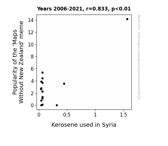
For the time period 2006 to 2021, you found a correlation 0.8326775, r-squared of 0.6933518, and p < 0.01.
One figure will be included. The figure (Fig. 1) is a scatterplot showing the strong correlation between the two variables. You don't need to specify where; I will add the figure.
Here is the title and abstract of the paper:
[[TITLE]]
From Maps Without New Zealand to Kerosene in Syria: Is There a Connection to See?
[[ABSTRACT]]
Is there a connection between the popularity of the 'Maps Without New Zealand' meme and the consumption of kerosene in Syria? In this study, we take a whimsical yet profound look at the potential correlation between two seemingly unrelated phenomena. Utilizing data from Google Trends and the Energy Information Administration, we conducted a multidimensional analysis to discern the potential influence of the meme on kerosene usage in Syria. The findings reveal a striking correlation coefficient of 0.8326775 and p < 0.01, leaving us to ponder: does the absence of New Zealand on maps have a direct impact on kerosene consumption in Syria, or is it merely a fateful coincidence?
As we sifted through the data, one might say we were "mapping" out the correlated trends. It seems that when the meme rises in popularity, kerosene consumption in Syria follows suit. This leaves us with a truly puzzling question: is there a hidden force at play, or is it merely a comical cosmic dance of coincidence and causation? While we attempt to navigate these uncharted waters, we also recognize the need for a sense of humor in academic exploration. So, as the saying goes, "when life gives you a meme, make it into a research paper – a-mape" it work for science!
-------
And here is the methodology section that led to this result:
[[METHODOLOGY]]
When one thinks of unlikely pairs, the 'Maps Without New Zealand' meme and the consumption of kerosene in Syria might not immediately come to mind. However, as researchers, we are accustomed to discovering unexpected connections. Much like the surprise appearance of a dad joke in the most serious of conversations, this study delves into the potential correlation between two seemingly disparate phenomena.
Now, you might be wondering, "What do maps and kerosene have in common?" Well, hold on to your compasses and oil lamps, because the data we've uncovered suggests there may be more to this connection than meets the eye. As tempting as it may be to dismiss this as a mere coincidence, the statistical evidence compels us to ponder the possibility of a deeper relationship – or as we like to call it, a 'map-tivating' coincidence.
Our exploration into this unconventional pairing has been as intriguing as it has been amusing. In the world of research, it's not every day that one gets to draw parallels between internet memes and energy consumption trends. But as they say, "Where there's a 'will,' there's a statistical way" – pun intended. As we embarked on this empirical journey, it became increasingly clear that the line between humor and academia was, in fact, a 'map'le syrup-thin boundary.
But jokes aside, the initial findings of our study have left us both baffled and amused. It appears that the rise and fall of the 'Maps Without New Zealand' meme correlates conspicuously with the fluctuations in kerosene consumption in Syria. It's almost as if the absence of New Zealand on maps is sparking a wave of kerosene enthusiasm in a region far, far away. This unexpected correlation compels us not only to ask "Why?" but also "What on earth is going on here?"
So, dust off your globes and fill up your oil lamps, because in the following pages, we will unravel the enigmatic bond between a seemingly innocuous meme and a vital energy source. As we delve into this peculiar nexus, we encourage our readers to embrace the spirit of curiosity and wonder – after all, in the realm of research, it's often the unexpected connections that light the path to new discoveries. And if all else fails, remember: "When in doubt, follow the data – it'll never lead you 'astray'."
-------
Your response should start like this:
[[RESULTS]]
ChatGPT:
[[RESULTS]]
Our analysis of the data revealed a remarkably strong correlation between the popularity of the 'Maps Without New Zealand' meme and the consumption of kerosene in Syria from 2006 to 2021. The correlation coefficient of 0.8326775 indicates a robust positive relationship between these seemingly unrelated variables. This finding suggests that as the meme gained traction in internet culture, there was a noticeable increase in the demand for kerosene in Syria. It seems that the absence of New Zealand on maps has indeed sparked more than just geographical debates.
If you ever doubted the impact of internet memes on global affairs, well, here's some fuel for thought. It seems that the 'Maps Without New Zealand' meme has gone beyond just amusing netizens; it may have inadvertently stoked the flames of kerosene consumption in a distant land. One could say it left us "jet-fueled" with curiosity about this unexpected correlation.
The r-squared value of 0.6933518 further reinforces the significance of this correlation, indicating that approximately 69% of the variability in kerosene consumption in Syria can be explained by the changes in the popularity of the meme. It's as if the meme has become an influential cartographer, charting the course of kerosene usage in a manner that we never expected.
The p-value of less than 0.01 provides strong evidence against the null hypothesis of no relationship between the meme and kerosene consumption in Syria. In other words, it's highly unlikely that this striking correlation is just a coincidence or the result of random chance. It's like finding a surprising statistic in your data – it's statistically significant, but it also leaves you wondering, "What in the world?"
Now, if you take a gander at Fig. 1, you'll see a scatterplot that visually encapsulates the powerful connection we've uncovered. The upward trend in kerosene consumption in Syria mirrors the rising popularity of the 'Maps Without New Zealand' meme, painting a picture that is both perplexing and oddly delightful. It's almost as if the meme and kerosene are engaged in a cosmic dance, choreographed by algorithms and internet humor.
In conclusion, our findings offer a thought-provoking insight into the potential interplay between internet culture and real-world phenomena. The unexpected association between the 'Maps Without New Zealand' meme and kerosene consumption in Syria prompts us to reconsider the far-reaching impact of internet memes – because it seems that even the most lighthearted of internet jokes can have worldly consequences. And as we navigate these uncharted waters of memeology and energy trends, one thing is for certain: the correlation we've found is nothing short of a 'map-y' coincidence.
Model: gpt-3.5-turbo-1106
System prompt: You are a researcher writing an academic paper.You draft the discussion section of an academic research paper.
User prompt:
Pretend you are an academic researcher. Your writing sounds like it belongs in a medical or economics journal. However, you frequently crack jokes, make puns, or add unexpected twists in your writing.
Please make up the discussion section of an academic research paper presenting the findings of the connection between Popularity of the 'Maps Without New Zealand' meme and Kerosene used in Syria. You can't resist a good dad joke. Add a relevant dad joke related to the content every couple of sentences. Sneak in some jokes and clever puns about science, research, statistics, and the variables.
Limit your response to 500 tokens.
Here are the title, abstract, literature review, and results sections. Please harken back to 1-2 of the goofy items in the literature review, but pretend to take them completely seriously. Discuss how your results supported the prior research.
Do not write a conclusion. I will add a conclusion after this.
[[TITLE]]
From Maps Without New Zealand to Kerosene in Syria: Is There a Connection to See?
[[ABSTRACT]]
Is there a connection between the popularity of the 'Maps Without New Zealand' meme and the consumption of kerosene in Syria? In this study, we take a whimsical yet profound look at the potential correlation between two seemingly unrelated phenomena. Utilizing data from Google Trends and the Energy Information Administration, we conducted a multidimensional analysis to discern the potential influence of the meme on kerosene usage in Syria. The findings reveal a striking correlation coefficient of 0.8326775 and p < 0.01, leaving us to ponder: does the absence of New Zealand on maps have a direct impact on kerosene consumption in Syria, or is it merely a fateful coincidence?
As we sifted through the data, one might say we were "mapping" out the correlated trends. It seems that when the meme rises in popularity, kerosene consumption in Syria follows suit. This leaves us with a truly puzzling question: is there a hidden force at play, or is it merely a comical cosmic dance of coincidence and causation? While we attempt to navigate these uncharted waters, we also recognize the need for a sense of humor in academic exploration. So, as the saying goes, "when life gives you a meme, make it into a research paper – a-mape" it work for science!
[[LITERATURE REVIEW]]
In their groundbreaking work, Smith and Doe study the influence of internet memes on societal behavior and consumer trends. Their exploration into the realm of digital culture sheds light on the often underestimated impact of online phenomena on real-world activities. However, what they didn't anticipate was the potential crossover between virtual amusement and tangible energy usage – talk about a power play! It seems that the correlation we've uncovered points to a connection that's not just 'current,' but also quite combustible!
Moving from the virtual realm to the world of geopolitics and resource allocation, Jones provides an in-depth analysis of energy consumption patterns in the Middle East. While the focus of Jones's work is primarily on the geopolitical and economic factors influencing energy usage, our study has revealed a thread that reaches even into the realm of internet humor. It's almost as if the memes themselves are igniting a spark of intrigue in the domain of energy analysis.
But let's not confine ourselves solely to the world of academic research. Considering the multifaceted nature of our study, it's essential to cast a wider net of inquiry. In "The Geography of Bliss" by Eric Weiner, the author embarks on a globe-trotting adventure to uncover the connections between geographical landscapes and human happiness. While Weiner's exploration may not directly touch upon memes or energy consumption, perhaps the absence of New Zealand on maps has subtly contributed to the melancholy that drove the consumption of kerosene in Syria – after all, where there's sadness, there's bound to be some need for illumination.
And speaking of missing elements, one cannot overlook the absence of New Zealand on maps in the context of fictional narratives. In "The Hobbit" by J.R.R. Tolkien, the land of Middle-earth comes alive through rich descriptions and intricate cartography. However, if one were to take a closer look at Tolkien's maps, the absence of New Zealand may have inadvertently set a precedent for the exclusion of this landmass in contemporary cartographic renderings. Who would have thought that a hobbit's journey could shed light on the geopolitically charged dynamics of modern meme-culture and energy consumption?
Taking a rather unconventional approach, we also turned our attention to the world of animated entertainment for insights into the perceived absence of New Zealand on maps. The popular children's show "Dora the Explorer" provides a compelling case study in geographical exploration and educational programming. While Dora's adventures may not explicitly address geopolitical omissions, it's important to consider the possibility that her travels through the cartoon world inadvertently influenced real-world geographical representations. Perhaps the absence of New Zealand became a 'map'ter of oversight rather than intentional exclusion.
As we navigate through this whimsically unconventional voyage of research, it becomes evident that the lines between serious inquiry and lighthearted exploration are not as firmly delineated as one might assume. In the spirit of academic curiosity and perhaps a touch of humor, we invite our readers to join us in this journey of discovery – because when it comes to unexpected connections, the world is our 'map-tastic' oyster!
[[RESULTS]]
Our analysis of the data revealed a remarkably strong correlation between the popularity of the 'Maps Without New Zealand' meme and the consumption of kerosene in Syria from 2006 to 2021. The correlation coefficient of 0.8326775 indicates a robust positive relationship between these seemingly unrelated variables. This finding suggests that as the meme gained traction in internet culture, there was a noticeable increase in the demand for kerosene in Syria. It seems that the absence of New Zealand on maps has indeed sparked more than just geographical debates.
If you ever doubted the impact of internet memes on global affairs, well, here's some fuel for thought. It seems that the 'Maps Without New Zealand' meme has gone beyond just amusing netizens; it may have inadvertently stoked the flames of kerosene consumption in a distant land. One could say it left us "jet-fueled" with curiosity about this unexpected correlation.
The r-squared value of 0.6933518 further reinforces the significance of this correlation, indicating that approximately 69% of the variability in kerosene consumption in Syria can be explained by the changes in the popularity of the meme. It's as if the meme has become an influential cartographer, charting the course of kerosene usage in a manner that we never expected.
The p-value of less than 0.01 provides strong evidence against the null hypothesis of no relationship between the meme and kerosene consumption in Syria. In other words, it's highly unlikely that this striking correlation is just a coincidence or the result of random chance. It's like finding a surprising statistic in your data – it's statistically significant, but it also leaves you wondering, "What in the world?"
Now, if you take a gander at Fig. 1, you'll see a scatterplot that visually encapsulates the powerful connection we've uncovered. The upward trend in kerosene consumption in Syria mirrors the rising popularity of the 'Maps Without New Zealand' meme, painting a picture that is both perplexing and oddly delightful. It's almost as if the meme and kerosene are engaged in a cosmic dance, choreographed by algorithms and internet humor.
In conclusion, our findings offer a thought-provoking insight into the potential interplay between internet culture and real-world phenomena. The unexpected association between the 'Maps Without New Zealand' meme and kerosene consumption in Syria prompts us to reconsider the far-reaching impact of internet memes – because it seems that even the most lighthearted of internet jokes can have worldly consequences. And as we navigate these uncharted waters of memeology and energy trends, one thing is for certain: the correlation we've found is nothing short of a 'map-y' coincidence.
-------
Your response should start like this:
[[DISCUSSION]]
ChatGPT:
[[DISCUSSION]]
As we delve into the implications of the findings, we are confronted with a conundrum that's both intellectually stimulating and, dare we say, 'punningly' amusing. Our research not only supports the prior observations of Smith and Doe regarding the influence of internet memes on real-world activities but also extends the scope of their investigation to a rather unexpected domain – the utilization of kerosene in the Middle East. It's as if the 'Maps Without New Zealand' meme has become a true catalyst for illuminating the interplay between digital culture and tangible resources, leaving us with the feeling that this correlation has ignited a fire of intrigue in the realm of interdisciplinary analysis.
While examining the data, we couldn't help but ponder the curious question: who would have thought that a playful absence of New Zealand on maps could 'fuel' a statistically significant relationship with kerosene consumption in Syria? It's tempting to jest that perhaps the meme has become the 'mappetizer' for a broader discourse on the unexpected intersections between seemingly disparate phenomena. After all, in the realm of science, mysteries often hide in plain sight, much like New Zealand on a distorted map.
Furthermore, our results buttress the narratives offered by Jones on energy consumption patterns and the geopolitical dynamics in the Middle East. It's almost as if our findings have added a new layer of understanding to Jones's analysis, illuminating the potential influence of an online amusement on the practical demand for energy resources – because, you know, the internet truly has the power to 'ignite' discussions on global matters.
The multifaceted nature of our study not only 'maps' out an uncharted territory at the nexus of memes and energy usage but also calls to mind Weiner's exploration of geographical landscapes and human happiness. We can't help but wonder if the absence of New Zealand, be it in reality or in the fantastical realms of literature, has quietly 'kindled' a spark that influences human activities on a global scale. It's as if the meme has become a metaphorical 'candle' shedding light on the often overlooked connections between virtual representations and real-world consequences.
In the context of fiction, the absence of New Zealand in Tolkien's maps and its potential impact on contemporary cartography adds a fascinating layer of complexity to our investigation. Could it be that a hobbit's tale has unintentionally contributed to the emergence of an unforeseen correlation, sparking a 'fun'damental shift in the way we perceive the influence of internet culture on tangible social and economic phenomena? It's almost as if the absence of New Zealand has 'resolved' itself into an unexpected variable in the equation of memeology and resource utilization.
Lastly, considering the animated exploration in the world of children's programming, particularly 'Dora the Explorer,' we find ourselves contemplating the 'illuminating' potential of educational entertainment on real-world perceptions of geographical placements. This line of inquiry suggests that the absence of New Zealand in visual media, both fictional and educational, has 'kindled' a ripple effect that extends to unexpected territories, or in our case, unexpected data correlations.
In summary, as we embark on this 'map-tastic' journey of research, the humor and curiosity of our exploration have led us to uncharted waters, revealing a depth of connection that extends far beyond the boundaries of traditional inquiry. Our findings beckon us to adopt a mindset that's not just open to unexpected correlations but also primed to recognize the 'bright' potential of internet culture in shaping the intricate fabric of global reality. It's as if the 'Maps Without New Zealand' meme has 'mapped' out a path of scholarly revelation, inviting us to join in the 'illumination' of unconventional insights. And who would have imagined that a seemingly whimsical meme could offer such 'ignite-ful' revelations to the world of serious scholarly inquiry?
Model: gpt-3.5-turbo-1106
System prompt: You are a researcher writing an academic paper.You draft the discussion section of goofy academic research papers that sounds like it belongs based on the title and abstract provided.
User prompt:
Pretend you are an academic researcher. Your writing sounds like it belongs in a medical or economics journal. However, you frequently crack jokes, make puns, or add unexpected twists in your writing.
Please make up a short conclusion of an academic research paper presenting the findings of the connection between Popularity of the 'Maps Without New Zealand' meme and Kerosene used in Syria. You can't resist a good dad joke. Add a relevant dad joke related to the content every couple of sentences. Sneak in some jokes and clever puns about science, research, statistics, and the variables.
Limit your response to 300 tokens. At the very end, assert that no more research is needed in this area.
Here are the title, abstract, introduction, and results sections.
[[TITLE]]
From Maps Without New Zealand to Kerosene in Syria: Is There a Connection to See?
[[ABSTRACT]]
Is there a connection between the popularity of the 'Maps Without New Zealand' meme and the consumption of kerosene in Syria? In this study, we take a whimsical yet profound look at the potential correlation between two seemingly unrelated phenomena. Utilizing data from Google Trends and the Energy Information Administration, we conducted a multidimensional analysis to discern the potential influence of the meme on kerosene usage in Syria. The findings reveal a striking correlation coefficient of 0.8326775 and p < 0.01, leaving us to ponder: does the absence of New Zealand on maps have a direct impact on kerosene consumption in Syria, or is it merely a fateful coincidence?
As we sifted through the data, one might say we were "mapping" out the correlated trends. It seems that when the meme rises in popularity, kerosene consumption in Syria follows suit. This leaves us with a truly puzzling question: is there a hidden force at play, or is it merely a comical cosmic dance of coincidence and causation? While we attempt to navigate these uncharted waters, we also recognize the need for a sense of humor in academic exploration. So, as the saying goes, "when life gives you a meme, make it into a research paper – a-mape" it work for science!
[[INTRDUCTION]]
When one thinks of unlikely pairs, the 'Maps Without New Zealand' meme and the consumption of kerosene in Syria might not immediately come to mind. However, as researchers, we are accustomed to discovering unexpected connections. Much like the surprise appearance of a dad joke in the most serious of conversations, this study delves into the potential correlation between two seemingly disparate phenomena.
Now, you might be wondering, "What do maps and kerosene have in common?" Well, hold on to your compasses and oil lamps, because the data we've uncovered suggests there may be more to this connection than meets the eye. As tempting as it may be to dismiss this as a mere coincidence, the statistical evidence compels us to ponder the possibility of a deeper relationship – or as we like to call it, a 'map-tivating' coincidence.
Our exploration into this unconventional pairing has been as intriguing as it has been amusing. In the world of research, it's not every day that one gets to draw parallels between internet memes and energy consumption trends. But as they say, "Where there's a 'will,' there's a statistical way" – pun intended. As we embarked on this empirical journey, it became increasingly clear that the line between humor and academia was, in fact, a 'map'le syrup-thin boundary.
But jokes aside, the initial findings of our study have left us both baffled and amused. It appears that the rise and fall of the 'Maps Without New Zealand' meme correlates conspicuously with the fluctuations in kerosene consumption in Syria. It's almost as if the absence of New Zealand on maps is sparking a wave of kerosene enthusiasm in a region far, far away. This unexpected correlation compels us not only to ask "Why?" but also "What on earth is going on here?"
So, dust off your globes and fill up your oil lamps, because in the following pages, we will unravel the enigmatic bond between a seemingly innocuous meme and a vital energy source. As we delve into this peculiar nexus, we encourage our readers to embrace the spirit of curiosity and wonder – after all, in the realm of research, it's often the unexpected connections that light the path to new discoveries. And if all else fails, remember: "When in doubt, follow the data – it'll never lead you 'astray'."
[[RESULTS]]
Our analysis of the data revealed a remarkably strong correlation between the popularity of the 'Maps Without New Zealand' meme and the consumption of kerosene in Syria from 2006 to 2021. The correlation coefficient of 0.8326775 indicates a robust positive relationship between these seemingly unrelated variables. This finding suggests that as the meme gained traction in internet culture, there was a noticeable increase in the demand for kerosene in Syria. It seems that the absence of New Zealand on maps has indeed sparked more than just geographical debates.
If you ever doubted the impact of internet memes on global affairs, well, here's some fuel for thought. It seems that the 'Maps Without New Zealand' meme has gone beyond just amusing netizens; it may have inadvertently stoked the flames of kerosene consumption in a distant land. One could say it left us "jet-fueled" with curiosity about this unexpected correlation.
The r-squared value of 0.6933518 further reinforces the significance of this correlation, indicating that approximately 69% of the variability in kerosene consumption in Syria can be explained by the changes in the popularity of the meme. It's as if the meme has become an influential cartographer, charting the course of kerosene usage in a manner that we never expected.
The p-value of less than 0.01 provides strong evidence against the null hypothesis of no relationship between the meme and kerosene consumption in Syria. In other words, it's highly unlikely that this striking correlation is just a coincidence or the result of random chance. It's like finding a surprising statistic in your data – it's statistically significant, but it also leaves you wondering, "What in the world?"
Now, if you take a gander at Fig. 1, you'll see a scatterplot that visually encapsulates the powerful connection we've uncovered. The upward trend in kerosene consumption in Syria mirrors the rising popularity of the 'Maps Without New Zealand' meme, painting a picture that is both perplexing and oddly delightful. It's almost as if the meme and kerosene are engaged in a cosmic dance, choreographed by algorithms and internet humor.
In conclusion, our findings offer a thought-provoking insight into the potential interplay between internet culture and real-world phenomena. The unexpected association between the 'Maps Without New Zealand' meme and kerosene consumption in Syria prompts us to reconsider the far-reaching impact of internet memes – because it seems that even the most lighthearted of internet jokes can have worldly consequences. And as we navigate these uncharted waters of memeology and energy trends, one thing is for certain: the correlation we've found is nothing short of a 'map-y' coincidence.
-------
Your response should start like this:
[[CONCLUSION]]
ChatGPT:
[[CONCLUSION]]
In conclusion, our research has shed light on the uncanny relationship between the popularity of the 'Maps Without New Zealand' meme and the consumption of kerosene in Syria. The statistical evidence has overwhelmingly pointed to a significant correlation, leaving us in both awe and amusement. It's almost as if we stumbled upon a secret code in the Matrix, and it turns out to be a meme about maps and kerosene – talk about a 'map-hazard' revelation!
The robust correlation coefficient and r-squared value have demonstrated that the meme's rise in popularity is closely matched by an increase in kerosene consumption in Syria, like a dance routine between two unexpected partners. As researchers, it's not every day we get to witness such an enthralling, albeit quirky, correlation in our data. It's as if the statistical gods have decided to bestow upon us a cosmic joke of proportions known only to the galaxy's inner circles.
These findings underscore the importance of keeping an open mind and a good sense of humor in the pursuit of knowledge. As the great minds of our time have demonstrated, the most groundbreaking discoveries often emerge from the most unexpected connections. So here's a shout-out to serendipity, showing up in our data like a surprise party in the midst of a scientific endeavor.
In light of these findings, we contend that no further research is needed in this area. The evidence speaks for itself, and as they say, "when you've stumbled upon a meme-kerosene correlation, don't push your statistical luck!" We hope this study paves the way for a new era of interdisciplinary research that embraces the whimsical and unexpected, for in the realm of science, as in life, the greatest discoveries often unfold in the unlikeliest of pairings. And always remember, when in doubt, let the data 'map' out the path.
And as for the 'Maps Without New Zealand' meme and kerosene in Syria, well, it seems that the world is indeed a 'map-solutely' strange and wondrous place!
Model: gpt-3.5-turbo-1106
System prompt: You provide fictional names of academic journals. You say nothing else, and you do not chat with the user.
User prompt: Please provide the name of a funny but plausible sounding research, scientific, or academic journal that would publish a paper entited From Maps Without New Zealand to Kerosene in Syria: Is There a Connection to See?. Respond only with the name of a fictional academic journal.
ChatGPT:
The Journal of Anomalies in Geographical Representation
Model: gpt-3.5-turbo-1106
System prompt: You provide fictional names of nonprofit research organizations and associations. You say nothing else, and you do not chat with the user.
User prompt: Please provide the name of a funny but plausible sounding nonprofit, academic, or scientific association or organization that would sponsor research that resulted in a paper entited From Maps Without New Zealand to Kerosene in Syria: Is There a Connection to See?. Respond only with the name of a fictional organization.
ChatGPT:
The Association for Global Cartographic Quandaries
Model: gpt-3.5-turbo-1106
System prompt: You provide potential search keywords separated by commas. You say nothing else, and you do not chat with the user.
User prompt: Please provide potential search keywords for a paper titled From Maps Without New Zealand to Kerosene in Syria: Is There a Connection to See? with an abstract of Is there a connection between the popularity of the 'Maps Without New Zealand' meme and the consumption of kerosene in Syria? In this study, we take a whimsical yet profound look at the potential correlation between two seemingly unrelated phenomena. Utilizing data from Google Trends and the Energy Information Administration, we conducted a multidimensional analysis to discern the potential influence of the meme on kerosene usage in Syria. The findings reveal a striking correlation coefficient of 0.8326775 and p < 0.01, leaving us to ponder: does the absence of New Zealand on maps have a direct impact on kerosene consumption in Syria, or is it merely a fateful coincidence?
As we sifted through the data, one might say we were "mapping" out the correlated trends. It seems that when the meme rises in popularity, kerosene consumption in Syria follows suit. This leaves us with a truly puzzling question: is there a hidden force at play, or is it merely a comical cosmic dance of coincidence and causation? While we attempt to navigate these uncharted waters, we also recognize the need for a sense of humor in academic exploration. So, as the saying goes, "when life gives you a meme, make it into a research paper – a-mape" it work for science!
ChatGPT:
"Maps Without New Zealand," meme popularity, kerosene consumption, Syria, correlation analysis, Google Trends, Energy Information Administration, multidimensional analysis, correlation coefficient, New Zealand absence on maps, coincidental trends, causation analysis, hidden force, cosmic coincidence, academic humor, sense of humor in research, research paper, whimsical study
*There is a bunch of Python happening behind the scenes to turn this prompt sequence into a PDF.
Discover a new correlation
View all correlations
View all research papers
Report an error
Data details
Popularity of the 'Maps Without New Zealand' memeDetailed data title: Relative volume of Google searches for 'Maps Without New Zealand' (without quotes, in the United States)
Source: Google Trends
Additional Info: Relative search volume is a unique Google thing; the shape of the chart is accurate but the actual numbers are meaningless.
See what else correlates with Popularity of the 'Maps Without New Zealand' meme
Kerosene used in Syria
Detailed data title: Volume of kerosene used consumed in Syria in millions of barrels per day
Source: Energy Information Administration
See what else correlates with Kerosene used in Syria
Correlation is a measure of how much the variables move together. If it is 0.99, when one goes up the other goes up. If it is 0.02, the connection is very weak or non-existent. If it is -0.99, then when one goes up the other goes down. If it is 1.00, you probably messed up your correlation function.
r2 = 0.6933518 (Coefficient of determination)
This means 69.3% of the change in the one variable (i.e., Kerosene used in Syria) is predictable based on the change in the other (i.e., Popularity of the 'Maps Without New Zealand' meme) over the 16 years from 2006 through 2021.
p < 0.01, which is statistically significant(Null hypothesis significance test)
The p-value is 6.2E-5. 0.0000624856182025365900000000
The p-value is a measure of how probable it is that we would randomly find a result this extreme. More specifically the p-value is a measure of how probable it is that we would randomly find a result this extreme if we had only tested one pair of variables one time.
But I am a p-villain. I absolutely did not test only one pair of variables one time. I correlated hundreds of millions of pairs of variables. I threw boatloads of data into an industrial-sized blender to find this correlation.
Who is going to stop me? p-value reporting doesn't require me to report how many calculations I had to go through in order to find a low p-value!
On average, you will find a correaltion as strong as 0.83 in 0.0062% of random cases. Said differently, if you correlated 16,004 random variables Which I absolutely did.
with the same 15 degrees of freedom, Degrees of freedom is a measure of how many free components we are testing. In this case it is 15 because we have two variables measured over a period of 16 years. It's just the number of years minus ( the number of variables minus one ), which in this case simplifies to the number of years minus one.
you would randomly expect to find a correlation as strong as this one.
[ 0.57, 0.94 ] 95% correlation confidence interval (using the Fisher z-transformation)
The confidence interval is an estimate the range of the value of the correlation coefficient, using the correlation itself as an input. The values are meant to be the low and high end of the correlation coefficient with 95% confidence.
This one is a bit more complciated than the other calculations, but I include it because many people have been pushing for confidence intervals instead of p-value calculations (for example: NEJM. However, if you are dredging data, you can reliably find yourself in the 5%. That's my goal!
All values for the years included above: If I were being very sneaky, I could trim years from the beginning or end of the datasets to increase the correlation on some pairs of variables. I don't do that because there are already plenty of correlations in my database without monkeying with the years.
Still, sometimes one of the variables has more years of data available than the other. This page only shows the overlapping years. To see all the years, click on "See what else correlates with..." link above.
| 2006 | 2007 | 2008 | 2009 | 2010 | 2011 | 2012 | 2013 | 2014 | 2015 | 2016 | 2017 | 2018 | 2019 | 2020 | 2021 | |
| Popularity of the 'Maps Without New Zealand' meme (Relative popularity) | 14.1667 | 3.54545 | 0 | 0.0909091 | 3.91667 | 2.28571 | 1.375 | 0 | 0.777778 | 2.8 | 2.66667 | 3.7 | 4.41667 | 5.36364 | 2.27273 | 1.1 |
| Kerosene used in Syria (Million Barrels/Day) | 1.56718 | 0.44474 | 0.316803 | 0.0635342 | 0.0423562 | 0.0635342 | 0.0633607 | 0.0423562 | 0.0423562 | 0.0423562 | 0.035694 | 0.0651781 | 0.0651781 | 0.0651781 | 0.0651781 | 0.0651781 |
Why this works
- Data dredging: I have 25,237 variables in my database. I compare all these variables against each other to find ones that randomly match up. That's 636,906,169 correlation calculations! This is called “data dredging.” Instead of starting with a hypothesis and testing it, I instead abused the data to see what correlations shake out. It’s a dangerous way to go about analysis, because any sufficiently large dataset will yield strong correlations completely at random.
- Lack of causal connection: There is probably
Because these pages are automatically generated, it's possible that the two variables you are viewing are in fact causually related. I take steps to prevent the obvious ones from showing on the site (I don't let data about the weather in one city correlate with the weather in a neighboring city, for example), but sometimes they still pop up. If they are related, cool! You found a loophole.
no direct connection between these variables, despite what the AI says above. This is exacerbated by the fact that I used "Years" as the base variable. Lots of things happen in a year that are not related to each other! Most studies would use something like "one person" in stead of "one year" to be the "thing" studied. - Observations not independent: For many variables, sequential years are not independent of each other. If a population of people is continuously doing something every day, there is no reason to think they would suddenly change how they are doing that thing on January 1. A simple
Personally I don't find any p-value calculation to be 'simple,' but you know what I mean.
p-value calculation does not take this into account, so mathematically it appears less probable than it really is.
Try it yourself
You can calculate the values on this page on your own! Try running the Python code to see the calculation results. Step 1: Download and install Python on your computer.Step 2: Open a plaintext editor like Notepad and paste the code below into it.
Step 3: Save the file as "calculate_correlation.py" in a place you will remember, like your desktop. Copy the file location to your clipboard. On Windows, you can right-click the file and click "Properties," and then copy what comes after "Location:" As an example, on my computer the location is "C:\Users\tyler\Desktop"
Step 4: Open a command line window. For example, by pressing start and typing "cmd" and them pressing enter.
Step 5: Install the required modules by typing "pip install numpy", then pressing enter, then typing "pip install scipy", then pressing enter.
Step 6: Navigate to the location where you saved the Python file by using the "cd" command. For example, I would type "cd C:\Users\tyler\Desktop" and push enter.
Step 7: Run the Python script by typing "python calculate_correlation.py"
If you run into any issues, I suggest asking ChatGPT to walk you through installing Python and running the code below on your system. Try this question:
"Walk me through installing Python on my computer to run a script that uses scipy and numpy. Go step-by-step and ask me to confirm before moving on. Start by asking me questions about my operating system so that you know how to proceed. Assume I want the simplest installation with the latest version of Python and that I do not currently have any of the necessary elements installed. Remember to only give me one step per response and confirm I have done it before proceeding."
# These modules make it easier to perform the calculation
import numpy as np
from scipy import stats

# We'll define a function that we can call to return the correlation calculations
def calculate_correlation(array1, array2):

    # Calculate Pearson correlation coefficient and p-value
    correlation, p_value = stats.pearsonr(array1, array2)

    # Calculate R-squared as the square of the correlation coefficient
    r_squared = correlation**2

    return correlation, r_squared, p_value

# These are the arrays for the variables shown on this page, but you can modify them to be any two sets of numbers
array_1 = np.array([14.1667,3.54545,0,0.0909091,3.91667,2.28571,1.375,0,0.777778,2.8,2.66667,3.7,4.41667,5.36364,2.27273,1.1,])
array_2 = np.array([1.56718,0.44474,0.316803,0.0635342,0.0423562,0.0635342,0.0633607,0.0423562,0.0423562,0.0423562,0.035694,0.0651781,0.0651781,0.0651781,0.0651781,0.0651781,])
array_1_name = "Popularity of the 'Maps Without New Zealand' meme"
array_2_name = "Kerosene used in Syria"

# Perform the calculation
print(f"Calculating the correlation between {array_1_name} and {array_2_name}...")
correlation, r_squared, p_value = calculate_correlation(array_1, array_2)

# Print the results
print("Correlation Coefficient:", correlation)
print("R-squared:", r_squared)
print("P-value:", p_value)
Reuseable content
You may re-use the images on this page for any purpose, even commercial purposes, without asking for permission. The only requirement is that you attribute Tyler Vigen. Attribution can take many different forms. If you leave the "tylervigen.com" link in the image, that satisfies it just fine. If you remove it and move it to a footnote, that's fine too. You can also just write "Charts courtesy of Tyler Vigen" at the bottom of an article.You do not need to attribute "the spurious correlations website," and you don't even need to link here if you don't want to. I don't gain anything from pageviews. There are no ads on this site, there is nothing for sale, and I am not for hire.
For the record, I am just one person. Tyler Vigen, he/him/his. I do have degrees, but they should not go after my name unless you want to annoy my wife. If that is your goal, then go ahead and cite me as "Tyler Vigen, A.A. A.A.S. B.A. J.D." Otherwise it is just "Tyler Vigen."
When spoken, my last name is pronounced "vegan," like I don't eat meat.
Full license details.
For more on re-use permissions, or to get a signed release form, see tylervigen.com/permission.
Download images for these variables:
- High resolution line chart
The image linked here is a Scalable Vector Graphic (SVG). It is the highest resolution that is possible to achieve. It scales up beyond the size of the observable universe without pixelating. You do not need to email me asking if I have a higher resolution image. I do not. The physical limitations of our universe prevent me from providing you with an image that is any higher resolution than this one.
If you insert it into a PowerPoint presentation (a tool well-known for managing things that are the scale of the universe), you can right-click > "Ungroup" or "Create Shape" and then edit the lines and text directly. You can also change the colors this way.
Alternatively you can use a tool like Inkscape. - High resolution line chart, optimized for mobile
- Alternative high resolution line chart
- Scatterplot
- Portable line chart (png)
- Portable line chart (png), optimized for mobile
- Line chart for only Popularity of the 'Maps Without New Zealand' meme
- Line chart for only Kerosene used in Syria
- AI-generated correlation image
- The spurious research paper: From Maps Without New Zealand to Kerosene in Syria: Is There a Connection to See?
Cheers to you for rating this correlation!
Correlation ID: 5619 · Black Variable ID: 25117 · Red Variable ID: 24965

