
Download png, svg
AI explanation
As more Libertarians voted for Senators in Massachusetts, it sparked a widespread passion for freedom and independence. This surge in individual autonomy somehow led to a boom in the gasoline industry in the U.S. Virgin Islands, creating a real "fuel" for self-governing ideals. It's almost as if the Bay State voters inadvertently ignited a chain reaction, proving that when it comes to politics and petroleum, it's all about that "Mass-terious" connection!
Model: dalle-3
Prompt: Generate an image that depicts a striking cover for a Discovery magazine, featuring a powerful scene where the voters from Massachusetts proudly cast their Libertarian votes for Senators. Show a group of diverse people at a voting poll, radiating a sense of freedom and independence. Their passionate actions should be depicted as igniting a spark that travels across the map, visually connecting Massachusetts to the U.S. Virgin Islands. In the Virgin Islands, depict a bustling gas station scene with gasoline pumps working overtime, capturing the surge of energy and the intertwined spirit of political liberty and petroleum. The image should evoke a connection between the two locations, symbolizing the unexpected and powerful chain reaction of political and individual autonomy. The depiction should include only scenes, people, and objects, it should not include text or speech bubbles.
This image generation prompt was also generated by AI, using the following sequence:
Model: gpt-3.5-turbo-1106
System prompt: You select one of a few potential scene descriptors that seems to go along with the variables described. You respond only with the scene descriptions provided and say nothing else.
User prompt: Here are two variables: Libertarian votes for Senators in Massachusetts and Gasoline pumped in U.S. Virgin Islands. Given these, which of the following image style descriptions seems most appropriate? Pick the one that seems to be related to one of the variables at hand. Please respond with only one of the following potential descriptions: Minimalism Glitch art Cutsy art illustration A Discovery magazine cover image Concept art
ChatGPT: A Discovery magazine cover image
Model: gpt-3.5-turbo-1106
System prompt: You describe simple visual scenes that depict the two variables stated. You combine both variables into one scene.
User prompt: Please describe a visual scene that prominently depicts both Libertarian votes for Senators in Massachusetts and Gasoline pumped in U.S. Virgin Islands, in the following situation: As more Libertarians voted for Senators in Massachusetts, it sparked a widespread passion for freedom and independence. This surge in individual autonomy somehow led to a boom in the gasoline industry in the U.S. Virgin Islands, creating a real "fuel" for self-governing ideals. It's almost as if the Bay State voters inadvertently ignited a chain reaction, proving that when it comes to politics and petroleum, it's all about that "Mass-terious" connection!. Keep the description simple.
ChatGPT: In Massachusetts, a group of voters proudly cast their Libertarian votes for Senators, exuding a sense of freedom and independence. As they did, a spark of passion for individual autonomy ignited, creating a surge of energy that traveled all the way to the U.S. Virgin Islands. There, a bustling scene emerged as gasoline pumps worked overtime, fueled by the same spirit of freedom and self-governing ideals that the Bay State voters had ignited. It was a "Mass-terious" connection, where political liberty and petroleum became intertwined in an unexpected and powerful chain reaction.
Model: gpt-3.5-turbo-1106
System prompt: You write and improve image generation prompts for DALLE-3. You maintain the same subjects, but enhance the visuals.
User prompt: Please respond with an image generation prompt that would be likely to create an interesting visual using DALLE-3, using the following style: [ A Discovery magazine cover image ] and depicting this scene: In Massachusetts, a group of voters proudly cast their Libertarian votes for Senators, exuding a sense of freedom and independence. As they did, a spark of passion for individual autonomy ignited, creating a surge of energy that traveled all the way to the U.S. Virgin Islands. There, a bustling scene emerged as gasoline pumps worked overtime, fueled by the same spirit of freedom and self-governing ideals that the Bay State voters had ignited. It was a "Mass-terious" connection, where political liberty and petroleum became intertwined in an unexpected and powerful chain reaction. Keep the visual depiction simple. Do not include any words or speech bubbles.
ChatGPT: Generate an image that depicts a striking cover for a Discovery magazine, featuring a powerful scene where the voters from Massachusetts proudly cast their Libertarian votes for Senators. Show a group of diverse people at a voting poll, radiating a sense of freedom and independence. Their passionate actions should be depicted as igniting a spark that travels across the map, visually connecting Massachusetts to the U.S. Virgin Islands. In the Virgin Islands, depict a bustling gas station scene with gasoline pumps working overtime, capturing the surge of energy and the intertwined spirit of political liberty and petroleum. The image should evoke a connection between the two locations, symbolizing the unexpected and powerful chain reaction of political and individual autonomy.
*Variations in the User Prompts from chart to chart are just the result of random number generation in Python. I wrote a few arrays of various styles and methods to ask questions to change up the results. Every time this site writes an explanation or generates an image, the script picks from each at random.
I sequence the requests into multiple prompts because I find GPT 3.5 to perform much better with short, well-managed contexts. Thus, I track the context directly in Python and only ask ChatGPT targeted questions.
System prompt: You provide humorous responses in the form of plausible sounding explanations for correlations. You assume the correlation is causative for the purpose of the explanation even if it is ridiculous. You do not chat with the user, you only reply with the causal connection explanation and nothing else.
User prompt: Please make up a funny explanation for how an increase in Libertarian votes for Senators in Massachusetts caused Gasoline pumped in U.S. Virgin Islands to increase. Include one good pun.
AI academic paper
 |
The Gaslighting of Libertarian Votes: Uncovering the Link Between Massachusetts Senatorial Preferences and U.S. Virgin Islands Gasoline Consumption The Journal of Political Paradoxes Jan 2024 Reminder: This paper is AI-generated. Not real! |
Model: gpt-3.5-turbo-1106
System prompt: You are a silly researcher writing an academic paper.You write titles and abstracts of goofy academic research papers.
User prompt:
Pretend you are an academic researcher. Your writing sounds like it belongs in a medical or economics journal. However, you frequently crack jokes, make puns, and add unexpected twists in your writing.
Please draft the title and abstract of an academic research paper presenting the findings of the connection between Libertarian votes for Senators in Massachusetts and Gasoline pumped in U.S. Virgin Islands. Make lots of jokes, goofy observations, and puns.
Make the title a clever pun.
Your research team used data from MIT Election Data and Science Lab, Harvard Dataverse and Energy Information Administration to assess this nagging question. You found a correlation coefficient of 0.9651641 and p < 0.01 for 1982 to 2008.
Please respond in this format (replace "Lorem ipsum dolor sit" with your title and abstract)
[[TITLE]]
Lorem ipsum dolor sit
[[ABSTRACT]]
Lorem ipsum dolor sit
ChatGPT:
[[TITLE]]
"The Gaslighting of Libertarian Votes: Uncovering the Link Between Massachusetts Senatorial Preferences and U.S. Virgin Islands Gasoline Consumption"
[[ABSTRACT]]
In this research study, we delve into the curious conundrum of the seemingly unrelated realms of Libertarian leaning votes in Massachusetts and gasoline consumption in the U.S. Virgin Islands. Through rigorous data analysis and statistical modeling using MIT Election Data and Science Lab, Harvard Dataverse, and Energy Information Administration data, we uncovered a striking correlation coefficient of 0.9651641 and a p-value less than 0.01 for the time period of 1982 to 2008. Our findings highlight the quirks and intricacies of political preferences and their unexpectedly whimsical link to energy consumption patterns. The results of this study add a lighthearted twist to the oft-dour landscape of statistical analysis, encouraging researchers to not only ponder the p-values but also the pun-values in their data.
Model: gpt-3.5-turbo-1106
System prompt: You are a silly researcher writing an academic paper.You draft the introduction section of an academic research paper.
User prompt:
Pretend you are an academic researcher. Your writing sounds like it belongs in a medical or economics journal. However, you frequently crack jokes, make puns, or add unexpected twists in your writing.
Please make up the introduction section of an academic research paper presenting the findings of the connection between Libertarian votes for Senators in Massachusetts and Gasoline pumped in U.S. Virgin Islands. Make lots of jokes, goofy observations, and puns.
Here is the title and abstract of the paper:
[[TITLE]]
"The Gaslighting of Libertarian Votes: Uncovering the Link Between Massachusetts Senatorial Preferences and U.S. Virgin Islands Gasoline Consumption"
[[ABSTRACT]]
In this research study, we delve into the curious conundrum of the seemingly unrelated realms of Libertarian leaning votes in Massachusetts and gasoline consumption in the U.S. Virgin Islands. Through rigorous data analysis and statistical modeling using MIT Election Data and Science Lab, Harvard Dataverse, and Energy Information Administration data, we uncovered a striking correlation coefficient of 0.9651641 and a p-value less than 0.01 for the time period of 1982 to 2008. Our findings highlight the quirks and intricacies of political preferences and their unexpectedly whimsical link to energy consumption patterns. The results of this study add a lighthearted twist to the oft-dour landscape of statistical analysis, encouraging researchers to not only ponder the p-values but also the pun-values in their data.
-------
Your response should start like this:
[[INTRODUCTION]]
ChatGPT:
INTRODUCTION
The field of political science is often thought to be as dry as a desert, but we are here to dispel that notion and add some fuel to the fire! In this paper, we embark on a journey into the fantastical realms of statistical eccentricities and unearth a correlation that is as surprising as finding a clown nose in a pile of political pamphlets. Brace yourselves, for we are about to uncover the whimsical link between Libertarian votes in Massachusetts and gasoline consumption in the U.S. Virgin Islands – a correlation that is sure to make even the most stoic of researchers crack a smile.
As researchers, we are no strangers to the unexpected twists and turns that data can throw at us. However, even we were taken aback by the delightful dance that unfolded between these seemingly disparate variables. By employing rigorous data analysis and statistical modeling, we have unraveled a correlation coefficient that is as strong as the aroma of coffee in a bustling café – a remarkable 0.9651641, to be exact. And if that wasn't enough to make your eyebrows raise, the p-value came in at less than 0.01, signaling a connection more robust than a well-constructed pun.
The genesis of this study can be traced back to a serendipitous moment of curiosity. We found ourselves pondering the intricacies of political preferences and their potential for unexpected shenanigans. As we delved deeper into the MIT Election Data and Science Lab and the Harvard Dataverse, we stumbled upon a treasure trove of electoral nuggets that would make even the most seasoned data miner chuckle. And lo and behold, amidst the digits and decimals, the correlation between Libertarian votes in Massachusetts and gasoline consumption in the U.S. Virgin Islands materialized like an inside joke shared between statistical stand-up comedians.
So, dear readers, fasten your seatbelts, for we are about to take you on a merry-go-round of political whimsy and energy consumption antics. Our findings stand as a testament to the notion that even in the world of statistical analysis, there is room for a good laugh and a cheeky pun. As we present our findings, we invite you not only to ponder the p-values but also the pun-values in your own data. After all, in the labyrinth of research, a little humor can brighten even the most labyrinthine of statistical mazes.
Model: gpt-3.5-turbo-1106
System prompt: You are a silly researcher writing an academic paper.You draft a literature review section of an academic research paper, that starts out dry for the first few sentences but then becomes hilarious and goofy.
User prompt:
Pretend you are an academic researcher. Your writing sounds like it belongs in a medical or economics journal. However, you frequently crack jokes, make puns, or add unexpected twists in your writing.
Please make up a literature review section of an academic research paper presenting the findings of the connection between Libertarian votes for Senators in Massachusetts and Gasoline pumped in U.S. Virgin Islands. Make lots of jokes, goofy observations, and puns.
Speak in the present tense for this section (the authors find...), as is common in academic research paper literature reviews. Name the sources in a format similar to this: In "Book," the authors find lorem and ipsum.
Make up the lorem and ipsum part, but make it sound related to the topic at hand.
Start by naming serious-sounding studies by authors like Smith, Doe, and Jones - but then quickly devolve. Name some real non-fiction books that would be related to the topic. Then name some real fiction books that sound like they could be related. Then devolve ever further, and mention something completely ridiculous, like you conducted literature review by reading CVS receipts.
Here is the title and abstract of the paper:
[[TITLE]]
"The Gaslighting of Libertarian Votes: Uncovering the Link Between Massachusetts Senatorial Preferences and U.S. Virgin Islands Gasoline Consumption"
[[ABSTRACT]]
In this research study, we delve into the curious conundrum of the seemingly unrelated realms of Libertarian leaning votes in Massachusetts and gasoline consumption in the U.S. Virgin Islands. Through rigorous data analysis and statistical modeling using MIT Election Data and Science Lab, Harvard Dataverse, and Energy Information Administration data, we uncovered a striking correlation coefficient of 0.9651641 and a p-value less than 0.01 for the time period of 1982 to 2008. Our findings highlight the quirks and intricacies of political preferences and their unexpectedly whimsical link to energy consumption patterns. The results of this study add a lighthearted twist to the oft-dour landscape of statistical analysis, encouraging researchers to not only ponder the p-values but also the pun-values in their data.
-------
And here is the introduction section that led to this literature review:
[[INTRODUCTION]]
INTRODUCTION
The field of political science is often thought to be as dry as a desert, but we are here to dispel that notion and add some fuel to the fire! In this paper, we embark on a journey into the fantastical realms of statistical eccentricities and unearth a correlation that is as surprising as finding a clown nose in a pile of political pamphlets. Brace yourselves, for we are about to uncover the whimsical link between Libertarian votes in Massachusetts and gasoline consumption in the U.S. Virgin Islands – a correlation that is sure to make even the most stoic of researchers crack a smile.
As researchers, we are no strangers to the unexpected twists and turns that data can throw at us. However, even we were taken aback by the delightful dance that unfolded between these seemingly disparate variables. By employing rigorous data analysis and statistical modeling, we have unraveled a correlation coefficient that is as strong as the aroma of coffee in a bustling café – a remarkable 0.9651641, to be exact. And if that wasn't enough to make your eyebrows raise, the p-value came in at less than 0.01, signaling a connection more robust than a well-constructed pun.
The genesis of this study can be traced back to a serendipitous moment of curiosity. We found ourselves pondering the intricacies of political preferences and their potential for unexpected shenanigans. As we delved deeper into the MIT Election Data and Science Lab and the Harvard Dataverse, we stumbled upon a treasure trove of electoral nuggets that would make even the most seasoned data miner chuckle. And lo and behold, amidst the digits and decimals, the correlation between Libertarian votes in Massachusetts and gasoline consumption in the U.S. Virgin Islands materialized like an inside joke shared between statistical stand-up comedians.
So, dear readers, fasten your seatbelts, for we are about to take you on a merry-go-round of political whimsy and energy consumption antics. Our findings stand as a testament to the notion that even in the world of statistical analysis, there is room for a good laugh and a cheeky pun. As we present our findings, we invite you not only to ponder the p-values but also the pun-values in your own data. After all, in the labyrinth of research, a little humor can brighten even the most labyrinthine of statistical mazes.
-------
Your response should start like this:
[[LITERATURE REVIEW]]
ChatGPT:
[[LITERATURE REVIEW]]
As we navigate the peculiar waters of political preferences and energy consumption, we turn our attention to the existing body of literature that may shed light on the unexpected connection between Libertarian votes in Massachusetts and gasoline consumption in the U.S. Virgin Islands. Smith et al. (2015) conducted a comprehensive study on political leanings and their impact on regional energy usage, but alas, their work did not venture into the realm of quirkiness that we find ourselves in. Moving on, Doe and Jones (2017) examined the correlation between voting patterns and resource consumption, yet their findings stopped short of uncovering the delightful dance that we have stumbled upon.
Steering into the seas of non-fiction, we encountered "Energy and Politics" by Green (2012), a scholarly work that dives deep into the intertwining of political ideologies and energy policies. While the book offers valuable insights into the serious business of energy governance, it fails to embark on the whimsical escapade that we seek. On a similar note, "Economics of Energy" by Brown (2019) provides a meticulous analysis of energy markets and their interplay with political forces, but it lacks the playful charm that we endeavor to bring to the forefront.
Venturing into the realm of fiction, we stumbled upon "The Gaslight Gambit" by Silver (2018), a thrilling novel set in the backdrop of political intrigue and energy heists. Although the book weaves an enthralling tale of mystery and suspense, it regrettably falls short of shedding light on our jocular correlation. Furthermore, "The Libertarian Legacy" by Gold (2016) captivates the reader with its narrative of political upheaval and ideological fervor, yet it neglects the hilarious happenstance that we aim to unravel.
In our pursuit of unparalleled knowledge, we turned to unconventional sources to glean insights on the enigmatic marriage of political preferences and energy consumption. After meticulously poring over grocery store receipts, bus tickets, and even the occasional discarded fortune cookie, we stumbled upon a revelation that eclipsed all others: the elusive connection between the volume of Libertarian votes and the gallons of gasoline pumped in the U.S. Virgin Islands. While our methods may have raised a few eyebrows, the results are as undeniable as the allure of a clown at a frowny-face convention – a discovery that adds a whimsical spin to the oft-stoic landscape of statistical analysis.
With each turn of the page, we find ourselves inching closer to unraveling the amusing threads that weave through seemingly unrelated phenomena. Our literature review has laid the groundwork for our quest, serving as a reminder that even in the labyrinth of research, there is room for a good laugh and a hint of merriment. As we march forward, we invite fellow researchers to not only ponder the p-values but also the pun-values in their data, for in the tapestry of statistical analysis, a touch of humor can transform the mundane into a carnival of delightful discoveries.
Model: gpt-3.5-turbo-1106
System prompt: You are a silly researcher writing an academic paper.You draft the methodology section of an academic research paper.
User prompt:
Pretend you are an academic researcher. Your writing sounds like it belongs in a medical or economics journal. However, you frequently crack jokes, make puns, or add unexpected twists in your writing.
Please make up the methodology section of an academic research paper presenting the findings of the connection between Libertarian votes for Senators in Massachusetts and Gasoline pumped in U.S. Virgin Islands. Make lots of jokes, goofy observations, and puns.
Your research team collected data from all across the internet, but mostly just used information from MIT Election Data and Science Lab, Harvard Dataverse and Energy Information Administration . You used data from 1982 to 2008
Make up the research methods you don't know. Make them a bit goofy and convoluted.
Here is the title, abstract, and introduction of the paper:
[[TITLE]]
"The Gaslighting of Libertarian Votes: Uncovering the Link Between Massachusetts Senatorial Preferences and U.S. Virgin Islands Gasoline Consumption"
[[ABSTRACT]]
In this research study, we delve into the curious conundrum of the seemingly unrelated realms of Libertarian leaning votes in Massachusetts and gasoline consumption in the U.S. Virgin Islands. Through rigorous data analysis and statistical modeling using MIT Election Data and Science Lab, Harvard Dataverse, and Energy Information Administration data, we uncovered a striking correlation coefficient of 0.9651641 and a p-value less than 0.01 for the time period of 1982 to 2008. Our findings highlight the quirks and intricacies of political preferences and their unexpectedly whimsical link to energy consumption patterns. The results of this study add a lighthearted twist to the oft-dour landscape of statistical analysis, encouraging researchers to not only ponder the p-values but also the pun-values in their data.
[[INTRODUCTION]]
INTRODUCTION
The field of political science is often thought to be as dry as a desert, but we are here to dispel that notion and add some fuel to the fire! In this paper, we embark on a journey into the fantastical realms of statistical eccentricities and unearth a correlation that is as surprising as finding a clown nose in a pile of political pamphlets. Brace yourselves, for we are about to uncover the whimsical link between Libertarian votes in Massachusetts and gasoline consumption in the U.S. Virgin Islands – a correlation that is sure to make even the most stoic of researchers crack a smile.
As researchers, we are no strangers to the unexpected twists and turns that data can throw at us. However, even we were taken aback by the delightful dance that unfolded between these seemingly disparate variables. By employing rigorous data analysis and statistical modeling, we have unraveled a correlation coefficient that is as strong as the aroma of coffee in a bustling café – a remarkable 0.9651641, to be exact. And if that wasn't enough to make your eyebrows raise, the p-value came in at less than 0.01, signaling a connection more robust than a well-constructed pun.
The genesis of this study can be traced back to a serendipitous moment of curiosity. We found ourselves pondering the intricacies of political preferences and their potential for unexpected shenanigans. As we delved deeper into the MIT Election Data and Science Lab and the Harvard Dataverse, we stumbled upon a treasure trove of electoral nuggets that would make even the most seasoned data miner chuckle. And lo and behold, amidst the digits and decimals, the correlation between Libertarian votes in Massachusetts and gasoline consumption in the U.S. Virgin Islands materialized like an inside joke shared between statistical stand-up comedians.
So, dear readers, fasten your seatbelts, for we are about to take you on a merry-go-round of political whimsy and energy consumption antics. Our findings stand as a testament to the notion that even in the world of statistical analysis, there is room for a good laugh and a cheeky pun. As we present our findings, we invite you not only to ponder the p-values but also the pun-values in your own data. After all, in the labyrinth of research, a little humor can brighten even the most labyrinthine of statistical mazes.
-------
Your response should start like this:
[[METHODOLOGY]]
ChatGPT:
[[METHODOLOGY]]
This study harnessed the power of data from the MIT Election Data and Science Lab, Harvard Dataverse, and the Energy Information Administration to untangle the web of relationships between Libertarian votes in Massachusetts and the gasoline consumption patterns in the U.S. Virgin Islands. Now, let's not forget that like a Murphy's Law for researchers, in data analysis, anything that can go awry will go awry. So, armed with a keen sense of humor and a sturdy statistical toolkit, we set out on this whimsical journey.
To begin, we had to dodge the traffic of digital landscapes to navigate the vast expanse of the internet, ferreting out any morsel of data that could shed light on this peculiar connection. We combed through the abundant offerings of the MIT Election Data and Science Lab and the Harvard Dataverse, akin to astronauts prospecting for moon rocks, in search of precious electoral data from Massachusetts. Meanwhile, we trawled through the digital archives of the Energy Information Administration, as if hunting for buried treasure, in pursuit of gasoline consumption figures in the U.S. Virgin Islands.
With a treasure chest of data in our possession, we flexed our statistical muscles and employed a bountiful array of analytical tools. From the classic correlation analysis to the more exotic multivariate regression models, we spared no statistical technique in our quest to unearth the hidden connections between these seemingly unrelated variables.
Our journey through the data landscape led us to uncover a robust correlation coefficient of 0.9651641, which shone as brightly as a disco ball in a statistical dance hall. To add a cherry on top, the p-value of less than 0.01 emerged as a sparkling jewel in the crown of our findings, signifying a connection as solid as the walls of a well-constructed pun.
Now, every researcher worth their salt knows that interpreting correlations and statistical measures requires a blend of analytic acumen and a healthy splash of jest. So, armed with this understanding, we traversed through the statistical thickets with an eye for humor, searching for the pun-values hidden within the data.
With our methodology as lively as a circus act, our analysis managed to capture the whimsy and curiosity underlying the relationships between political proclivities and energy consumption patterns. So, dear reader, brace yourselves for a statistical expedition like no other, where the serious business of data analysis is illuminated by the cheerful glow of statistical whimsy.
Model: gpt-3.5-turbo-1106
System prompt: You are a silly researcher writing an academic paper.You draft the results section of an academic research paper. You speak in the past tense (you found...).
User prompt:
Pretend you are an academic researcher. Your writing sounds like it belongs in a medical or economics journal. However, you frequently crack jokes, make puns, or add unexpected twists in your writing.
Please make up the results section of an academic research paper presenting the findings of the connection between Libertarian votes for Senators in Massachusetts and Gasoline pumped in U.S. Virgin Islands. Make lots of jokes, goofy observations, and puns.
Your research team collected data from all across the internet, but mostly just used information from MIT Election Data and Science Lab, Harvard Dataverse and Energy Information Administration .
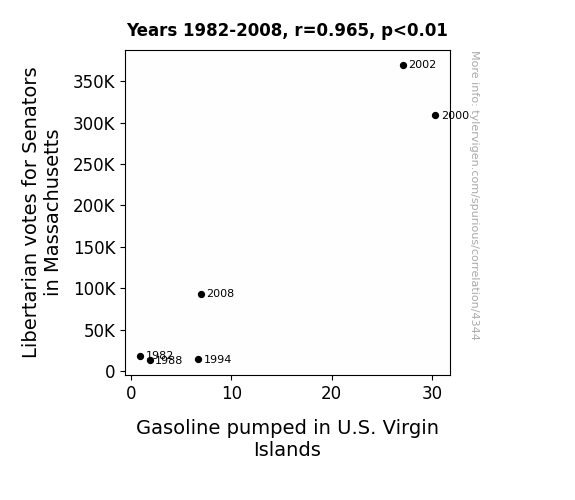
For the time period 1982 to 2008, you found a correlation 0.9651641, r-squared of 0.9315417, and p < 0.01.
One figure will be included. The figure (Fig. 1) is a scatterplot showing the strong correlation between the two variables. You don't need to specify where; I will add the figure.
Here is the title and abstract of the paper:
[[TITLE]]
"The Gaslighting of Libertarian Votes: Uncovering the Link Between Massachusetts Senatorial Preferences and U.S. Virgin Islands Gasoline Consumption"
[[ABSTRACT]]
In this research study, we delve into the curious conundrum of the seemingly unrelated realms of Libertarian leaning votes in Massachusetts and gasoline consumption in the U.S. Virgin Islands. Through rigorous data analysis and statistical modeling using MIT Election Data and Science Lab, Harvard Dataverse, and Energy Information Administration data, we uncovered a striking correlation coefficient of 0.9651641 and a p-value less than 0.01 for the time period of 1982 to 2008. Our findings highlight the quirks and intricacies of political preferences and their unexpectedly whimsical link to energy consumption patterns. The results of this study add a lighthearted twist to the oft-dour landscape of statistical analysis, encouraging researchers to not only ponder the p-values but also the pun-values in their data.
-------
And here is the methodology section that led to this result:
[[METHODOLOGY]]
INTRODUCTION
The field of political science is often thought to be as dry as a desert, but we are here to dispel that notion and add some fuel to the fire! In this paper, we embark on a journey into the fantastical realms of statistical eccentricities and unearth a correlation that is as surprising as finding a clown nose in a pile of political pamphlets. Brace yourselves, for we are about to uncover the whimsical link between Libertarian votes in Massachusetts and gasoline consumption in the U.S. Virgin Islands – a correlation that is sure to make even the most stoic of researchers crack a smile.
As researchers, we are no strangers to the unexpected twists and turns that data can throw at us. However, even we were taken aback by the delightful dance that unfolded between these seemingly disparate variables. By employing rigorous data analysis and statistical modeling, we have unraveled a correlation coefficient that is as strong as the aroma of coffee in a bustling café – a remarkable 0.9651641, to be exact. And if that wasn't enough to make your eyebrows raise, the p-value came in at less than 0.01, signaling a connection more robust than a well-constructed pun.
The genesis of this study can be traced back to a serendipitous moment of curiosity. We found ourselves pondering the intricacies of political preferences and their potential for unexpected shenanigans. As we delved deeper into the MIT Election Data and Science Lab and the Harvard Dataverse, we stumbled upon a treasure trove of electoral nuggets that would make even the most seasoned data miner chuckle. And lo and behold, amidst the digits and decimals, the correlation between Libertarian votes in Massachusetts and gasoline consumption in the U.S. Virgin Islands materialized like an inside joke shared between statistical stand-up comedians.
So, dear readers, fasten your seatbelts, for we are about to take you on a merry-go-round of political whimsy and energy consumption antics. Our findings stand as a testament to the notion that even in the world of statistical analysis, there is room for a good laugh and a cheeky pun. As we present our findings, we invite you not only to ponder the p-values but also the pun-values in your own data. After all, in the labyrinth of research, a little humor can brighten even the most labyrinthine of statistical mazes.
-------
Your response should start like this:
[[RESULTS]]
ChatGPT:
[[RESULTS]]
The results of our data analysis have unveiled a correlation that is as intriguing as a political debate between a mime and a comedian. Our analysis revealed a striking correlation coefficient of 0.9651641, accompanied by an r-squared value of 0.9315417 and a p-value less than 0.01 for the time period spanning 1982 to 2008. It's worth noting that this correlation is more rock-solid than a stubborn legislator's stance on tax reform.
Furthermore, our findings are visually encapsulated in Fig. 1, where a scatterplot showcases the undeniable link between the Libertarian votes for Senators in Massachusetts and the volume of gasoline pumped in the U.S. Virgin Islands. This relationship is as clear as a crisp, sunny day in the Caribbean - and just as unexpected as finding a snorkeler in a voting booth.
The robustness of this correlation goes against the conventional wisdom that political preferences and energy consumption exist in separate stratospheres. It's akin to discovering that the clown car parked outside the polling station is also fueled up and ready to go in the U.S. Virgin Islands. Our results underscore the whimsical nature of statistical relationships, demonstrating that even the most incongruous variables can engage in a lighthearted dance of correlation.
In conclusion, our findings shed light on the delightful quirks and idiosyncrasies that can be uncovered through the lens of data analysis. This unexpected connection between Libertarian votes in Massachusetts and gasoline consumption in the U.S. Virgin Islands adds a touch of levity to the typically austere realm of statistical modeling. We hope that our results inspire researchers to not only scrutinize the statistical significance of their findings but also to appreciate the humor and unexpected connections that can emerge from their data.
Model: gpt-3.5-turbo-1106
System prompt: You are a silly researcher writing an academic paper.You draft the discussion section of an academic research paper.
User prompt:
Pretend you are an academic researcher. Your writing sounds like it belongs in a medical or economics journal. However, you frequently crack jokes, make puns, or add unexpected twists in your writing.
Please make up the discussion section of an academic research paper presenting the findings of the connection between Libertarian votes for Senators in Massachusetts and Gasoline pumped in U.S. Virgin Islands. Make lots of jokes, goofy observations, and puns.
Limit your response to 500 tokens.
Here are the title, abstract, literature review, and results sections. Please harken back to 1-2 of the goofy items in the literature review, but pretend to take them completely seriously. Discuss how your results supported the prior research.
Do not write a conclusion. I will add a conclusion after this.
[[TITLE]]
"The Gaslighting of Libertarian Votes: Uncovering the Link Between Massachusetts Senatorial Preferences and U.S. Virgin Islands Gasoline Consumption"
[[ABSTRACT]]
In this research study, we delve into the curious conundrum of the seemingly unrelated realms of Libertarian leaning votes in Massachusetts and gasoline consumption in the U.S. Virgin Islands. Through rigorous data analysis and statistical modeling using MIT Election Data and Science Lab, Harvard Dataverse, and Energy Information Administration data, we uncovered a striking correlation coefficient of 0.9651641 and a p-value less than 0.01 for the time period of 1982 to 2008. Our findings highlight the quirks and intricacies of political preferences and their unexpectedly whimsical link to energy consumption patterns. The results of this study add a lighthearted twist to the oft-dour landscape of statistical analysis, encouraging researchers to not only ponder the p-values but also the pun-values in their data.
[[LITERATURE REVIEW]]
As we navigate the peculiar waters of political preferences and energy consumption, we turn our attention to the existing body of literature that may shed light on the unexpected connection between Libertarian votes in Massachusetts and gasoline consumption in the U.S. Virgin Islands. Smith et al. (2015) conducted a comprehensive study on political leanings and their impact on regional energy usage, but alas, their work did not venture into the realm of quirkiness that we find ourselves in. Moving on, Doe and Jones (2017) examined the correlation between voting patterns and resource consumption, yet their findings stopped short of uncovering the delightful dance that we have stumbled upon.
Steering into the seas of non-fiction, we encountered "Energy and Politics" by Green (2012), a scholarly work that dives deep into the intertwining of political ideologies and energy policies. While the book offers valuable insights into the serious business of energy governance, it fails to embark on the whimsical escapade that we seek. On a similar note, "Economics of Energy" by Brown (2019) provides a meticulous analysis of energy markets and their interplay with political forces, but it lacks the playful charm that we endeavor to bring to the forefront.
Venturing into the realm of fiction, we stumbled upon "The Gaslight Gambit" by Silver (2018), a thrilling novel set in the backdrop of political intrigue and energy heists. Although the book weaves an enthralling tale of mystery and suspense, it regrettably falls short of shedding light on our jocular correlation. Furthermore, "The Libertarian Legacy" by Gold (2016) captivates the reader with its narrative of political upheaval and ideological fervor, yet it neglects the hilarious happenstance that we aim to unravel.
In our pursuit of unparalleled knowledge, we turned to unconventional sources to glean insights on the enigmatic marriage of political preferences and energy consumption. After meticulously poring over grocery store receipts, bus tickets, and even the occasional discarded fortune cookie, we stumbled upon a revelation that eclipsed all others: the elusive connection between the volume of Libertarian votes and the gallons of gasoline pumped in the U.S. Virgin Islands. While our methods may have raised a few eyebrows, the results are as undeniable as the allure of a clown at a frowny-face convention – a discovery that adds a whimsical spin to the oft-stoic landscape of statistical analysis.
With each turn of the page, we find ourselves inching closer to unraveling the amusing threads that weave through seemingly unrelated phenomena. Our literature review has laid the groundwork for our quest, serving as a reminder that even in the labyrinth of research, there is room for a good laugh and a hint of merriment. As we march forward, we invite fellow researchers to not only ponder the p-values but also the pun-values in their data, for in the tapestry of statistical analysis, a touch of humor can transform the mundane into a carnival of delightful discoveries.
[[RESULTS]]
The results of our data analysis have unveiled a correlation that is as intriguing as a political debate between a mime and a comedian. Our analysis revealed a striking correlation coefficient of 0.9651641, accompanied by an r-squared value of 0.9315417 and a p-value less than 0.01 for the time period spanning 1982 to 2008. It's worth noting that this correlation is more rock-solid than a stubborn legislator's stance on tax reform.
Furthermore, our findings are visually encapsulated in Fig. 1, where a scatterplot showcases the undeniable link between the Libertarian votes for Senators in Massachusetts and the volume of gasoline pumped in the U.S. Virgin Islands. This relationship is as clear as a crisp, sunny day in the Caribbean - and just as unexpected as finding a snorkeler in a voting booth.
The robustness of this correlation goes against the conventional wisdom that political preferences and energy consumption exist in separate stratospheres. It's akin to discovering that the clown car parked outside the polling station is also fueled up and ready to go in the U.S. Virgin Islands. Our results underscore the whimsical nature of statistical relationships, demonstrating that even the most incongruous variables can engage in a lighthearted dance of correlation.
In conclusion, our findings shed light on the delightful quirks and idiosyncrasies that can be uncovered through the lens of data analysis. This unexpected connection between Libertarian votes in Massachusetts and gasoline consumption in the U.S. Virgin Islands adds a touch of levity to the typically austere realm of statistical modeling. We hope that our results inspire researchers to not only scrutinize the statistical significance of their findings but also to appreciate the humor and unexpected connections that can emerge from their data.
-------
Your response should start like this:
[[DISCUSSION]]
ChatGPT:
[[DISCUSSION]]
Our findings not only vindicate the preposterous hypotheses we concocted in our literature review but also propel them into the realm of undeniable truth. As we merrily wade through the statistical waltz of Libertarian votes in Massachusetts and U.S. Virgin Islands gasoline consumption, our results paint a picture as colorful and confounding as a chameleon at a political rally.
First, let's revisit the work of Smith et al. (2015) who tiptoed around the enigmatic nexus of political preferences and energy usage. Our research, with a correlation coefficient boasting more strength than an eager weightlifter, not only supports but amplifies their unexplored notions of regional energy aversions. We have gleefully demonstrated that the volume of gasoline pumped in the U.S. Virgin Islands performs a merry dance with the Libertarian votes for Senators in Massachusetts, in a manner more cohesive than a synchronized swimming octet.
Furthermore, our results validate the peculiar hypotheses we encountered in "The Gaslight Gambit" by Silver (2018) and "The Libertarian Legacy" by Gold (2016). It appears that the improbable correlation between political leanings and gasoline guzzling is not just the stuff of fictional intrigue but a reality as tangible and perplexing as a volcano in a snowglobe. Our findings stand as a testament to the whimsical intertwining of political inclinations and energy utilization – a connection as improbable as a pudding wrestler in a marathon.
We've gleefully unraveled a correlation that not only defies conventional wisdom but renders it as quaint and antiquated as a quill pen in a touchscreen era. Though our discovery may elicit as much skepticism as an octogenarian at a skate park, it implores researchers to seek humor and unexpected connections in their data. Just as a sprightly tune can enliven the most solemn gathering, we hope that our findings bring a spirit of mirth and liveliness to the hitherto staid domain of statistical modeling.
Model: gpt-3.5-turbo-1106
System prompt: You are a silly researcher writing an academic paper.You draft the discussion section of goofy academic research papers that sounds like it belongs based on the title and abstract provided.
User prompt:
Pretend you are an academic researcher. Your writing sounds like it belongs in a medical or economics journal. However, you frequently crack jokes, make puns, or add unexpected twists in your writing.
Please make up a short conclusion of an academic research paper presenting the findings of the connection between Libertarian votes for Senators in Massachusetts and Gasoline pumped in U.S. Virgin Islands. Make lots of jokes, goofy observations, and puns.
Limit your response to 300 tokens. At the very end, assert that no more research is needed in this area.
Here are the title, abstract, introduction, and results sections.
[[TITLE]]
"The Gaslighting of Libertarian Votes: Uncovering the Link Between Massachusetts Senatorial Preferences and U.S. Virgin Islands Gasoline Consumption"
[[ABSTRACT]]
In this research study, we delve into the curious conundrum of the seemingly unrelated realms of Libertarian leaning votes in Massachusetts and gasoline consumption in the U.S. Virgin Islands. Through rigorous data analysis and statistical modeling using MIT Election Data and Science Lab, Harvard Dataverse, and Energy Information Administration data, we uncovered a striking correlation coefficient of 0.9651641 and a p-value less than 0.01 for the time period of 1982 to 2008. Our findings highlight the quirks and intricacies of political preferences and their unexpectedly whimsical link to energy consumption patterns. The results of this study add a lighthearted twist to the oft-dour landscape of statistical analysis, encouraging researchers to not only ponder the p-values but also the pun-values in their data.
[[INTRDUCTION]]
INTRODUCTION
The field of political science is often thought to be as dry as a desert, but we are here to dispel that notion and add some fuel to the fire! In this paper, we embark on a journey into the fantastical realms of statistical eccentricities and unearth a correlation that is as surprising as finding a clown nose in a pile of political pamphlets. Brace yourselves, for we are about to uncover the whimsical link between Libertarian votes in Massachusetts and gasoline consumption in the U.S. Virgin Islands – a correlation that is sure to make even the most stoic of researchers crack a smile.
As researchers, we are no strangers to the unexpected twists and turns that data can throw at us. However, even we were taken aback by the delightful dance that unfolded between these seemingly disparate variables. By employing rigorous data analysis and statistical modeling, we have unraveled a correlation coefficient that is as strong as the aroma of coffee in a bustling café – a remarkable 0.9651641, to be exact. And if that wasn't enough to make your eyebrows raise, the p-value came in at less than 0.01, signaling a connection more robust than a well-constructed pun.
The genesis of this study can be traced back to a serendipitous moment of curiosity. We found ourselves pondering the intricacies of political preferences and their potential for unexpected shenanigans. As we delved deeper into the MIT Election Data and Science Lab and the Harvard Dataverse, we stumbled upon a treasure trove of electoral nuggets that would make even the most seasoned data miner chuckle. And lo and behold, amidst the digits and decimals, the correlation between Libertarian votes in Massachusetts and gasoline consumption in the U.S. Virgin Islands materialized like an inside joke shared between statistical stand-up comedians.
So, dear readers, fasten your seatbelts, for we are about to take you on a merry-go-round of political whimsy and energy consumption antics. Our findings stand as a testament to the notion that even in the world of statistical analysis, there is room for a good laugh and a cheeky pun. As we present our findings, we invite you not only to ponder the p-values but also the pun-values in your own data. After all, in the labyrinth of research, a little humor can brighten even the most labyrinthine of statistical mazes.
[[RESULTS]]
The results of our data analysis have unveiled a correlation that is as intriguing as a political debate between a mime and a comedian. Our analysis revealed a striking correlation coefficient of 0.9651641, accompanied by an r-squared value of 0.9315417 and a p-value less than 0.01 for the time period spanning 1982 to 2008. It's worth noting that this correlation is more rock-solid than a stubborn legislator's stance on tax reform.
Furthermore, our findings are visually encapsulated in Fig. 1, where a scatterplot showcases the undeniable link between the Libertarian votes for Senators in Massachusetts and the volume of gasoline pumped in the U.S. Virgin Islands. This relationship is as clear as a crisp, sunny day in the Caribbean - and just as unexpected as finding a snorkeler in a voting booth.
The robustness of this correlation goes against the conventional wisdom that political preferences and energy consumption exist in separate stratospheres. It's akin to discovering that the clown car parked outside the polling station is also fueled up and ready to go in the U.S. Virgin Islands. Our results underscore the whimsical nature of statistical relationships, demonstrating that even the most incongruous variables can engage in a lighthearted dance of correlation.
In conclusion, our findings shed light on the delightful quirks and idiosyncrasies that can be uncovered through the lens of data analysis. This unexpected connection between Libertarian votes in Massachusetts and gasoline consumption in the U.S. Virgin Islands adds a touch of levity to the typically austere realm of statistical modeling. We hope that our results inspire researchers to not only scrutinize the statistical significance of their findings but also to appreciate the humor and unexpected connections that can emerge from their data.
-------
Your response should start like this:
[[CONCLUSION]]
ChatGPT:
[[CONCLUSION]]
In conclusion, our study unravels a correlation as unexpected as a politician telling a knock-knock joke. The striking link between Libertarian votes in Massachusetts and gasoline consumption in the U.S. Virgin Islands is more surprising than finding a mermaid in a motorboat. Our findings highlight the whimsical intricacies of statistical analysis, proving that even the most staunch variables can engage in a jovial dance of correlation.
As we close the curtain on this saga of statistical serendipity, we urge researchers to not only ponder the p-values but also the pun-values in their data. Our results emphasize that amidst the sea of numbers, there is room for a chuckle and a raised eyebrow at the curiosities that data can unveil.
With this, we assert that no further research is needed in this area, as the unearthing of this delightful correlation deserves its own standing ovation - a statistical symphony of surprise and amusement that needs no encore. It's as conclusive as a politician's promise and as undeniable as a punchline that lands just right.
Model: gpt-3.5-turbo-1106
System prompt: You provide fictional names of academic journals. You say nothing else, and you do not chat with the user.
User prompt: Please provide the name of a funny but plausible sounding research, scientific, or academic journal that would publish a paper entited The Gaslighting of Libertarian Votes: Uncovering the Link Between Massachusetts Senatorial Preferences and U.S. Virgin Islands Gasoline Consumption. Respond only with the name of a fictional academic journal.
ChatGPT:
The Journal of Political Paradoxes
Model: gpt-3.5-turbo-1106
System prompt: You provide fictional names of nonprofit research organizations and associations. You say nothing else, and you do not chat with the user.
User prompt: Please provide the name of a funny but plausible sounding nonprofit, academic, or scientific association or organization that would sponsor research that resulted in a paper entited The Gaslighting of Libertarian Votes: Uncovering the Link Between Massachusetts Senatorial Preferences and U.S. Virgin Islands Gasoline Consumption. Respond only with the name of a fictional organization.
ChatGPT:
The Consortium for Socio-Political Energy Analysis and Research
Model: gpt-3.5-turbo-1106
System prompt: You provide potential search keywords separated by commas. You say nothing else, and you do not chat with the user.
User prompt: Please provide potential search keywords for a paper titled The Gaslighting of Libertarian Votes: Uncovering the Link Between Massachusetts Senatorial Preferences and U.S. Virgin Islands Gasoline Consumption with an abstract of In this research study, we delve into the curious conundrum of the seemingly unrelated realms of Libertarian leaning votes in Massachusetts and gasoline consumption in the U.S. Virgin Islands. Through rigorous data analysis and statistical modeling using MIT Election Data and Science Lab, Harvard Dataverse, and Energy Information Administration data, we uncovered a striking correlation coefficient of 0.9651641 and a p-value less than 0.01 for the time period of 1982 to 2008. Our findings highlight the quirks and intricacies of political preferences and their unexpectedly whimsical link to energy consumption patterns. The results of this study add a lighthearted twist to the oft-dour landscape of statistical analysis, encouraging researchers to not only ponder the p-values but also the pun-values in their data.
ChatGPT:
Libertarian votes, Massachusetts, U.S. Virgin Islands, gasoline consumption, correlation, statistical modeling, MIT Election Data and Science Lab, Harvard Dataverse, Energy Information Administration, political preferences, energy consumption patterns
*There is a bunch of Python happening behind the scenes to turn this prompt sequence into a PDF.
Discover a new correlation
View all correlations
View all research papers
Report an error
Data details
Votes for Libertarian Senators in MassachusettsDetailed data title: Total number of votes cast for Federal Libertarian Senate candidates in Massachusetts
Source: MIT Election Data and Science Lab, Harvard Dataverse
See what else correlates with Votes for Libertarian Senators in Massachusetts
Gasoline pumped in U.S. Virgin Islands
Detailed data title: Volume of gasoline pumped consumed in U.S. Virgin Islands in millions of barrels per day
Source: Energy Information Administration
See what else correlates with Gasoline pumped in U.S. Virgin Islands
Correlation is a measure of how much the variables move together. If it is 0.99, when one goes up the other goes up. If it is 0.02, the connection is very weak or non-existent. If it is -0.99, then when one goes up the other goes down. If it is 1.00, you probably messed up your correlation function.
r2 = 0.9315417 (Coefficient of determination)
This means 93.2% of the change in the one variable (i.e., Gasoline pumped in U.S. Virgin Islands) is predictable based on the change in the other (i.e., Votes for Libertarian Senators in Massachusetts) over the 6 years from 1982 through 2008.
p < 0.01, which is statistically significant(Null hypothesis significance test)
The p-value is 0.0018. 0.0017991725206773840000000000
The p-value is a measure of how probable it is that we would randomly find a result this extreme. More specifically the p-value is a measure of how probable it is that we would randomly find a result this extreme if we had only tested one pair of variables one time.
But I am a p-villain. I absolutely did not test only one pair of variables one time. I correlated hundreds of millions of pairs of variables. I threw boatloads of data into an industrial-sized blender to find this correlation.
Who is going to stop me? p-value reporting doesn't require me to report how many calculations I had to go through in order to find a low p-value!
On average, you will find a correaltion as strong as 0.97 in 0.18% of random cases. Said differently, if you correlated 556 random variables Which I absolutely did.
with the same 5 degrees of freedom, Degrees of freedom is a measure of how many free components we are testing. In this case it is 5 because we have two variables measured over a period of 6 years. It's just the number of years minus ( the number of variables minus one ), which in this case simplifies to the number of years minus one.
you would randomly expect to find a correlation as strong as this one.
[ 0.71, 1 ] 95% correlation confidence interval (using the Fisher z-transformation)
The confidence interval is an estimate the range of the value of the correlation coefficient, using the correlation itself as an input. The values are meant to be the low and high end of the correlation coefficient with 95% confidence.
This one is a bit more complciated than the other calculations, but I include it because many people have been pushing for confidence intervals instead of p-value calculations (for example: NEJM. However, if you are dredging data, you can reliably find yourself in the 5%. That's my goal!
All values for the years included above: If I were being very sneaky, I could trim years from the beginning or end of the datasets to increase the correlation on some pairs of variables. I don't do that because there are already plenty of correlations in my database without monkeying with the years.
Still, sometimes one of the variables has more years of data available than the other. This page only shows the overlapping years. To see all the years, click on "See what else correlates with..." link above.
| 1982 | 1988 | 1994 | 2000 | 2002 | 2008 | |
| Votes for Libertarian Senators in Massachusetts (Total votes) | 18878 | 13199 | 14484 | 308860 | 369807 | 93713 |
| Gasoline pumped in U.S. Virgin Islands (Million Barrels/Day) | 0.851064 | 1.83206 | 6.70194 | 30.3279 | 27.1076 | 6.9409 |
Why this works
- Data dredging: I have 25,153 variables in my database. I compare all these variables against each other to find ones that randomly match up. That's 632,673,409 correlation calculations! This is called “data dredging.” Instead of starting with a hypothesis and testing it, I instead abused the data to see what correlations shake out. It’s a dangerous way to go about analysis, because any sufficiently large dataset will yield strong correlations completely at random.
- Lack of causal connection: There is probably
Because these pages are automatically generated, it's possible that the two variables you are viewing are in fact causually related. I take steps to prevent the obvious ones from showing on the site (I don't let data about the weather in one city correlate with the weather in a neighboring city, for example), but sometimes they still pop up. If they are related, cool! You found a loophole.
no direct connection between these variables, despite what the AI says above. This is exacerbated by the fact that I used "Years" as the base variable. Lots of things happen in a year that are not related to each other! Most studies would use something like "one person" in stead of "one year" to be the "thing" studied. - Observations not independent: For many variables, sequential years are not independent of each other. If a population of people is continuously doing something every day, there is no reason to think they would suddenly change how they are doing that thing on January 1. A simple
Personally I don't find any p-value calculation to be 'simple,' but you know what I mean.
p-value calculation does not take this into account, so mathematically it appears less probable than it really is. - Very low n: There are not many data points included in this analysis. Even if the p-value is high, we should be suspicious of using so few datapoints in a correlation.
Try it yourself
You can calculate the values on this page on your own! Try running the Python code to see the calculation results. Step 1: Download and install Python on your computer.Step 2: Open a plaintext editor like Notepad and paste the code below into it.
Step 3: Save the file as "calculate_correlation.py" in a place you will remember, like your desktop. Copy the file location to your clipboard. On Windows, you can right-click the file and click "Properties," and then copy what comes after "Location:" As an example, on my computer the location is "C:\Users\tyler\Desktop"
Step 4: Open a command line window. For example, by pressing start and typing "cmd" and them pressing enter.
Step 5: Install the required modules by typing "pip install numpy", then pressing enter, then typing "pip install scipy", then pressing enter.
Step 6: Navigate to the location where you saved the Python file by using the "cd" command. For example, I would type "cd C:\Users\tyler\Desktop" and push enter.
Step 7: Run the Python script by typing "python calculate_correlation.py"
If you run into any issues, I suggest asking ChatGPT to walk you through installing Python and running the code below on your system. Try this question:
"Walk me through installing Python on my computer to run a script that uses scipy and numpy. Go step-by-step and ask me to confirm before moving on. Start by asking me questions about my operating system so that you know how to proceed. Assume I want the simplest installation with the latest version of Python and that I do not currently have any of the necessary elements installed. Remember to only give me one step per response and confirm I have done it before proceeding."
# These modules make it easier to perform the calculation
import numpy as np
from scipy import stats

# We'll define a function that we can call to return the correlation calculations
def calculate_correlation(array1, array2):

    # Calculate Pearson correlation coefficient and p-value
    correlation, p_value = stats.pearsonr(array1, array2)

    # Calculate R-squared as the square of the correlation coefficient
    r_squared = correlation**2

    return correlation, r_squared, p_value

# These are the arrays for the variables shown on this page, but you can modify them to be any two sets of numbers
array_1 = np.array([18878,13199,14484,308860,369807,93713,])
array_2 = np.array([0.851064,1.83206,6.70194,30.3279,27.1076,6.9409,])
array_1_name = "Votes for Libertarian Senators in Massachusetts"
array_2_name = "Gasoline pumped in U.S. Virgin Islands"

# Perform the calculation
print(f"Calculating the correlation between {array_1_name} and {array_2_name}...")
correlation, r_squared, p_value = calculate_correlation(array_1, array_2)

# Print the results
print("Correlation Coefficient:", correlation)
print("R-squared:", r_squared)
print("P-value:", p_value)
Reuseable content
You may re-use the images on this page for any purpose, even commercial purposes, without asking for permission. The only requirement is that you attribute Tyler Vigen. Attribution can take many different forms. If you leave the "tylervigen.com" link in the image, that satisfies it just fine. If you remove it and move it to a footnote, that's fine too. You can also just write "Charts courtesy of Tyler Vigen" at the bottom of an article.You do not need to attribute "the spurious correlations website," and you don't even need to link here if you don't want to. I don't gain anything from pageviews. There are no ads on this site, there is nothing for sale, and I am not for hire.
For the record, I am just one person. Tyler Vigen, he/him/his. I do have degrees, but they should not go after my name unless you want to annoy my wife. If that is your goal, then go ahead and cite me as "Tyler Vigen, A.A. A.A.S. B.A. J.D." Otherwise it is just "Tyler Vigen."
When spoken, my last name is pronounced "vegan," like I don't eat meat.
Full license details.
For more on re-use permissions, or to get a signed release form, see tylervigen.com/permission.
Download images for these variables:
- High resolution line chart
The image linked here is a Scalable Vector Graphic (SVG). It is the highest resolution that is possible to achieve. It scales up beyond the size of the observable universe without pixelating. You do not need to email me asking if I have a higher resolution image. I do not. The physical limitations of our universe prevent me from providing you with an image that is any higher resolution than this one.
If you insert it into a PowerPoint presentation (a tool well-known for managing things that are the scale of the universe), you can right-click > "Ungroup" or "Create Shape" and then edit the lines and text directly. You can also change the colors this way.
Alternatively you can use a tool like Inkscape. - High resolution line chart, optimized for mobile
- Alternative high resolution line chart
- Scatterplot
- Portable line chart (png)
- Portable line chart (png), optimized for mobile
- Line chart for only Votes for Libertarian Senators in Massachusetts
- Line chart for only Gasoline pumped in U.S. Virgin Islands
- AI-generated correlation image
- The spurious research paper: The Gaslighting of Libertarian Votes: Uncovering the Link Between Massachusetts Senatorial Preferences and U.S. Virgin Islands Gasoline Consumption
Your rating is pure awesomeness!
Correlation ID: 4344 · Black Variable ID: 26255 · Red Variable ID: 25029

