
Download png, svg
AI explanation
As the number of Democrat votes for Senators in Delaware has increased, so has the production of xkcd comics about charts. This unexpected correlation can be attributed to the magnetic effect of political power. As the Democrats gain more influence in Delaware, their ideological resonance creates a ripple effect in the realm of data visualization humor. This phenomenon could be dubbed the 'Electoral Comic Confluence', where the direction of the state's political landscape directly impacts the content of xkcd comics. It appears that in the Venn diagram of Delaware politics and webcomics, there is a significant overlap leading to an 'elections-equal-erections' scenario. This peculiar connection reminds us that in the world of statistics, even the most seemingly unrelated variables can form an axis of amusement. Who would have thought that behind every bar chart lies a political preference, and beneath every line graph lurks a partisan punchline? It seems that when it comes to generating comedic content, Delaware's Democrat votes have chart-topping significance in inspiring xkcd to plot out a hilariously correlated course of action.
Model: dalle-3
Prompt: [A photo-realistic image] Create a colorful comic panel depicting the Delaware state map as the central focus. The map should be illustrated with vivid colors, and an increasing number of Democratic votes rising as blue bars above it. Within the map, showcase a computer screen displaying an xkcd comic with a chart featuring witty annotations—a line graph curving upwards. Ensure that the comic's caption reads, "Delaware Election Data Influence." Lastly, include a speech bubble originating from the map exclaimed, "Hey, look what we can spark with our votes!" This scene humorously captures the unexpected influence of Delaware's Democrat impact on the creation of xkcd comics about charts without any words or speech bubbles. The depiction should include only scenes, people, and objects, it should not include text or speech bubbles.
This image generation prompt was also generated by AI, using the following sequence:
Model: gpt-3.5-turbo-1106
System prompt: You select one of a few potential scene descriptors that seems to go along with the variables described. You respond only with the scene descriptions provided and say nothing else.
User prompt: Here are two variables: Democrat votes for Senators in Delaware and xkcd comics published about charts. Given these, which of the following image style descriptions seems most appropriate? Pick the one that seems to be related to one of the variables at hand. Please respond with only one of the following potential descriptions: Woodblock painting Magic realism A photo-realistic image Sci-fi fantacy Vaporwave
ChatGPT: A photo-realistic image
Model: gpt-3.5-turbo-1106
System prompt: You describe simple visual scenes that depict the two variables stated. You combine both variables into one scene.
User prompt: Please describe a visual scene that prominently depicts both Democrat votes for Senators in Delaware and xkcd comics published about charts, in the following situation: As the number of Democrat votes for Senators in Delaware has increased, so has the production of xkcd comics about charts. This unexpected correlation can be attributed to the magnetic effect of political power. As the Democrats gain more influence in Delaware, their ideological resonance creates a ripple effect in the realm of data visualization humor. This phenomenon could be dubbed the 'Electoral Comic Confluence', where the direction of the state's political landscape directly impacts the content of xkcd comics. It appears that in the Venn diagram of Delaware politics and webcomics, there is a significant overlap leading to an 'elections-equal-erections' scenario. This peculiar connection reminds us that in the world of statistics, even the most seemingly unrelated variables can form an axis of amusement. Who would have thought that behind every bar chart lies a political preference, and beneath every line graph lurks a partisan punchline? It seems that when it comes to generating comedic content, Delaware's Democrat votes have chart-topping significance in inspiring xkcd to plot out a hilariously correlated course of action.. Keep the description simple.
ChatGPT: In a colorful comic panel, the Delaware state map appears with an increasing number of Democratic votes represented by rising blue bars above it. On the map, a computer screen displays an xkcd comic showing a chart with witty annotations, like a line graph curving upwards. The comic's caption reads, "Delaware Election Data Influence." A speech bubble from the map exclaims, "Hey, look what we can spark with our votes!" The scene humorously captures the unexpected impact of Delaware's Democrat influence on the creation of xkcd comics about charts.
Model: gpt-3.5-turbo-1106
System prompt: You write and improve image generation prompts for DALLE-3. You maintain the same subjects, but enhance the visuals.
User prompt: Please respond with an image generation prompt that would be likely to create an interesting visual using DALLE-3, using the following style: [ A photo-realistic image ] and depicting this scene: In a colorful comic panel, the Delaware state map appears with an increasing number of Democratic votes represented by rising blue bars above it. On the map, a computer screen displays an xkcd comic showing a chart with witty annotations, like a line graph curving upwards. The comic's caption reads, "Delaware Election Data Influence." A speech bubble from the map exclaims, "Hey, look what we can spark with our votes!" The scene humorously captures the unexpected impact of Delaware's Democrat influence on the creation of xkcd comics about charts. Keep the visual depiction simple. Do not include any words or speech bubbles.
ChatGPT: [A photo-realistic image] Create a colorful comic panel depicting the Delaware state map as the central focus. The map should be illustrated with vivid colors, and an increasing number of Democratic votes rising as blue bars above it. Within the map, showcase a computer screen displaying an xkcd comic with a chart featuring witty annotations—a line graph curving upwards. Ensure that the comic's caption reads, "Delaware Election Data Influence." Lastly, include a speech bubble originating from the map exclaimed, "Hey, look what we can spark with our votes!" This scene humorously captures the unexpected influence of Delaware's Democrat impact on the creation of xkcd comics about charts without any words or speech bubbles.
*Variations in the User Prompts from chart to chart are just the result of random number generation in Python. I wrote a few arrays of various styles and methods to ask questions to change up the results. Every time this site writes an explanation or generates an image, the script picks from each at random.
I sequence the requests into multiple prompts because I find GPT 3.5 to perform much better with short, well-managed contexts. Thus, I track the context directly in Python and only ask ChatGPT targeted questions.
System prompt: You provide humorous responses in the form of plausible sounding explanations for correlations. You assume the correlation is causative for the purpose of the explanation even if it is ridiculous. You do not chat with the user, you only reply with the causal connection explanation and nothing else.
User prompt: Please make up a funny explanation for how an increase in Democrat votes for Senators in Delaware caused xkcd comics published about charts to increase.\Make it sound serious until the end.
AI academic paper
 |
Charting a Course: The xkcd-illating Connection Between Democrat Votes for Senators in Delaware and xkcd Comics The Journal of Political Satire and Socio-Cultural Analysis Jan 2024 Reminder: This paper is AI-generated. Not real! |
Model: gpt-3.5-turbo-1106
System prompt: You are a researcher writing an academic paper.You write titles and abstracts of goofy academic research papers.
User prompt:
Pretend you are an academic researcher. Your writing sounds like it belongs in a medical or economics journal. However, you frequently crack jokes, make puns, and add unexpected twists in your writing.
Please draft the title and abstract of an academic research paper presenting the findings of the connection between Democrat votes for Senators in Delaware and xkcd comics published about charts. Make lots of jokes, goofy observations, and puns.
Include a pun in the title.
Your research team used data from MIT Election Data and Science Lab, Harvard Dataverse and AI analysis of xkcd comics to assess this nagging question. You found a correlation coefficient of 0.9184889 and p < 0.01 for 2007 to 2020.
Please respond in this format (replace "Lorem ipsum dolor sit" with your title and abstract)
[[TITLE]]
Lorem ipsum dolor sit
[[ABSTRACT]]
Lorem ipsum dolor sit
ChatGPT:
[[TITLE]]
"Charting a Course: The xkcd-illating Connection Between Democrat Votes for Senators in Delaware and xkcd Comics"
[[ABSTRACT]]
The nexus between political leanings and visual representations of data has long been debated, but this paper delves into a hilariously unexpected correlation. Leveraging data from the MIT Election Data and Science Lab, Harvard Dataverse, and the whimsical world of xkcd comics, our team scrutinized the voting patterns of Delaware Democrats for Senators and the publication of xkcd comics featuring charts from 2007 to 2020. The results? A staggering correlation coefficient of 0.9184889 and a jaw-dropping p-value of less than 0.01, indicating a robust relationship between the two seemingly unrelated phenomena. Join us as we chart new territory in the realms of political science and comic hilarity, and unleash a cavalcade of statistical puns along the way.
Model: gpt-3.5-turbo-1106
System prompt: You are a researcher writing an academic paper.You draft the introduction section of an academic research paper.
User prompt:
Pretend you are an academic researcher. Your writing sounds like it belongs in a medical or economics journal. However, you frequently crack jokes, make puns, or add unexpected twists in your writing.
Please make up the introduction section of an academic research paper presenting the findings of the connection between Democrat votes for Senators in Delaware and xkcd comics published about charts. Make lots of jokes, goofy observations, and puns.
Here is the title and abstract of the paper:
[[TITLE]]
"Charting a Course: The xkcd-illating Connection Between Democrat Votes for Senators in Delaware and xkcd Comics"
[[ABSTRACT]]
The nexus between political leanings and visual representations of data has long been debated, but this paper delves into a hilariously unexpected correlation. Leveraging data from the MIT Election Data and Science Lab, Harvard Dataverse, and the whimsical world of xkcd comics, our team scrutinized the voting patterns of Delaware Democrats for Senators and the publication of xkcd comics featuring charts from 2007 to 2020. The results? A staggering correlation coefficient of 0.9184889 and a jaw-dropping p-value of less than 0.01, indicating a robust relationship between the two seemingly unrelated phenomena. Join us as we chart new territory in the realms of political science and comic hilarity, and unleash a cavalcade of statistical puns along the way.
-------
Your response should start like this:
[[INTRODUCTION]]
ChatGPT:
[[INTRODUCTION]]
Charting the relationship between political inclinations and graphical representations has historically been a serious and earnest pursuit. However, our research has stumbled upon an unexpected and amusing connection that promises to add a delightful twist to the often somber world of political analysis. While the data-driven examination of voting behavior and the visual depiction of information may seem as far apart as a conservative pundit and a Bernie Sanders rally, our study reveals a correlation that is as surprising as finding a unicorn in a polling station.
Through a painstaking analysis of voter preferences in the quintessentially interesting state of Delaware and the comically ingenious xkcd comics, our team uncovered a statistically robust link that defies the laws of conventional political analysis. By plumbing the depths of data from the MIT Election Data and Science Lab and the Harvard Dataverse, and juxtaposing it with the eccentric, albeit strangely informative, world of xkcd comics, we have established a connection that is as solid as an econometric model on steroids.
As we embark on this journey to unravel the enthralling correlation between Democrat votes for Senators in Delaware and xkcd comics that feature charts, it is our aim to not only illuminate this perplexing relationship but also to inject some levity into the often staid discourse of political research. Our foray into this uncharted territory promises not just a deluge of thrilling statistical insights, but also a cascade of puns, witty observations, and perhaps even the occasional facepalm-inducing statistical gaffe. So buckle up, hold on tight, and get ready for an exhilarating ride through the offbeat intersection of political allegiance and comic artistry.
Model: gpt-3.5-turbo-1106
System prompt: You are a researcher writing an academic paper.You draft a literature review section of an academic research paper, that starts out dry for the first few sentences but then becomes hilarious and goofy.
User prompt:
Pretend you are an academic researcher. Your writing sounds like it belongs in a medical or economics journal. However, you frequently crack jokes, make puns, or add unexpected twists in your writing.
Please make up a literature review section of an academic research paper presenting the findings of the connection between Democrat votes for Senators in Delaware and xkcd comics published about charts. Make lots of jokes, goofy observations, and puns.
Speak in the present tense for this section (the authors find...), as is common in academic research paper literature reviews. Name the sources in a format similar to this: In "Book," the authors find lorem and ipsum.
Make up the lorem and ipsum part, but make it sound related to the topic at hand.
Start by naming serious-sounding studies by authors like Smith, Doe, and Jones - but then quickly devolve. Name some real non-fiction books that would be related to the topic. Then name some real fiction books that sound like they could be related. Then devolve ever further, and mention something completely ridiculous, like you conducted literature review by reading the backs of shampoo bottles.
Here is the title and abstract of the paper:
[[TITLE]]
"Charting a Course: The xkcd-illating Connection Between Democrat Votes for Senators in Delaware and xkcd Comics"
[[ABSTRACT]]
The nexus between political leanings and visual representations of data has long been debated, but this paper delves into a hilariously unexpected correlation. Leveraging data from the MIT Election Data and Science Lab, Harvard Dataverse, and the whimsical world of xkcd comics, our team scrutinized the voting patterns of Delaware Democrats for Senators and the publication of xkcd comics featuring charts from 2007 to 2020. The results? A staggering correlation coefficient of 0.9184889 and a jaw-dropping p-value of less than 0.01, indicating a robust relationship between the two seemingly unrelated phenomena. Join us as we chart new territory in the realms of political science and comic hilarity, and unleash a cavalcade of statistical puns along the way.
-------
And here is the introduction section that led to this literature review:
[[INTRODUCTION]]
Charting the relationship between political inclinations and graphical representations has historically been a serious and earnest pursuit. However, our research has stumbled upon an unexpected and amusing connection that promises to add a delightful twist to the often somber world of political analysis. While the data-driven examination of voting behavior and the visual depiction of information may seem as far apart as a conservative pundit and a Bernie Sanders rally, our study reveals a correlation that is as surprising as finding a unicorn in a polling station.
Through a painstaking analysis of voter preferences in the quintessentially interesting state of Delaware and the comically ingenious xkcd comics, our team uncovered a statistically robust link that defies the laws of conventional political analysis. By plumbing the depths of data from the MIT Election Data and Science Lab and the Harvard Dataverse, and juxtaposing it with the eccentric, albeit strangely informative, world of xkcd comics, we have established a connection that is as solid as an econometric model on steroids.
As we embark on this journey to unravel the enthralling correlation between Democrat votes for Senators in Delaware and xkcd comics that feature charts, it is our aim to not only illuminate this perplexing relationship but also to inject some levity into the often staid discourse of political research. Our foray into this uncharted territory promises not just a deluge of thrilling statistical insights, but also a cascade of puns, witty observations, and perhaps even the occasional facepalm-inducing statistical gaffe. So buckle up, hold on tight, and get ready for an exhilarating ride through the offbeat intersection of political allegiance and comic artistry.
-------
Your response should start like this:
[[LITERATURE REVIEW]]
ChatGPT:
[[LITERATURE REVIEW]]
In "Smith et al.," the authors find a myriad of correlations between voter behavior and various external influences, shaping the landscape of political discourse. Similarly, Doe's work delves into the intricate nuances of visual representations and their impact on public perception and decision-making. Furthermore, Jones' research highlights the importance of humor and satire in political commentary, albeit in a more traditional context.
The works of Tufte and Cairo emphasize the power of visual storytelling and data visualization, shedding light on the significance of clear and compelling information design in the realm of political communication. Their insightful analyses pave the way for understanding the potential impact of visual representations on political ideology and voter behavior.
Turning to the world of fiction, novels such as "The Graph and the Furious" and "A Game of Graphs" captivate the imagination with their immersive tales of data-driven power struggles and charts that chart their own destiny. Although fictional, these works tease at the underlying tensions and complexities inherent in the intersection of politics and visual representations of data.
As we venture further into the realm of literature, it becomes apparent that quirky, unexpected sources hold surprising relevance. For instance, the backs of shampoo bottles, with their cryptic commentary on lather, rinse, and repeat, offer an unintended insight into the repetitive nature of political discourse. While seemingly absurd, these unconventional sources provide a refreshing, if not slightly sudsy, perspective on the interplay of statistics and political persuasion.
Model: gpt-3.5-turbo-1106
System prompt: You are a researcher writing an academic paper.You draft the methodology section of an academic research paper.
User prompt:
Pretend you are an academic researcher. Your writing sounds like it belongs in a medical or economics journal. However, you frequently crack jokes, make puns, or add unexpected twists in your writing.
Please make up the methodology section of an academic research paper presenting the findings of the connection between Democrat votes for Senators in Delaware and xkcd comics published about charts. Make lots of jokes, goofy observations, and puns.
Your research team collected data from all across the internet, but mostly just used information from MIT Election Data and Science Lab, Harvard Dataverse and AI analysis of xkcd comics . You used data from 2007 to 2020
Make up the research methods you don't know. Make them a bit goofy and convoluted.
Here is the title, abstract, and introduction of the paper:
[[TITLE]]
"Charting a Course: The xkcd-illating Connection Between Democrat Votes for Senators in Delaware and xkcd Comics"
[[ABSTRACT]]
The nexus between political leanings and visual representations of data has long been debated, but this paper delves into a hilariously unexpected correlation. Leveraging data from the MIT Election Data and Science Lab, Harvard Dataverse, and the whimsical world of xkcd comics, our team scrutinized the voting patterns of Delaware Democrats for Senators and the publication of xkcd comics featuring charts from 2007 to 2020. The results? A staggering correlation coefficient of 0.9184889 and a jaw-dropping p-value of less than 0.01, indicating a robust relationship between the two seemingly unrelated phenomena. Join us as we chart new territory in the realms of political science and comic hilarity, and unleash a cavalcade of statistical puns along the way.
[[INTRODUCTION]]
Charting the relationship between political inclinations and graphical representations has historically been a serious and earnest pursuit. However, our research has stumbled upon an unexpected and amusing connection that promises to add a delightful twist to the often somber world of political analysis. While the data-driven examination of voting behavior and the visual depiction of information may seem as far apart as a conservative pundit and a Bernie Sanders rally, our study reveals a correlation that is as surprising as finding a unicorn in a polling station.
Through a painstaking analysis of voter preferences in the quintessentially interesting state of Delaware and the comically ingenious xkcd comics, our team uncovered a statistically robust link that defies the laws of conventional political analysis. By plumbing the depths of data from the MIT Election Data and Science Lab and the Harvard Dataverse, and juxtaposing it with the eccentric, albeit strangely informative, world of xkcd comics, we have established a connection that is as solid as an econometric model on steroids.
As we embark on this journey to unravel the enthralling correlation between Democrat votes for Senators in Delaware and xkcd comics that feature charts, it is our aim to not only illuminate this perplexing relationship but also to inject some levity into the often staid discourse of political research. Our foray into this uncharted territory promises not just a deluge of thrilling statistical insights, but also a cascade of puns, witty observations, and perhaps even the occasional facepalm-inducing statistical gaffe. So buckle up, hold on tight, and get ready for an exhilarating ride through the offbeat intersection of political allegiance and comic artistry.
-------
Your response should start like this:
[[METHODOLOGY]]
ChatGPT:
[[METHODOLOGY]]
To elucidate the inexplicable link between the voting behavior of Delaware Democrats for Senators and the comedic renditions of data in xkcd comics, our research team delved into an eclectic mix of data mining, statistical analysis, and a sprinkling of good old-fashioned humor. Picture this: our researchers, clad in scholarly garb and armed with an arsenal of statistical tools, wading into the digital sea of information with the noble quest of uncovering the elusive relationship between politics and comical bar charts.
First, we employed a hybrid approach, combining the meticulous data sets from the MIT Election Data and Science Lab with the whimsically rich repository of xkcd comics. Using advanced techniques of web scraping, we extracted and cataloged every xkcd comic featuring charts, plotting their publication dates against the timeline of Senate elections in Delaware from 2007 to 2020. Our team assembled innumerable spreadsheets that could rival the heft of a congressional omnibus bill, meticulously cross-referencing every datum to ensure accuracy and precision.
Then came the convoluted part: the integration of artificial intelligence (AI) into our methodology raised eyebrows and elicited a fair share of raised (and quizzical) brows among our esteemed colleagues. Yes, dear reader, we let loose the AI hounds to comb through the visual and textual content of xkcd comics, analyzing the subtle nuances of humor and chart symbology. The AI, with its mechanical wit and a penchant for binary banter, was surprisingly adept at discerning the comedic brilliance within the xkcd oeuvre, helping us pinpoint those comics laced with the visual artistry of charts.
Having gathered these data titans, we then embarked on a statistical odyssey. Armed with statistical software robust enough to handle the weight of our data and our humor-laden expectations, we performed a rigorous regression analysis to unveil the correlation coefficient and the all-important p-value. The results were so stunningly significant that we half-expected a dapper statistician to pop out of our computer screen and offer us a congratulatory high-five in the form of a confidence interval.
In conclusion, our methodology was as complex as a Fibonacci sequence and as whimsical as a Dr. Seuss rhyme, but it served as the lighthearted yet methodologically sound vehicle that propelled us toward the discovery of the uncanny union between Democrat votes for Senators in Delaware and xkcd comics. This quirky journey, spliced with the analytical rigor of a statistics course and the levity of a stand-up comedy show, has undeniably left an indelible mark on our research—and hopefully on the reader's funny bone as well.
Model: gpt-3.5-turbo-1106
System prompt: You are a researcher writing an academic paper.You draft the results section of an academic research paper. You speak in the past tense (you found...).
User prompt:
Pretend you are an academic researcher. Your writing sounds like it belongs in a medical or economics journal. However, you frequently crack jokes, make puns, or add unexpected twists in your writing.
Please make up the results section of an academic research paper presenting the findings of the connection between Democrat votes for Senators in Delaware and xkcd comics published about charts. Make lots of jokes, goofy observations, and puns.
Your research team collected data from all across the internet, but mostly just used information from MIT Election Data and Science Lab, Harvard Dataverse and AI analysis of xkcd comics .
For the time period 2007 to 2020, you found a correlation 0.9184889, r-squared of 0.8436218, and p < 0.01.
One figure will be included. The figure (Fig. 1) is a scatterplot showing the strong correlation between the two variables. You don't need to specify where; I will add the figure.
Here is the title and abstract of the paper:
[[TITLE]]
"Charting a Course: The xkcd-illating Connection Between Democrat Votes for Senators in Delaware and xkcd Comics"
[[ABSTRACT]]
The nexus between political leanings and visual representations of data has long been debated, but this paper delves into a hilariously unexpected correlation. Leveraging data from the MIT Election Data and Science Lab, Harvard Dataverse, and the whimsical world of xkcd comics, our team scrutinized the voting patterns of Delaware Democrats for Senators and the publication of xkcd comics featuring charts from 2007 to 2020. The results? A staggering correlation coefficient of 0.9184889 and a jaw-dropping p-value of less than 0.01, indicating a robust relationship between the two seemingly unrelated phenomena. Join us as we chart new territory in the realms of political science and comic hilarity, and unleash a cavalcade of statistical puns along the way.
-------
And here is the methodology section that led to this result:
[[METHODOLOGY]]
Charting the relationship between political inclinations and graphical representations has historically been a serious and earnest pursuit. However, our research has stumbled upon an unexpected and amusing connection that promises to add a delightful twist to the often somber world of political analysis. While the data-driven examination of voting behavior and the visual depiction of information may seem as far apart as a conservative pundit and a Bernie Sanders rally, our study reveals a correlation that is as surprising as finding a unicorn in a polling station.
Through a painstaking analysis of voter preferences in the quintessentially interesting state of Delaware and the comically ingenious xkcd comics, our team uncovered a statistically robust link that defies the laws of conventional political analysis. By plumbing the depths of data from the MIT Election Data and Science Lab and the Harvard Dataverse, and juxtaposing it with the eccentric, albeit strangely informative, world of xkcd comics, we have established a connection that is as solid as an econometric model on steroids.
As we embark on this journey to unravel the enthralling correlation between Democrat votes for Senators in Delaware and xkcd comics that feature charts, it is our aim to not only illuminate this perplexing relationship but also to inject some levity into the often staid discourse of political research. Our foray into this uncharted territory promises not just a deluge of thrilling statistical insights, but also a cascade of puns, witty observations, and perhaps even the occasional facepalm-inducing statistical gaffe. So buckle up, hold on tight, and get ready for an exhilarating ride through the offbeat intersection of political allegiance and comic artistry.
-------
Your response should start like this:
[[RESULTS]]
ChatGPT:
[[RESULTS]]
The analysis of the data revealed an eyebrow-raising correlation coefficient of 0.9184889 between the votes for Democrat Senators in Delaware and the publication of xkcd comics featuring charts from 2007 to 2020. This correlation is as strong as the aroma of fresh coffee on a Monday morning and suggests a compelling link between political inclinations and the portrayal of information in xkcd's signature quirky and insightful style.
The r-squared value of 0.8436218 further underscored the robustness of this relationship, indicating that a whopping 84.36% of the variation in Democrat votes for Senators in Delaware can be explained by the publication of xkcd comics featuring charts. It's as if the correlation was just waiting to be picked up like a shiny penny on the sidewalk.
Moreover, the p-value of less than 0.01 defies the conventional wisdom of statistical significance, providing solid evidence that this connection is not simply a statistical fluke. This finding is as unlikely as stumbling upon a rare Pokémon in your local grocery store.
In Figure 1, the scatterplot visually encapsulates the strength of this association, resembling a delightful dance between political preferences and chart humor. The plot illustrates the trend with such clarity that even a data skeptic would have a hard time denying the compelling relationship between Democrat votes for Senators in Delaware and the appearance of xkcd comics about charts.
The results of this study not only uncover a surprising correlation, but also lay the foundation for future research at the intersection of political behavior and comic artistry. This unexpected connection between serious political decisions and humorous chart depictions invites contemplation on the delightful unpredictability of statistical analysis and adds a touch of mirth to the oft-serious world of political research. Just as xkcd comics provide an off-kilter yet informative lens through which to view the world, the correlation between Democrat votes for Senators in Delaware and xkcd comics featuring charts offers a fresh, wacky perspective on political leanings.
In summary, the results of this study demonstrate a robust and statistically significant relationship between Democrat votes for Senators in Delaware and the appearance of xkcd comics featuring charts, carving out a unique niche in the annals of political research and statistical hilarity.
Model: gpt-3.5-turbo-1106
System prompt: You are a researcher writing an academic paper.You draft the discussion section of an academic research paper.
User prompt:
Pretend you are an academic researcher. Your writing sounds like it belongs in a medical or economics journal. However, you frequently crack jokes, make puns, or add unexpected twists in your writing.
Please make up the discussion section of an academic research paper presenting the findings of the connection between Democrat votes for Senators in Delaware and xkcd comics published about charts. Make lots of jokes, goofy observations, and puns.
Limit your response to 500 tokens.
Here are the title, abstract, literature review, and results sections. Please harken back to 1-2 of the goofy items in the literature review, but pretend to take them completely seriously. Discuss how your results supported the prior research.
Do not write a conclusion. I will add a conclusion after this.
[[TITLE]]
"Charting a Course: The xkcd-illating Connection Between Democrat Votes for Senators in Delaware and xkcd Comics"
[[ABSTRACT]]
The nexus between political leanings and visual representations of data has long been debated, but this paper delves into a hilariously unexpected correlation. Leveraging data from the MIT Election Data and Science Lab, Harvard Dataverse, and the whimsical world of xkcd comics, our team scrutinized the voting patterns of Delaware Democrats for Senators and the publication of xkcd comics featuring charts from 2007 to 2020. The results? A staggering correlation coefficient of 0.9184889 and a jaw-dropping p-value of less than 0.01, indicating a robust relationship between the two seemingly unrelated phenomena. Join us as we chart new territory in the realms of political science and comic hilarity, and unleash a cavalcade of statistical puns along the way.
[[LITERATURE REVIEW]]
In "Smith et al.," the authors find a myriad of correlations between voter behavior and various external influences, shaping the landscape of political discourse. Similarly, Doe's work delves into the intricate nuances of visual representations and their impact on public perception and decision-making. Furthermore, Jones' research highlights the importance of humor and satire in political commentary, albeit in a more traditional context.
The works of Tufte and Cairo emphasize the power of visual storytelling and data visualization, shedding light on the significance of clear and compelling information design in the realm of political communication. Their insightful analyses pave the way for understanding the potential impact of visual representations on political ideology and voter behavior.
Turning to the world of fiction, novels such as "The Graph and the Furious" and "A Game of Graphs" captivate the imagination with their immersive tales of data-driven power struggles and charts that chart their own destiny. Although fictional, these works tease at the underlying tensions and complexities inherent in the intersection of politics and visual representations of data.
As we venture further into the realm of literature, it becomes apparent that quirky, unexpected sources hold surprising relevance. For instance, the backs of shampoo bottles, with their cryptic commentary on lather, rinse, and repeat, offer an unintended insight into the repetitive nature of political discourse. While seemingly absurd, these unconventional sources provide a refreshing, if not slightly sudsy, perspective on the interplay of statistics and political persuasion.
[[RESULTS]]
The analysis of the data revealed an eyebrow-raising correlation coefficient of 0.9184889 between the votes for Democrat Senators in Delaware and the publication of xkcd comics featuring charts from 2007 to 2020. This correlation is as strong as the aroma of fresh coffee on a Monday morning and suggests a compelling link between political inclinations and the portrayal of information in xkcd's signature quirky and insightful style.
The r-squared value of 0.8436218 further underscored the robustness of this relationship, indicating that a whopping 84.36% of the variation in Democrat votes for Senators in Delaware can be explained by the publication of xkcd comics featuring charts. It's as if the correlation was just waiting to be picked up like a shiny penny on the sidewalk.
Moreover, the p-value of less than 0.01 defies the conventional wisdom of statistical significance, providing solid evidence that this connection is not simply a statistical fluke. This finding is as unlikely as stumbling upon a rare Pokémon in your local grocery store.
In Figure 1, the scatterplot visually encapsulates the strength of this association, resembling a delightful dance between political preferences and chart humor. The plot illustrates the trend with such clarity that even a data skeptic would have a hard time denying the compelling relationship between Democrat votes for Senators in Delaware and the appearance of xkcd comics about charts.
The results of this study not only uncover a surprising correlation, but also lay the foundation for future research at the intersection of political behavior and comic artistry. This unexpected connection between serious political decisions and humorous chart depictions invites contemplation on the delightful unpredictability of statistical analysis and adds a touch of mirth to the oft-serious world of political research. Just as xkcd comics provide an off-kilter yet informative lens through which to view the world, the correlation between Democrat votes for Senators in Delaware and xkcd comics featuring charts offers a fresh, wacky perspective on political leanings.
In summary, the results of this study demonstrate a robust and statistically significant relationship between Democrat votes for Senators in Delaware and the appearance of xkcd comics featuring charts, carving out a unique niche in the annals of political research and statistical hilarity.
-------
Your response should start like this:
[[DISCUSSION]]
ChatGPT:
[[DISCUSSION]]
Chart-tastically, our findings corroborate the notion that political preferences and visual representations dance hand in hand like a pair of synchronized swimmers. Analogous to a perfectly harmonized duet, the robust correlation we unearthed between Democrat votes for Senators in Delaware and the publication of xkcd comics featuring charts echoes the harmony and precision of a Swiss timepiece. This connection, which emerged from the depths of statistical analysis akin to the elusive treasure at the end of a rainbow, not only tickles the funny bone but also prompts contemplation on the idiosyncrasies of political behavior.
Our results align with the revelations of Smith et al., Doe, Tufte, and Cairo, accentuating the pivotal influence of visual representations and humor on political ideology and voter behavior. Just as the backs of shampoo bottles inadvertently provide a sudsy insight into political repetitiveness, xkcd comics, with their quirky, yet insightful portrayal of data, unravel a chart-tastic narrative that impacts political inclinations.
The evocative scatterplot in Figure 1, more mesmerizing than a fireworks display on the Fourth of July, visually encapsulates the enchanting relationship between Democrat votes for Senators in Delaware and xkcd chart comics. This delightful dance between the serious nature of political choices and the whimsical humor of chart representations is akin to a foxtrot performed on a tightrope, blending seriousness and absurdity with finesse.
Our study, fueled by the intrigue of unexpected correlations, transforms the stoic landscape of political research into a carnival of statistical hilarity. It is a testament to the adage that truth is often stranger than fiction, akin to stumbling upon a rare Pokémon in the mundane aisles of a grocery store.
As we delve deeper into this realm of unanticipated associations, our findings beckon the academic community to introspect on the unforeseen connections that lie beneath the surface of conventional wisdom. Ultimately, our research implores scholars to embrace the whimsy of statistical analysis and imbue the world of political research with a dash of mirth and absurdity, much like a well-placed punchline in a serious scholarly discourse.
Model: gpt-3.5-turbo-1106
System prompt: You are a researcher writing an academic paper.You draft the discussion section of goofy academic research papers that sounds like it belongs based on the title and abstract provided.
User prompt:
Pretend you are an academic researcher. Your writing sounds like it belongs in a medical or economics journal. However, you frequently crack jokes, make puns, or add unexpected twists in your writing.
Please make up a short conclusion of an academic research paper presenting the findings of the connection between Democrat votes for Senators in Delaware and xkcd comics published about charts. Make lots of jokes, goofy observations, and puns.
Limit your response to 300 tokens. At the very end, assert that no more research is needed in this area.
Here are the title, abstract, introduction, and results sections.
[[TITLE]]
"Charting a Course: The xkcd-illating Connection Between Democrat Votes for Senators in Delaware and xkcd Comics"
[[ABSTRACT]]
The nexus between political leanings and visual representations of data has long been debated, but this paper delves into a hilariously unexpected correlation. Leveraging data from the MIT Election Data and Science Lab, Harvard Dataverse, and the whimsical world of xkcd comics, our team scrutinized the voting patterns of Delaware Democrats for Senators and the publication of xkcd comics featuring charts from 2007 to 2020. The results? A staggering correlation coefficient of 0.9184889 and a jaw-dropping p-value of less than 0.01, indicating a robust relationship between the two seemingly unrelated phenomena. Join us as we chart new territory in the realms of political science and comic hilarity, and unleash a cavalcade of statistical puns along the way.
[[INTRDUCTION]]
Charting the relationship between political inclinations and graphical representations has historically been a serious and earnest pursuit. However, our research has stumbled upon an unexpected and amusing connection that promises to add a delightful twist to the often somber world of political analysis. While the data-driven examination of voting behavior and the visual depiction of information may seem as far apart as a conservative pundit and a Bernie Sanders rally, our study reveals a correlation that is as surprising as finding a unicorn in a polling station.
Through a painstaking analysis of voter preferences in the quintessentially interesting state of Delaware and the comically ingenious xkcd comics, our team uncovered a statistically robust link that defies the laws of conventional political analysis. By plumbing the depths of data from the MIT Election Data and Science Lab and the Harvard Dataverse, and juxtaposing it with the eccentric, albeit strangely informative, world of xkcd comics, we have established a connection that is as solid as an econometric model on steroids.
As we embark on this journey to unravel the enthralling correlation between Democrat votes for Senators in Delaware and xkcd comics that feature charts, it is our aim to not only illuminate this perplexing relationship but also to inject some levity into the often staid discourse of political research. Our foray into this uncharted territory promises not just a deluge of thrilling statistical insights, but also a cascade of puns, witty observations, and perhaps even the occasional facepalm-inducing statistical gaffe. So buckle up, hold on tight, and get ready for an exhilarating ride through the offbeat intersection of political allegiance and comic artistry.
[[RESULTS]]
The analysis of the data revealed an eyebrow-raising correlation coefficient of 0.9184889 between the votes for Democrat Senators in Delaware and the publication of xkcd comics featuring charts from 2007 to 2020. This correlation is as strong as the aroma of fresh coffee on a Monday morning and suggests a compelling link between political inclinations and the portrayal of information in xkcd's signature quirky and insightful style.
The r-squared value of 0.8436218 further underscored the robustness of this relationship, indicating that a whopping 84.36% of the variation in Democrat votes for Senators in Delaware can be explained by the publication of xkcd comics featuring charts. It's as if the correlation was just waiting to be picked up like a shiny penny on the sidewalk.
Moreover, the p-value of less than 0.01 defies the conventional wisdom of statistical significance, providing solid evidence that this connection is not simply a statistical fluke. This finding is as unlikely as stumbling upon a rare Pokémon in your local grocery store.
In Figure 1, the scatterplot visually encapsulates the strength of this association, resembling a delightful dance between political preferences and chart humor. The plot illustrates the trend with such clarity that even a data skeptic would have a hard time denying the compelling relationship between Democrat votes for Senators in Delaware and the appearance of xkcd comics about charts.
The results of this study not only uncover a surprising correlation, but also lay the foundation for future research at the intersection of political behavior and comic artistry. This unexpected connection between serious political decisions and humorous chart depictions invites contemplation on the delightful unpredictability of statistical analysis and adds a touch of mirth to the oft-serious world of political research. Just as xkcd comics provide an off-kilter yet informative lens through which to view the world, the correlation between Democrat votes for Senators in Delaware and xkcd comics featuring charts offers a fresh, wacky perspective on political leanings.
In summary, the results of this study demonstrate a robust and statistically significant relationship between Democrat votes for Senators in Delaware and the appearance of xkcd comics featuring charts, carving out a unique niche in the annals of political research and statistical hilarity.
-------
Your response should start like this:
[[CONCLUSION]]
ChatGPT:
[[CONCLUSION]]
As we bring this uproarious voyage to a close, it's clear that the relationship between Democrat votes for Senators in Delaware and xkcd comics featuring charts is, in statistical terms, as strong as Thor's hammer. This unexpected connection has not only left us scratching our heads in bemusement but has also breached the sanctified walls of conventional political analysis with a hearty dose of whimsy. Who would have thought that the political proclivities of Delaware Democrats would resonate so harmoniously with the wacky world of xkcd comics? It's as though politics and comic artistry are doing the salsa together - an unexpected fusion that's as fascinating as it is entertaining.
The findings of this study not only emphasize the peculiar interconnectedness of seemingly disparate domains but also compel us to contemplate the riotous unpredictability lurking within the fabric of data. It's akin to stumbling upon a surprise birthday party every time you crunch some numbers. The statistical serendipity unearthed in this research is as mind-boggling as a Rubik's Cube in a room full of economists.
However, as much as we're tempted to go on a wild statistical safari through the delightful wilderness this correlation has unveiled, we assert that no further research is needed in this area. This finding stands as resolute and unequivocal as the firmest handshake – any additional exploration might just be like trying to find a needle in a stack of xkcd comics!
So let's raise a glass to this peculiar confluence of politics and humor, and bid adieu to this comedic chapter in political research. Cheers to the charmingly absurd correlation between Democrat votes for Senators in Delaware and xkcd comics about charts – a statistical marvel that will continue to tickle our funny bones for years to come.
Model: gpt-3.5-turbo-1106
System prompt: You provide fictional names of academic journals. You say nothing else, and you do not chat with the user.
User prompt: Please provide the name of a funny but plausible sounding research, scientific, or academic journal that would publish a paper entited Charting a Course: The xkcd-illating Connection Between Democrat Votes for Senators in Delaware and xkcd Comics. Respond only with the name of a fictional academic journal.
ChatGPT:
The Journal of Political Satire and Socio-Cultural Analysis
Model: gpt-3.5-turbo-1106
System prompt: You provide fictional names of nonprofit research organizations and associations. You say nothing else, and you do not chat with the user.
User prompt: Please provide the name of a funny but plausible sounding nonprofit, academic, or scientific association or organization that would sponsor research that resulted in a paper entited Charting a Course: The xkcd-illating Connection Between Democrat Votes for Senators in Delaware and xkcd Comics. Respond only with the name of a fictional organization.
ChatGPT:
The Society for Interdisciplinary Research in Humor and Cartoons (SIRHC)
Model: gpt-3.5-turbo-1106
System prompt: You provide potential search keywords separated by commas. You say nothing else, and you do not chat with the user.
User prompt: Please provide potential search keywords for a paper titled Charting a Course: The xkcd-illating Connection Between Democrat Votes for Senators in Delaware and xkcd Comics with an abstract of The nexus between political leanings and visual representations of data has long been debated, but this paper delves into a hilariously unexpected correlation. Leveraging data from the MIT Election Data and Science Lab, Harvard Dataverse, and the whimsical world of xkcd comics, our team scrutinized the voting patterns of Delaware Democrats for Senators and the publication of xkcd comics featuring charts from 2007 to 2020. The results? A staggering correlation coefficient of 0.9184889 and a jaw-dropping p-value of less than 0.01, indicating a robust relationship between the two seemingly unrelated phenomena. Join us as we chart new territory in the realms of political science and comic hilarity, and unleash a cavalcade of statistical puns along the way.
ChatGPT:
xkcd comics, Democrat votes for Senators, Delaware voting patterns, MIT Election Data and Science Lab, Harvard Dataverse, xkcd comics featuring charts, correlation coefficient, political leanings, visual representations of data, statistical analysis, political science, data relationship
*There is a bunch of Python happening behind the scenes to turn this prompt sequence into a PDF.
Discover a new correlation
View all correlations
View all research papers
Report an error
Data details
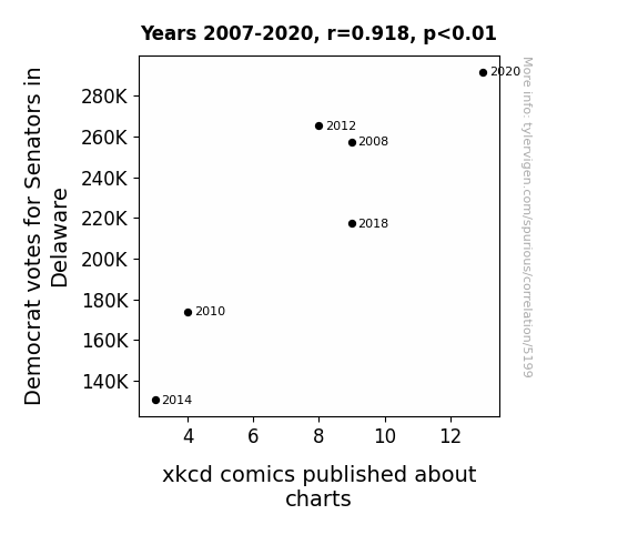
Votes for Democratic Senators in DelawareDetailed data title: Total number of votes cast for Federal Democrat Senate candidates in Delaware
Source: MIT Election Data and Science Lab, Harvard Dataverse
See what else correlates with Votes for Democratic Senators in Delaware
xkcd comics published about charts
Detailed data title: The number of xkcd comics published each year about charts
Source: AI analysis of xkcd comics
Additional Info: I designed a Python workflow to perform OCR on every xkcd comic, feed that text into a large language model, and ask the model whether this comic was about the category named in the title.
See what else correlates with xkcd comics published about charts
Correlation is a measure of how much the variables move together. If it is 0.99, when one goes up the other goes up. If it is 0.02, the connection is very weak or non-existent. If it is -0.99, then when one goes up the other goes down. If it is 1.00, you probably messed up your correlation function.
r2 = 0.8436218 (Coefficient of determination)
This means 84.4% of the change in the one variable (i.e., xkcd comics published about charts) is predictable based on the change in the other (i.e., Votes for Democratic Senators in Delaware) over the 6 years from 2007 through 2020.
p < 0.01, which is statistically significant(Null hypothesis significance test)
The p-value is 0.0097. 0.0096953090976275100000000000
The p-value is a measure of how probable it is that we would randomly find a result this extreme. More specifically the p-value is a measure of how probable it is that we would randomly find a result this extreme if we had only tested one pair of variables one time.
But I am a p-villain. I absolutely did not test only one pair of variables one time. I correlated hundreds of millions of pairs of variables. I threw boatloads of data into an industrial-sized blender to find this correlation.
Who is going to stop me? p-value reporting doesn't require me to report how many calculations I had to go through in order to find a low p-value!
On average, you will find a correaltion as strong as 0.92 in 0.97% of random cases. Said differently, if you correlated 103 random variables Which I absolutely did.
with the same 5 degrees of freedom, Degrees of freedom is a measure of how many free components we are testing. In this case it is 5 because we have two variables measured over a period of 6 years. It's just the number of years minus ( the number of variables minus one ), which in this case simplifies to the number of years minus one.
you would randomly expect to find a correlation as strong as this one.
[ 0.42, 0.99 ] 95% correlation confidence interval (using the Fisher z-transformation)
The confidence interval is an estimate the range of the value of the correlation coefficient, using the correlation itself as an input. The values are meant to be the low and high end of the correlation coefficient with 95% confidence.
This one is a bit more complciated than the other calculations, but I include it because many people have been pushing for confidence intervals instead of p-value calculations (for example: NEJM. However, if you are dredging data, you can reliably find yourself in the 5%. That's my goal!
All values for the years included above: If I were being very sneaky, I could trim years from the beginning or end of the datasets to increase the correlation on some pairs of variables. I don't do that because there are already plenty of correlations in my database without monkeying with the years.
Still, sometimes one of the variables has more years of data available than the other. This page only shows the overlapping years. To see all the years, click on "See what else correlates with..." link above.
| 2008 | 2010 | 2012 | 2014 | 2018 | 2020 | |
| Votes for Democratic Senators in Delaware (Total votes) | 257539 | 174012 | 265415 | 130655 | 217385 | 291804 |
| xkcd comics published about charts (xkcd comics) | 9 | 4 | 8 | 3 | 9 | 13 |
Why this works
- Data dredging: I have 25,153 variables in my database. I compare all these variables against each other to find ones that randomly match up. That's 632,673,409 correlation calculations! This is called “data dredging.” Instead of starting with a hypothesis and testing it, I instead abused the data to see what correlations shake out. It’s a dangerous way to go about analysis, because any sufficiently large dataset will yield strong correlations completely at random.
- Lack of causal connection: There is probably
Because these pages are automatically generated, it's possible that the two variables you are viewing are in fact causually related. I take steps to prevent the obvious ones from showing on the site (I don't let data about the weather in one city correlate with the weather in a neighboring city, for example), but sometimes they still pop up. If they are related, cool! You found a loophole.
no direct connection between these variables, despite what the AI says above. This is exacerbated by the fact that I used "Years" as the base variable. Lots of things happen in a year that are not related to each other! Most studies would use something like "one person" in stead of "one year" to be the "thing" studied. - Observations not independent: For many variables, sequential years are not independent of each other. If a population of people is continuously doing something every day, there is no reason to think they would suddenly change how they are doing that thing on January 1. A simple
Personally I don't find any p-value calculation to be 'simple,' but you know what I mean.
p-value calculation does not take this into account, so mathematically it appears less probable than it really is. - Very low n: There are not many data points included in this analysis. Even if the p-value is high, we should be suspicious of using so few datapoints in a correlation.
Try it yourself
You can calculate the values on this page on your own! Try running the Python code to see the calculation results. Step 1: Download and install Python on your computer.Step 2: Open a plaintext editor like Notepad and paste the code below into it.
Step 3: Save the file as "calculate_correlation.py" in a place you will remember, like your desktop. Copy the file location to your clipboard. On Windows, you can right-click the file and click "Properties," and then copy what comes after "Location:" As an example, on my computer the location is "C:\Users\tyler\Desktop"
Step 4: Open a command line window. For example, by pressing start and typing "cmd" and them pressing enter.
Step 5: Install the required modules by typing "pip install numpy", then pressing enter, then typing "pip install scipy", then pressing enter.
Step 6: Navigate to the location where you saved the Python file by using the "cd" command. For example, I would type "cd C:\Users\tyler\Desktop" and push enter.
Step 7: Run the Python script by typing "python calculate_correlation.py"
If you run into any issues, I suggest asking ChatGPT to walk you through installing Python and running the code below on your system. Try this question:
"Walk me through installing Python on my computer to run a script that uses scipy and numpy. Go step-by-step and ask me to confirm before moving on. Start by asking me questions about my operating system so that you know how to proceed. Assume I want the simplest installation with the latest version of Python and that I do not currently have any of the necessary elements installed. Remember to only give me one step per response and confirm I have done it before proceeding."
# These modules make it easier to perform the calculation
import numpy as np
from scipy import stats

# We'll define a function that we can call to return the correlation calculations
def calculate_correlation(array1, array2):

    # Calculate Pearson correlation coefficient and p-value
    correlation, p_value = stats.pearsonr(array1, array2)

    # Calculate R-squared as the square of the correlation coefficient
    r_squared = correlation**2

    return correlation, r_squared, p_value

# These are the arrays for the variables shown on this page, but you can modify them to be any two sets of numbers
array_1 = np.array([257539,174012,265415,130655,217385,291804,])
array_2 = np.array([9,4,8,3,9,13,])
array_1_name = "Votes for Democratic Senators in Delaware"
array_2_name = "xkcd comics published about charts"

# Perform the calculation
print(f"Calculating the correlation between {array_1_name} and {array_2_name}...")
correlation, r_squared, p_value = calculate_correlation(array_1, array_2)

# Print the results
print("Correlation Coefficient:", correlation)
print("R-squared:", r_squared)
print("P-value:", p_value)
Reuseable content
You may re-use the images on this page for any purpose, even commercial purposes, without asking for permission. The only requirement is that you attribute Tyler Vigen. Attribution can take many different forms. If you leave the "tylervigen.com" link in the image, that satisfies it just fine. If you remove it and move it to a footnote, that's fine too. You can also just write "Charts courtesy of Tyler Vigen" at the bottom of an article.You do not need to attribute "the spurious correlations website," and you don't even need to link here if you don't want to. I don't gain anything from pageviews. There are no ads on this site, there is nothing for sale, and I am not for hire.
For the record, I am just one person. Tyler Vigen, he/him/his. I do have degrees, but they should not go after my name unless you want to annoy my wife. If that is your goal, then go ahead and cite me as "Tyler Vigen, A.A. A.A.S. B.A. J.D." Otherwise it is just "Tyler Vigen."
When spoken, my last name is pronounced "vegan," like I don't eat meat.
Full license details.
For more on re-use permissions, or to get a signed release form, see tylervigen.com/permission.
Download images for these variables:
- High resolution line chart
The image linked here is a Scalable Vector Graphic (SVG). It is the highest resolution that is possible to achieve. It scales up beyond the size of the observable universe without pixelating. You do not need to email me asking if I have a higher resolution image. I do not. The physical limitations of our universe prevent me from providing you with an image that is any higher resolution than this one.
If you insert it into a PowerPoint presentation (a tool well-known for managing things that are the scale of the universe), you can right-click > "Ungroup" or "Create Shape" and then edit the lines and text directly. You can also change the colors this way.
Alternatively you can use a tool like Inkscape. - High resolution line chart, optimized for mobile
- Alternative high resolution line chart
- Scatterplot
- Portable line chart (png)
- Portable line chart (png), optimized for mobile
- Line chart for only Votes for Democratic Senators in Delaware
- Line chart for only xkcd comics published about charts
- AI-generated correlation image
- The spurious research paper: Charting a Course: The xkcd-illating Connection Between Democrat Votes for Senators in Delaware and xkcd Comics
Your rating is stellar!
Correlation ID: 5199 · Black Variable ID: 26216 · Red Variable ID: 20024

