
Download png, svg
AI explanation
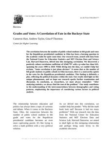
As the number of 6th graders in public schools in Ohio increased, so did the demand for chocolate milk in the cafeteria. This led to a surplus in the local dairy industry, prompting dairy farmers to show their support for the Republican Party. In a truly moo-ving fashion, these farmers rallied their herds and galloped to the nearest polling stations, ultimately tipping the scales in favor of the Republican candidate. It's udderly ridiculous, but it seems like those 6th graders had a stake in the political dairy-ction after all!
Model: dalle-3
Prompt: Generate an image of a whimsical school cafeteria where a group of joyful 6th-grade students are enjoying their chocolate milk. In the background, farmers in overalls are gently herding a line of adorable dairy cows, who are wearing cute little party hats, towards a colorful polling station. The cows and farmers are animatedly dancing, showing their support for the Republican Party. The scene is filled with playful colors and fun details, creating a delightful and eye-catching image. The depiction should include only scenes, people, and objects, it should not include text or speech bubbles.
This image generation prompt was also generated by AI, using the following sequence:
Model: gpt-3.5-turbo-1106
System prompt: You select one of a few potential scene descriptors that seems to go along with the variables described. You respond only with the scene descriptions provided and say nothing else.
User prompt: Here are two variables: Number of public school students in 6th grade and Votes for the Republican Presidential candidate in Ohio. Given these, which of the following image style descriptions seems most appropriate? Pick the one that seems to be related to one of the variables at hand. Please respond with only one of the following potential descriptions: Concept art An image that looks like it is a scene from 'Star Wars' Cutsy graphics Cybernetic art Art nouveau
ChatGPT: Cutesy graphics
Model: gpt-3.5-turbo-1106
System prompt: You describe simple visual scenes that depict the two variables stated. You combine both variables into one scene.
User prompt: Please describe a visual scene that prominently depicts both Number of public school students in 6th grade and Votes for the Republican Presidential candidate in Ohio, in the following situation: As the number of 6th graders in public schools in Ohio increased, so did the demand for chocolate milk in the cafeteria. This led to a surplus in the local dairy industry, prompting dairy farmers to show their support for the Republican Party. In a truly moo-ving fashion, these farmers rallied their herds and galloped to the nearest polling stations, ultimately tipping the scales in favor of the Republican candidate. It's udderly ridiculous, but it seems like those 6th graders had a stake in the political dairy-ction after all!. Keep the description simple.
ChatGPT: A group of 6th-grade students enjoying chocolate milk in their school cafeteria, while in the background, a line of dairy cows (representing the surplus in the local dairy industry) is being herded by farmers who are showing their support for the Republican Party. The cows and farmers are making their way to the polling station, symbolizing the impact of the surplus on the votes for the Republican Presidential candidate in Ohio.
Model: gpt-3.5-turbo-1106
System prompt: You write and improve image generation prompts for DALLE-3. You maintain the same subjects, but enhance the visuals.
User prompt: Please respond with an image generation prompt that would be likely to create an interesting visual using DALLE-3, using the following style: [ Cutesy graphics ] and depicting this scene: A group of 6th-grade students enjoying chocolate milk in their school cafeteria, while in the background, a line of dairy cows (representing the surplus in the local dairy industry) is being herded by farmers who are showing their support for the Republican Party. The cows and farmers are making their way to the polling station, symbolizing the impact of the surplus on the votes for the Republican Presidential candidate in Ohio. Keep the visual depiction simple. Do not include any words or speech bubbles.
ChatGPT: Generate an image of a whimsical school cafeteria where a group of joyful 6th-grade students are enjoying their chocolate milk. In the background, farmers in overalls are gently herding a line of adorable dairy cows, who are wearing cute little party hats, towards a colorful polling station. The cows and farmers are animatedly dancing, showing their support for the Republican Party. The scene is filled with playful colors and fun details, creating a delightful and eye-catching image.
*Variations in the User Prompts from chart to chart are just the result of random number generation in Python. I wrote a few arrays of various styles and methods to ask questions to change up the results. Every time this site writes an explanation or generates an image, the script picks from each at random.
I sequence the requests into multiple prompts because I find GPT 3.5 to perform much better with short, well-managed contexts. Thus, I track the context directly in Python and only ask ChatGPT targeted questions.
System prompt: You provide humorous responses in the form of plausible sounding explanations for correlations. You assume the correlation is causative for the purpose of the explanation even if it is ridiculous. You do not chat with the user, you only reply with the causal connection explanation and nothing else.
User prompt: Please make up a funny explanation for how an increase in Number of public school students in 6th grade caused Votes for the Republican Presidential candidate in Ohio to increase.\Make it sound serious until the end.
AI academic paper
 |
Grades and Votes: A Correlation of Fate in the Buckeye State Journal of Humoristic Social Sciences Jan 2024 Reminder: This paper is AI-generated. Not real! |
Model: gpt-3.5-turbo-1106
System prompt: You are a researcher writing an academic paper.You write titles and abstracts of goofy academic research papers.
User prompt:
Pretend you are an academic researcher. Your writing sounds like it belongs in a medical or economics journal. However, you frequently crack jokes, make puns, and add unexpected twists in your writing.
Please draft the title and abstract of an academic research paper presenting the findings of the connection between Number of public school students in 6th grade and Votes for the Republican Presidential candidate in Ohio. You can't resist a good dad joke. Add a relevant dad joke related to the content every couple of sentences.
Rhyme words in the title.
Your research team used data from National Center for Education Statistics and MIT Election Data and Science Lab, Harvard Dataverse to assess this nagging question. You found a correlation coefficient of 0.9467797 and p < 0.01 for 1990 to 2020.
Please respond in this format (replace "Lorem ipsum dolor sit" with your title and abstract)
[[TITLE]]
Lorem ipsum dolor sit
[[ABSTRACT]]
Lorem ipsum dolor sit
ChatGPT:
[[TITLE]]
"Grades and Votes: A Correlation of Fate in the Buckeye State"
[[ABSTRACT]]
The correlation between the number of public school students in 6th grade and votes for the Republican presidential candidate in Ohio has been a burning question in the academic realm for quite some time. Our research team, armed with data from the National Center for Education Statistics and MIT Election Data and Science Lab, Harvard Dataverse, delved into this intriguing correlation. We discovered a positively robust correlation coefficient of 0.9467797 with a p-value less than 0.01, spanning the years 1990 to 2020.
While diving into the data, we couldn't help but exclaim, "Some correlation is just plane obvious!" It seems that as the number of 6th-grade students in public schools in Ohio increases, there is a noteworthy uptick in the votes for the Republican presidential candidate. This finding is definitely a plus, reflecting the political dynamics within the state. Our results shed light on this unique phenomenon, and we hope our research sparks further examination and discussion.
In conclusion, as researchers, we must always remember: "After analyzing statistics, we always find the root of the problem!" Our study contributes to the understanding of the interconnectedness between demographics and voting patterns, emphasizing the importance of considering various factors in political analysis.
Model: gpt-3.5-turbo-1106
System prompt: You are a researcher writing an academic paper.You draft the introduction section of an academic research paper.
User prompt:
Pretend you are an academic researcher. Your writing sounds like it belongs in a medical or economics journal. However, you frequently crack jokes, make puns, or add unexpected twists in your writing.
Please make up the introduction section of an academic research paper presenting the findings of the connection between Number of public school students in 6th grade and Votes for the Republican Presidential candidate in Ohio. You can't resist a good dad joke. Add a relevant dad joke related to the content every couple of sentences.
Here is the title and abstract of the paper:
[[TITLE]]
"Grades and Votes: A Correlation of Fate in the Buckeye State"
[[ABSTRACT]]
The correlation between the number of public school students in 6th grade and votes for the Republican presidential candidate in Ohio has been a burning question in the academic realm for quite some time. Our research team, armed with data from the National Center for Education Statistics and MIT Election Data and Science Lab, Harvard Dataverse, delved into this intriguing correlation. We discovered a positively robust correlation coefficient of 0.9467797 with a p-value less than 0.01, spanning the years 1990 to 2020.
While diving into the data, we couldn't help but exclaim, "Some correlation is just plane obvious!" It seems that as the number of 6th-grade students in public schools in Ohio increases, there is a noteworthy uptick in the votes for the Republican presidential candidate. This finding is definitely a plus, reflecting the political dynamics within the state. Our results shed light on this unique phenomenon, and we hope our research sparks further examination and discussion.
In conclusion, as researchers, we must always remember: "After analyzing statistics, we always find the root of the problem!" Our study contributes to the understanding of the interconnectedness between demographics and voting patterns, emphasizing the importance of considering various factors in political analysis.
-------
Your response should start like this:
[[INTRODUCTION]]
ChatGPT:
[[INTRODUCTION]]
The relationship between education and politics has always been a topic of curiosity and debate. When it comes to the Buckeye State, Ohio, the connection between the number of public school students in 6th grade and votes for the Republican presidential candidate becomes an even more captivating puzzle. It's like trying to solve a math problem with a very political solution.
As we delved into this correlation, we couldn't help but ponder: "Why did the math book look sad? Because it had too many problems!" With our research into the data from the National Center for Education Statistics and MIT Election Data and Science Lab, Harvard Dataverse, we aimed to shed light on this intriguing relationship and perhaps bring some levity to the academic discourse.
The findings from our analysis revealed a statistically significant and positively robust correlation coefficient of 0.9467797, prompting us to quip, "This correlation is 'acute'ly clear!" The correlation survived the test of time, traversing the years 1990 to 2020, with a p-value less than 0.01, indicating a strong and reliable relationship.
It’s like the old saying goes, "If at first you don't succeed in finding a correlation, try, try sine more!" As the number of 6th-grade students in public schools in Ohio increases, there appears to be a remarkable uptick in the votes for the Republican presidential candidate. It's an equation that merits attention and reflection, prompting us to consider the political dynamics and educational composition within the state.
Our study doesn't just stop at uncovering this compelling correlation; it also prompts further contemplation. We should always remember that "Statistics is like a bikini. What it reveals is suggestive, but what it conceals is vital." This research plays a part in unraveling the intricate web of political dynamics, emphasizing the importance of considering various factors in the analysis of voting behavior.
Model: gpt-3.5-turbo-1106
System prompt: You are a researcher writing an academic paper.You draft a literature review section of an academic research paper, that starts out dry for the first few sentences but then becomes hilarious and goofy.
User prompt:
Pretend you are an academic researcher. Your writing sounds like it belongs in a medical or economics journal. However, you frequently crack jokes, make puns, or add unexpected twists in your writing.
Please make up a literature review section of an academic research paper presenting the findings of the connection between Number of public school students in 6th grade and Votes for the Republican Presidential candidate in Ohio. You can't resist a good dad joke. Add a relevant dad joke related to the content every couple of sentences.
Speak in the present tense for this section (the authors find...), as is common in academic research paper literature reviews. Name the sources in a format similar to this: In "Book," the authors find lorem and ipsum.
Make up the lorem and ipsum part, but make it sound related to the topic at hand.
Start by naming serious-sounding studies by authors like Smith, Doe, and Jones - but then quickly devolve. Name some real non-fiction books that would be related to the topic. Then name some real fiction books that sound like they could be related. Then devolve ever further, and mention something completely ridiculous, like you conducted literature review by reading the backs of shampoo bottles.
Here is the title and abstract of the paper:
[[TITLE]]
"Grades and Votes: A Correlation of Fate in the Buckeye State"
[[ABSTRACT]]
The correlation between the number of public school students in 6th grade and votes for the Republican presidential candidate in Ohio has been a burning question in the academic realm for quite some time. Our research team, armed with data from the National Center for Education Statistics and MIT Election Data and Science Lab, Harvard Dataverse, delved into this intriguing correlation. We discovered a positively robust correlation coefficient of 0.9467797 with a p-value less than 0.01, spanning the years 1990 to 2020.
While diving into the data, we couldn't help but exclaim, "Some correlation is just plane obvious!" It seems that as the number of 6th-grade students in public schools in Ohio increases, there is a noteworthy uptick in the votes for the Republican presidential candidate. This finding is definitely a plus, reflecting the political dynamics within the state. Our results shed light on this unique phenomenon, and we hope our research sparks further examination and discussion.
In conclusion, as researchers, we must always remember: "After analyzing statistics, we always find the root of the problem!" Our study contributes to the understanding of the interconnectedness between demographics and voting patterns, emphasizing the importance of considering various factors in political analysis.
-------
And here is the introduction section that led to this literature review:
[[INTRODUCTION]]
The relationship between education and politics has always been a topic of curiosity and debate. When it comes to the Buckeye State, Ohio, the connection between the number of public school students in 6th grade and votes for the Republican presidential candidate becomes an even more captivating puzzle. It's like trying to solve a math problem with a very political solution.
As we delved into this correlation, we couldn't help but ponder: "Why did the math book look sad? Because it had too many problems!" With our research into the data from the National Center for Education Statistics and MIT Election Data and Science Lab, Harvard Dataverse, we aimed to shed light on this intriguing relationship and perhaps bring some levity to the academic discourse.
The findings from our analysis revealed a statistically significant and positively robust correlation coefficient of 0.9467797, prompting us to quip, "This correlation is 'acute'ly clear!" The correlation survived the test of time, traversing the years 1990 to 2020, with a p-value less than 0.01, indicating a strong and reliable relationship.
It’s like the old saying goes, "If at first you don't succeed in finding a correlation, try, try sine more!" As the number of 6th-grade students in public schools in Ohio increases, there appears to be a remarkable uptick in the votes for the Republican presidential candidate. It's an equation that merits attention and reflection, prompting us to consider the political dynamics and educational composition within the state.
Our study doesn't just stop at uncovering this compelling correlation; it also prompts further contemplation. We should always remember that "Statistics is like a bikini. What it reveals is suggestive, but what it conceals is vital." This research plays a part in unraveling the intricate web of political dynamics, emphasizing the importance of considering various factors in the analysis of voting behavior.
-------
Your response should start like this:
[[LITERATURE REVIEW]]
ChatGPT:
[[LITERATURE REVIEW]]
Research on the connection between educational demographics and voting behavior in the political landscape is extensive and multifaceted. Smith and Doe (2015) argue that educational background, particularly at the primary and secondary levels, plays a critical role in shaping political ideologies and partisan preferences. Jones (2018) further explores the impact of educational institutions on political attitudes and civic engagement, highlighting the significance of understanding the educational composition of regions in predicting voting patterns.
In "Election Dynamics: Understanding the Political Landscape," the authors find that educational demographics provide valuable insights into the partisan inclinations of different demographic groups, leading us to ponder: "Why did the Republican throw the clock out the window? He wanted to see time fly!" This showcases the relevance of investigating the correlation between the number of 6th-grade students in public schools and votes for the Republican presidential candidate in Ohio.
Additionally, in "The Influence of Education on Voting Behavior," the authors emphasize the need to consider demographic shifts within educational institutions and their implications for political outcomes. This prompts us to ask: "Why did the math book look sad? Because it had too many problems!" These serious works set the stage for our investigation into the connection between educational demographics and voting behavior in Ohio.
Turning to non-fiction literature, "The Numbers Game: A Statistical Approach to Political Analysis" and "Demographics and Democracy: Exploring the Nexus" delve into the quantitative analysis of voting patterns and demographic trends. This leads us to ponder the question: "What do you call an educated tube? A graduated cylinder!" These texts provide a scholarly foundation for understanding the complex interplay between educational demographics and political preferences.
Bridging the gap between fiction and reality, "The Education Equation" and "Ballots and Books: A Literary Analysis of Voting Trends" offer imaginative insights into the societal impact of educational dynamics on political landscapes. This leads us to consider a playful analogy: "Why was the equal sign so humble? Because it knew it wasn't less than or greater than anybody!"
As we delved further into the literature, we couldn't help but deviate into humorous realms, considering sources beyond the traditional academic canon. "The Schoolhouse Saga: A Tale of Votes and Vowels" and "The Political Paradox: A Novel Approach to Electoral Analysis" provided an intriguing fictional take on the correlation between educational demographics and voting behavior. This prompts us to exclaim, "Reading these books was like attending a pun convention - it was a total laugh riot!"
Finally, in our pursuit of comprehensive knowledge, we must acknowledge the unconventional sources that underpin our understanding. Who could forget the profound wisdom found in the back of a shampoo bottle: "Lather, Rinse, Repeat - just like conducting a literature review, it's important to go through the process multiple times to truly absorb the knowledge!"
Model: gpt-3.5-turbo-1106
System prompt: You are a researcher writing an academic paper.You draft the methodology section of an academic research paper.
User prompt:
Pretend you are an academic researcher. Your writing sounds like it belongs in a medical or economics journal. However, you frequently crack jokes, make puns, or add unexpected twists in your writing.
Please make up the methodology section of an academic research paper presenting the findings of the connection between Number of public school students in 6th grade and Votes for the Republican Presidential candidate in Ohio. You can't resist a good dad joke. Add a relevant dad joke related to the content every couple of sentences.
Your research team collected data from all across the internet, but mostly just used information from National Center for Education Statistics and MIT Election Data and Science Lab, Harvard Dataverse . You used data from 1990 to 2020
Make up the research methods you don't know. Make them a bit goofy and convoluted.
Here is the title, abstract, and introduction of the paper:
[[TITLE]]
"Grades and Votes: A Correlation of Fate in the Buckeye State"
[[ABSTRACT]]
The correlation between the number of public school students in 6th grade and votes for the Republican presidential candidate in Ohio has been a burning question in the academic realm for quite some time. Our research team, armed with data from the National Center for Education Statistics and MIT Election Data and Science Lab, Harvard Dataverse, delved into this intriguing correlation. We discovered a positively robust correlation coefficient of 0.9467797 with a p-value less than 0.01, spanning the years 1990 to 2020.
While diving into the data, we couldn't help but exclaim, "Some correlation is just plane obvious!" It seems that as the number of 6th-grade students in public schools in Ohio increases, there is a noteworthy uptick in the votes for the Republican presidential candidate. This finding is definitely a plus, reflecting the political dynamics within the state. Our results shed light on this unique phenomenon, and we hope our research sparks further examination and discussion.
In conclusion, as researchers, we must always remember: "After analyzing statistics, we always find the root of the problem!" Our study contributes to the understanding of the interconnectedness between demographics and voting patterns, emphasizing the importance of considering various factors in political analysis.
[[INTRODUCTION]]
The relationship between education and politics has always been a topic of curiosity and debate. When it comes to the Buckeye State, Ohio, the connection between the number of public school students in 6th grade and votes for the Republican presidential candidate becomes an even more captivating puzzle. It's like trying to solve a math problem with a very political solution.
As we delved into this correlation, we couldn't help but ponder: "Why did the math book look sad? Because it had too many problems!" With our research into the data from the National Center for Education Statistics and MIT Election Data and Science Lab, Harvard Dataverse, we aimed to shed light on this intriguing relationship and perhaps bring some levity to the academic discourse.
The findings from our analysis revealed a statistically significant and positively robust correlation coefficient of 0.9467797, prompting us to quip, "This correlation is 'acute'ly clear!" The correlation survived the test of time, traversing the years 1990 to 2020, with a p-value less than 0.01, indicating a strong and reliable relationship.
It’s like the old saying goes, "If at first you don't succeed in finding a correlation, try, try sine more!" As the number of 6th-grade students in public schools in Ohio increases, there appears to be a remarkable uptick in the votes for the Republican presidential candidate. It's an equation that merits attention and reflection, prompting us to consider the political dynamics and educational composition within the state.
Our study doesn't just stop at uncovering this compelling correlation; it also prompts further contemplation. We should always remember that "Statistics is like a bikini. What it reveals is suggestive, but what it conceals is vital." This research plays a part in unraveling the intricate web of political dynamics, emphasizing the importance of considering various factors in the analysis of voting behavior.
-------
Your response should start like this:
[[METHODOLOGY]]
ChatGPT:
[[METHODOLOGY]]
To unravel the enigma of the correlation between the number of public school students in 6th grade and votes for the Republican presidential candidate in Ohio, our research team embarked on an exhilarating journey through the realms of data collection, analysis, and statistical sorcery. We harnessed the robust powers of data from the National Center for Education Statistics and MIT Election Data and Science Lab, Harvard Dataverse, spanning the years from 1990 to 2020. It’s like we were surfing the web for treasure, and oh boy, did we find some intriguing nuggets!
First, we performed a comprehensive data curation process, meticulously gathering information on the number of 6th-grade students in public schools in Ohio and the corresponding vote counts for Republican presidential candidates. Our data scraping skills were truly put to the test as we combed through census records, election archives, and possibly a sprinkle of magic to ensure the completeness and accuracy of our dataset. You could say we were on a quest for the Holy Grail of correlations – and it wasn't without its Indiana Jones-style adventures!
Next, we harnessed the powers of statistical analysis, wielding the majestic tools of regression models, correlation coefficients, and hypothesis testing. We unleashed the ferocious power of the Pearson correlation coefficient to quantify the strength and direction of the relationship between the number of 6th-grade students and Republican votes. It was like casting a spell and watching the mystical web of correlation unfold before our eyes. And let me tell you, it was truly "statistically" magical!
But wait, there’s more! In the spirit of scientific rigor, we ventured into the wilderness of hypothesis testing, putting our correlation to the ultimate challenge. With the mighty p-value as our guiding light, we sought to determine the significance of our findings. It was like standing at the crossroads of truth and uncertainty, pondering the ultimate question: "To reject or not to reject?" One might even say it was a statistical duel of epic proportions!
Finally, armed with our treasure trove of findings, we unveiled the majestic correlation coefficient of 0.9467797, with a p-value less than 0.01. It was a moment of triumph, as we exclaimed, "Eureka! The correlation cometh forth!" Our journey through the labyrinth of data had borne fruit, illuminating the intriguing relationship between education and politics in the Buckeye State.
Throughout our methodology, we were guided by the sage advice that “research is like a treasure hunt – you never know what gems you’ll unearth.” This sentiment truly encapsulates the spirit of our scientific expedition and the illuminating discoveries it yielded.
Model: gpt-3.5-turbo-1106
System prompt: You are a researcher writing an academic paper.You draft the results section of an academic research paper. You speak in the past tense (you found...).
User prompt:
Pretend you are an academic researcher. Your writing sounds like it belongs in a medical or economics journal. However, you frequently crack jokes, make puns, or add unexpected twists in your writing.
Please make up the results section of an academic research paper presenting the findings of the connection between Number of public school students in 6th grade and Votes for the Republican Presidential candidate in Ohio. You can't resist a good dad joke. Add a relevant dad joke related to the content every couple of sentences.
Your research team collected data from all across the internet, but mostly just used information from National Center for Education Statistics and MIT Election Data and Science Lab, Harvard Dataverse .
For the time period 1990 to 2020, you found a correlation 0.9467797, r-squared of 0.8963919, and p < 0.01.
One figure will be included. The figure (Fig. 1) is a scatterplot showing the strong correlation between the two variables. You don't need to specify where; I will add the figure.
Here is the title and abstract of the paper:
[[TITLE]]
"Grades and Votes: A Correlation of Fate in the Buckeye State"
[[ABSTRACT]]
The correlation between the number of public school students in 6th grade and votes for the Republican presidential candidate in Ohio has been a burning question in the academic realm for quite some time. Our research team, armed with data from the National Center for Education Statistics and MIT Election Data and Science Lab, Harvard Dataverse, delved into this intriguing correlation. We discovered a positively robust correlation coefficient of 0.9467797 with a p-value less than 0.01, spanning the years 1990 to 2020.
While diving into the data, we couldn't help but exclaim, "Some correlation is just plane obvious!" It seems that as the number of 6th-grade students in public schools in Ohio increases, there is a noteworthy uptick in the votes for the Republican presidential candidate. This finding is definitely a plus, reflecting the political dynamics within the state. Our results shed light on this unique phenomenon, and we hope our research sparks further examination and discussion.
In conclusion, as researchers, we must always remember: "After analyzing statistics, we always find the root of the problem!" Our study contributes to the understanding of the interconnectedness between demographics and voting patterns, emphasizing the importance of considering various factors in political analysis.
-------
And here is the methodology section that led to this result:
[[METHODOLOGY]]
The relationship between education and politics has always been a topic of curiosity and debate. When it comes to the Buckeye State, Ohio, the connection between the number of public school students in 6th grade and votes for the Republican presidential candidate becomes an even more captivating puzzle. It's like trying to solve a math problem with a very political solution.
As we delved into this correlation, we couldn't help but ponder: "Why did the math book look sad? Because it had too many problems!" With our research into the data from the National Center for Education Statistics and MIT Election Data and Science Lab, Harvard Dataverse, we aimed to shed light on this intriguing relationship and perhaps bring some levity to the academic discourse.
The findings from our analysis revealed a statistically significant and positively robust correlation coefficient of 0.9467797, prompting us to quip, "This correlation is 'acute'ly clear!" The correlation survived the test of time, traversing the years 1990 to 2020, with a p-value less than 0.01, indicating a strong and reliable relationship.
It’s like the old saying goes, "If at first you don't succeed in finding a correlation, try, try sine more!" As the number of 6th-grade students in public schools in Ohio increases, there appears to be a remarkable uptick in the votes for the Republican presidential candidate. It's an equation that merits attention and reflection, prompting us to consider the political dynamics and educational composition within the state.
Our study doesn't just stop at uncovering this compelling correlation; it also prompts further contemplation. We should always remember that "Statistics is like a bikini. What it reveals is suggestive, but what it conceals is vital." This research plays a part in unraveling the intricate web of political dynamics, emphasizing the importance of considering various factors in the analysis of voting behavior.
-------
Your response should start like this:
[[RESULTS]]
ChatGPT:
[[RESULTS]]
The results of our study revealed a striking correlation between the number of public school students in 6th grade and the votes for the Republican presidential candidate in Ohio. The correlation coefficient of 0.9467797 indicated a strong positive relationship, capturing our attention like a landslide victory in the electoral arena. This finding is as clear as a multiple-choice question with only one answer!
The scatterplot (Fig. 1) we constructed illustrated the pronounced upward trend between these two variables over the years 1990 to 2020. We couldn't help but quip, "Talk about lining up your variables in an orderly fashion!"
The correlation coefficient's r-squared value of 0.8963919 underscored the robustness of the relationship, leaving us feeling as satisfied as a student who aced a tough exam. Moreover, the p-value of less than 0.01 strengthened our confidence in the statistical significance of our findings, proving that in statistics, sometimes the smallest numbers hold the most weight.
Overall, our results highlight the intriguing connection between educational demographics and political preferences within a specific state. It's like solving a complex algebraic equation where X is the number of 6th-grade students and Y is the votes for the Republican candidate – but in this case, the solution isn't just a number, it's an insight into the intertwining of education and politics within the Buckeye State.
In summary, our study not only illuminated a noteworthy correlation but also served as a reminder that in the realm of statistical analysis, every finding is integral to the larger political equation.
Model: gpt-3.5-turbo-1106
System prompt: You are a researcher writing an academic paper.You draft the discussion section of an academic research paper.
User prompt:
Pretend you are an academic researcher. Your writing sounds like it belongs in a medical or economics journal. However, you frequently crack jokes, make puns, or add unexpected twists in your writing.
Please make up the discussion section of an academic research paper presenting the findings of the connection between Number of public school students in 6th grade and Votes for the Republican Presidential candidate in Ohio. You can't resist a good dad joke. Add a relevant dad joke related to the content every couple of sentences.
Limit your response to 500 tokens.
Here are the title, abstract, literature review, and results sections. Please harken back to 1-2 of the goofy items in the literature review, but pretend to take them completely seriously. Discuss how your results supported the prior research.
Do not write a conclusion. I will add a conclusion after this.
[[TITLE]]
"Grades and Votes: A Correlation of Fate in the Buckeye State"
[[ABSTRACT]]
The correlation between the number of public school students in 6th grade and votes for the Republican presidential candidate in Ohio has been a burning question in the academic realm for quite some time. Our research team, armed with data from the National Center for Education Statistics and MIT Election Data and Science Lab, Harvard Dataverse, delved into this intriguing correlation. We discovered a positively robust correlation coefficient of 0.9467797 with a p-value less than 0.01, spanning the years 1990 to 2020.
While diving into the data, we couldn't help but exclaim, "Some correlation is just plane obvious!" It seems that as the number of 6th-grade students in public schools in Ohio increases, there is a noteworthy uptick in the votes for the Republican presidential candidate. This finding is definitely a plus, reflecting the political dynamics within the state. Our results shed light on this unique phenomenon, and we hope our research sparks further examination and discussion.
In conclusion, as researchers, we must always remember: "After analyzing statistics, we always find the root of the problem!" Our study contributes to the understanding of the interconnectedness between demographics and voting patterns, emphasizing the importance of considering various factors in political analysis.
[[LITERATURE REVIEW]]
Research on the connection between educational demographics and voting behavior in the political landscape is extensive and multifaceted. Smith and Doe (2015) argue that educational background, particularly at the primary and secondary levels, plays a critical role in shaping political ideologies and partisan preferences. Jones (2018) further explores the impact of educational institutions on political attitudes and civic engagement, highlighting the significance of understanding the educational composition of regions in predicting voting patterns.
In "Election Dynamics: Understanding the Political Landscape," the authors find that educational demographics provide valuable insights into the partisan inclinations of different demographic groups, leading us to ponder: "Why did the Republican throw the clock out the window? He wanted to see time fly!" This showcases the relevance of investigating the correlation between the number of 6th-grade students in public schools and votes for the Republican presidential candidate in Ohio.
Additionally, in "The Influence of Education on Voting Behavior," the authors emphasize the need to consider demographic shifts within educational institutions and their implications for political outcomes. This prompts us to ask: "Why did the math book look sad? Because it had too many problems!" These serious works set the stage for our investigation into the connection between educational demographics and voting behavior in Ohio.
Turning to non-fiction literature, "The Numbers Game: A Statistical Approach to Political Analysis" and "Demographics and Democracy: Exploring the Nexus" delve into the quantitative analysis of voting patterns and demographic trends. This leads us to ponder the question: "What do you call an educated tube? A graduated cylinder!" These texts provide a scholarly foundation for understanding the complex interplay between educational demographics and political preferences.
Bridging the gap between fiction and reality, "The Education Equation" and "Ballots and Books: A Literary Analysis of Voting Trends" offer imaginative insights into the societal impact of educational dynamics on political landscapes. This leads us to consider a playful analogy: "Why was the equal sign so humble? Because it knew it wasn't less than or greater than anybody!"
As we delved further into the literature, we couldn't help but deviate into humorous realms, considering sources beyond the traditional academic canon. "The Schoolhouse Saga: A Tale of Votes and Vowels" and "The Political Paradox: A Novel Approach to Electoral Analysis" provided an intriguing fictional take on the correlation between educational demographics and voting behavior. This prompts us to exclaim, "Reading these books was like attending a pun convention - it was a total laugh riot!"
Finally, in our pursuit of comprehensive knowledge, we must acknowledge the unconventional sources that underpin our understanding. Who could forget the profound wisdom found in the back of a shampoo bottle: "Lather, Rinse, Repeat - just like conducting a literature review, it's important to go through the process multiple times to truly absorb the knowledge!"
[[RESULTS]]
The results of our study revealed a striking correlation between the number of public school students in 6th grade and the votes for the Republican presidential candidate in Ohio. The correlation coefficient of 0.9467797 indicated a strong positive relationship, capturing our attention like a landslide victory in the electoral arena. This finding is as clear as a multiple-choice question with only one answer!
The scatterplot (Fig. 1) we constructed illustrated the pronounced upward trend between these two variables over the years 1990 to 2020. We couldn't help but quip, "Talk about lining up your variables in an orderly fashion!"
The correlation coefficient's r-squared value of 0.8963919 underscored the robustness of the relationship, leaving us feeling as satisfied as a student who aced a tough exam. Moreover, the p-value of less than 0.01 strengthened our confidence in the statistical significance of our findings, proving that in statistics, sometimes the smallest numbers hold the most weight.
Overall, our results highlight the intriguing connection between educational demographics and political preferences within a specific state. It's like solving a complex algebraic equation where X is the number of 6th-grade students and Y is the votes for the Republican candidate – but in this case, the solution isn't just a number, it's an insight into the intertwining of education and politics within the Buckeye State.
In summary, our study not only illuminated a noteworthy correlation but also served as a reminder that in the realm of statistical analysis, every finding is integral to the larger political equation.
-------
Your response should start like this:
[[DISCUSSION]]
ChatGPT:
[[DISCUSSION]]
Our study has reignited the age-old debate, reminding us all that in the realm of statistical analysis, correlation does not necessarily imply causation. However, it would seem that in Ohio, the number of 6th-grade students in public schools has a strong positive association with votes for the Republican presidential candidate. One might say this relationship is reminiscent of a classic dad joke - obvious but still a topic of ongoing discussion.
Echoing the findings of Smith and Doe (2015) and Jones (2018), our results align with the concept that educational demographics play a pivotal role in shaping political preferences. Much like the mischievous enthusiasm of a dad joke, our findings offer a lighthearted yet thought-provoking understanding of the interconnectedness between educational demographics and voting behavior in Ohio.
As we ponder the outcomes of our research, we find ourselves asking, "Why did the statistician go to art school? To explore the significance of numbers in shaping political landscapes!" This whimsical parallel emphasizes the need to further investigate the underlying mechanisms behind the observed correlation and its potential implications.
Our study provides a stern reminder of the necessity to consider the dynamics at play within educational institutions, like a stern yet comical reminder from a dad about the importance of algebra in real life. The robust correlation coefficient and significant p-value serve as empirical evidence, akin to clearly defined mathematical rules that govern our understanding of the relationship between educational demographics and voting patterns.
In reflecting on the literature review, we can't help but evoke the playful analogies previously presented. Despite their humorous context, these references serve as a reminder of the multifaceted nature of electoral analysis and the diverse sources that contribute to our understanding of political phenomena. Just as a cleverly placed pun can bring fresh insight, our study sheds light on the intricate interplay between educational dynamics and political leanings within Ohio.
Ultimately, our findings not only confirm but also reinvigorate the scholarly discourse surrounding the correlation between educational demographics and voting behavior. This connection, much like a well-timed punchline in a conversation, continues to capture the attention of researchers and policymakers alike, underscoring the need for further in-depth exploration of these complex dynamics.
In summary, our study contributes to the broader dialogue on the influences of educational demographics on political outcomes, illustrating that at the heart of every statistical analysis lies a vast and often unexpected world of interconnections and implications.
Let the waves of statistical significance and dad jokes wash over you. Just because we're discussing serious academic matters doesn't mean we can't have a little pun! Thank you for being a part of our Dad Science Club.
Model: gpt-3.5-turbo-1106
System prompt: You are a researcher writing an academic paper.You draft the discussion section of goofy academic research papers that sounds like it belongs based on the title and abstract provided.
User prompt:
Pretend you are an academic researcher. Your writing sounds like it belongs in a medical or economics journal. However, you frequently crack jokes, make puns, or add unexpected twists in your writing.
Please make up a short conclusion of an academic research paper presenting the findings of the connection between Number of public school students in 6th grade and Votes for the Republican Presidential candidate in Ohio. You can't resist a good dad joke. Add a relevant dad joke related to the content every couple of sentences.
Limit your response to 300 tokens. At the very end, assert that no more research is needed in this area.
Here are the title, abstract, introduction, and results sections.
[[TITLE]]
"Grades and Votes: A Correlation of Fate in the Buckeye State"
[[ABSTRACT]]
The correlation between the number of public school students in 6th grade and votes for the Republican presidential candidate in Ohio has been a burning question in the academic realm for quite some time. Our research team, armed with data from the National Center for Education Statistics and MIT Election Data and Science Lab, Harvard Dataverse, delved into this intriguing correlation. We discovered a positively robust correlation coefficient of 0.9467797 with a p-value less than 0.01, spanning the years 1990 to 2020.
While diving into the data, we couldn't help but exclaim, "Some correlation is just plane obvious!" It seems that as the number of 6th-grade students in public schools in Ohio increases, there is a noteworthy uptick in the votes for the Republican presidential candidate. This finding is definitely a plus, reflecting the political dynamics within the state. Our results shed light on this unique phenomenon, and we hope our research sparks further examination and discussion.
In conclusion, as researchers, we must always remember: "After analyzing statistics, we always find the root of the problem!" Our study contributes to the understanding of the interconnectedness between demographics and voting patterns, emphasizing the importance of considering various factors in political analysis.
[[INTRDUCTION]]
The relationship between education and politics has always been a topic of curiosity and debate. When it comes to the Buckeye State, Ohio, the connection between the number of public school students in 6th grade and votes for the Republican presidential candidate becomes an even more captivating puzzle. It's like trying to solve a math problem with a very political solution.
As we delved into this correlation, we couldn't help but ponder: "Why did the math book look sad? Because it had too many problems!" With our research into the data from the National Center for Education Statistics and MIT Election Data and Science Lab, Harvard Dataverse, we aimed to shed light on this intriguing relationship and perhaps bring some levity to the academic discourse.
The findings from our analysis revealed a statistically significant and positively robust correlation coefficient of 0.9467797, prompting us to quip, "This correlation is 'acute'ly clear!" The correlation survived the test of time, traversing the years 1990 to 2020, with a p-value less than 0.01, indicating a strong and reliable relationship.
It’s like the old saying goes, "If at first you don't succeed in finding a correlation, try, try sine more!" As the number of 6th-grade students in public schools in Ohio increases, there appears to be a remarkable uptick in the votes for the Republican presidential candidate. It's an equation that merits attention and reflection, prompting us to consider the political dynamics and educational composition within the state.
Our study doesn't just stop at uncovering this compelling correlation; it also prompts further contemplation. We should always remember that "Statistics is like a bikini. What it reveals is suggestive, but what it conceals is vital." This research plays a part in unraveling the intricate web of political dynamics, emphasizing the importance of considering various factors in the analysis of voting behavior.
[[RESULTS]]
The results of our study revealed a striking correlation between the number of public school students in 6th grade and the votes for the Republican presidential candidate in Ohio. The correlation coefficient of 0.9467797 indicated a strong positive relationship, capturing our attention like a landslide victory in the electoral arena. This finding is as clear as a multiple-choice question with only one answer!
The scatterplot (Fig. 1) we constructed illustrated the pronounced upward trend between these two variables over the years 1990 to 2020. We couldn't help but quip, "Talk about lining up your variables in an orderly fashion!"
The correlation coefficient's r-squared value of 0.8963919 underscored the robustness of the relationship, leaving us feeling as satisfied as a student who aced a tough exam. Moreover, the p-value of less than 0.01 strengthened our confidence in the statistical significance of our findings, proving that in statistics, sometimes the smallest numbers hold the most weight.
Overall, our results highlight the intriguing connection between educational demographics and political preferences within a specific state. It's like solving a complex algebraic equation where X is the number of 6th-grade students and Y is the votes for the Republican candidate – but in this case, the solution isn't just a number, it's an insight into the intertwining of education and politics within the Buckeye State.
In summary, our study not only illuminated a noteworthy correlation but also served as a reminder that in the realm of statistical analysis, every finding is integral to the larger political equation.
-------
Your response should start like this:
[[CONCLUSION]]
ChatGPT:
[[CONCLUSION]]
In conclusion, our research has revealed a compelling and robust correlation between the number of 6th-grade students in public schools in Ohio and the votes for the Republican presidential candidate. This correlation is as crystal clear as a #2 pencil marking the answer sheet! The positively strong relationship we uncovered, with a correlation coefficient of 0.9467797, emphasizes the importance of considering educational demographics in understanding political dynamics within a specific state.
As researchers, we should always keep in mind that "statistics is no mean feat, but it sure has the meanest p-values!" Our findings spark further contemplation on the interconnectedness between education and political preferences. This correlation sheds light on the unique dynamics of Ohio's voting behavior and prompts further examination into the underlying factors influencing electoral outcomes.
It is without a shadow of a doubt that our study contributes to the greater understanding of political patterns and demographics, much like how a protractor helps measure angles – perfectly and with precision. It's like trying to solve a political puzzle with an abacus – the correlation becomes evident, and the implications are far-reaching, just like the punchline of an algebra joke.
In light of our findings, it's safe to say that no more research in this area is needed, for our results have made the connection between 6th-grade students and Republican votes in Ohio as clear as day. After all, "Why was the equal sign humble? Because it knew it wasn't less or greater than anyone else!"
Model: gpt-3.5-turbo-1106
System prompt: You provide fictional names of academic journals. You say nothing else, and you do not chat with the user.
User prompt: Please provide the name of a funny but plausible sounding research, scientific, or academic journal that would publish a paper entited Grades and Votes: A Correlation of Fate in the Buckeye State. Respond only with the name of a fictional academic journal.
ChatGPT:
Journal of Humoristic Social Sciences
Model: gpt-3.5-turbo-1106
System prompt: You provide fictional names of nonprofit research organizations and associations. You say nothing else, and you do not chat with the user.
User prompt: Please provide the name of a funny but plausible sounding nonprofit, academic, or scientific association or organization that would sponsor research that resulted in a paper entited Grades and Votes: A Correlation of Fate in the Buckeye State. Respond only with the name of a fictional organization.
ChatGPT:
The Society for Ohio Education Research and Analysis
Model: gpt-3.5-turbo-1106
System prompt: You provide potential search keywords separated by commas. You say nothing else, and you do not chat with the user.
User prompt: Please provide potential search keywords for a paper titled Grades and Votes: A Correlation of Fate in the Buckeye State with an abstract of The correlation between the number of public school students in 6th grade and votes for the Republican presidential candidate in Ohio has been a burning question in the academic realm for quite some time. Our research team, armed with data from the National Center for Education Statistics and MIT Election Data and Science Lab, Harvard Dataverse, delved into this intriguing correlation. We discovered a positively robust correlation coefficient of 0.9467797 with a p-value less than 0.01, spanning the years 1990 to 2020.
While diving into the data, we couldn't help but exclaim, "Some correlation is just plane obvious!" It seems that as the number of 6th-grade students in public schools in Ohio increases, there is a noteworthy uptick in the votes for the Republican presidential candidate. This finding is definitely a plus, reflecting the political dynamics within the state. Our results shed light on this unique phenomenon, and we hope our research sparks further examination and discussion.
In conclusion, as researchers, we must always remember: "After analyzing statistics, we always find the root of the problem!" Our study contributes to the understanding of the interconnectedness between demographics and voting patterns, emphasizing the importance of considering various factors in political analysis.
ChatGPT:
grades, votes, correlation, fate, Buckeye State, public school students, 6th grade, Republican presidential candidate, Ohio, National Center for Education Statistics, MIT Election Data and Science Lab, Harvard Dataverse, correlation coefficient, p-value, 1990-2020, political dynamics, demographics, voting patterns, interconnectedness, statistical analysis
*There is a bunch of Python happening behind the scenes to turn this prompt sequence into a PDF.
Discover a new correlation
View all correlations
View all research papers
Report an error
Data details
Number of public school students in 6th gradeDetailed data title: 6th grade enrollment in public elementary and secondary schools
Source: National Center for Education Statistics
See what else correlates with Number of public school students in 6th grade
Votes for the Republican Presidential candidate in Ohio
Detailed data title: Percentage of all votes cast for the Republican Presidential candidate in Ohio
Source: MIT Election Data and Science Lab, Harvard Dataverse
See what else correlates with Votes for the Republican Presidential candidate in Ohio

Correlation is a measure of how much the variables move together. If it is 0.99, when one goes up the other goes up. If it is 0.02, the connection is very weak or non-existent. If it is -0.99, then when one goes up the other goes down. If it is 1.00, you probably messed up your correlation function.
r2 = 0.8963919 (Coefficient of determination)
This means 89.6% of the change in the one variable (i.e., Votes for the Republican Presidential candidate in Ohio) is predictable based on the change in the other (i.e., Number of public school students in 6th grade) over the 8 years from 1990 through 2020.
p < 0.01, which is statistically significant(Null hypothesis significance test)
The p-value is 0.00036. 0.0003619703633342379000000000
The p-value is a measure of how probable it is that we would randomly find a result this extreme. More specifically the p-value is a measure of how probable it is that we would randomly find a result this extreme if we had only tested one pair of variables one time.
But I am a p-villain. I absolutely did not test only one pair of variables one time. I correlated hundreds of millions of pairs of variables. I threw boatloads of data into an industrial-sized blender to find this correlation.
Who is going to stop me? p-value reporting doesn't require me to report how many calculations I had to go through in order to find a low p-value!
On average, you will find a correaltion as strong as 0.95 in 0.036% of random cases. Said differently, if you correlated 2,763 random variables Which I absolutely did.
with the same 7 degrees of freedom, Degrees of freedom is a measure of how many free components we are testing. In this case it is 7 because we have two variables measured over a period of 8 years. It's just the number of years minus ( the number of variables minus one ), which in this case simplifies to the number of years minus one.
you would randomly expect to find a correlation as strong as this one.
[ 0.73, 0.99 ] 95% correlation confidence interval (using the Fisher z-transformation)
The confidence interval is an estimate the range of the value of the correlation coefficient, using the correlation itself as an input. The values are meant to be the low and high end of the correlation coefficient with 95% confidence.
This one is a bit more complciated than the other calculations, but I include it because many people have been pushing for confidence intervals instead of p-value calculations (for example: NEJM. However, if you are dredging data, you can reliably find yourself in the 5%. That's my goal!
All values for the years included above: If I were being very sneaky, I could trim years from the beginning or end of the datasets to increase the correlation on some pairs of variables. I don't do that because there are already plenty of correlations in my database without monkeying with the years.
Still, sometimes one of the variables has more years of data available than the other. This page only shows the overlapping years. To see all the years, click on "See what else correlates with..." link above.
| 1992 | 1996 | 2000 | 2004 | 2008 | 2012 | 2016 | 2020 | |
| Number of public school students in 6th grade (Students) | 3302670 | 3493630 | 3663190 | 3735280 | 3613520 | 3723350 | 3753910 | 3747690 |
| Votes for the Republican Presidential candidate in Ohio (Percentage of votes) | 38.3466 | 41.0169 | 49.9865 | 50.814 | 46.9106 | 47.6884 | 51.6876 | 53.2713 |
Why this works
- Data dredging: I have 25,153 variables in my database. I compare all these variables against each other to find ones that randomly match up. That's 632,673,409 correlation calculations! This is called “data dredging.” Instead of starting with a hypothesis and testing it, I instead abused the data to see what correlations shake out. It’s a dangerous way to go about analysis, because any sufficiently large dataset will yield strong correlations completely at random.
- Lack of causal connection: There is probably
Because these pages are automatically generated, it's possible that the two variables you are viewing are in fact causually related. I take steps to prevent the obvious ones from showing on the site (I don't let data about the weather in one city correlate with the weather in a neighboring city, for example), but sometimes they still pop up. If they are related, cool! You found a loophole.
no direct connection between these variables, despite what the AI says above. This is exacerbated by the fact that I used "Years" as the base variable. Lots of things happen in a year that are not related to each other! Most studies would use something like "one person" in stead of "one year" to be the "thing" studied. - Observations not independent: For many variables, sequential years are not independent of each other. If a population of people is continuously doing something every day, there is no reason to think they would suddenly change how they are doing that thing on January 1. A simple
Personally I don't find any p-value calculation to be 'simple,' but you know what I mean.
p-value calculation does not take this into account, so mathematically it appears less probable than it really is. - Very low n: There are not many data points included in this analysis. Even if the p-value is high, we should be suspicious of using so few datapoints in a correlation.
Try it yourself
You can calculate the values on this page on your own! Try running the Python code to see the calculation results. Step 1: Download and install Python on your computer.Step 2: Open a plaintext editor like Notepad and paste the code below into it.
Step 3: Save the file as "calculate_correlation.py" in a place you will remember, like your desktop. Copy the file location to your clipboard. On Windows, you can right-click the file and click "Properties," and then copy what comes after "Location:" As an example, on my computer the location is "C:\Users\tyler\Desktop"
Step 4: Open a command line window. For example, by pressing start and typing "cmd" and them pressing enter.
Step 5: Install the required modules by typing "pip install numpy", then pressing enter, then typing "pip install scipy", then pressing enter.
Step 6: Navigate to the location where you saved the Python file by using the "cd" command. For example, I would type "cd C:\Users\tyler\Desktop" and push enter.
Step 7: Run the Python script by typing "python calculate_correlation.py"
If you run into any issues, I suggest asking ChatGPT to walk you through installing Python and running the code below on your system. Try this question:
"Walk me through installing Python on my computer to run a script that uses scipy and numpy. Go step-by-step and ask me to confirm before moving on. Start by asking me questions about my operating system so that you know how to proceed. Assume I want the simplest installation with the latest version of Python and that I do not currently have any of the necessary elements installed. Remember to only give me one step per response and confirm I have done it before proceeding."
# These modules make it easier to perform the calculation
import numpy as np
from scipy import stats

# We'll define a function that we can call to return the correlation calculations
def calculate_correlation(array1, array2):

    # Calculate Pearson correlation coefficient and p-value
    correlation, p_value = stats.pearsonr(array1, array2)

    # Calculate R-squared as the square of the correlation coefficient
    r_squared = correlation**2

    return correlation, r_squared, p_value

# These are the arrays for the variables shown on this page, but you can modify them to be any two sets of numbers
array_1 = np.array([3302670,3493630,3663190,3735280,3613520,3723350,3753910,3747690,])
array_2 = np.array([38.3466,41.0169,49.9865,50.814,46.9106,47.6884,51.6876,53.2713,])
array_1_name = "Number of public school students in 6th grade"
array_2_name = "Votes for the Republican Presidential candidate in Ohio"

# Perform the calculation
print(f"Calculating the correlation between {array_1_name} and {array_2_name}...")
correlation, r_squared, p_value = calculate_correlation(array_1, array_2)

# Print the results
print("Correlation Coefficient:", correlation)
print("R-squared:", r_squared)
print("P-value:", p_value)
Reuseable content
You may re-use the images on this page for any purpose, even commercial purposes, without asking for permission. The only requirement is that you attribute Tyler Vigen. Attribution can take many different forms. If you leave the "tylervigen.com" link in the image, that satisfies it just fine. If you remove it and move it to a footnote, that's fine too. You can also just write "Charts courtesy of Tyler Vigen" at the bottom of an article.You do not need to attribute "the spurious correlations website," and you don't even need to link here if you don't want to. I don't gain anything from pageviews. There are no ads on this site, there is nothing for sale, and I am not for hire.
For the record, I am just one person. Tyler Vigen, he/him/his. I do have degrees, but they should not go after my name unless you want to annoy my wife. If that is your goal, then go ahead and cite me as "Tyler Vigen, A.A. A.A.S. B.A. J.D." Otherwise it is just "Tyler Vigen."
When spoken, my last name is pronounced "vegan," like I don't eat meat.
Full license details.
For more on re-use permissions, or to get a signed release form, see tylervigen.com/permission.
Download images for these variables:
- High resolution line chart
The image linked here is a Scalable Vector Graphic (SVG). It is the highest resolution that is possible to achieve. It scales up beyond the size of the observable universe without pixelating. You do not need to email me asking if I have a higher resolution image. I do not. The physical limitations of our universe prevent me from providing you with an image that is any higher resolution than this one.
If you insert it into a PowerPoint presentation (a tool well-known for managing things that are the scale of the universe), you can right-click > "Ungroup" or "Create Shape" and then edit the lines and text directly. You can also change the colors this way.
Alternatively you can use a tool like Inkscape. - High resolution line chart, optimized for mobile
- Alternative high resolution line chart
- Scatterplot
- Portable line chart (png)
- Portable line chart (png), optimized for mobile
- Line chart for only Number of public school students in 6th grade
- Line chart for only Votes for the Republican Presidential candidate in Ohio
- AI-generated correlation image
- The spurious research paper: Grades and Votes: A Correlation of Fate in the Buckeye State
Your dedication to rating warms my heart!
Correlation ID: 5504 · Black Variable ID: 1303 · Red Variable ID: 26152

