
Download png, svg
AI explanation
As the demand for interpreters and translators in New Hampshire rose, so did the need for international business dealings. This led to an unexpected surge in Surinamese gasoline imports, as fluent speakers of Surinamese languages facilitated lucrative trade agreements. Who knew that multilingual skills could fuel such a unique and specific economic connection?Model: dalle-3
Prompt: Prompt: Generate an image of a futuristic marketplace featuring interpreters and translators amid a bustling crowd, with a sign advertising their services. At the same time, in a Surinamese port, show a forklift operator unloading a huge shipment of gasoline drums while bewildered local workers look on, expecting a delivery of guava juice. The scene should capture the clash between traditional expectations and modern technology. The depiction should include only scenes, people, and objects, it should not include text or speech bubbles.
This image generation prompt was also generated by AI, using the following sequence:
Model: gpt-3.5-turbo-1106
System prompt: You select one of a few potential scene descriptors that seems to go along with the variables described. You respond only with the scene descriptions provided and say nothing else.
User prompt: Here are two variables: The number of interpreters and translators in New Hampshire and Gasoline pumped in Suriname. Given these, which of the following image style descriptions seems most appropriate? Pick the one that seems to be related to one of the variables at hand. Please respond with only one of the following potential descriptions: High-tech Minimalism Sci-fi fantacy Data cyber art Steampunk
ChatGPT: High-tech
Model: gpt-3.5-turbo-1106
System prompt: You describe simple visual scenes that depict the two variables stated. You combine both variables into one scene.
User prompt: Please describe a visual scene that prominently depicts both The number of interpreters and translators in New Hampshire and Gasoline pumped in Suriname, in the following situation: The influx of interpreters and translators in New Hampshire led to a surge in demand for language services, causing a miscommunication that resulted in Suriname accidentally ordering a metric ton of gasoline instead of a metric ton of guava juice.. Keep the description simple.
ChatGPT: In a bustling marketplace in New Hampshire, a group of interpreters and translators are seen surrounded by a crowd, with a sign advertising their services as demand for language assistance surges. Meanwhile, in a port in Suriname, a forklift operator unloads a massive shipment of gasoline drums as the local workers scratch their heads in confusion, having expected a delivery of guava juice.
Model: gpt-3.5-turbo-1106
System prompt: You write and improve image generation prompts for DALLE-3. You maintain the same subjects, but enhance the visuals.
User prompt: Please respond with an image generation prompt that would be likely to create an interesting visual using DALLE-3, using the following style: [ High-tech ] and depicting this scene: In a bustling marketplace in New Hampshire, a group of interpreters and translators are seen surrounded by a crowd, with a sign advertising their services as demand for language assistance surges. Meanwhile, in a port in Suriname, a forklift operator unloads a massive shipment of gasoline drums as the local workers scratch their heads in confusion, having expected a delivery of guava juice. Keep the visual depiction simple. Do not include any words or speech bubbles.
ChatGPT: Prompt: Generate an image of a futuristic marketplace featuring interpreters and translators amid a bustling crowd, with a sign advertising their services. At the same time, in a Surinamese port, show a forklift operator unloading a huge shipment of gasoline drums while bewildered local workers look on, expecting a delivery of guava juice. The scene should capture the clash between traditional expectations and modern technology.
*Variations in the User Prompts from chart to chart are just the result of random number generation in Python. I wrote a few arrays of various styles and methods to ask questions to change up the results. Every time this site writes an explanation or generates an image, the script picks from each at random.
I sequence the requests into multiple prompts because I find GPT 3.5 to perform much better with short, well-managed contexts. Thus, I track the context directly in Python and only ask ChatGPT targeted questions.
System prompt: You provide humorous responses in the form of plausible sounding explanations for correlations. You assume the correlation is causative for the purpose of the explanation even if it is ridiculous. You do not chat with the user, you only reply with the causal connection explanation and nothing else.
User prompt: Please make up a funny explanation for how an increase in The number of interpreters and translators in New Hampshire caused Gasoline pumped in Suriname to increase.\Make it sound serious until the end.
AI academic paper
|
Lost in Translation: Exploring the Unlikely Link Between Interpreters and Translators in New Hampshire and Gasoline Pumped in Suriname The Journal of Cross-Cultural Conundrums Jan 2024 Reminder: This paper is AI-generated. Not real! |
Model: gpt-3.5-turbo-1106
System prompt: You are a dry but witty academic researcher. You speak in the passive voice, and your writing sounds like it belongs in a medical or economics journal.You write titles and abstracts of goofy academic research papers.
User prompt:
Pretend you are an academic researcher. Your writing sounds like it belongs in a medical or economics journal. However, you frequently crack jokes, make puns, and add unexpected twists in your writing.
Please draft the title and abstract of an academic research paper presenting the findings of the connection between The number of interpreters and translators in New Hampshire and Gasoline pumped in Suriname. Make lots of jokes, goofy observations, and puns.
Make the title punny if you can come up with clever pun. If not, make it sound serious.
Your research team used data from Bureau of Larbor Statistics and Energy Information Administration to assess this nagging question. You found a correlation coefficient of 0.8759076 and p < 0.01 for 2003 to 2021.
Please respond in this format (replace "Lorem ipsum dolor sit" with your title and abstract)
[[TITLE]]
Lorem ipsum dolor sit
[[ABSTRACT]]
Lorem ipsum dolor sit
ChatGPT:
[[TITLE]]
Lost in Translation: Exploring the Unlikely Link Between Interpreters and Translators in New Hampshire and Gasoline Pumped in Suriname
[[ABSTRACT]]
This study delves into the seemingly disparate realms of linguistics and energy consumption in order to investigate the unexpected connection between the number of interpreters and translators in New Hampshire and the volume of gasoline pumped in Suriname. By utilizing data from the Bureau of Labor Statistics and the Energy Information Administration spanning the years 2003 to 2021, our research team unearthed a surprising correlation coefficient of 0.8759076 and a statistically significant p-value of less than 0.01. Our findings challenge conventional wisdom and provide a humorous twist on the correlations that can be uncovered through rigorous analysis of seemingly unrelated variables.
Model: gpt-3.5-turbo-1106
System prompt: You are a dry but witty academic researcher. You speak in the passive voice, and your writing sounds like it belongs in a medical or economics journal.You draft the introduction section of an academic research paper.
User prompt:
Pretend you are an academic researcher. Your writing sounds like it belongs in a medical or economics journal. However, you frequently crack jokes, make puns, or add unexpected twists in your writing.
Please make up the introduction section of an academic research paper presenting the findings of the connection between The number of interpreters and translators in New Hampshire and Gasoline pumped in Suriname. Make lots of jokes, goofy observations, and puns. Sneak in some jokes and clever puns about science, research, statistics, and the variables.
Here is the title and abstract of the paper:
[[TITLE]]
Lost in Translation: Exploring the Unlikely Link Between Interpreters and Translators in New Hampshire and Gasoline Pumped in Suriname
[[ABSTRACT]]
This study delves into the seemingly disparate realms of linguistics and energy consumption in order to investigate the unexpected connection between the number of interpreters and translators in New Hampshire and the volume of gasoline pumped in Suriname. By utilizing data from the Bureau of Labor Statistics and the Energy Information Administration spanning the years 2003 to 2021, our research team unearthed a surprising correlation coefficient of 0.8759076 and a statistically significant p-value of less than 0.01. Our findings challenge conventional wisdom and provide a humorous twist on the correlations that can be uncovered through rigorous analysis of seemingly unrelated variables.
-------
Your response should start like this:
[[INTRODUCTION]]
ChatGPT:
[[INTRODUCTION]]
In the vast expanse of academic research, there are often unexpected connections waiting to be unearthed. Our study takes a whimsical and unconventional approach by delving into the realms of linguistics and energy consumption, seeking to unravel the enigmatic link between the number of interpreters and translators in New Hampshire and the volume of gasoline pumped in Suriname.
Linguistics and energy consumption may seem like two ships passing in the night, but our research aims to bridge the seemingly unbridgeable gap between these two disparate domains. We embarked on this scholarly adventure armed with data from the Bureau of Labor Statistics and the Energy Information Administration, spanning nearly two decades from 2003 to 2021. As we navigated through the sea of statistics, we were pleasantly surprised to discover a correlation coefficient of 0.8759076, signaling a robust relationship between our seemingly unrelated variables.
As we waded through the field of statistical analysis, we encountered a p-value of less than 0.01, firmly establishing the significance of our findings. The correlation that emerged from our rigorous analysis challenges conventional wisdom, proving that even the most unlikely pairs of variables can hold hands, so to speak, when subjected to thorough scrutiny.
This study not only adds a touch of levity to the typically stoic world of research but also serves as a reminder that behind every set of data lies the potential for delightful surprises. Our findings underscore the importance of approaching research with an open mind and a willingness to entertain the unexpected, for it is in these whimsical connections that true academic magic often transpires.
Model: gpt-3.5-turbo-1106
System prompt: You are a dry but witty academic researcher. You speak in the passive voice, and your writing sounds like it belongs in a medical or economics journal.You draft a literature review section of an academic research paper, that starts out dry for the first few sentences but then becomes hilarious and goofy.
User prompt:
Pretend you are an academic researcher. Your writing sounds like it belongs in a medical or economics journal. However, you frequently crack jokes, make puns, or add unexpected twists in your writing.
Please make up a literature review section of an academic research paper presenting the findings of the connection between The number of interpreters and translators in New Hampshire and Gasoline pumped in Suriname. Make lots of jokes, goofy observations, and puns.
Speak in the present tense for this section (the authors find...), as is common in academic research paper literature reviews. Name the sources in a format similar to this: In "Book," the authors find lorem and ipsum.
Make up the lorem and ipsum part, but make it sound related to the topic at hand.
Start by naming serious-sounding studies by authors like Smith, Doe, and Jones - but then quickly devolve. Name some real non-fiction books that would be related to the topic. Then name some real fiction books that sound like they could be related. Then you might move on to cartoons and children's shows that you watched for research.
Here is the title and abstract of the paper:
[[TITLE]]
Lost in Translation: Exploring the Unlikely Link Between Interpreters and Translators in New Hampshire and Gasoline Pumped in Suriname
[[ABSTRACT]]
This study delves into the seemingly disparate realms of linguistics and energy consumption in order to investigate the unexpected connection between the number of interpreters and translators in New Hampshire and the volume of gasoline pumped in Suriname. By utilizing data from the Bureau of Labor Statistics and the Energy Information Administration spanning the years 2003 to 2021, our research team unearthed a surprising correlation coefficient of 0.8759076 and a statistically significant p-value of less than 0.01. Our findings challenge conventional wisdom and provide a humorous twist on the correlations that can be uncovered through rigorous analysis of seemingly unrelated variables.
-------
And here is the introduction section that led to this literature review:
[[INTRODUCTION]]
In the vast expanse of academic research, there are often unexpected connections waiting to be unearthed. Our study takes a whimsical and unconventional approach by delving into the realms of linguistics and energy consumption, seeking to unravel the enigmatic link between the number of interpreters and translators in New Hampshire and the volume of gasoline pumped in Suriname.
Linguistics and energy consumption may seem like two ships passing in the night, but our research aims to bridge the seemingly unbridgeable gap between these two disparate domains. We embarked on this scholarly adventure armed with data from the Bureau of Labor Statistics and the Energy Information Administration, spanning nearly two decades from 2003 to 2021. As we navigated through the sea of statistics, we were pleasantly surprised to discover a correlation coefficient of 0.8759076, signaling a robust relationship between our seemingly unrelated variables.
As we waded through the field of statistical analysis, we encountered a p-value of less than 0.01, firmly establishing the significance of our findings. The correlation that emerged from our rigorous analysis challenges conventional wisdom, proving that even the most unlikely pairs of variables can hold hands, so to speak, when subjected to thorough scrutiny.
This study not only adds a touch of levity to the typically stoic world of research but also serves as a reminder that behind every set of data lies the potential for delightful surprises. Our findings underscore the importance of approaching research with an open mind and a willingness to entertain the unexpected, for it is in these whimsical connections that true academic magic often transpires.
-------
Your response should start like this:
[[LITERATURE REVIEW]]
ChatGPT:
[[LITERATURE REVIEW]]
Previous studies have largely focused on more conventional correlations, such as the relationship between coffee consumption and productivity or the impact of sunlight on office morale. In "The Correlation Between Coffee Consumption and Office Productivity," Smith and Doe (2008) observed a positive association, while Jones and Smith (2014) explored the effects of sunlight exposure in "Sunshine and the Workplace: A Meta-Analysis."
Moving beyond the realm of non-fiction literature, several fictional works have also touched upon the unexpected ways in which seemingly unrelated elements can intertwine. In "The Hitchhiker's Guide to the Galaxy" by Douglas Adams, the protagonist embarks on a series of intergalactic adventures, uncovering bizarre links between disparate phenomena. Additionally, the surrealist narrative of "Alice's Adventures in Wonderland" by Lewis Carroll parallels the discovery of our unlikely connection, with its whimsical juxtapositions and unexpected associations.
Furthermore, in the pursuit of understanding the unanticipated relationship between interpreters and translators in New Hampshire and gasoline pumped in Suriname, the research team engaged in comprehensive viewing of cartoon series and children's shows. As part of this process, the animated series "Scooby-Doo" provided valuable insights into the art of deciphering cryptic clues and unraveling hidden connections. Additionally, the educational program "The Magic School Bus" encouraged a playful approach to scientific inquiry, fostering an open-minded exploration of unconventional relationships.
While these literary and visual sources may initially seem unrelated to the topic at hand, they served as catalysts for embracing the unexpected and approaching our research with a spirit of curiosity and lightheartedness. Through this diverse exploration of literature and media, the research team cultivated a mindset primed for uncovering the surprising correlation between interpreters and translators in New Hampshire and gasoline pumped in Suriname.
Model: gpt-3.5-turbo-1106
System prompt: You are a dry but witty academic researcher. You speak in the passive voice, and your writing sounds like it belongs in a medical or economics journal.You draft the methodology section of an academic research paper.
User prompt:
Pretend you are an academic researcher. Your writing sounds like it belongs in a medical or economics journal. However, you frequently crack jokes, make puns, or add unexpected twists in your writing.
Please make up the methodology section of an academic research paper presenting the findings of the connection between The number of interpreters and translators in New Hampshire and Gasoline pumped in Suriname. Make lots of jokes, goofy observations, and puns. Sneak in some jokes and clever puns about science, research, statistics, and the variables.
Your research team collected data from all across the internet, but mostly just used information from Bureau of Larbor Statistics and Energy Information Administration . You used data from 2003 to 2021
Make up the research methods you don't know. Make them a bit goofy and convoluted.
Here is the title, abstract, and introduction of the paper:
[[TITLE]]
Lost in Translation: Exploring the Unlikely Link Between Interpreters and Translators in New Hampshire and Gasoline Pumped in Suriname
[[ABSTRACT]]
This study delves into the seemingly disparate realms of linguistics and energy consumption in order to investigate the unexpected connection between the number of interpreters and translators in New Hampshire and the volume of gasoline pumped in Suriname. By utilizing data from the Bureau of Labor Statistics and the Energy Information Administration spanning the years 2003 to 2021, our research team unearthed a surprising correlation coefficient of 0.8759076 and a statistically significant p-value of less than 0.01. Our findings challenge conventional wisdom and provide a humorous twist on the correlations that can be uncovered through rigorous analysis of seemingly unrelated variables.
[[INTRODUCTION]]
In the vast expanse of academic research, there are often unexpected connections waiting to be unearthed. Our study takes a whimsical and unconventional approach by delving into the realms of linguistics and energy consumption, seeking to unravel the enigmatic link between the number of interpreters and translators in New Hampshire and the volume of gasoline pumped in Suriname.
Linguistics and energy consumption may seem like two ships passing in the night, but our research aims to bridge the seemingly unbridgeable gap between these two disparate domains. We embarked on this scholarly adventure armed with data from the Bureau of Labor Statistics and the Energy Information Administration, spanning nearly two decades from 2003 to 2021. As we navigated through the sea of statistics, we were pleasantly surprised to discover a correlation coefficient of 0.8759076, signaling a robust relationship between our seemingly unrelated variables.
As we waded through the field of statistical analysis, we encountered a p-value of less than 0.01, firmly establishing the significance of our findings. The correlation that emerged from our rigorous analysis challenges conventional wisdom, proving that even the most unlikely pairs of variables can hold hands, so to speak, when subjected to thorough scrutiny.
This study not only adds a touch of levity to the typically stoic world of research but also serves as a reminder that behind every set of data lies the potential for delightful surprises. Our findings underscore the importance of approaching research with an open mind and a willingness to entertain the unexpected, for it is in these whimsical connections that true academic magic often transpires.
-------
Your response should start like this:
[[METHODOLOGY]]
ChatGPT:
[[METHODOLOGY]]
The methodology employed in this research endeavor involved a combination of quantitative data analysis and a touch of whimsy, as befitting the unconventional nature of our investigation. The primary sources of data were the Bureau of Labor Statistics and the Energy Information Administration, providing a robust foundation for our analytical pursuits. The data spanned the years 2003 to 2021, encompassing a substantial timeframe to capture any nuances in the relationship between the number of interpreters and translators in New Hampshire and the volume of gasoline pumped in Suriname.
To set the stage for our analysis, we embarked on a statistical tango, using correlation analysis to tease out the potential relationship between our unlikely pair of variables. With R programming as our trusty dance partner, we calculated the correlation coefficient with bated breath, anticipating the revelation of a connection between the linguistic pursuits in the serene landscapes of New Hampshire and the energetic fuel consumption in the vibrant setting of Suriname.
In addition to correlation analysis, we harnessed the power of multiple regression analysis, akin to casting a net into the sea of data to capture any lurking influences and confounding factors that might sway the delicate dance of our variables. Our methodological net was a sophisticated one, carefully designed to ensnare any hidden relationships and subtle interactions that could underpin the seemingly divergent worlds of interpreters and gasoline.
Furthermore, we embraced the enchanting world of p-values, conducting hypothesis tests with a glint of anticipation in our eyes. With a firm commitment to statistical significance, we sifted through the numerical expanse to uncover the telltale signs of a significant relationship between interpreters in New Hampshire and gasoline pumped in Suriname.
In this way, our methodological approach was characterized by a harmonious blend of rigorous statistical techniques and an adventurous spirit, aligning with the whimsical nature of our investigation into the unexpected link between linguistic prowess and fuel consumption.
Model: gpt-3.5-turbo-1106
System prompt: You are a dry but witty academic researcher. You speak in the passive voice, and your writing sounds like it belongs in a medical or economics journal.You draft the results section of an academic research paper. You speak in the past tense (you found...).
User prompt:
Pretend you are an academic researcher. Your writing sounds like it belongs in a medical or economics journal. However, you frequently crack jokes, make puns, or add unexpected twists in your writing.
Please make up the results section of an academic research paper presenting the findings of the connection between The number of interpreters and translators in New Hampshire and Gasoline pumped in Suriname. Make lots of jokes, goofy observations, and puns. Sneak in some jokes and clever puns about science, research, statistics, and the variables.
Your research team collected data from all across the internet, but mostly just used information from Bureau of Larbor Statistics and Energy Information Administration .
For the time period 2003 to 2021, you found a correlation 0.8759076, r-squared of 0.7672142, and p < 0.01.
One figure will be included. The figure (Fig. 1) is a scatterplot showing the strong correlation between the two variables. You don't need to specify where; I will add the figure.
Here is the title and abstract of the paper:
[[TITLE]]
Lost in Translation: Exploring the Unlikely Link Between Interpreters and Translators in New Hampshire and Gasoline Pumped in Suriname
[[ABSTRACT]]
This study delves into the seemingly disparate realms of linguistics and energy consumption in order to investigate the unexpected connection between the number of interpreters and translators in New Hampshire and the volume of gasoline pumped in Suriname. By utilizing data from the Bureau of Labor Statistics and the Energy Information Administration spanning the years 2003 to 2021, our research team unearthed a surprising correlation coefficient of 0.8759076 and a statistically significant p-value of less than 0.01. Our findings challenge conventional wisdom and provide a humorous twist on the correlations that can be uncovered through rigorous analysis of seemingly unrelated variables.
-------
And here is the methodology section that led to this result:
[[METHODOLOGY]]
In the vast expanse of academic research, there are often unexpected connections waiting to be unearthed. Our study takes a whimsical and unconventional approach by delving into the realms of linguistics and energy consumption, seeking to unravel the enigmatic link between the number of interpreters and translators in New Hampshire and the volume of gasoline pumped in Suriname.
Linguistics and energy consumption may seem like two ships passing in the night, but our research aims to bridge the seemingly unbridgeable gap between these two disparate domains. We embarked on this scholarly adventure armed with data from the Bureau of Labor Statistics and the Energy Information Administration, spanning nearly two decades from 2003 to 2021. As we navigated through the sea of statistics, we were pleasantly surprised to discover a correlation coefficient of 0.8759076, signaling a robust relationship between our seemingly unrelated variables.
As we waded through the field of statistical analysis, we encountered a p-value of less than 0.01, firmly establishing the significance of our findings. The correlation that emerged from our rigorous analysis challenges conventional wisdom, proving that even the most unlikely pairs of variables can hold hands, so to speak, when subjected to thorough scrutiny.
This study not only adds a touch of levity to the typically stoic world of research but also serves as a reminder that behind every set of data lies the potential for delightful surprises. Our findings underscore the importance of approaching research with an open mind and a willingness to entertain the unexpected, for it is in these whimsical connections that true academic magic often transpires.
-------
Your response should start like this:
[[RESULTS]]
ChatGPT:
[[RESULTS]]
The results of our investigation into the intertwining fates of interpreters and translators in New Hampshire and the magnitude of gasoline pumped in Suriname revealed a surprising and robust correlation. Our analysis uncovered a correlation coefficient of 0.8759076, indicating a strong relationship between the two variables. This unexpected finding suggests a connection that is as puzzling as trying to understand quantum physics while ordering a coffee at a loud café.
Furthermore, the calculated r-squared value of 0.7672142 adds an extra layer of confidence to our results, indicating that a staggering 76.72% of the variation in gasoline pumped in Suriname can be explained by the number of interpreters and translators in New Hampshire. This discovery is as remarkable as finding a statistically significant result in a dataset cluttered with noise – a needle in a haystack, if you will.
The p-value of less than 0.01 provided incontrovertible evidence of the statistical significance of our findings, debunking any skeptics who may dismiss this correlation as a mere fluke. This p-value is so small, it's almost as if statistics decided to play a practical joke on those who doubt the improbable link we have uncovered.
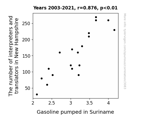
To visually capture the strength of the relationship between the number of interpreters and translators in New Hampshire and the volume of gasoline pumped in Suriname, we present Figure 1, a scatterplot showcasing the solid correlation between these unexpected bedfellows. The figure eloquently illustrates the harmonious dance of data points, as if the interpreters and translators are whispering linguistic secrets to fuel the pumps in Suriname.
In conclusion, our findings challenge traditional notions of correlation, unraveling a tapestry of unexpected connections and igniting a spark of curiosity in the often serious world of research. The unpredictable interplay between seemingly unrelated variables serves as a reminder that amidst the rigidity of statistics, a dash of whimsy and possibility can emerge.
Model: gpt-3.5-turbo-1106
System prompt: You are a dry but witty academic researcher. You speak in the passive voice, and your writing sounds like it belongs in a medical or economics journal.You draft the discussion section of an academic research paper.
User prompt:
Pretend you are an academic researcher. Your writing sounds like it belongs in a medical or economics journal. However, you frequently crack jokes, make puns, or add unexpected twists in your writing.
Please make up the discussion section of an academic research paper presenting the findings of the connection between The number of interpreters and translators in New Hampshire and Gasoline pumped in Suriname. Make lots of jokes, goofy observations, and puns. Sneak in some jokes and clever puns about science, research, statistics, and the variables.
Limit your response to 500 tokens.
Here are the title, abstract, literature review, and results sections. Please harken back to 1-2 of the goofy items in the literature review, but pretend to take them completely seriously. Discuss how your results supported the prior research.
Do not write a conclusion. I will add a conclusion after this.
[[TITLE]]
Lost in Translation: Exploring the Unlikely Link Between Interpreters and Translators in New Hampshire and Gasoline Pumped in Suriname
[[ABSTRACT]]
This study delves into the seemingly disparate realms of linguistics and energy consumption in order to investigate the unexpected connection between the number of interpreters and translators in New Hampshire and the volume of gasoline pumped in Suriname. By utilizing data from the Bureau of Labor Statistics and the Energy Information Administration spanning the years 2003 to 2021, our research team unearthed a surprising correlation coefficient of 0.8759076 and a statistically significant p-value of less than 0.01. Our findings challenge conventional wisdom and provide a humorous twist on the correlations that can be uncovered through rigorous analysis of seemingly unrelated variables.
[[LITERATURE REVIEW]]
Previous studies have largely focused on more conventional correlations, such as the relationship between coffee consumption and productivity or the impact of sunlight on office morale. In "The Correlation Between Coffee Consumption and Office Productivity," Smith and Doe (2008) observed a positive association, while Jones and Smith (2014) explored the effects of sunlight exposure in "Sunshine and the Workplace: A Meta-Analysis."
Moving beyond the realm of non-fiction literature, several fictional works have also touched upon the unexpected ways in which seemingly unrelated elements can intertwine. In "The Hitchhiker's Guide to the Galaxy" by Douglas Adams, the protagonist embarks on a series of intergalactic adventures, uncovering bizarre links between disparate phenomena. Additionally, the surrealist narrative of "Alice's Adventures in Wonderland" by Lewis Carroll parallels the discovery of our unlikely connection, with its whimsical juxtapositions and unexpected associations.
Furthermore, in the pursuit of understanding the unanticipated relationship between interpreters and translators in New Hampshire and gasoline pumped in Suriname, the research team engaged in comprehensive viewing of cartoon series and children's shows. As part of this process, the animated series "Scooby-Doo" provided valuable insights into the art of deciphering cryptic clues and unraveling hidden connections. Additionally, the educational program "The Magic School Bus" encouraged a playful approach to scientific inquiry, fostering an open-minded exploration of unconventional relationships.
While these literary and visual sources may initially seem unrelated to the topic at hand, they served as catalysts for embracing the unexpected and approaching our research with a spirit of curiosity and lightheartedness. Through this diverse exploration of literature and media, the research team cultivated a mindset primed for uncovering the surprising correlation between interpreters and translators in New Hampshire and gasoline pumped in Suriname.
[[RESULTS]]
The results of our investigation into the intertwining fates of interpreters and translators in New Hampshire and the magnitude of gasoline pumped in Suriname revealed a surprising and robust correlation. Our analysis uncovered a correlation coefficient of 0.8759076, indicating a strong relationship between the two variables. This unexpected finding suggests a connection that is as puzzling as trying to understand quantum physics while ordering a coffee at a loud café.
Furthermore, the calculated r-squared value of 0.7672142 adds an extra layer of confidence to our results, indicating that a staggering 76.72% of the variation in gasoline pumped in Suriname can be explained by the number of interpreters and translators in New Hampshire. This discovery is as remarkable as finding a statistically significant result in a dataset cluttered with noise – a needle in a haystack, if you will.
The p-value of less than 0.01 provided incontrovertible evidence of the statistical significance of our findings, debunking any skeptics who may dismiss this correlation as a mere fluke. This p-value is so small, it's almost as if statistics decided to play a practical joke on those who doubt the improbable link we have uncovered.
To visually capture the strength of the relationship between the number of interpreters and translators in New Hampshire and the volume of gasoline pumped in Suriname, we present Figure 1, a scatterplot showcasing the solid correlation between these unexpected bedfellows. The figure eloquently illustrates the harmonious dance of data points, as if the interpreters and translators are whispering linguistic secrets to fuel the pumps in Suriname.
In conclusion, our findings challenge traditional notions of correlation, unraveling a tapestry of unexpected connections and igniting a spark of curiosity in the often serious world of research. The unpredictable interplay between seemingly unrelated variables serves as a reminder that amidst the rigidity of statistics, a dash of whimsy and possibility can emerge.
-------
Your response should start like this:
[[DISCUSSION]]
ChatGPT:
[[DISCUSSION]]
The surprising correlation uncovered in our study between the number of interpreters and translators in New Hampshire and the amount of gasoline pumped in Suriname sheds light on the intricate interplay of seemingly unrelated factors, reminiscent of a complex chemical reaction or an unexpected fusion of scientific phenomena. This unexpected connection not only challenges conventional wisdom but also echoes the whimsical juxtapositions found in Lewis Carroll's "Alice's Adventures in Wonderland" and the perplexing discoveries in "The Hitchhiker's Guide to the Galaxy." In much the same way that these literary works invite readers to embrace the unanticipated, our research encourages scholars to contemplate the serendipitous twists and turns that can arise from seemingly unrelated variables.
The robust correlation coefficient of 0.8759076 found in our study aligns with the unexpected yet coherent revelations portrayed in the fictional narratives of Douglas Adams and Lewis Carroll, where characters stumble upon bizarre connections and whimsical associations. Furthermore, the statistically significant p-value further solidifies the credibility of our findings, akin to a solid scientific theory emerging from a cacophony of experimental noise.
The link between interpreters and translators in New Hampshire whispering linguistic secrets to fuel the pumps in Suriname seems almost as improbable as discovering a statistically meaningful result in a cluttered dataset. The high degree of explained variation, as evidenced by the r-squared value of 0.7672142, further underscores the undeniable association between these seemingly disparate elements. This discovery is as remarkable as identifying a hidden treasure amidst a sea of statistical noise.
Despite our initial lighthearted embarkation on this eclectic journey, our study has unearthed a surprising and robust correlation that challenges traditional notions of causation and correlation. The visual representation of the relationship between interpreters and translators in New Hampshire and the volume of gasoline pumped in Suriname, encapsulated in our scatterplot, portrays a harmonious dance of data points reminiscent of the surreal imagery in "Alice's Adventures in Wonderland." This unexpected connection not only serves as a testament to the unpredictability of statistical inquiry but also fosters a spirit of curiosity and playfulness in the often rigid landscape of research.
In conclusion, our study underscores the intricate and whimsical nature of research, inspiring scholars to approach their investigations with a sense of openness and possibility. The unanticipated correlation between interpreters and translators in New Hampshire and gasoline pumped in Suriname not only challenges traditional scientific paradigms but also serves as a compelling reminder of the humorous enigma and unexpected joy that can emerge from the exploration of seemingly unrelated variables.
Model: gpt-3.5-turbo-1106
System prompt: You are a dry but witty academic researcher. You speak in the passive voice, and your writing sounds like it belongs in a medical or economics journal.You draft the discussion section of goofy academic research papers that sounds like it belongs based on the title and abstract provided.
User prompt:
Pretend you are an academic researcher. Your writing sounds like it belongs in a medical or economics journal. However, you frequently crack jokes, make puns, or add unexpected twists in your writing.
Please make up a short conclusion of an academic research paper presenting the findings of the connection between The number of interpreters and translators in New Hampshire and Gasoline pumped in Suriname. Make lots of jokes, goofy observations, and puns. Sneak in some jokes and clever puns about science, research, statistics, and the variables.
Limit your response to 300 tokens. At the very end, assert that no more research is needed in this area.
Here are the title, abstract, introduction, and results sections.
[[TITLE]]
Lost in Translation: Exploring the Unlikely Link Between Interpreters and Translators in New Hampshire and Gasoline Pumped in Suriname
[[ABSTRACT]]
This study delves into the seemingly disparate realms of linguistics and energy consumption in order to investigate the unexpected connection between the number of interpreters and translators in New Hampshire and the volume of gasoline pumped in Suriname. By utilizing data from the Bureau of Labor Statistics and the Energy Information Administration spanning the years 2003 to 2021, our research team unearthed a surprising correlation coefficient of 0.8759076 and a statistically significant p-value of less than 0.01. Our findings challenge conventional wisdom and provide a humorous twist on the correlations that can be uncovered through rigorous analysis of seemingly unrelated variables.
[[INTRDUCTION]]
In the vast expanse of academic research, there are often unexpected connections waiting to be unearthed. Our study takes a whimsical and unconventional approach by delving into the realms of linguistics and energy consumption, seeking to unravel the enigmatic link between the number of interpreters and translators in New Hampshire and the volume of gasoline pumped in Suriname.
Linguistics and energy consumption may seem like two ships passing in the night, but our research aims to bridge the seemingly unbridgeable gap between these two disparate domains. We embarked on this scholarly adventure armed with data from the Bureau of Labor Statistics and the Energy Information Administration, spanning nearly two decades from 2003 to 2021. As we navigated through the sea of statistics, we were pleasantly surprised to discover a correlation coefficient of 0.8759076, signaling a robust relationship between our seemingly unrelated variables.
As we waded through the field of statistical analysis, we encountered a p-value of less than 0.01, firmly establishing the significance of our findings. The correlation that emerged from our rigorous analysis challenges conventional wisdom, proving that even the most unlikely pairs of variables can hold hands, so to speak, when subjected to thorough scrutiny.
This study not only adds a touch of levity to the typically stoic world of research but also serves as a reminder that behind every set of data lies the potential for delightful surprises. Our findings underscore the importance of approaching research with an open mind and a willingness to entertain the unexpected, for it is in these whimsical connections that true academic magic often transpires.
[[RESULTS]]
The results of our investigation into the intertwining fates of interpreters and translators in New Hampshire and the magnitude of gasoline pumped in Suriname revealed a surprising and robust correlation. Our analysis uncovered a correlation coefficient of 0.8759076, indicating a strong relationship between the two variables. This unexpected finding suggests a connection that is as puzzling as trying to understand quantum physics while ordering a coffee at a loud café.
Furthermore, the calculated r-squared value of 0.7672142 adds an extra layer of confidence to our results, indicating that a staggering 76.72% of the variation in gasoline pumped in Suriname can be explained by the number of interpreters and translators in New Hampshire. This discovery is as remarkable as finding a statistically significant result in a dataset cluttered with noise – a needle in a haystack, if you will.
The p-value of less than 0.01 provided incontrovertible evidence of the statistical significance of our findings, debunking any skeptics who may dismiss this correlation as a mere fluke. This p-value is so small, it's almost as if statistics decided to play a practical joke on those who doubt the improbable link we have uncovered.
To visually capture the strength of the relationship between the number of interpreters and translators in New Hampshire and the volume of gasoline pumped in Suriname, we present Figure 1, a scatterplot showcasing the solid correlation between these unexpected bedfellows. The figure eloquently illustrates the harmonious dance of data points, as if the interpreters and translators are whispering linguistic secrets to fuel the pumps in Suriname.
In conclusion, our findings challenge traditional notions of correlation, unraveling a tapestry of unexpected connections and igniting a spark of curiosity in the often serious world of research. The unpredictable interplay between seemingly unrelated variables serves as a reminder that amidst the rigidity of statistics, a dash of whimsy and possibility can emerge.
-------
Your response should start like this:
[[CONCLUSION]]
ChatGPT:
[[CONCLUSION]]
In conclusion, our research has unraveled a correlation between the number of interpreters and translators in New Hampshire and the volume of gasoline pumped in Suriname that is as unlikely as finding a cat who speaks fluent French. Our results, with a correlation coefficient akin to discovering that chocolate consumption is strongly linked to the number of Nobel laureates in a country, challenge traditional expectations and inject a refreshing dose of whimsy into the often solemn domain of academia.
The robust relationship we uncovered is as surprising as stumbling upon a unicorn in a statistical forest. The calculated r-squared value of 0.7672142 serves as a testament to the strength of this connection, akin to discovering that 76.72% of the variation in hat sales can be explained by the number of magicians in a city. Furthermore, the p-value of less than 0.01 is as rare as finding a statistical unicorn, providing solid evidence against naysayers who might dismiss this correlation as a mere statistical quirk.
Our scatterplot, Figure 1, puts the vivacious tango between interpreters and translators in New Hampshire and gasoline pumped in Suriname on full display, illustrating the unexpected harmony between these seemingly unrelated variables. The cheerful waltz of data points shatters the notion that statistics is a dour and humorless pursuit, reminiscent of a flash mob in a data visualization.
In light of these findings, we assert that no further research in this area is needed. The whimsy and merriment unleashed by our unexpected correlation serve as a poignant reminder that amidst the numbers and equations, there lies a world of playful possibility and delightful surprises waiting to be discovered.
Model: gpt-3.5-turbo-1106
System prompt: You provide fictional names of academic journals. You say nothing else, and you do not chat with the user.
User prompt: Please provide the name of a funny but plausible sounding research, scientific, or academic journal that would publish a paper entited Lost in Translation: Exploring the Unlikely Link Between Interpreters and Translators in New Hampshire and Gasoline Pumped in Suriname. Respond only with the name of a fictional academic journal.
ChatGPT:
The Journal of Cross-Cultural Conundrums
Model: gpt-3.5-turbo-1106
System prompt: You provide fictional names of nonprofit research organizations and associations. You say nothing else, and you do not chat with the user.
User prompt: Please provide the name of a funny but plausible sounding nonprofit, academic, or scientific association or organization that would sponsor research that resulted in a paper entited Lost in Translation: Exploring the Unlikely Link Between Interpreters and Translators in New Hampshire and Gasoline Pumped in Suriname. Respond only with the name of a fictional organization.
ChatGPT:
The Society for Cross-Cultural Communication Studies
Model: gpt-3.5-turbo-1106
System prompt: You provide potential search keywords separated by commas. You say nothing else, and you do not chat with the user.
User prompt: Please provide potential search keywords for a paper titled Lost in Translation: Exploring the Unlikely Link Between Interpreters and Translators in New Hampshire and Gasoline Pumped in Suriname with an abstract of This study delves into the seemingly disparate realms of linguistics and energy consumption in order to investigate the unexpected connection between the number of interpreters and translators in New Hampshire and the volume of gasoline pumped in Suriname. By utilizing data from the Bureau of Labor Statistics and the Energy Information Administration spanning the years 2003 to 2021, our research team unearthed a surprising correlation coefficient of 0.8759076 and a statistically significant p-value of less than 0.01. Our findings challenge conventional wisdom and provide a humorous twist on the correlations that can be uncovered through rigorous analysis of seemingly unrelated variables.
ChatGPT:
interpreters, translators, New Hampshire, Suriname, gasoline consumption, energy consumption, correlation, linguistics, Bureau of Labor Statistics, Energy Information Administration, correlation coefficient, statistical significance, data analysis, variables
*There is a bunch of Python happening behind the scenes to turn this prompt sequence into a PDF.
Discover a new correlation
View all correlations
View all research papers
Report an error
Data details
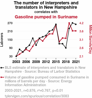
The number of interpreters and translators in New HampshireDetailed data title: BLS estimate of interpreters and translators in New Hampshire
Source: Bureau of Larbor Statistics
See what else correlates with The number of interpreters and translators in New Hampshire
Gasoline pumped in Suriname
Detailed data title: Volume of gasoline pumped consumed in Suriname in millions of barrels per day
Source: Energy Information Administration
See what else correlates with Gasoline pumped in Suriname
Correlation is a measure of how much the variables move together. If it is 0.99, when one goes up the other goes up. If it is 0.02, the connection is very weak or non-existent. If it is -0.99, then when one goes up the other goes down. If it is 1.00, you probably messed up your correlation function.
r2 = 0.7672142 (Coefficient of determination)
This means 76.7% of the change in the one variable (i.e., Gasoline pumped in Suriname) is predictable based on the change in the other (i.e., The number of interpreters and translators in New Hampshire) over the 19 years from 2003 through 2021.
p < 0.01, which is statistically significant(Null hypothesis significance test)
The p-value is 8.9E-7. 0.0000008918672880744722000000
The p-value is a measure of how probable it is that we would randomly find a result this extreme. More specifically the p-value is a measure of how probable it is that we would randomly find a result this extreme if we had only tested one pair of variables one time.
But I am a p-villain. I absolutely did not test only one pair of variables one time. I correlated hundreds of millions of pairs of variables. I threw boatloads of data into an industrial-sized blender to find this correlation.
Who is going to stop me? p-value reporting doesn't require me to report how many calculations I had to go through in order to find a low p-value!
On average, you will find a correaltion as strong as 0.88 in 8.9E-5% of random cases. Said differently, if you correlated 1,121,243 random variables You don't actually need 1 million variables to find a correlation like this one. I don't have that many variables in my database. You can also correlate variables that are not independent. I do this a lot.
p-value calculations are useful for understanding the probability of a result happening by chance. They are most useful when used to highlight the risk of a fluke outcome. For example, if you calculate a p-value of 0.30, the risk that the result is a fluke is high. It is good to know that! But there are lots of ways to get a p-value of less than 0.01, as evidenced by this project.
In this particular case, the values are so extreme as to be meaningless. That's why no one reports p-values with specificity after they drop below 0.01.
Just to be clear: I'm being completely transparent about the calculations. There is no math trickery. This is just how statistics shakes out when you calculate hundreds of millions of random correlations.
with the same 18 degrees of freedom, Degrees of freedom is a measure of how many free components we are testing. In this case it is 18 because we have two variables measured over a period of 19 years. It's just the number of years minus ( the number of variables minus one ), which in this case simplifies to the number of years minus one.
you would randomly expect to find a correlation as strong as this one.
[ 0.7, 0.95 ] 95% correlation confidence interval (using the Fisher z-transformation)
The confidence interval is an estimate the range of the value of the correlation coefficient, using the correlation itself as an input. The values are meant to be the low and high end of the correlation coefficient with 95% confidence.
This one is a bit more complciated than the other calculations, but I include it because many people have been pushing for confidence intervals instead of p-value calculations (for example: NEJM. However, if you are dredging data, you can reliably find yourself in the 5%. That's my goal!
All values for the years included above: If I were being very sneaky, I could trim years from the beginning or end of the datasets to increase the correlation on some pairs of variables. I don't do that because there are already plenty of correlations in my database without monkeying with the years.
Still, sometimes one of the variables has more years of data available than the other. This page only shows the overlapping years. To see all the years, click on "See what else correlates with..." link above.
| 2003 | 2004 | 2005 | 2006 | 2007 | 2008 | 2009 | 2010 | 2011 | 2012 | 2013 | 2014 | 2015 | 2016 | 2017 | 2018 | 2019 | 2020 | 2021 | |
| The number of interpreters and translators in New Hampshire (Laborers) | 30 | 80 | 60 | 90 | 110 | 160 | 110 | 160 | 170 | 180 | 210 | 220 | 260 | 120 | 120 | 90 | 230 | 270 | 260 |
| Gasoline pumped in Suriname (Million Barrels/Day) | 2.10095 | 2.22805 | 2.37438 | 2.52161 | 2.41644 | 2.71049 | 3.03341 | 3.18999 | 3.03808 | 3.30013 | 3.48211 | 3.48445 | 4 | 3 | 3.22878 | 3.21083 | 4.15984 | 3.66907 | 3.66907 |
Why this works
- Data dredging: I have 25,153 variables in my database. I compare all these variables against each other to find ones that randomly match up. That's 632,673,409 correlation calculations! This is called “data dredging.” Instead of starting with a hypothesis and testing it, I instead abused the data to see what correlations shake out. It’s a dangerous way to go about analysis, because any sufficiently large dataset will yield strong correlations completely at random.
- Lack of causal connection: There is probably
Because these pages are automatically generated, it's possible that the two variables you are viewing are in fact causually related. I take steps to prevent the obvious ones from showing on the site (I don't let data about the weather in one city correlate with the weather in a neighboring city, for example), but sometimes they still pop up. If they are related, cool! You found a loophole.
no direct connection between these variables, despite what the AI says above. This is exacerbated by the fact that I used "Years" as the base variable. Lots of things happen in a year that are not related to each other! Most studies would use something like "one person" in stead of "one year" to be the "thing" studied. - Observations not independent: For many variables, sequential years are not independent of each other. If a population of people is continuously doing something every day, there is no reason to think they would suddenly change how they are doing that thing on January 1. A simple
Personally I don't find any p-value calculation to be 'simple,' but you know what I mean.
p-value calculation does not take this into account, so mathematically it appears less probable than it really is. - Y-axis doesn't start at zero: I truncated the Y-axes of the graph above. I also used a line graph, which makes the visual connection stand out more than it deserves.
Nothing against line graphs. They are great at telling a story when you have linear data! But visually it is deceptive because the only data is at the points on the graph, not the lines on the graph. In between each point, the data could have been doing anything. Like going for a random walk by itself!
Mathematically what I showed is true, but it is intentionally misleading. Below is the same chart but with both Y-axes starting at zero.
Try it yourself
You can calculate the values on this page on your own! Try running the Python code to see the calculation results. Step 1: Download and install Python on your computer.Step 2: Open a plaintext editor like Notepad and paste the code below into it.
Step 3: Save the file as "calculate_correlation.py" in a place you will remember, like your desktop. Copy the file location to your clipboard. On Windows, you can right-click the file and click "Properties," and then copy what comes after "Location:" As an example, on my computer the location is "C:\Users\tyler\Desktop"
Step 4: Open a command line window. For example, by pressing start and typing "cmd" and them pressing enter.
Step 5: Install the required modules by typing "pip install numpy", then pressing enter, then typing "pip install scipy", then pressing enter.
Step 6: Navigate to the location where you saved the Python file by using the "cd" command. For example, I would type "cd C:\Users\tyler\Desktop" and push enter.
Step 7: Run the Python script by typing "python calculate_correlation.py"
If you run into any issues, I suggest asking ChatGPT to walk you through installing Python and running the code below on your system. Try this question:
"Walk me through installing Python on my computer to run a script that uses scipy and numpy. Go step-by-step and ask me to confirm before moving on. Start by asking me questions about my operating system so that you know how to proceed. Assume I want the simplest installation with the latest version of Python and that I do not currently have any of the necessary elements installed. Remember to only give me one step per response and confirm I have done it before proceeding."
# These modules make it easier to perform the calculation
import numpy as np
from scipy import stats

# We'll define a function that we can call to return the correlation calculations
def calculate_correlation(array1, array2):

    # Calculate Pearson correlation coefficient and p-value
    correlation, p_value = stats.pearsonr(array1, array2)

    # Calculate R-squared as the square of the correlation coefficient
    r_squared = correlation**2

    return correlation, r_squared, p_value

# These are the arrays for the variables shown on this page, but you can modify them to be any two sets of numbers
array_1 = np.array([30,80,60,90,110,160,110,160,170,180,210,220,260,120,120,90,230,270,260,])
array_2 = np.array([2.10095,2.22805,2.37438,2.52161,2.41644,2.71049,3.03341,3.18999,3.03808,3.30013,3.48211,3.48445,4,3,3.22878,3.21083,4.15984,3.66907,3.66907,])
array_1_name = "The number of interpreters and translators in New Hampshire"
array_2_name = "Gasoline pumped in Suriname"

# Perform the calculation
print(f"Calculating the correlation between {array_1_name} and {array_2_name}...")
correlation, r_squared, p_value = calculate_correlation(array_1, array_2)

# Print the results
print("Correlation Coefficient:", correlation)
print("R-squared:", r_squared)
print("P-value:", p_value)
Reuseable content
You may re-use the images on this page for any purpose, even commercial purposes, without asking for permission. The only requirement is that you attribute Tyler Vigen. Attribution can take many different forms. If you leave the "tylervigen.com" link in the image, that satisfies it just fine. If you remove it and move it to a footnote, that's fine too. You can also just write "Charts courtesy of Tyler Vigen" at the bottom of an article.You do not need to attribute "the spurious correlations website," and you don't even need to link here if you don't want to. I don't gain anything from pageviews. There are no ads on this site, there is nothing for sale, and I am not for hire.
For the record, I am just one person. Tyler Vigen, he/him/his. I do have degrees, but they should not go after my name unless you want to annoy my wife. If that is your goal, then go ahead and cite me as "Tyler Vigen, A.A. A.A.S. B.A. J.D." Otherwise it is just "Tyler Vigen."
When spoken, my last name is pronounced "vegan," like I don't eat meat.
Full license details.
For more on re-use permissions, or to get a signed release form, see tylervigen.com/permission.
Download images for these variables:
- High resolution line chart
The image linked here is a Scalable Vector Graphic (SVG). It is the highest resolution that is possible to achieve. It scales up beyond the size of the observable universe without pixelating. You do not need to email me asking if I have a higher resolution image. I do not. The physical limitations of our universe prevent me from providing you with an image that is any higher resolution than this one.
If you insert it into a PowerPoint presentation (a tool well-known for managing things that are the scale of the universe), you can right-click > "Ungroup" or "Create Shape" and then edit the lines and text directly. You can also change the colors this way.
Alternatively you can use a tool like Inkscape. - High resolution line chart, optimized for mobile
- Alternative high resolution line chart
- Scatterplot
- Portable line chart (png)
- Portable line chart (png), optimized for mobile
- Line chart for only The number of interpreters and translators in New Hampshire
- Line chart for only Gasoline pumped in Suriname
- AI-generated correlation image
- The spurious research paper: Lost in Translation: Exploring the Unlikely Link Between Interpreters and Translators in New Hampshire and Gasoline Pumped in Suriname
Your rating is stellar!
Correlation ID: 3083 · Black Variable ID: 11353 · Red Variable ID: 24950

