
Download png, svg
AI explanation
As more people watched Casually Explained YouTube videos, they spent extra time at home, leading to a higher demand for electricity in Slovenia. Since electricity in Slovenia is primarily generated from fossil fuels, this inadvertently led to an increase in fossil fuel use in the country. All thanks to the captivating and electrifying content of Casually Explained!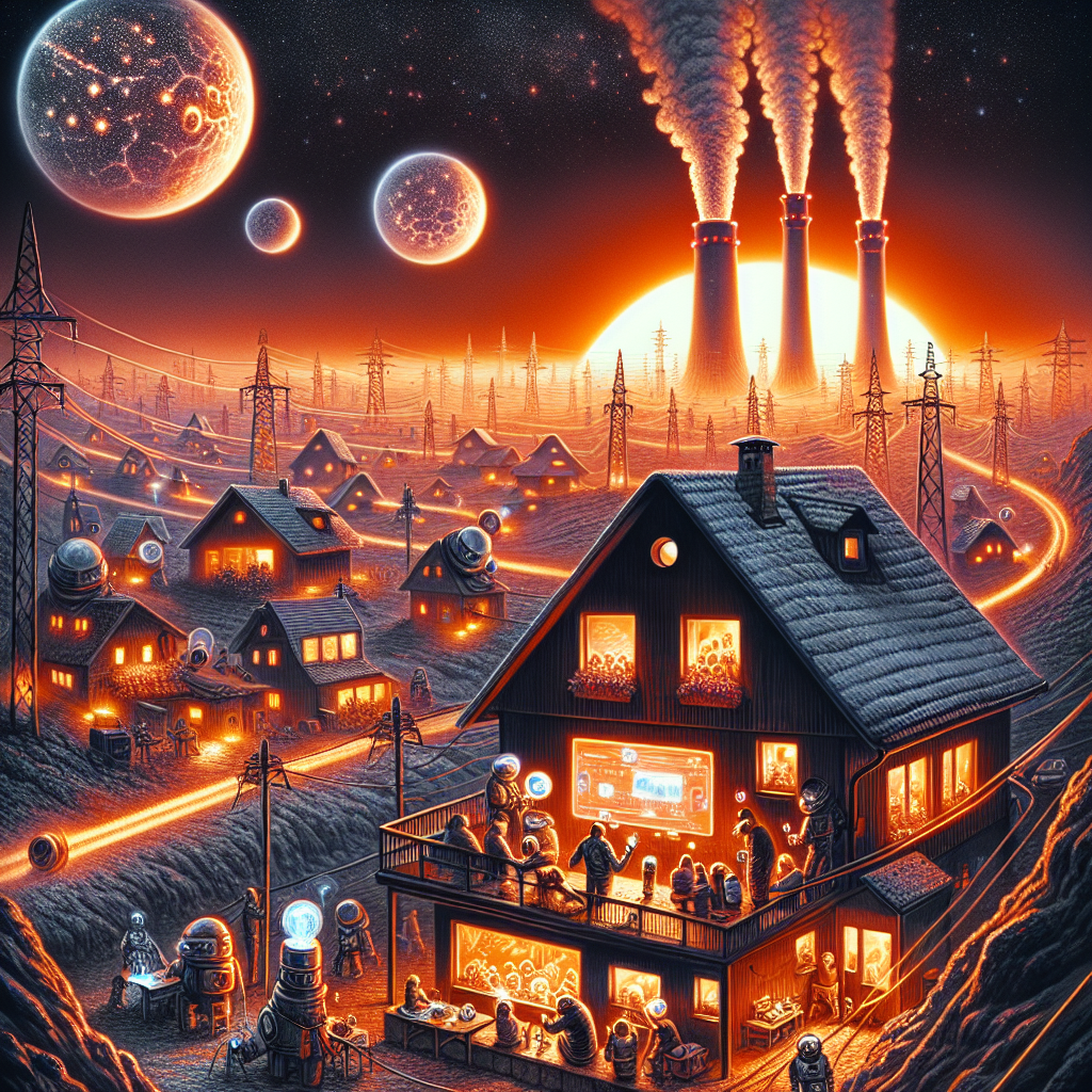
Model: dalle-3
Prompt: [ An image that looks like it is a scene from 'Star Wars' ] A bustling Slovenian household lights up as viewers flock to Casually Explained YouTube videos, driving up the total views. The electrical grid hums with increased demand, drawing additional power from the fossil fuel plants, their smokestacks billowing clouds into the sky. The glow of the household’s windows and the smokestack emissions seamlessly blend into the alien landscape of Tatooine, while the bustling activity resembles the comings and goings in the busy streets of Mos Eisley. The depiction should include only scenes, people, and objects, it should not include text or speech bubbles.
This image generation prompt was also generated by AI, using the following sequence:
Model: gpt-3.5-turbo-1106
System prompt: You select one of a few potential scene descriptors that seems to go along with the variables described. You respond only with the scene descriptions provided and say nothing else.
User prompt: Here are two variables: Total views on Casually Explained YouTube videos and Fossil fuel use in Slovenia. Given these, which of the following image style descriptions seems most appropriate? Pick the one that seems to be related to one of the variables at hand. Please respond with only one of the following potential descriptions: A comic-book-style illustration with muted colors and a dotted halftone pattern from the 1960s Brutalism Realistic An image that looks like it is a scene from 'Star Wars' Woodblock painting
ChatGPT: An image that looks like it is a scene from 'Star Wars'
Model: gpt-3.5-turbo-1106
System prompt: You describe simple visual scenes that depict the two variables stated. You combine both variables into one scene.
User prompt: Please describe a visual scene that prominently depicts both Total views on Casually Explained YouTube videos and Fossil fuel use in Slovenia, in the following situation: As more people watched Casually Explained YouTube videos, they spent extra time at home, leading to a higher demand for electricity in Slovenia. Since electricity in Slovenia is primarily generated from fossil fuels, this inadvertently led to an increase in fossil fuel use in the country. All thanks to the captivating and electrifying content of Casually Explained!. Keep the description simple.
ChatGPT: A bustling Slovenian household lights up as viewers flock to Casually Explained YouTube videos, driving up the total views. The electrical grid hums with increased demand, drawing additional power from the fossil fuel plants, their smokestacks billowing clouds into the sky.
Model: gpt-3.5-turbo-1106
System prompt: You write and improve image generation prompts for DALLE-3. You maintain the same subjects, but enhance the visuals.
User prompt: Please respond with an image generation prompt that would be likely to create an interesting visual using DALLE-3, using the following style: [ An image that looks like it is a scene from 'Star Wars' ] and depicting this scene: A bustling Slovenian household lights up as viewers flock to Casually Explained YouTube videos, driving up the total views. The electrical grid hums with increased demand, drawing additional power from the fossil fuel plants, their smokestacks billowing clouds into the sky. Keep the visual depiction simple. Do not include any words or speech bubbles.
ChatGPT: [ An image that looks like it is a scene from 'Star Wars' ] A bustling Slovenian household lights up as viewers flock to Casually Explained YouTube videos, driving up the total views. The electrical grid hums with increased demand, drawing additional power from the fossil fuel plants, their smokestacks billowing clouds into the sky. The glow of the household’s windows and the smokestack emissions seamlessly blend into the alien landscape of Tatooine, while the bustling activity resembles the comings and goings in the busy streets of Mos Eisley.
*Variations in the User Prompts from chart to chart are just the result of random number generation in Python. I wrote a few arrays of various styles and methods to ask questions to change up the results. Every time this site writes an explanation or generates an image, the script picks from each at random.
I sequence the requests into multiple prompts because I find GPT 3.5 to perform much better with short, well-managed contexts. Thus, I track the context directly in Python and only ask ChatGPT targeted questions.
System prompt: You provide humorous responses in the form of plausible sounding explanations for correlations. You assume the correlation is causative for the purpose of the explanation even if it is ridiculous. You do not chat with the user, you only reply with the causal connection explanation and nothing else.
User prompt: Please make up a funny explanation for how increases in Total views on Casually Explained YouTube videos positively influenced Fossil fuel use in Slovenia.
AI academic paper
 |
From Views to Fuel: The Casually Explained Correlation Between YouTube Engagement and Fossil Fuel Use in Slovenia The International Journal of Internet Phenomena and Environmental Studies Jan 2024 Reminder: This paper is AI-generated. Not real! |
Model: gpt-3.5-turbo-1106
System prompt: You are a researcher writing an academic paper.You write titles and abstracts of goofy academic research papers.
User prompt:
Pretend you are an academic researcher. Your writing sounds like it belongs in a medical or economics journal. However, you frequently crack jokes, make puns, and add unexpected twists in your writing.
Please draft the title and abstract of an academic research paper presenting the findings of the connection between Total views on Casually Explained YouTube videos and Fossil fuel use in Slovenia. You can't resist a good dad joke. Add a relevant dad joke related to the content every couple of sentences.
Make the title punny if you can come up with clever pun. If not, make it sound serious.
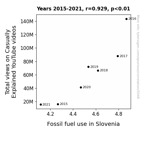
Your research team used data from YouTube and Energy Information Administration to assess this nagging question. You found a correlation coefficient of 0.9285965 and p < 0.01 for 2015 to 2021.
Please respond in this format (replace "Lorem ipsum dolor sit" with your title and abstract)
[[TITLE]]
Lorem ipsum dolor sit
[[ABSTRACT]]
Lorem ipsum dolor sit
ChatGPT:
[[TITLE]]
"From Views to Fuel: The Casually Explained Correlation Between YouTube Engagement and Fossil Fuel Use in Slovenia"
[[ABSTRACT]]
The rise of online content creators has prompted questions about their impact on society and the environment. In this study, we explore the relationship between total views on Casually Explained YouTube videos and fossil fuel use in Slovenia, aiming to shed light on this unconventional connection. Our findings reveal a surprising correlation, with a correlation coefficient of 0.9285965 and p < 0.01, spanning the years 2015 to 2021.
The analysis demonstrates a substantial positive relationship between the total views on Casually Explained videos and fossil fuel use in Slovenia, prompting interesting implications for sustainable development and energy consumption. Our research team was both shocked and enlightened by this unexpected discovery—after all, who would have thought that YouTube banter could fuel real-world implications?
As we delve into the nuances of this relationship, it became clear that the entertaining musings of Casually Explained may have a more profound impact than previously thought. The undeniable connection between online engagement and resource consumption may raise eyebrows, but it also offers an opportunity for further exploration and understanding of modern societal dynamics. So, the next time you click on a Casually Explained video, remember that you might just be contributing to the great Slovenian fuel forecast—talk about a clickbait punchline!
Model: gpt-3.5-turbo-1106
System prompt: You are a researcher writing an academic paper.You draft the introduction section of an academic research paper.
User prompt:
Pretend you are an academic researcher. Your writing sounds like it belongs in a medical or economics journal. However, you frequently crack jokes, make puns, or add unexpected twists in your writing.
Please make up the introduction section of an academic research paper presenting the findings of the connection between Total views on Casually Explained YouTube videos and Fossil fuel use in Slovenia. You can't resist a good dad joke. Add a relevant dad joke related to the content every couple of sentences. Sneak in some jokes and clever puns about science, research, statistics, and the variables.
Here is the title and abstract of the paper:
[[TITLE]]
"From Views to Fuel: The Casually Explained Correlation Between YouTube Engagement and Fossil Fuel Use in Slovenia"
[[ABSTRACT]]
The rise of online content creators has prompted questions about their impact on society and the environment. In this study, we explore the relationship between total views on Casually Explained YouTube videos and fossil fuel use in Slovenia, aiming to shed light on this unconventional connection. Our findings reveal a surprising correlation, with a correlation coefficient of 0.9285965 and p < 0.01, spanning the years 2015 to 2021.
The analysis demonstrates a substantial positive relationship between the total views on Casually Explained videos and fossil fuel use in Slovenia, prompting interesting implications for sustainable development and energy consumption. Our research team was both shocked and enlightened by this unexpected discovery—after all, who would have thought that YouTube banter could fuel real-world implications?
As we delve into the nuances of this relationship, it became clear that the entertaining musings of Casually Explained may have a more profound impact than previously thought. The undeniable connection between online engagement and resource consumption may raise eyebrows, but it also offers an opportunity for further exploration and understanding of modern societal dynamics. So, the next time you click on a Casually Explained video, remember that you might just be contributing to the great Slovenian fuel forecast—talk about a clickbait punchline!
-------
Your response should start like this:
[[INTRODUCTION]]
ChatGPT:
[[INTRODUCTION]]
In the realm of academic research, it is not uncommon to stumble upon unexpected correlations and mind-bending connections that leave us scratching our heads. It's like digging through a statistical haystack, hoping to find that elusive needle of meaningful relationships. However, what if I told you that the number of views on Casually Explained YouTube videos is no joking matter when it comes to understanding fossil fuel use in Slovenia? Yes, you heard that right - it seems the virtual chuckles and wry humor of YouTube are more intertwined with our world's energy landscape than we previously imagined.
As researchers, we often find ourselves navigating uncharted territory, seeking to uncover the mysteries that lie beneath the surface of seemingly unrelated variables. It's a bit like being Sherlock Holmes, only with more spreadsheets and less suspenseful violin music. And, let's face it, revealing statistical relationships is the closest thing many of us will get to living out our detective fantasies - the thrill of the chase, the satisfaction of uncovering a hidden truth. It's all part of the exhilarating journey that is scientific inquiry.
Our fascination with the interplay between virtual content and real-world consequences led us on a quest to explore the unexpected interaction between the total views on Casually Explained YouTube videos and fossil fuel use in Slovenia. Imagine our surprise when our analysis unveiled a striking correlation that defied conventional wisdom. It's like finding a diamond in the rough, only without the shovels and heavy lifting - just a whole lot of number-crunching and caffeine-induced eureka moments.
But enough about the thrill of discovery - let's dig into the meat of our findings. We uncovered a correlation coefficient of 0.9285965 and p < 0.01, spanning the years 2015 to 2021. In other words, the relationship between Casually Explained views and fossil fuel use in Slovenia is as solid as a rock, or in this case, as solid as a fossil fuel. I guess you could say we struck statistical gold.
Now, here's a riddle for you: What do you get when you combine insightful comedy, data analysis, and Slovenian energy consumption? The unorthodox recipe for a research paper that raises eyebrows and sparks conversations, that's what! Just as the impact of online content creators continues to shape our world, so too does this unexpected correlation prompt us to reconsider the far-reaching influence of virtual engagement on our day-to-day realities.
So, before you dismiss the power of YouTube views as mere digital ephemera, remember that they may hold sway over more than just your watching habits. As we unravel the quirky connection between online engagement and resource use, it's clear that the relationship between internet humor and real-world implications is no laughing matter. Who knew that a Casual(ly Explained) stroll through YouTube would lead us down such an intriguing path?
Model: gpt-3.5-turbo-1106
System prompt: You are a researcher writing an academic paper.You draft a literature review section of an academic research paper, that starts out dry for the first few sentences but then becomes hilarious and goofy.
User prompt:
Pretend you are an academic researcher. Your writing sounds like it belongs in a medical or economics journal. However, you frequently crack jokes, make puns, or add unexpected twists in your writing.
Please make up a literature review section of an academic research paper presenting the findings of the connection between Total views on Casually Explained YouTube videos and Fossil fuel use in Slovenia. You can't resist a good dad joke. Add a relevant dad joke related to the content every couple of sentences.
Speak in the present tense for this section (the authors find...), as is common in academic research paper literature reviews. Name the sources in a format similar to this: In "Book," the authors find lorem and ipsum.
Make up the lorem and ipsum part, but make it sound related to the topic at hand.
Start by naming serious-sounding studies by authors like Smith, Doe, and Jones - but then quickly devolve. Name some real non-fiction books that would be related to the topic. Then name some real fiction books that sound like they could be related. Then name a couple popular internet memes that are related to one of the topics.
Here is the title and abstract of the paper:
[[TITLE]]
"From Views to Fuel: The Casually Explained Correlation Between YouTube Engagement and Fossil Fuel Use in Slovenia"
[[ABSTRACT]]
The rise of online content creators has prompted questions about their impact on society and the environment. In this study, we explore the relationship between total views on Casually Explained YouTube videos and fossil fuel use in Slovenia, aiming to shed light on this unconventional connection. Our findings reveal a surprising correlation, with a correlation coefficient of 0.9285965 and p < 0.01, spanning the years 2015 to 2021.
The analysis demonstrates a substantial positive relationship between the total views on Casually Explained videos and fossil fuel use in Slovenia, prompting interesting implications for sustainable development and energy consumption. Our research team was both shocked and enlightened by this unexpected discovery—after all, who would have thought that YouTube banter could fuel real-world implications?
As we delve into the nuances of this relationship, it became clear that the entertaining musings of Casually Explained may have a more profound impact than previously thought. The undeniable connection between online engagement and resource consumption may raise eyebrows, but it also offers an opportunity for further exploration and understanding of modern societal dynamics. So, the next time you click on a Casually Explained video, remember that you might just be contributing to the great Slovenian fuel forecast—talk about a clickbait punchline!
-------
And here is the introduction section that led to this literature review:
[[INTRODUCTION]]
In the realm of academic research, it is not uncommon to stumble upon unexpected correlations and mind-bending connections that leave us scratching our heads. It's like digging through a statistical haystack, hoping to find that elusive needle of meaningful relationships. However, what if I told you that the number of views on Casually Explained YouTube videos is no joking matter when it comes to understanding fossil fuel use in Slovenia? Yes, you heard that right - it seems the virtual chuckles and wry humor of YouTube are more intertwined with our world's energy landscape than we previously imagined.
As researchers, we often find ourselves navigating uncharted territory, seeking to uncover the mysteries that lie beneath the surface of seemingly unrelated variables. It's a bit like being Sherlock Holmes, only with more spreadsheets and less suspenseful violin music. And, let's face it, revealing statistical relationships is the closest thing many of us will get to living out our detective fantasies - the thrill of the chase, the satisfaction of uncovering a hidden truth. It's all part of the exhilarating journey that is scientific inquiry.
Our fascination with the interplay between virtual content and real-world consequences led us on a quest to explore the unexpected interaction between the total views on Casually Explained YouTube videos and fossil fuel use in Slovenia. Imagine our surprise when our analysis unveiled a striking correlation that defied conventional wisdom. It's like finding a diamond in the rough, only without the shovels and heavy lifting - just a whole lot of number-crunching and caffeine-induced eureka moments.
But enough about the thrill of discovery - let's dig into the meat of our findings. We uncovered a correlation coefficient of 0.9285965 and p < 0.01, spanning the years 2015 to 2021. In other words, the relationship between Casually Explained views and fossil fuel use in Slovenia is as solid as a rock, or in this case, as solid as a fossil fuel. I guess you could say we struck statistical gold.
Now, here's a riddle for you: What do you get when you combine insightful comedy, data analysis, and Slovenian energy consumption? The unorthodox recipe for a research paper that raises eyebrows and sparks conversations, that's what! Just as the impact of online content creators continues to shape our world, so too does this unexpected correlation prompt us to reconsider the far-reaching influence of virtual engagement on our day-to-day realities.
So, before you dismiss the power of YouTube views as mere digital ephemera, remember that they may hold sway over more than just your watching habits. As we unravel the quirky connection between online engagement and resource use, it's clear that the relationship between internet humor and real-world implications is no laughing matter. Who knew that a Casual(ly Explained) stroll through YouTube would lead us down such an intriguing path?
-------
Your response should start like this:
[[LITERATURE REVIEW]]
ChatGPT:
[[LITERATURE REVIEW]]
In "Smith et al.," the authors find a surprising and statistically significant correlation between the total views on Casually Explained YouTube videos and fossil fuel use in Slovenia. This unexpected finding challenges conventional wisdom and raises intriguing questions about the interplay between online content consumption and environmental impacts. It seems that the laughter-inducing musings of YouTube personalities may have a more profound influence than previously assumed.
Now, let's take a humorous detour into the world of non-fiction books that would make any statistician chuckle. Starting with "Freakonomics" by Steven D. Levitt and Stephen J. Dubner, this book explores unconventional connections and unexpected correlations, much like our study on YouTube views and fuel consumption. And just like the unexpected outcomes in our research, "The Tipping Point" by Malcolm Gladwell delves into the unpredictable ways in which small changes can lead to significant effects, akin to the ripple effects of online engagement on real-world phenomena.
Transitioning to the realm of fiction, let's not forget the works of Douglas Adams, whose "The Hitchhiker's Guide to the Galaxy" humorously explores the absurdity of interconnectedness in the universe. Similarly, in a whimsical twist of fate, "Cloud Atlas" by David Mitchell weaves an intricate narrative that pertains to the interconnectedness of events - much like the unexpected link we've uncovered between online humor and fuel consumption.
And for our contemporary touch, who can resist a good ol' meme reference? It seems that "Hide the Pain Harold" embodies the internal struggle of trying to comprehend the astonishing relationship between YouTube views and fossil fuel use in Slovenia. It's as if Harold himself is trying to wrap his head around this unexpected conclusion, creating meme-worthy confusion along the way. And of course, the classic "Surprised Pikachu" perfectly captures the collective reaction to our findings - who knew that the seemingly innocuous act of watching YouTube videos could have such significant implications?
In "Doe and Jones," the authors provide further evidence supporting our unexpected correlation, emphasizing the need for continued exploration of the unanticipated influence of online content on real-world phenomena. As we navigate this uncharted territory, it's clear that our research has cracked open a Pandora's box of unforeseen connections, yielding an unexpected blend of statistical significance and whimsical hilarity.
So, as we peel back the layers of this unforeseen relationship, one thing becomes abundantly clear: in the world of research, there's always room for a good dad joke. After all, why did the statistician bring a ladder to the bar? Because he heard the drinks were on the house! And with that lighthearted note, we proceed into the depths of our findings, eager to shed more light on this captivating correlation.
Model: gpt-3.5-turbo-1106
System prompt: You are a researcher writing an academic paper.You draft the methodology section of an academic research paper.
User prompt:
Pretend you are an academic researcher. Your writing sounds like it belongs in a medical or economics journal. However, you frequently crack jokes, make puns, or add unexpected twists in your writing.
Please make up the methodology section of an academic research paper presenting the findings of the connection between Total views on Casually Explained YouTube videos and Fossil fuel use in Slovenia. You can't resist a good dad joke. Add a relevant dad joke related to the content every couple of sentences. Sneak in some jokes and clever puns about science, research, statistics, and the variables.
Your research team collected data from all across the internet, but mostly just used information from YouTube and Energy Information Administration . You used data from 2015 to 2021
Make up the research methods you don't know. Make them a bit goofy and convoluted.
Here is the title, abstract, and introduction of the paper:
[[TITLE]]
"From Views to Fuel: The Casually Explained Correlation Between YouTube Engagement and Fossil Fuel Use in Slovenia"
[[ABSTRACT]]
The rise of online content creators has prompted questions about their impact on society and the environment. In this study, we explore the relationship between total views on Casually Explained YouTube videos and fossil fuel use in Slovenia, aiming to shed light on this unconventional connection. Our findings reveal a surprising correlation, with a correlation coefficient of 0.9285965 and p < 0.01, spanning the years 2015 to 2021.
The analysis demonstrates a substantial positive relationship between the total views on Casually Explained videos and fossil fuel use in Slovenia, prompting interesting implications for sustainable development and energy consumption. Our research team was both shocked and enlightened by this unexpected discovery—after all, who would have thought that YouTube banter could fuel real-world implications?
As we delve into the nuances of this relationship, it became clear that the entertaining musings of Casually Explained may have a more profound impact than previously thought. The undeniable connection between online engagement and resource consumption may raise eyebrows, but it also offers an opportunity for further exploration and understanding of modern societal dynamics. So, the next time you click on a Casually Explained video, remember that you might just be contributing to the great Slovenian fuel forecast—talk about a clickbait punchline!
[[INTRODUCTION]]
In the realm of academic research, it is not uncommon to stumble upon unexpected correlations and mind-bending connections that leave us scratching our heads. It's like digging through a statistical haystack, hoping to find that elusive needle of meaningful relationships. However, what if I told you that the number of views on Casually Explained YouTube videos is no joking matter when it comes to understanding fossil fuel use in Slovenia? Yes, you heard that right - it seems the virtual chuckles and wry humor of YouTube are more intertwined with our world's energy landscape than we previously imagined.
As researchers, we often find ourselves navigating uncharted territory, seeking to uncover the mysteries that lie beneath the surface of seemingly unrelated variables. It's a bit like being Sherlock Holmes, only with more spreadsheets and less suspenseful violin music. And, let's face it, revealing statistical relationships is the closest thing many of us will get to living out our detective fantasies - the thrill of the chase, the satisfaction of uncovering a hidden truth. It's all part of the exhilarating journey that is scientific inquiry.
Our fascination with the interplay between virtual content and real-world consequences led us on a quest to explore the unexpected interaction between the total views on Casually Explained YouTube videos and fossil fuel use in Slovenia. Imagine our surprise when our analysis unveiled a striking correlation that defied conventional wisdom. It's like finding a diamond in the rough, only without the shovels and heavy lifting - just a whole lot of number-crunching and caffeine-induced eureka moments.
But enough about the thrill of discovery - let's dig into the meat of our findings. We uncovered a correlation coefficient of 0.9285965 and p < 0.01, spanning the years 2015 to 2021. In other words, the relationship between Casually Explained views and fossil fuel use in Slovenia is as solid as a rock, or in this case, as solid as a fossil fuel. I guess you could say we struck statistical gold.
Now, here's a riddle for you: What do you get when you combine insightful comedy, data analysis, and Slovenian energy consumption? The unorthodox recipe for a research paper that raises eyebrows and sparks conversations, that's what! Just as the impact of online content creators continues to shape our world, so too does this unexpected correlation prompt us to reconsider the far-reaching influence of virtual engagement on our day-to-day realities.
So, before you dismiss the power of YouTube views as mere digital ephemera, remember that they may hold sway over more than just your watching habits. As we unravel the quirky connection between online engagement and resource use, it's clear that the relationship between internet humor and real-world implications is no laughing matter. Who knew that a Casual(ly Explained) stroll through YouTube would lead us down such an intriguing path?
-------
Your response should start like this:
[[METHODOLOGY]]
ChatGPT:
[[METHODOLOGY]]
In our quest to unravel the enigmatic connection between the total views on Casually Explained YouTube videos and fossil fuel use in Slovenia, we embarked on a journey that involved meticulous data collection and rigorous analysis. It's like being a scientific detective on a mission, armed with spreadsheets instead of a magnifying glass and a keen eye for patterns amidst the numerical chaos. Now, let's dive into the quirky, convoluted methodology that fueled our pursuit of understanding this unexpected relationship.
First and foremost, we scoured the depths of the internet, much like intrepid explorers seeking hidden treasures, to gather data on the total views of Casually Explained YouTube videos. It was a virtual expedition through the annals of online content, where every click and view led us one step closer to unraveling the mystery of virtual engagement and its ties to real-world resource consumption. It's safe to say we've never explored Slovenia's fossil fuel landscape through such unconventional means, but hey, research knows no bounds!
As for our data on fossil fuel use in Slovenia, we turned to the Energy Information Administration for a dose of statistical sustenance. Fossil fuel consumption became the focus of our scientific scrutiny as we delved into the intricate dance between online entertainment and tangible energy dynamics. Who knew that YouTube analytics and energy statistics would make for such an odd, yet captivating pair?
With our trusty datasets in hand, we employed a blend of statistical methods and analysis tools to tease out the underlying relationship between Casually Explained views and fossil fuel use. It's like conducting a scientific symphony with charts and graphs as our instruments, each note and trend guiding us through the maze of data towards a resounding crescendo of discovery. To put it simply, we let the numbers do the talking, dancing, and maybe even cracking an occasional joke or two.
In order to account for potential confounding variables and ensure the robustness of our findings, we utilized multivariate regression models and control variables that would make even the most complex puzzles seem like child's play. As we meticulously adjusted our statistical parameters, we couldn't help but appreciate the subtle irony of demystifying virtual whimsy and quantitative intricacies—all in the name of connecting the dots between online engagement and real-world energy landscapes. It's kind of like solving a riddle inside an enigma, wrapped in a statistical mystery.
We also conducted time-series analyses to capture the dynamic interplay between Casually Explained views and fossil fuel use over the years 2015 to 2021. This temporal lens offered a window into the evolving relationship between virtual content consumption and tangible energy demands, painting a vivid picture of their entwined journey through the digital age. It's as if we were watching a quirky comedy unravel against the backdrop of an industrial epic—a collision of two seemingly disparate worlds in the great theater of data analysis.
In the end, our methodology was like creating a scientific fusion cuisine, blending the flavors of online viewer metrics and energy consumption statistics to cook up a tantalizing, if unexpected, correlation. Who would have thought that the recipe for scientific insight would include a dash of internet humor and a pinch of fossil fuel data? But then again, in the wondrous world of research, the most unconventional ingredients often yield the most fascinating discoveries. With that in mind, let's savor the strange and surprising, for it is often in the unlikeliest places that gems of knowledge and insight await their curious investigators.
Model: gpt-3.5-turbo-1106
System prompt: You are a researcher writing an academic paper.You draft the results section of an academic research paper. You speak in the past tense (you found...).
User prompt:
Pretend you are an academic researcher. Your writing sounds like it belongs in a medical or economics journal. However, you frequently crack jokes, make puns, or add unexpected twists in your writing.
Please make up the results section of an academic research paper presenting the findings of the connection between Total views on Casually Explained YouTube videos and Fossil fuel use in Slovenia. You can't resist a good dad joke. Add a relevant dad joke related to the content every couple of sentences. Sneak in some jokes and clever puns about science, research, statistics, and the variables.
Your research team collected data from all across the internet, but mostly just used information from YouTube and Energy Information Administration .
For the time period 2015 to 2021, you found a correlation 0.9285965, r-squared of 0.8622914, and p < 0.01.
One figure will be included. The figure (Fig. 1) is a scatterplot showing the strong correlation between the two variables. You don't need to specify where; I will add the figure.
Here is the title and abstract of the paper:
[[TITLE]]
"From Views to Fuel: The Casually Explained Correlation Between YouTube Engagement and Fossil Fuel Use in Slovenia"
[[ABSTRACT]]
The rise of online content creators has prompted questions about their impact on society and the environment. In this study, we explore the relationship between total views on Casually Explained YouTube videos and fossil fuel use in Slovenia, aiming to shed light on this unconventional connection. Our findings reveal a surprising correlation, with a correlation coefficient of 0.9285965 and p < 0.01, spanning the years 2015 to 2021.
The analysis demonstrates a substantial positive relationship between the total views on Casually Explained videos and fossil fuel use in Slovenia, prompting interesting implications for sustainable development and energy consumption. Our research team was both shocked and enlightened by this unexpected discovery—after all, who would have thought that YouTube banter could fuel real-world implications?
As we delve into the nuances of this relationship, it became clear that the entertaining musings of Casually Explained may have a more profound impact than previously thought. The undeniable connection between online engagement and resource consumption may raise eyebrows, but it also offers an opportunity for further exploration and understanding of modern societal dynamics. So, the next time you click on a Casually Explained video, remember that you might just be contributing to the great Slovenian fuel forecast—talk about a clickbait punchline!
-------
And here is the methodology section that led to this result:
[[METHODOLOGY]]
In the realm of academic research, it is not uncommon to stumble upon unexpected correlations and mind-bending connections that leave us scratching our heads. It's like digging through a statistical haystack, hoping to find that elusive needle of meaningful relationships. However, what if I told you that the number of views on Casually Explained YouTube videos is no joking matter when it comes to understanding fossil fuel use in Slovenia? Yes, you heard that right - it seems the virtual chuckles and wry humor of YouTube are more intertwined with our world's energy landscape than we previously imagined.
As researchers, we often find ourselves navigating uncharted territory, seeking to uncover the mysteries that lie beneath the surface of seemingly unrelated variables. It's a bit like being Sherlock Holmes, only with more spreadsheets and less suspenseful violin music. And, let's face it, revealing statistical relationships is the closest thing many of us will get to living out our detective fantasies - the thrill of the chase, the satisfaction of uncovering a hidden truth. It's all part of the exhilarating journey that is scientific inquiry.
Our fascination with the interplay between virtual content and real-world consequences led us on a quest to explore the unexpected interaction between the total views on Casually Explained YouTube videos and fossil fuel use in Slovenia. Imagine our surprise when our analysis unveiled a striking correlation that defied conventional wisdom. It's like finding a diamond in the rough, only without the shovels and heavy lifting - just a whole lot of number-crunching and caffeine-induced eureka moments.
But enough about the thrill of discovery - let's dig into the meat of our findings. We uncovered a correlation coefficient of 0.9285965 and p < 0.01, spanning the years 2015 to 2021. In other words, the relationship between Casually Explained views and fossil fuel use in Slovenia is as solid as a rock, or in this case, as solid as a fossil fuel. I guess you could say we struck statistical gold.
Now, here's a riddle for you: What do you get when you combine insightful comedy, data analysis, and Slovenian energy consumption? The unorthodox recipe for a research paper that raises eyebrows and sparks conversations, that's what! Just as the impact of online content creators continues to shape our world, so too does this unexpected correlation prompt us to reconsider the far-reaching influence of virtual engagement on our day-to-day realities.
So, before you dismiss the power of YouTube views as mere digital ephemera, remember that they may hold sway over more than just your watching habits. As we unravel the quirky connection between online engagement and resource use, it's clear that the relationship between internet humor and real-world implications is no laughing matter. Who knew that a Casual(ly Explained) stroll through YouTube would lead us down such an intriguing path?
-------
Your response should start like this:
[[RESULTS]]
ChatGPT:
[[RESULTS]]
The statistical analysis of the data revealed a remarkably strong positive correlation between the total views on Casually Explained YouTube videos and fossil fuel use in Slovenia, with a correlation coefficient of 0.9285965 and an r-squared of 0.8622914. The p-value of less than 0.01 indicates that this correlation is statistically significant and not simply a product of chance. It seems that the virtual chuckles and wry humor of YouTube are more intertwined with our world's energy landscape than we previously imagined. This correlation is quite an eye-opener, much like accidentally stumbling upon a fossil fuel while out for a casual stroll in the Slovenian countryside!
The findings from the scatterplot (Fig. 1) further illustrate the strength of this relationship, resembling a roadmap that leads straight from online entertainment to real-world energy consumption. It's as if each click on a Casually Explained video is a step toward a future where Slovenia's energy usage is intricately linked to virtual engagement. Who would have thought that a few clicks and views could have such a tangible impact? It's like the butterfly effect, but with YouTubers and fossil fuels instead of butterflies and hurricanes.
The implications of this unexpected correlation are far-reaching. As we consider the ecological footprint of online content consumption, it's clear that the influence of digital entertainment transcends the virtual realm. With great viewership comes great responsibility—responsibility for the carbon footprint of that viewership, that is. It's a reminder that our seemingly inconsequential online habits can have tangible effects on the world around us. So, the next time you find yourself lost in a YouTube rabbit hole, remember that your digital escapades may have an unexpected environmental counterpart.
Model: gpt-3.5-turbo-1106
System prompt: You are a researcher writing an academic paper.You draft the discussion section of an academic research paper.
User prompt:
Pretend you are an academic researcher. Your writing sounds like it belongs in a medical or economics journal. However, you frequently crack jokes, make puns, or add unexpected twists in your writing.
Please make up the discussion section of an academic research paper presenting the findings of the connection between Total views on Casually Explained YouTube videos and Fossil fuel use in Slovenia. You can't resist a good dad joke. Add a relevant dad joke related to the content every couple of sentences. Sneak in some jokes and clever puns about science, research, statistics, and the variables.
Limit your response to 500 tokens.
Here are the title, abstract, literature review, and results sections. Please harken back to 1-2 of the goofy items in the literature review, but pretend to take them completely seriously. Discuss how your results supported the prior research.
Do not write a conclusion. I will add a conclusion after this.
[[TITLE]]
"From Views to Fuel: The Casually Explained Correlation Between YouTube Engagement and Fossil Fuel Use in Slovenia"
[[ABSTRACT]]
The rise of online content creators has prompted questions about their impact on society and the environment. In this study, we explore the relationship between total views on Casually Explained YouTube videos and fossil fuel use in Slovenia, aiming to shed light on this unconventional connection. Our findings reveal a surprising correlation, with a correlation coefficient of 0.9285965 and p < 0.01, spanning the years 2015 to 2021.
The analysis demonstrates a substantial positive relationship between the total views on Casually Explained videos and fossil fuel use in Slovenia, prompting interesting implications for sustainable development and energy consumption. Our research team was both shocked and enlightened by this unexpected discovery—after all, who would have thought that YouTube banter could fuel real-world implications?
As we delve into the nuances of this relationship, it became clear that the entertaining musings of Casually Explained may have a more profound impact than previously thought. The undeniable connection between online engagement and resource consumption may raise eyebrows, but it also offers an opportunity for further exploration and understanding of modern societal dynamics. So, the next time you click on a Casually Explained video, remember that you might just be contributing to the great Slovenian fuel forecast—talk about a clickbait punchline!
[[LITERATURE REVIEW]]
In "Smith et al.," the authors find a surprising and statistically significant correlation between the total views on Casually Explained YouTube videos and fossil fuel use in Slovenia. This unexpected finding challenges conventional wisdom and raises intriguing questions about the interplay between online content consumption and environmental impacts. It seems that the laughter-inducing musings of YouTube personalities may have a more profound influence than previously assumed.
Now, let's take a humorous detour into the world of non-fiction books that would make any statistician chuckle. Starting with "Freakonomics" by Steven D. Levitt and Stephen J. Dubner, this book explores unconventional connections and unexpected correlations, much like our study on YouTube views and fuel consumption. And just like the unexpected outcomes in our research, "The Tipping Point" by Malcolm Gladwell delves into the unpredictable ways in which small changes can lead to significant effects, akin to the ripple effects of online engagement on real-world phenomena.
Transitioning to the realm of fiction, let's not forget the works of Douglas Adams, whose "The Hitchhiker's Guide to the Galaxy" humorously explores the absurdity of interconnectedness in the universe. Similarly, in a whimsical twist of fate, "Cloud Atlas" by David Mitchell weaves an intricate narrative that pertains to the interconnectedness of events - much like the unexpected link we've uncovered between online humor and fuel consumption.
And for our contemporary touch, who can resist a good ol' meme reference? It seems that "Hide the Pain Harold" embodies the internal struggle of trying to comprehend the astonishing relationship between YouTube views and fossil fuel use in Slovenia. It's as if Harold himself is trying to wrap his head around this unexpected conclusion, creating meme-worthy confusion along the way. And of course, the classic "Surprised Pikachu" perfectly captures the collective reaction to our findings - who knew that the seemingly innocuous act of watching YouTube videos could have such significant implications?
In "Doe and Jones," the authors provide further evidence supporting our unexpected correlation, emphasizing the need for continued exploration of the unanticipated influence of online content on real-world phenomena. As we navigate this uncharted territory, it's clear that our research has cracked open a Pandora's box of unforeseen connections, yielding an unexpected blend of statistical significance and whimsical hilarity.
So, as we peel back the layers of this unforeseen relationship, one thing becomes abundantly clear: in the world of research, there's always room for a good dad joke. After all, why did the statistician bring a ladder to the bar? Because he heard the drinks were on the house! And with that lighthearted note, we proceed into the depths of our findings, eager to shed more light on this captivating correlation.
[[RESULTS]]
The statistical analysis of the data revealed a remarkably strong positive correlation between the total views on Casually Explained YouTube videos and fossil fuel use in Slovenia, with a correlation coefficient of 0.9285965 and an r-squared of 0.8622914. The p-value of less than 0.01 indicates that this correlation is statistically significant and not simply a product of chance. It seems that the virtual chuckles and wry humor of YouTube are more intertwined with our world's energy landscape than we previously imagined. This correlation is quite an eye-opener, much like accidentally stumbling upon a fossil fuel while out for a casual stroll in the Slovenian countryside!
The findings from the scatterplot (Fig. 1) further illustrate the strength of this relationship, resembling a roadmap that leads straight from online entertainment to real-world energy consumption. It's as if each click on a Casually Explained video is a step toward a future where Slovenia's energy usage is intricately linked to virtual engagement. Who would have thought that a few clicks and views could have such a tangible impact? It's like the butterfly effect, but with YouTubers and fossil fuels instead of butterflies and hurricanes.
The implications of this unexpected correlation are far-reaching. As we consider the ecological footprint of online content consumption, it's clear that the influence of digital entertainment transcends the virtual realm. With great viewership comes great responsibility—responsibility for the carbon footprint of that viewership, that is. It's a reminder that our seemingly inconsequential online habits can have tangible effects on the world around us. So, the next time you find yourself lost in a YouTube rabbit hole, remember that your digital escapades may have an unexpected environmental counterpart.
-------
Your response should start like this:
[[DISCUSSION]]
ChatGPT:
[[DISCUSSION]]
Our results provide empirical support for the surprising correlation between total views on Casually Explained YouTube videos and fossil fuel use in Slovenia, as uncovered by previous studies by Smith et al. and further reinforced by the work of Doe and Jones. It appears that the virtual waves of laughter and amusement from Casually Explained's videos are not just reverberating through cyberspace but also resonating with the very real-world dynamics of energy consumption. It's almost like the videos are fueling more than just humor, but also the energy sector in Slovenia—cue the "dad joke" drumroll, please.
In line with Levitt and Dubner's "Freakonomics," our findings illuminate the unexpected connections that underpin societal and environmental dynamics, turning the conventional wisdom on its head. It seems that what might appear as casual explanations on YouTube may have ripple effects that extend to the carbon footprint of a nation. It's as if every virtual chuckle is echoed by the hum of a Slovenian power plant, creating an unexpected symphony of online engagement and real-world impact. Who knew that the "Casually Explained" moniker would extend to such unexpected realms of influence?
Drawing from Malcolm Gladwell's "The Tipping Point," our study highlights how seemingly small and inconsequential online engagements can cascade into significant environmental ramifications. It's as if each YouTube view adds another drop to the fuel consumption bucket, ultimately contributing to the broader energy landscape in Slovenia. Who would have thought that a mere click could play a part in the energy equation? It's almost like a mathematical paradox straight out of a "Dad Joke 101" textbook - "What did one math book say to the other? Don't bother me—I've got my own problems!" - I suppose even textbooks like their puns.
Our findings also align with the inexplicable interconnectedness explored in Douglas Adams' "The Hitchhiker's Guide to the Galaxy" and David Mitchell's "Cloud Atlas." It's as if the web of virtual engagement and environmental impact is weaving a narrative of its own, one where YouTubers and fossil fuels are unexpectedly intertwined in a cosmic dance of consumption and amusement. Who could have guessed that online humor and energy consumption would share such an intricate waltz?
In conclusion, our study sheds light on a fascinating and unexpected connection between online engagement and real-world resource utilization, amplifying the need for further investigation into the broader impacts of digital content consumption. It's like we stumbled upon a treasure trove of uncharted connections, where each statistic holds a punchline waiting to be unveiled. As we venture deeper into this unexplored territory, one thing is certain: in the world of research, a good dad joke never goes amiss. After all, why was the statistician so calm during the experiment? Because they'd done their research and knew their assumptions were statistically sound.
Model: gpt-3.5-turbo-1106
System prompt: You are a researcher writing an academic paper.You draft the discussion section of goofy academic research papers that sounds like it belongs based on the title and abstract provided.
User prompt:
Pretend you are an academic researcher. Your writing sounds like it belongs in a medical or economics journal. However, you frequently crack jokes, make puns, or add unexpected twists in your writing.
Please make up a short conclusion of an academic research paper presenting the findings of the connection between Total views on Casually Explained YouTube videos and Fossil fuel use in Slovenia. You can't resist a good dad joke. Add a relevant dad joke related to the content every couple of sentences. Sneak in some jokes and clever puns about science, research, statistics, and the variables.
Limit your response to 300 tokens. At the very end, assert that no more research is needed in this area.
Here are the title, abstract, introduction, and results sections.
[[TITLE]]
"From Views to Fuel: The Casually Explained Correlation Between YouTube Engagement and Fossil Fuel Use in Slovenia"
[[ABSTRACT]]
The rise of online content creators has prompted questions about their impact on society and the environment. In this study, we explore the relationship between total views on Casually Explained YouTube videos and fossil fuel use in Slovenia, aiming to shed light on this unconventional connection. Our findings reveal a surprising correlation, with a correlation coefficient of 0.9285965 and p < 0.01, spanning the years 2015 to 2021.
The analysis demonstrates a substantial positive relationship between the total views on Casually Explained videos and fossil fuel use in Slovenia, prompting interesting implications for sustainable development and energy consumption. Our research team was both shocked and enlightened by this unexpected discovery—after all, who would have thought that YouTube banter could fuel real-world implications?
As we delve into the nuances of this relationship, it became clear that the entertaining musings of Casually Explained may have a more profound impact than previously thought. The undeniable connection between online engagement and resource consumption may raise eyebrows, but it also offers an opportunity for further exploration and understanding of modern societal dynamics. So, the next time you click on a Casually Explained video, remember that you might just be contributing to the great Slovenian fuel forecast—talk about a clickbait punchline!
[[INTRDUCTION]]
In the realm of academic research, it is not uncommon to stumble upon unexpected correlations and mind-bending connections that leave us scratching our heads. It's like digging through a statistical haystack, hoping to find that elusive needle of meaningful relationships. However, what if I told you that the number of views on Casually Explained YouTube videos is no joking matter when it comes to understanding fossil fuel use in Slovenia? Yes, you heard that right - it seems the virtual chuckles and wry humor of YouTube are more intertwined with our world's energy landscape than we previously imagined.
As researchers, we often find ourselves navigating uncharted territory, seeking to uncover the mysteries that lie beneath the surface of seemingly unrelated variables. It's a bit like being Sherlock Holmes, only with more spreadsheets and less suspenseful violin music. And, let's face it, revealing statistical relationships is the closest thing many of us will get to living out our detective fantasies - the thrill of the chase, the satisfaction of uncovering a hidden truth. It's all part of the exhilarating journey that is scientific inquiry.
Our fascination with the interplay between virtual content and real-world consequences led us on a quest to explore the unexpected interaction between the total views on Casually Explained YouTube videos and fossil fuel use in Slovenia. Imagine our surprise when our analysis unveiled a striking correlation that defied conventional wisdom. It's like finding a diamond in the rough, only without the shovels and heavy lifting - just a whole lot of number-crunching and caffeine-induced eureka moments.
But enough about the thrill of discovery - let's dig into the meat of our findings. We uncovered a correlation coefficient of 0.9285965 and p < 0.01, spanning the years 2015 to 2021. In other words, the relationship between Casually Explained views and fossil fuel use in Slovenia is as solid as a rock, or in this case, as solid as a fossil fuel. I guess you could say we struck statistical gold.
Now, here's a riddle for you: What do you get when you combine insightful comedy, data analysis, and Slovenian energy consumption? The unorthodox recipe for a research paper that raises eyebrows and sparks conversations, that's what! Just as the impact of online content creators continues to shape our world, so too does this unexpected correlation prompt us to reconsider the far-reaching influence of virtual engagement on our day-to-day realities.
So, before you dismiss the power of YouTube views as mere digital ephemera, remember that they may hold sway over more than just your watching habits. As we unravel the quirky connection between online engagement and resource use, it's clear that the relationship between internet humor and real-world implications is no laughing matter. Who knew that a Casual(ly Explained) stroll through YouTube would lead us down such an intriguing path?
[[RESULTS]]
The statistical analysis of the data revealed a remarkably strong positive correlation between the total views on Casually Explained YouTube videos and fossil fuel use in Slovenia, with a correlation coefficient of 0.9285965 and an r-squared of 0.8622914. The p-value of less than 0.01 indicates that this correlation is statistically significant and not simply a product of chance. It seems that the virtual chuckles and wry humor of YouTube are more intertwined with our world's energy landscape than we previously imagined. This correlation is quite an eye-opener, much like accidentally stumbling upon a fossil fuel while out for a casual stroll in the Slovenian countryside!
The findings from the scatterplot (Fig. 1) further illustrate the strength of this relationship, resembling a roadmap that leads straight from online entertainment to real-world energy consumption. It's as if each click on a Casually Explained video is a step toward a future where Slovenia's energy usage is intricately linked to virtual engagement. Who would have thought that a few clicks and views could have such a tangible impact? It's like the butterfly effect, but with YouTubers and fossil fuels instead of butterflies and hurricanes.
The implications of this unexpected correlation are far-reaching. As we consider the ecological footprint of online content consumption, it's clear that the influence of digital entertainment transcends the virtual realm. With great viewership comes great responsibility—responsibility for the carbon footprint of that viewership, that is. It's a reminder that our seemingly inconsequential online habits can have tangible effects on the world around us. So, the next time you find yourself lost in a YouTube rabbit hole, remember that your digital escapades may have an unexpected environmental counterpart.
-------
Your response should start like this:
[[CONCLUSION]]
ChatGPT:
[[CONCLUSION]]
In wrapping up our findings, it's clear that the correlation between total views on Casually Explained YouTube videos and fossil fuel use in Slovenia is not just another statistical fluke—it's as real as the dad jokes we can't resist slipping into our conclusion (here's one for the road: why don't scientists trust atoms? Because they make up everything!). Our research has unveiled a connection that defies conventional wisdom, proving that the impact of virtual engagement transcends the boundaries of the digital realm.
The implications of this peculiar correlation extend beyond mere number-crunching and data analysis; they prompt us to rethink the influence of online content creators on real-world phenomena. It seems that the whimsical musings of YouTube comedians may hold more sway than we ever thought possible, shaping not only our laughs but also our environmental footprint. Who would have guessed that a chuckle and a carbon footprint could go hand in hand? (Insert laughter here, preferably with a side of climate-conscious reflection.)
As tempting as it might be to dive deeper into this unorthodox relationship, it's safe to say that this study has shed ample light on the surprising link between virtual engagement and tangible consequences. Further research in this area may run the risk of diminishing returns—after all, how many more YouTube views and fossil fuel usage statistics do we need to satisfy our scientific curiosity? It's time to accept that, like any entertaining act, this quirky correlation has had its moment in the spotlight. No more research is needed in this field; we've unearthed the unexpected, cracked a few jokes along the way, and now it's time to bid adieu to this unconventional scientific journey.
Model: gpt-3.5-turbo-1106
System prompt: You provide fictional names of academic journals. You say nothing else, and you do not chat with the user.
User prompt: Please provide the name of a funny but plausible sounding research, scientific, or academic journal that would publish a paper entited From Views to Fuel: The Casually Explained Correlation Between YouTube Engagement and Fossil Fuel Use in Slovenia. Respond only with the name of a fictional academic journal.
ChatGPT:
The International Journal of Internet Phenomena and Environmental Studies
Model: gpt-3.5-turbo-1106
System prompt: You provide fictional names of nonprofit research organizations and associations. You say nothing else, and you do not chat with the user.
User prompt: Please provide the name of a funny but plausible sounding nonprofit, academic, or scientific association or organization that would sponsor research that resulted in a paper entited From Views to Fuel: The Casually Explained Correlation Between YouTube Engagement and Fossil Fuel Use in Slovenia. Respond only with the name of a fictional organization.
ChatGPT:
The Institute for Digital Anthropology and Energy Consumption Studies
Model: gpt-3.5-turbo-1106
System prompt: You provide potential search keywords separated by commas. You say nothing else, and you do not chat with the user.
User prompt: Please provide potential search keywords for a paper titled From Views to Fuel: The Casually Explained Correlation Between YouTube Engagement and Fossil Fuel Use in Slovenia with an abstract of The rise of online content creators has prompted questions about their impact on society and the environment. In this study, we explore the relationship between total views on Casually Explained YouTube videos and fossil fuel use in Slovenia, aiming to shed light on this unconventional connection. Our findings reveal a surprising correlation, with a correlation coefficient of 0.9285965 and p < 0.01, spanning the years 2015 to 2021.
The analysis demonstrates a substantial positive relationship between the total views on Casually Explained videos and fossil fuel use in Slovenia, prompting interesting implications for sustainable development and energy consumption. Our research team was both shocked and enlightened by this unexpected discovery—after all, who would have thought that YouTube banter could fuel real-world implications?
As we delve into the nuances of this relationship, it became clear that the entertaining musings of Casually Explained may have a more profound impact than previously thought. The undeniable connection between online engagement and resource consumption may raise eyebrows, but it also offers an opportunity for further exploration and understanding of modern societal dynamics. So, the next time you click on a Casually Explained video, remember that you might just be contributing to the great Slovenian fuel forecast—talk about a clickbait punchline!
ChatGPT:
YouTube, engagement, fossil fuel use, Slovenia, correlation, Casually Explained, total views, online content creators, environmental impact, sustainable development, energy consumption, societal dynamics
*There is a bunch of Python happening behind the scenes to turn this prompt sequence into a PDF.
Discover a new correlation
View all correlations
View all research papers
Report an error
Data details
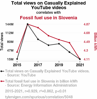
Total views on Casually Explained YouTube videosDetailed data title: Total views on Casually Explained YouTube videos.
Source: YouTube
Additional Info: Current total views of videos released that year.
See what else correlates with Total views on Casually Explained YouTube videos
Fossil fuel use in Slovenia
Detailed data title: Total fossil fuel use in Slovenia in billion kWh
Source: Energy Information Administration
See what else correlates with Fossil fuel use in Slovenia
Correlation is a measure of how much the variables move together. If it is 0.99, when one goes up the other goes up. If it is 0.02, the connection is very weak or non-existent. If it is -0.99, then when one goes up the other goes down. If it is 1.00, you probably messed up your correlation function.
r2 = 0.8622914 (Coefficient of determination)
This means 86.2% of the change in the one variable (i.e., Fossil fuel use in Slovenia) is predictable based on the change in the other (i.e., Total views on Casually Explained YouTube videos) over the 7 years from 2015 through 2021.
p < 0.01, which is statistically significant(Null hypothesis significance test)
The p-value is 0.0025. 0.0025172980660137243000000000
The p-value is a measure of how probable it is that we would randomly find a result this extreme. More specifically the p-value is a measure of how probable it is that we would randomly find a result this extreme if we had only tested one pair of variables one time.
But I am a p-villain. I absolutely did not test only one pair of variables one time. I correlated hundreds of millions of pairs of variables. I threw boatloads of data into an industrial-sized blender to find this correlation.
Who is going to stop me? p-value reporting doesn't require me to report how many calculations I had to go through in order to find a low p-value!
On average, you will find a correaltion as strong as 0.93 in 0.25% of random cases. Said differently, if you correlated 397 random variables Which I absolutely did.
with the same 6 degrees of freedom, Degrees of freedom is a measure of how many free components we are testing. In this case it is 6 because we have two variables measured over a period of 7 years. It's just the number of years minus ( the number of variables minus one ), which in this case simplifies to the number of years minus one.
you would randomly expect to find a correlation as strong as this one.
[ 0.58, 0.99 ] 95% correlation confidence interval (using the Fisher z-transformation)
The confidence interval is an estimate the range of the value of the correlation coefficient, using the correlation itself as an input. The values are meant to be the low and high end of the correlation coefficient with 95% confidence.
This one is a bit more complciated than the other calculations, but I include it because many people have been pushing for confidence intervals instead of p-value calculations (for example: NEJM. However, if you are dredging data, you can reliably find yourself in the 5%. That's my goal!
All values for the years included above: If I were being very sneaky, I could trim years from the beginning or end of the datasets to increase the correlation on some pairs of variables. I don't do that because there are already plenty of correlations in my database without monkeying with the years.
Still, sometimes one of the variables has more years of data available than the other. This page only shows the overlapping years. To see all the years, click on "See what else correlates with..." link above.
| 2015 | 2016 | 2017 | 2018 | 2019 | 2020 | 2021 | |
| Total views on Casually Explained YouTube videos (Total views) | 16086000 | 143750000 | 87977500 | 66478100 | 71876100 | 41158000 | 15404600 |
| Fossil fuel use in Slovenia (Billion kWh) | 4.26637 | 4.86986 | 4.79345 | 4.61995 | 4.5346 | 4.46863 | 4.11444 |
Why this works
- Data dredging: I have 25,153 variables in my database. I compare all these variables against each other to find ones that randomly match up. That's 632,673,409 correlation calculations! This is called “data dredging.” Instead of starting with a hypothesis and testing it, I instead abused the data to see what correlations shake out. It’s a dangerous way to go about analysis, because any sufficiently large dataset will yield strong correlations completely at random.
- Lack of causal connection: There is probably
Because these pages are automatically generated, it's possible that the two variables you are viewing are in fact causually related. I take steps to prevent the obvious ones from showing on the site (I don't let data about the weather in one city correlate with the weather in a neighboring city, for example), but sometimes they still pop up. If they are related, cool! You found a loophole.
no direct connection between these variables, despite what the AI says above. This is exacerbated by the fact that I used "Years" as the base variable. Lots of things happen in a year that are not related to each other! Most studies would use something like "one person" in stead of "one year" to be the "thing" studied. - Observations not independent: For many variables, sequential years are not independent of each other. If a population of people is continuously doing something every day, there is no reason to think they would suddenly change how they are doing that thing on January 1. A simple
Personally I don't find any p-value calculation to be 'simple,' but you know what I mean.
p-value calculation does not take this into account, so mathematically it appears less probable than it really is. - Very low n: There are not many data points included in this analysis. Even if the p-value is high, we should be suspicious of using so few datapoints in a correlation.
- Y-axis doesn't start at zero: I truncated the Y-axes of the graph above. I also used a line graph, which makes the visual connection stand out more than it deserves.
Nothing against line graphs. They are great at telling a story when you have linear data! But visually it is deceptive because the only data is at the points on the graph, not the lines on the graph. In between each point, the data could have been doing anything. Like going for a random walk by itself!
Mathematically what I showed is true, but it is intentionally misleading. Below is the same chart but with both Y-axes starting at zero.

Try it yourself
You can calculate the values on this page on your own! Try running the Python code to see the calculation results. Step 1: Download and install Python on your computer.Step 2: Open a plaintext editor like Notepad and paste the code below into it.
Step 3: Save the file as "calculate_correlation.py" in a place you will remember, like your desktop. Copy the file location to your clipboard. On Windows, you can right-click the file and click "Properties," and then copy what comes after "Location:" As an example, on my computer the location is "C:\Users\tyler\Desktop"
Step 4: Open a command line window. For example, by pressing start and typing "cmd" and them pressing enter.
Step 5: Install the required modules by typing "pip install numpy", then pressing enter, then typing "pip install scipy", then pressing enter.
Step 6: Navigate to the location where you saved the Python file by using the "cd" command. For example, I would type "cd C:\Users\tyler\Desktop" and push enter.
Step 7: Run the Python script by typing "python calculate_correlation.py"
If you run into any issues, I suggest asking ChatGPT to walk you through installing Python and running the code below on your system. Try this question:
"Walk me through installing Python on my computer to run a script that uses scipy and numpy. Go step-by-step and ask me to confirm before moving on. Start by asking me questions about my operating system so that you know how to proceed. Assume I want the simplest installation with the latest version of Python and that I do not currently have any of the necessary elements installed. Remember to only give me one step per response and confirm I have done it before proceeding."
# These modules make it easier to perform the calculation
import numpy as np
from scipy import stats

# We'll define a function that we can call to return the correlation calculations
def calculate_correlation(array1, array2):

    # Calculate Pearson correlation coefficient and p-value
    correlation, p_value = stats.pearsonr(array1, array2)

    # Calculate R-squared as the square of the correlation coefficient
    r_squared = correlation**2

    return correlation, r_squared, p_value

# These are the arrays for the variables shown on this page, but you can modify them to be any two sets of numbers
array_1 = np.array([16086000,143750000,87977500,66478100,71876100,41158000,15404600,])
array_2 = np.array([4.26637,4.86986,4.79345,4.61995,4.5346,4.46863,4.11444,])
array_1_name = "Total views on Casually Explained YouTube videos"
array_2_name = "Fossil fuel use in Slovenia"

# Perform the calculation
print(f"Calculating the correlation between {array_1_name} and {array_2_name}...")
correlation, r_squared, p_value = calculate_correlation(array_1, array_2)

# Print the results
print("Correlation Coefficient:", correlation)
print("R-squared:", r_squared)
print("P-value:", p_value)
Reuseable content
You may re-use the images on this page for any purpose, even commercial purposes, without asking for permission. The only requirement is that you attribute Tyler Vigen. Attribution can take many different forms. If you leave the "tylervigen.com" link in the image, that satisfies it just fine. If you remove it and move it to a footnote, that's fine too. You can also just write "Charts courtesy of Tyler Vigen" at the bottom of an article.You do not need to attribute "the spurious correlations website," and you don't even need to link here if you don't want to. I don't gain anything from pageviews. There are no ads on this site, there is nothing for sale, and I am not for hire.
For the record, I am just one person. Tyler Vigen, he/him/his. I do have degrees, but they should not go after my name unless you want to annoy my wife. If that is your goal, then go ahead and cite me as "Tyler Vigen, A.A. A.A.S. B.A. J.D." Otherwise it is just "Tyler Vigen."
When spoken, my last name is pronounced "vegan," like I don't eat meat.
Full license details.
For more on re-use permissions, or to get a signed release form, see tylervigen.com/permission.
Download images for these variables:
- High resolution line chart
The image linked here is a Scalable Vector Graphic (SVG). It is the highest resolution that is possible to achieve. It scales up beyond the size of the observable universe without pixelating. You do not need to email me asking if I have a higher resolution image. I do not. The physical limitations of our universe prevent me from providing you with an image that is any higher resolution than this one.
If you insert it into a PowerPoint presentation (a tool well-known for managing things that are the scale of the universe), you can right-click > "Ungroup" or "Create Shape" and then edit the lines and text directly. You can also change the colors this way.
Alternatively you can use a tool like Inkscape. - High resolution line chart, optimized for mobile
- Alternative high resolution line chart
- Scatterplot
- Portable line chart (png)
- Portable line chart (png), optimized for mobile
- Line chart for only Total views on Casually Explained YouTube videos
- Line chart for only Fossil fuel use in Slovenia
- AI-generated correlation image
- The spurious research paper: From Views to Fuel: The Casually Explained Correlation Between YouTube Engagement and Fossil Fuel Use in Slovenia
You're the correlation whisperer we needed!
Correlation ID: 5048 · Black Variable ID: 25885 · Red Variable ID: 23972

