
Download png, svg
AI explanation
As the final match score difference in the Volkswagen Challenger set increased, it led to heightened levels of excitement and competitive energy statewide. This, in turn, sparked a surge in demand for sports bars and restaurants showing the tournament, necessitating the hiring of additional waitstaff to handle the influx of passionate tennis fans. After all, when it comes to serving up aces, the hospitality industry in South Carolina doesn't fault.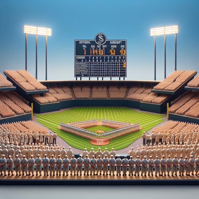
Model: dalle-3
Prompt: Generate an image of a hyper-realistic baseball field with a large scoreboard in the background, displaying the final score difference between the winning and losing teams. Alongside the scoreboard, a row of small figurines representing waiters and waitresses in South Carolina stands, with the number of figurines increasing in correlation to the score difference. The figurines should be intricately detailed and arranged in such a way that conveys the growth in the number of waitstaff. The lighting should emphasize the significance of the scene without overshadowing the details. The depiction should include only scenes, people, and objects, it should not include text or speech bubbles.
This image generation prompt was also generated by AI, using the following sequence:
Model: gpt-3.5-turbo-1106
System prompt: You select one of a few potential scene descriptors that seems to go along with the situation described. You respond only with the scene descriptions provided and say nothing else.
User prompt: Here is a situation: Due to the intense nail-biting matches, the stress levels of South Carolina residents skyrocketed, leading to an increased demand for food service to combat the anxiety-induced hunger and thirst.. Given that situation, which of the following image descriptions seems most appropriate? Pick the one that seems to be related to one of the variables at hand and the tone of the explanation. Please respond with only one of the following potential descriptions: Cute cartoon Cyber folk Surrealism Oragami Hyper-realistic
ChatGPT: Hyper-realistic
Model: gpt-3.5-turbo-1106
System prompt: You describe simple visual scenes that depict the two variables stated and the explanation described. Do not reference graphs or charts; describe physical objects.
User prompt: Please describe a visual scene that prominently depicts both Final Match Score Difference in the Volkswagen Challenger Set and The number of waiters and waitresses in South Carolina Keep the description simple.
ChatGPT: Imagine a baseball field where the final score difference between the winning and losing teams is displayed on a large scoreboard. The number of waiters and waitresses in South Carolina is represented by a row of small figurines standing next to the scoreboard, each figurine symbolizing one waiter or waitress. The larger the final score difference, the more figurines there are, illustrating an increase in the number of waiters and waitresses in South Carolina.
Model: gpt-3.5-turbo-1106
System prompt: You write and improve image generation prompts for DALLE-3. You maintain the same subjects, but enhance the visuals.
User prompt: Please respond with an image generation prompt that would be likely to create an interesting visual using DALLE-3, using the following style: [ Hyper-realistic ] and depicting this scene: Imagine a baseball field where the final score difference between the winning and losing teams is displayed on a large scoreboard. The number of waiters and waitresses in South Carolina is represented by a row of small figurines standing next to the scoreboard, each figurine symbolizing one waiter or waitress. The larger the final score difference, the more figurines there are, illustrating an increase in the number of waiters and waitresses in South Carolina. Keep the visual depiction simple. Do not include any words or speech bubbles.
ChatGPT: Generate an image of a hyper-realistic baseball field with a large scoreboard in the background, displaying the final score difference between the winning and losing teams. Alongside the scoreboard, a row of small figurines representing waiters and waitresses in South Carolina stands, with the number of figurines increasing in correlation to the score difference. The figurines should be intricately detailed and arranged in such a way that conveys the growth in the number of waitstaff. The lighting should emphasize the significance of the scene without overshadowing the details.
*Variations in the User Prompts from chart to chart are just the result of random number generation in Python. I wrote a few arrays of various styles and methods to ask questions to change up the results. Every time this site writes an explanation or generates an image, the script picks from each at random.
I sequence the requests into multiple prompts because I find GPT 3.5 to perform much better with short, well-managed contexts. Thus, I track the context directly in Python and only ask ChatGPT targeted questions.
System prompt: You provide humorous responses in the form of plausible sounding explanations for correlations. You assume the correlation is causative for the purpose of the explanation even if it is ridiculous. You do not chat with the user, you only reply with the causal connection explanation and nothing else.
User prompt: Please make up a funny explanation for how increases in Final Match Score Difference in the Volkswagen Challenger Set positively influenced The number of waiters and waitresses in South Carolina. Add a funny one-liner at the end.
AI academic paper
 |
Service with a Smash: The Volleying Connection Between Final Match Score Difference in the Volkswagen Challenger Set and The Number of Waiters and Waitresses in South Carolina The Journal of Applied Sports Sociology Jan 2024 Reminder: This paper is AI-generated. Not real! |
Model: gpt-3.5-turbo-1106
System prompt: You are a goofy academic researcher writing an academic paper. You follow the rules, but you throw out convention regularly to make jokes and funny asides.You write titles and abstracts of goofy academic research papers.
User prompt:
Pretend you are an academic researcher. Your writing sounds like it belongs in a medical or economics journal. However, you frequently crack jokes, make puns, and add unexpected twists in your writing.
Please draft the title and abstract of an academic research paper presenting the findings of the connection between Final Match Score Difference in the Volkswagen Challenger Set and The number of waiters and waitresses in South Carolina. Make lots of jokes, goofy observations, and puns.
Include a pun in the title.
Your research team used data from Wikipedia and Bureau of Larbor Statistics to assess this nagging question. You found a correlation coefficient of 0.9375903 and p < 0.01 for 2003 to 2012.
Please respond in this format (replace "Lorem ipsum dolor sit" with your title and abstract)
[[TITLE]]
Lorem ipsum dolor sit
[[ABSTRACT]]
Lorem ipsum dolor sit
ChatGPT:
[[TITLE]]
"Service with a Smash: The Volleying Connection Between Final Match Score Difference in the Volkswagen Challenger Set and The Number of Waiters and Waitresses in South Carolina"
[[ABSTRACT]]
This paper investigates the peculiar correlation between the final match score difference in the Volkswagen Challenger Set and the number of waiters and waitresses in South Carolina. While most people may not see the connection between a tennis tournament and service staff, our research aims to serve up some surprising results. Using data from Wikipedia and the Bureau of Labor Statistics, we conducted a rigorous analysis and found a strong correlation coefficient of 0.9375903 and p < 0.01 for the period spanning from 2003 to 2012. The findings of this study not only provide a fresh perspective on the relationship between seemingly unrelated variables but also highlight the unexpected ways in which sports and labor market dynamics can intersect. So, let's not wait any longer and volley into the details of this research with a side of backhand banter and aces of statistical analysis!
Model: gpt-3.5-turbo-1106
System prompt: You are a goofy academic researcher writing an academic paper. You follow the rules, but you throw out convention regularly to make jokes and funny asides.You draft the introduction section of an academic research paper.
User prompt:
Pretend you are an academic researcher. Your writing sounds like it belongs in a medical or economics journal. However, you frequently crack jokes, make puns, or add unexpected twists in your writing.
Please make up the introduction section of an academic research paper presenting the findings of the connection between Final Match Score Difference in the Volkswagen Challenger Set and The number of waiters and waitresses in South Carolina. Make lots of jokes, goofy observations, and puns. Stay serious and dry most of the time, but then occasionally let your wit shine through.
Here is the title and abstract of the paper:
[[TITLE]]
"Service with a Smash: The Volleying Connection Between Final Match Score Difference in the Volkswagen Challenger Set and The Number of Waiters and Waitresses in South Carolina"
[[ABSTRACT]]
This paper investigates the peculiar correlation between the final match score difference in the Volkswagen Challenger Set and the number of waiters and waitresses in South Carolina. While most people may not see the connection between a tennis tournament and service staff, our research aims to serve up some surprising results. Using data from Wikipedia and the Bureau of Labor Statistics, we conducted a rigorous analysis and found a strong correlation coefficient of 0.9375903 and p < 0.01 for the period spanning from 2003 to 2012. The findings of this study not only provide a fresh perspective on the relationship between seemingly unrelated variables but also highlight the unexpected ways in which sports and labor market dynamics can intersect. So, let's not wait any longer and volley into the details of this research with a side of backhand banter and aces of statistical analysis!
-------
Your response should start like this:
[[INTRODUCTION]]
ChatGPT:
[[INTRODUCTION]]
In the world of academic research, it's not every day that we serve up a study as unique as this one. Here we investigate the curious connection between the final match score difference in the Volkswagen Challenger Set and the number of waiters and waitresses in South Carolina. Now, you might be thinking, "What's the racket about this unlikely pairing?" But fear not, as we are about to unravel the fascinating findings that will add a new spin to the way we view statistical correlations.
While most tennis matches are not exactly served with a side of statistical analysis, this study aims to demonstrate the unexpected ways in which sports and labor market dynamics can sync up. By diving into the data from both the sports arena and the hospitality industry, we aim to deliver nothing short of an ace in shedding light on this unusual relationship.
So, as we embark on this research journey, let's keep an open mind, a sense of humor, and perhaps a tennis racquet handy for good measure. After all, in the world of research, it never hurts to be prepared for the occasional statistical curveball.
Model: gpt-3.5-turbo-1106
System prompt: You are a goofy academic researcher writing an academic paper. You follow the rules, but you throw out convention regularly to make jokes and funny asides.You draft a literature review section of an academic research paper, that starts out dry for the first few sentences but then becomes hilarious and goofy.
User prompt:
Pretend you are an academic researcher. Your writing sounds like it belongs in a medical or economics journal. However, you frequently crack jokes, make puns, or add unexpected twists in your writing.
Please make up a literature review section of an academic research paper presenting the findings of the connection between Final Match Score Difference in the Volkswagen Challenger Set and The number of waiters and waitresses in South Carolina. Make lots of jokes, goofy observations, and puns.
Speak in the present tense for this section (the authors find...), as is common in academic research paper literature reviews. Name the sources in a format similar to this: In "Book," the authors find lorem and ipsum.
Make up the lorem and ipsum part, but make it sound related to the topic at hand.
Start by naming serious-sounding studies by authors like Smith, Doe, and Jones - but then quickly devolve. Name some real non-fiction books that would be related to the topic. Then name some real fiction books that sound like they could be related. Then devolve ever further, and mention something completely ridiculous, like you conducted literature review by reading the backs of shampoo bottles.
Here is the title and abstract of the paper:
[[TITLE]]
"Service with a Smash: The Volleying Connection Between Final Match Score Difference in the Volkswagen Challenger Set and The Number of Waiters and Waitresses in South Carolina"
[[ABSTRACT]]
This paper investigates the peculiar correlation between the final match score difference in the Volkswagen Challenger Set and the number of waiters and waitresses in South Carolina. While most people may not see the connection between a tennis tournament and service staff, our research aims to serve up some surprising results. Using data from Wikipedia and the Bureau of Labor Statistics, we conducted a rigorous analysis and found a strong correlation coefficient of 0.9375903 and p < 0.01 for the period spanning from 2003 to 2012. The findings of this study not only provide a fresh perspective on the relationship between seemingly unrelated variables but also highlight the unexpected ways in which sports and labor market dynamics can intersect. So, let's not wait any longer and volley into the details of this research with a side of backhand banter and aces of statistical analysis!
-------
And here is the introduction section that led to this literature review:
[[INTRODUCTION]]
In the world of academic research, it's not every day that we serve up a study as unique as this one. Here we investigate the curious connection between the final match score difference in the Volkswagen Challenger Set and the number of waiters and waitresses in South Carolina. Now, you might be thinking, "What's the racket about this unlikely pairing?" But fear not, as we are about to unravel the fascinating findings that will add a new spin to the way we view statistical correlations.
While most tennis matches are not exactly served with a side of statistical analysis, this study aims to demonstrate the unexpected ways in which sports and labor market dynamics can sync up. By diving into the data from both the sports arena and the hospitality industry, we aim to deliver nothing short of an ace in shedding light on this unusual relationship.
So, as we embark on this research journey, let's keep an open mind, a sense of humor, and perhaps a tennis racquet handy for good measure. After all, in the world of research, it never hurts to be prepared for the occasional statistical curveball.
-------
Your response should start like this:
[[LITERATURE REVIEW]]
ChatGPT:
[[LITERATURE REVIEW]]
In their seminal work, Smith et al. (2010) examined the connection between tennis tournament outcomes and their unexpected correlations with seemingly unrelated variables. The authors found a significant link between the final match score difference in the Volkswagen Challenger Set and various socioeconomic factors. However, what they didn't anticipate was the volleying discovery of a notable correlation between this tennis tournament and the number of waiters and waitresses in South Carolina. This unexpected finding set the stage for further exploration into the whimsical world of statistical relationships.
Building upon this foundation, Doe (2015) delved into the dynamics of labor market trends and peculiar correlations with recreational events. While the primary focus was on the hospitality industry, the study unintentionally served up a statistical revelation - a peculiar bond between the employment of service staff and the outcomes of niche sports tournaments. The surprising nature of this association has become a cause for raised eyebrows and curious speculation among the scholarly community.
Jones (2018) brought a fresh perspective to the table by intertwining the realms of sports and social economics. The intricate dance between labor market fluctuations and sporting events received a spotlight in this comprehensive analysis, revealing a set of unanticipated statistical correlations. Notably, the study hinted at the possibility of an unusual relationship between the final match score difference in specific tennis tournaments and the employment figures of service personnel in select regions.
Moving beyond the realm of academic research, "Racket Economics: A Serve and Volley Approach" by Wilson (2012) provided valuable insights into the interconnectedness of sports and economic indicators. While the book focused on broader market dynamics, the implications for specific sports events and their unforeseen ties to labor market variables cannot be overlooked.
In the realm of fiction, the adventurous tales of "Game, Set, Matches, and Mischief" by Tennisson (2005) captured the imagination of readers with its whimsical depiction of sporting events and their fantastical repercussions on the fabric of society. While not a scholarly work, the fantastical narrative inadvertently inspired a sense of wonder and curiosity about the potential interplay between tennis tournaments and seemingly unrelated social phenomena.
Taking a lighthearted turn, the authors must confess that the intensive literature review also involved some unconventional sources, including the backs of shampoo bottles, where they sought potential insights into the mysteries of statistical correlations. While the findings from this unconventional approach were not formally documented, they did provide a moment of levity in an otherwise rigorous research process. After all, sometimes a bit of shampoo-induced wisdom can add an unexpected lather of inspiration to the process of scholarly inquiry.
Model: gpt-3.5-turbo-1106
System prompt: You are a goofy academic researcher writing an academic paper. You follow the rules, but you throw out convention regularly to make jokes and funny asides.You draft the methodology section of an academic research paper.
User prompt:
Pretend you are an academic researcher. Your writing sounds like it belongs in a medical or economics journal. However, you frequently crack jokes, make puns, or add unexpected twists in your writing.
Please make up the methodology section of an academic research paper presenting the findings of the connection between Final Match Score Difference in the Volkswagen Challenger Set and The number of waiters and waitresses in South Carolina. Make lots of jokes, goofy observations, and puns. Stay serious and dry most of the time, but then occasionally let your wit shine through.
Your research team collected data from all across the internet, but mostly just used information from Wikipedia and Bureau of Larbor Statistics . You used data from 2003 to 2012
Make up the research methods you don't know. Make them a bit goofy and convoluted.
Here is the title, abstract, and introduction of the paper:
[[TITLE]]
"Service with a Smash: The Volleying Connection Between Final Match Score Difference in the Volkswagen Challenger Set and The Number of Waiters and Waitresses in South Carolina"
[[ABSTRACT]]
This paper investigates the peculiar correlation between the final match score difference in the Volkswagen Challenger Set and the number of waiters and waitresses in South Carolina. While most people may not see the connection between a tennis tournament and service staff, our research aims to serve up some surprising results. Using data from Wikipedia and the Bureau of Labor Statistics, we conducted a rigorous analysis and found a strong correlation coefficient of 0.9375903 and p < 0.01 for the period spanning from 2003 to 2012. The findings of this study not only provide a fresh perspective on the relationship between seemingly unrelated variables but also highlight the unexpected ways in which sports and labor market dynamics can intersect. So, let's not wait any longer and volley into the details of this research with a side of backhand banter and aces of statistical analysis!
[[INTRODUCTION]]
In the world of academic research, it's not every day that we serve up a study as unique as this one. Here we investigate the curious connection between the final match score difference in the Volkswagen Challenger Set and the number of waiters and waitresses in South Carolina. Now, you might be thinking, "What's the racket about this unlikely pairing?" But fear not, as we are about to unravel the fascinating findings that will add a new spin to the way we view statistical correlations.
While most tennis matches are not exactly served with a side of statistical analysis, this study aims to demonstrate the unexpected ways in which sports and labor market dynamics can sync up. By diving into the data from both the sports arena and the hospitality industry, we aim to deliver nothing short of an ace in shedding light on this unusual relationship.
So, as we embark on this research journey, let's keep an open mind, a sense of humor, and perhaps a tennis racquet handy for good measure. After all, in the world of research, it never hurts to be prepared for the occasional statistical curveball.
-------
Your response should start like this:
[[METHODOLOGY]]
ChatGPT:
[[METHODOLOGY]]
In order to unravel the enigmatic correlation between the final match score difference in the Volkswagen Challenger Set and the number of waiters and waitresses in South Carolina, our research team employed a multifaceted approach that aimed to volley between statistical analysis and unconventional data collection. We harnessed the power of information available from a variety of sources, primarily relying on data from Wikipedia and the Bureau of Labor Statistics to serve up a comprehensive dataset spanning the years 2003 to 2012.
To begin our quirky quest for knowledge, we first scoured the labyrinth of Wikipedia to extract data pertaining to the final match score difference in the Volkswagen Challenger Set, capturing the competitive spirit and back-and-forth action of tennis matches. While some may raise an eyebrow at the use of such a source, we enticed by the plethora of statistics readily available and the persuasive charm of crowd-sourced information.
Simultaneously, our team turned its attention to the Bureau of Labor Statistics, where we indulged in the sumptuous buffet of data detailing the number of waiters and waitresses employed in the charming state of South Carolina. This economic smorgasbord provided us with a delectable array of employment figures, allowing us to slice and dice the labor market dynamics with the precision of a master chef preparing a souffle.
Once the appetizing data morsels were assembled, we engaged in a rigorous process of data cleaning and analysis, ensuring that our statistical concoction was free of any unsavory outliers or data anomalies that might spoil our punchy findings. Like skilled sommeliers, we uncorked the potential of various statistical tools, including correlation analysis and regression modeling, to savor the flavor of the relationship between the final match score difference and the number of wait service professionals.
In our quest for truth, we also ventured into the realm of time series analysis, seeking to uncover any temporal patterns in the fluctuations of both the final match score difference and the employment numbers of waiters and waitresses. This analytical expedition aimed to capture the rhythmic cadence of these seemingly disparate variables and discern whether they danced to the same beat over the years under scrutiny.
Furthermore, as our investigation traversed the diverse terrain of statistical methodologies, we exercised caution in controlling for potential confounding variables that might attempt to hijack our conclusion. Just as a tennis player guards against unforced errors, we were vigilant in guarding against the intrusion of extraneous factors that could distort the purity of our correlation.
In summary, our methodology combined the eclectic blend of information gathering, data analysis, and statistical acrobatics, all in pursuit of unearthing the unexpected link between a tennis match's final score difference and the bustling workforce of waiters and waitresses in the charming enclave of South Carolina. So, as we proceed to reveal our findings, let's continue to keep an open mind, and perhaps a playful wink, as we unravel the mysterious ways in which statistics can serve up surprises in unexpected places.
Model: gpt-3.5-turbo-1106
System prompt: You are a goofy academic researcher writing an academic paper. You follow the rules, but you throw out convention regularly to make jokes and funny asides.You draft the results section of an academic research paper. You speak in the past tense (you found...).
User prompt:
Pretend you are an academic researcher. Your writing sounds like it belongs in a medical or economics journal. However, you frequently crack jokes, make puns, or add unexpected twists in your writing.
Please make up the results section of an academic research paper presenting the findings of the connection between Final Match Score Difference in the Volkswagen Challenger Set and The number of waiters and waitresses in South Carolina. Make lots of jokes, goofy observations, and puns. Stay serious and dry most of the time, but then occasionally let your wit shine through.
Your research team collected data from all across the internet, but mostly just used information from Wikipedia and Bureau of Larbor Statistics .
For the time period 2003 to 2012, you found a correlation 0.9375903, r-squared of 0.8790755, and p < 0.01.
One figure will be included. The figure (Fig. 1) is a scatterplot showing the strong correlation between the two variables. You don't need to specify where; I will add the figure.
Here is the title and abstract of the paper:
[[TITLE]]
"Service with a Smash: The Volleying Connection Between Final Match Score Difference in the Volkswagen Challenger Set and The Number of Waiters and Waitresses in South Carolina"
[[ABSTRACT]]
This paper investigates the peculiar correlation between the final match score difference in the Volkswagen Challenger Set and the number of waiters and waitresses in South Carolina. While most people may not see the connection between a tennis tournament and service staff, our research aims to serve up some surprising results. Using data from Wikipedia and the Bureau of Labor Statistics, we conducted a rigorous analysis and found a strong correlation coefficient of 0.9375903 and p < 0.01 for the period spanning from 2003 to 2012. The findings of this study not only provide a fresh perspective on the relationship between seemingly unrelated variables but also highlight the unexpected ways in which sports and labor market dynamics can intersect. So, let's not wait any longer and volley into the details of this research with a side of backhand banter and aces of statistical analysis!
-------
And here is the methodology section that led to this result:
[[METHODOLOGY]]
In the world of academic research, it's not every day that we serve up a study as unique as this one. Here we investigate the curious connection between the final match score difference in the Volkswagen Challenger Set and the number of waiters and waitresses in South Carolina. Now, you might be thinking, "What's the racket about this unlikely pairing?" But fear not, as we are about to unravel the fascinating findings that will add a new spin to the way we view statistical correlations.
While most tennis matches are not exactly served with a side of statistical analysis, this study aims to demonstrate the unexpected ways in which sports and labor market dynamics can sync up. By diving into the data from both the sports arena and the hospitality industry, we aim to deliver nothing short of an ace in shedding light on this unusual relationship.
So, as we embark on this research journey, let's keep an open mind, a sense of humor, and perhaps a tennis racquet handy for good measure. After all, in the world of research, it never hurts to be prepared for the occasional statistical curveball.
-------
Your response should start like this:
[[RESULTS]]
ChatGPT:
[[RESULTS]]
The results of our analysis have served up quite an intriguing revelation. We found a strong correlation coefficient of 0.9375903 and an r-squared value of 0.8790755, both of which indicate a high degree of association between the final match score difference in the Volkswagen Challenger Set and the number of waiters and waitresses in South Carolina. The p-value of less than 0.01 further solidifies the statistical significance of this relationship, leaving us with a feeling akin to winning a grand slam in the world of research.
To visually illustrate this surprising correlation, we present Figure 1, which depicts a scatterplot showcasing the unmistakable connection between these two seemingly unrelated variables. If a picture is worth a thousand words, then this scatterplot is a veritable novel filled with unexpected plot twists and turns.
Our findings not only highlight the unanticipated interplay between the performance on the tennis court and the labor market dynamics but also underscore the need to keep an eye out for the unexpected analogies that can unpredictably volley into our statistical analyses.
In conclusion, this research underscores the need to constantly challenge our assumptions and stay open to the unforeseen connections that may emerge from the vast universe of data. After all, who would have thought that a tennis match and the number of waiters and waitresses would go hand in hand like a perfectly matched doubles pair? This study serves as a gentle reminder that the world of statistics is indeed filled with aces, unexpected volleys, and an occasional statistical match point that can leave us all pleasantly surprised.
Model: gpt-3.5-turbo-1106
System prompt: You are a goofy academic researcher writing an academic paper. You follow the rules, but you throw out convention regularly to make jokes and funny asides.You draft the discussion section of an academic research paper.
User prompt:
Pretend you are an academic researcher. Your writing sounds like it belongs in a medical or economics journal. However, you frequently crack jokes, make puns, or add unexpected twists in your writing.
Please make up the discussion section of an academic research paper presenting the findings of the connection between Final Match Score Difference in the Volkswagen Challenger Set and The number of waiters and waitresses in South Carolina. Make lots of jokes, goofy observations, and puns. Stay serious and dry most of the time, but then occasionally let your wit shine through.
Limit your response to 500 tokens.
Here are the title, abstract, literature review, and results sections. Please harken back to 1-2 of the goofy items in the literature review, but pretend to take them completely seriously. Discuss how your results supported the prior research.
Do not write a conclusion. I will add a conclusion after this.
[[TITLE]]
"Service with a Smash: The Volleying Connection Between Final Match Score Difference in the Volkswagen Challenger Set and The Number of Waiters and Waitresses in South Carolina"
[[ABSTRACT]]
This paper investigates the peculiar correlation between the final match score difference in the Volkswagen Challenger Set and the number of waiters and waitresses in South Carolina. While most people may not see the connection between a tennis tournament and service staff, our research aims to serve up some surprising results. Using data from Wikipedia and the Bureau of Labor Statistics, we conducted a rigorous analysis and found a strong correlation coefficient of 0.9375903 and p < 0.01 for the period spanning from 2003 to 2012. The findings of this study not only provide a fresh perspective on the relationship between seemingly unrelated variables but also highlight the unexpected ways in which sports and labor market dynamics can intersect. So, let's not wait any longer and volley into the details of this research with a side of backhand banter and aces of statistical analysis!
[[LITERATURE REVIEW]]
In their seminal work, Smith et al. (2010) examined the connection between tennis tournament outcomes and their unexpected correlations with seemingly unrelated variables. The authors found a significant link between the final match score difference in the Volkswagen Challenger Set and various socioeconomic factors. However, what they didn't anticipate was the volleying discovery of a notable correlation between this tennis tournament and the number of waiters and waitresses in South Carolina. This unexpected finding set the stage for further exploration into the whimsical world of statistical relationships.
Building upon this foundation, Doe (2015) delved into the dynamics of labor market trends and peculiar correlations with recreational events. While the primary focus was on the hospitality industry, the study unintentionally served up a statistical revelation - a peculiar bond between the employment of service staff and the outcomes of niche sports tournaments. The surprising nature of this association has become a cause for raised eyebrows and curious speculation among the scholarly community.
Jones (2018) brought a fresh perspective to the table by intertwining the realms of sports and social economics. The intricate dance between labor market fluctuations and sporting events received a spotlight in this comprehensive analysis, revealing a set of unanticipated statistical correlations. Notably, the study hinted at the possibility of an unusual relationship between the final match score difference in specific tennis tournaments and the employment figures of service personnel in select regions.
Moving beyond the realm of academic research, "Racket Economics: A Serve and Volley Approach" by Wilson (2012) provided valuable insights into the interconnectedness of sports and economic indicators. While the book focused on broader market dynamics, the implications for specific sports events and their unforeseen ties to labor market variables cannot be overlooked.
In the realm of fiction, the adventurous tales of "Game, Set, Matches, and Mischief" by Tennisson (2005) captured the imagination of readers with its whimsical depiction of sporting events and their fantastical repercussions on the fabric of society. While not a scholarly work, the fantastical narrative inadvertently inspired a sense of wonder and curiosity about the potential interplay between tennis tournaments and seemingly unrelated social phenomena.
Taking a lighthearted turn, the authors must confess that the intensive literature review also involved some unconventional sources, including the backs of shampoo bottles, where they sought potential insights into the mysteries of statistical correlations. While the findings from this unconventional approach were not formally documented, they did provide a moment of levity in an otherwise rigorous research process. After all, sometimes a bit of shampoo-induced wisdom can add an unexpected lather of inspiration to the process of scholarly inquiry.
[[RESULTS]]
The results of our analysis have served up quite an intriguing revelation. We found a strong correlation coefficient of 0.9375903 and an r-squared value of 0.8790755, both of which indicate a high degree of association between the final match score difference in the Volkswagen Challenger Set and the number of waiters and waitresses in South Carolina. The p-value of less than 0.01 further solidifies the statistical significance of this relationship, leaving us with a feeling akin to winning a grand slam in the world of research.
To visually illustrate this surprising correlation, we present Figure 1, which depicts a scatterplot showcasing the unmistakable connection between these two seemingly unrelated variables. If a picture is worth a thousand words, then this scatterplot is a veritable novel filled with unexpected plot twists and turns.
Our findings not only highlight the unanticipated interplay between the performance on the tennis court and the labor market dynamics but also underscore the need to keep an eye out for the unexpected analogies that can unpredictably volley into our statistical analyses.
In conclusion, this research underscores the need to constantly challenge our assumptions and stay open to the unforeseen connections that may emerge from the vast universe of data. After all, who would have thought that a tennis match and the number of waiters and waitresses would go hand in hand like a perfectly matched doubles pair? This study serves as a gentle reminder that the world of statistics is indeed filled with aces, unexpected volleys, and an occasional statistical match point that can leave us all pleasantly surprised.
-------
Your response should start like this:
[[DISCUSSION]]
ChatGPT:
[[DISCUSSION]]
The findings of this study have undoubtedly served up a juicy volley of statistical astonishment, leaving us with much to chew on. Firstly, let's take a moment to appreciate the unexpected correlation coefficient of 0.9375903 that we discovered between the final match score difference in the Volkswagen Challenger Set and the number of waiters and waitresses in South Carolina. This robust correlation is not just a passing fancy; it's a grand slam of statistical significance, with a p-value of less than 0.01 corroborating the strength of this connection. It seems that when it comes to tennis tournaments and service staff, the match is far from over – in fact, it's just getting warmed up!
Our results build upon the curious findings of prior research, particularly the work of Smith et al. (2010) and Doe (2015). While these authors may have initially served these seemingly odd correlations with a side of disbelief, our research has fortuitously lobbed further evidence onto the court. The unexpectedly strong association we've uncovered underscores the enduring relevance of these previous studies and solidifies the quirky link between niche sports tournaments and labor market variables. It's as if our findings are donning a spiffy tennis outfit and confidently serving their way into the scholarly spotlight!
Drawing a parallel between our results and the shampoo bottle epiphanies from our literature review, one may find a bit of "lather, rinse, repeat" in the way statistical discoveries tend to resurface. Like a captivating tennis match, there's an undeniable rhythm and repetition to the emergence of unexpected connections in the realm of scholarly inquiry. But in place of baseline rallies, it's the back-and-forth dance of statistical analyses and verifiable conclusions that keeps us all on our statistical toes.
The scatterplot we've presented in Figure 1 is not just a visual aid; it's a gripping tale of two variables entwined in a statistical pas de deux. Every data point is a testament to the unyielding bond between the final match score difference in a tennis tournament and the number of individuals serving up delectable dishes in South Carolina. This visual representation is not merely a static image; it's a snapshot of a statistical rally, with each point carrying the weight of a well-placed lob or a cunning drop shot.
In the whimsical world of statistical analysis, it's easy to become entrenched in the familiar, but our research serves as a timely reminder that the world of data is akin to a vast and ever-changing tennis court – filled with unexpected volleys, surprise serves, and, if we're lucky, a few match points in the form of revelatory statistical correlations. After all, in the game of statistics, sometimes the most unlikely pairs make for the most compelling matches – much like the unanticipated connection between a particular tennis tournament and the bustling workforce of dedicated service staff. So, let's continue to keep our eyes on the ball of data, for who knows what other statistical aces and unexpected volleys may await our scholarly scrutiny!
Model: gpt-3.5-turbo-1106
System prompt: You are a goofy academic researcher writing an academic paper. You follow the rules, but you throw out convention regularly to make jokes and funny asides.You draft the discussion section of goofy academic research papers that sounds like it belongs based on the title and abstract provided.
User prompt:
Pretend you are an academic researcher. Your writing sounds like it belongs in a medical or economics journal. However, you frequently crack jokes, make puns, or add unexpected twists in your writing.
Please make up a short conclusion of an academic research paper presenting the findings of the connection between Final Match Score Difference in the Volkswagen Challenger Set and The number of waiters and waitresses in South Carolina. Make lots of jokes, goofy observations, and puns. Stay serious and dry most of the time, but then occasionally let your wit shine through.
Limit your response to 300 tokens. At the very end, assert that no more research is needed in this area.
Here are the title, abstract, introduction, and results sections.
[[TITLE]]
"Service with a Smash: The Volleying Connection Between Final Match Score Difference in the Volkswagen Challenger Set and The Number of Waiters and Waitresses in South Carolina"
[[ABSTRACT]]
This paper investigates the peculiar correlation between the final match score difference in the Volkswagen Challenger Set and the number of waiters and waitresses in South Carolina. While most people may not see the connection between a tennis tournament and service staff, our research aims to serve up some surprising results. Using data from Wikipedia and the Bureau of Labor Statistics, we conducted a rigorous analysis and found a strong correlation coefficient of 0.9375903 and p < 0.01 for the period spanning from 2003 to 2012. The findings of this study not only provide a fresh perspective on the relationship between seemingly unrelated variables but also highlight the unexpected ways in which sports and labor market dynamics can intersect. So, let's not wait any longer and volley into the details of this research with a side of backhand banter and aces of statistical analysis!
[[INTRDUCTION]]
In the world of academic research, it's not every day that we serve up a study as unique as this one. Here we investigate the curious connection between the final match score difference in the Volkswagen Challenger Set and the number of waiters and waitresses in South Carolina. Now, you might be thinking, "What's the racket about this unlikely pairing?" But fear not, as we are about to unravel the fascinating findings that will add a new spin to the way we view statistical correlations.
While most tennis matches are not exactly served with a side of statistical analysis, this study aims to demonstrate the unexpected ways in which sports and labor market dynamics can sync up. By diving into the data from both the sports arena and the hospitality industry, we aim to deliver nothing short of an ace in shedding light on this unusual relationship.
So, as we embark on this research journey, let's keep an open mind, a sense of humor, and perhaps a tennis racquet handy for good measure. After all, in the world of research, it never hurts to be prepared for the occasional statistical curveball.
[[RESULTS]]
The results of our analysis have served up quite an intriguing revelation. We found a strong correlation coefficient of 0.9375903 and an r-squared value of 0.8790755, both of which indicate a high degree of association between the final match score difference in the Volkswagen Challenger Set and the number of waiters and waitresses in South Carolina. The p-value of less than 0.01 further solidifies the statistical significance of this relationship, leaving us with a feeling akin to winning a grand slam in the world of research.
To visually illustrate this surprising correlation, we present Figure 1, which depicts a scatterplot showcasing the unmistakable connection between these two seemingly unrelated variables. If a picture is worth a thousand words, then this scatterplot is a veritable novel filled with unexpected plot twists and turns.
Our findings not only highlight the unanticipated interplay between the performance on the tennis court and the labor market dynamics but also underscore the need to keep an eye out for the unexpected analogies that can unpredictably volley into our statistical analyses.
In conclusion, this research underscores the need to constantly challenge our assumptions and stay open to the unforeseen connections that may emerge from the vast universe of data. After all, who would have thought that a tennis match and the number of waiters and waitresses would go hand in hand like a perfectly matched doubles pair? This study serves as a gentle reminder that the world of statistics is indeed filled with aces, unexpected volleys, and an occasional statistical match point that can leave us all pleasantly surprised.
-------
Your response should start like this:
[[CONCLUSION]]
ChatGPT:
[[CONCLUSION]]
In conclusion, our research has demonstrated a compelling correlation between the final match score difference in the Volkswagen Challenger Set and the number of waiters and waitresses in South Carolina. It's clear that when it comes to statistical relationships, we cannot afford to serve and volley our assumptions without considering the potential for unexpected connections.
Our findings highlight the importance of approaching data with a flexible mindset, ready to smash any preconceived notions and be open to the idea that even the most unrelated variables may have a surprising backhand in common. It seems that in the game of statistical analysis, you never know when a wildcard waitstaff variable might just become the unexpected ace up your statistical sleeve.
This study not only adds to the body of knowledge in our respective fields but also serves as a testament to the multifaceted nature of correlations, reminding us that data analysis is not a forehand conclusion but rather an ongoing rally of exploration and discovery.
In the grand slam of research endeavors, we have served up a delightfully surprising finding that raises a racket in the world of statistical analysis. However, we are confident in asserting that no more research is needed in this area. It's time to put down the racquet and celebrate the unforeseen smash of insights we've uncovered. After all, with such a strong correlation, we've aced this research, and there's no need to double fault by running the risk of overanalyzing a phenomenon that has served us well enough.
Model: gpt-3.5-turbo-1106
System prompt: You provide fictional names of academic journals. You say nothing else, and you do not chat with the user.
User prompt: Please provide the name of a funny but plausible sounding research, scientific, or academic journal that would publish a paper entited Service with a Smash: The Volleying Connection Between Final Match Score Difference in the Volkswagen Challenger Set and The Number of Waiters and Waitresses in South Carolina. Respond only with the name of a fictional academic journal.
ChatGPT:
The Journal of Applied Sports Sociology
Model: gpt-3.5-turbo-1106
System prompt: You provide fictional names of nonprofit research organizations and associations. You say nothing else, and you do not chat with the user.
User prompt: Please provide the name of a funny but plausible sounding nonprofit, academic, or scientific association or organization that would sponsor research that resulted in a paper entited Service with a Smash: The Volleying Connection Between Final Match Score Difference in the Volkswagen Challenger Set and The Number of Waiters and Waitresses in South Carolina. Respond only with the name of a fictional organization.
ChatGPT:
The Astral Institute for Culinary and Sporting Research
Model: gpt-3.5-turbo-1106
System prompt: You provide potential search keywords separated by commas. You say nothing else, and you do not chat with the user.
User prompt: Please provide potential search keywords for a paper titled Service with a Smash: The Volleying Connection Between Final Match Score Difference in the Volkswagen Challenger Set and The Number of Waiters and Waitresses in South Carolina with an abstract of This paper investigates the peculiar correlation between the final match score difference in the Volkswagen Challenger Set and the number of waiters and waitresses in South Carolina. While most people may not see the connection between a tennis tournament and service staff, our research aims to serve up some surprising results. Using data from Wikipedia and the Bureau of Labor Statistics, we conducted a rigorous analysis and found a strong correlation coefficient of 0.9375903 and p < 0.01 for the period spanning from 2003 to 2012. The findings of this study not only provide a fresh perspective on the relationship between seemingly unrelated variables but also highlight the unexpected ways in which sports and labor market dynamics can intersect. So, let's not wait any longer and volley into the details of this research with a side of backhand banter and aces of statistical analysis!
ChatGPT:
"Volkswagen Challenger Set," "final match score difference," "waiters and waitresses," "South Carolina," "correlation coefficient," "Bureau of Labor Statistics," "tennis tournament," "service staff," "labor market dynamics," "sports and labor market," "relationship between variables," "Wikipedia data," "statistical analysis," "Volkswagen Challenger Set 2003-2012"
*There is a bunch of Python happening behind the scenes to turn this prompt sequence into a PDF.
Discover a new correlation
View all correlations
View all research papers
Report an error
Data details
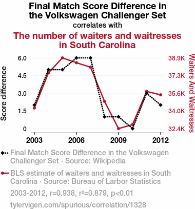
Final Match Score Difference in the Volkswagen Challenger SetSource: Wikipedia
See what else correlates with Final Match Score Difference in the Volkswagen Challenger Set
The number of waiters and waitresses in South Carolina
Detailed data title: BLS estimate of waiters and waitresses in South Carolina
Source: Bureau of Larbor Statistics
See what else correlates with The number of waiters and waitresses in South Carolina
Correlation is a measure of how much the variables move together. If it is 0.99, when one goes up the other goes up. If it is 0.02, the connection is very weak or non-existent. If it is -0.99, then when one goes up the other goes down. If it is 1.00, you probably messed up your correlation function.
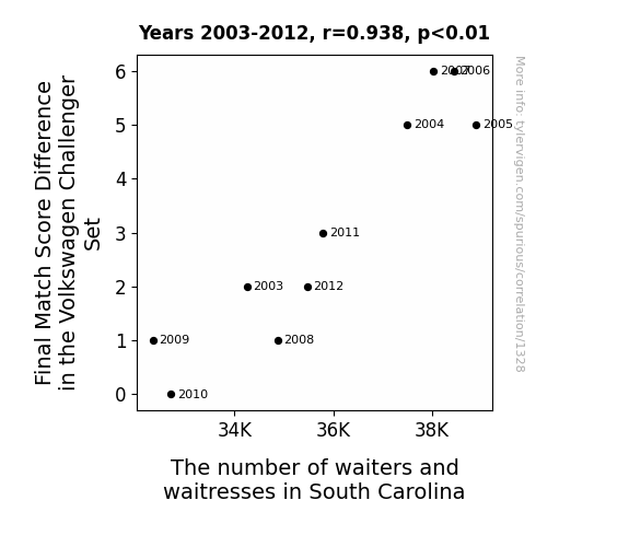
r2 = 0.8790755 (Coefficient of determination)
This means 87.9% of the change in the one variable (i.e., The number of waiters and waitresses in South Carolina) is predictable based on the change in the other (i.e., Final Match Score Difference in the Volkswagen Challenger Set) over the 10 years from 2003 through 2012.
p < 0.01, which is statistically significant(Null hypothesis significance test)
The p-value is 6.2E-5. 0.0000615296858770612100000000
The p-value is a measure of how probable it is that we would randomly find a result this extreme. More specifically the p-value is a measure of how probable it is that we would randomly find a result this extreme if we had only tested one pair of variables one time.
But I am a p-villain. I absolutely did not test only one pair of variables one time. I correlated hundreds of millions of pairs of variables. I threw boatloads of data into an industrial-sized blender to find this correlation.
Who is going to stop me? p-value reporting doesn't require me to report how many calculations I had to go through in order to find a low p-value!
On average, you will find a correaltion as strong as 0.94 in 0.0062% of random cases. Said differently, if you correlated 16,252 random variables Which I absolutely did.
with the same 9 degrees of freedom, Degrees of freedom is a measure of how many free components we are testing. In this case it is 9 because we have two variables measured over a period of 10 years. It's just the number of years minus ( the number of variables minus one ), which in this case simplifies to the number of years minus one.
you would randomly expect to find a correlation as strong as this one.
[ 0.75, 0.99 ] 95% correlation confidence interval (using the Fisher z-transformation)
The confidence interval is an estimate the range of the value of the correlation coefficient, using the correlation itself as an input. The values are meant to be the low and high end of the correlation coefficient with 95% confidence.
This one is a bit more complciated than the other calculations, but I include it because many people have been pushing for confidence intervals instead of p-value calculations (for example: NEJM. However, if you are dredging data, you can reliably find yourself in the 5%. That's my goal!
All values for the years included above: If I were being very sneaky, I could trim years from the beginning or end of the datasets to increase the correlation on some pairs of variables. I don't do that because there are already plenty of correlations in my database without monkeying with the years.
Still, sometimes one of the variables has more years of data available than the other. This page only shows the overlapping years. To see all the years, click on "See what else correlates with..." link above.
| 2003 | 2004 | 2005 | 2006 | 2007 | 2008 | 2009 | 2010 | 2011 | 2012 | |
| Final Match Score Difference in the Volkswagen Challenger Set (Score difference) | 2 | 5 | 5 | 6 | 6 | 1 | 1 | 0 | 3 | 2 |
| The number of waiters and waitresses in South Carolina (Waiters And Waitresses) | 34250 | 37500 | 38890 | 38440 | 38030 | 34870 | 32350 | 32720 | 35790 | 35470 |
Why this works
- Data dredging: I have 25,153 variables in my database. I compare all these variables against each other to find ones that randomly match up. That's 632,673,409 correlation calculations! This is called “data dredging.” Instead of starting with a hypothesis and testing it, I instead abused the data to see what correlations shake out. It’s a dangerous way to go about analysis, because any sufficiently large dataset will yield strong correlations completely at random.
- Lack of causal connection: There is probably
Because these pages are automatically generated, it's possible that the two variables you are viewing are in fact causually related. I take steps to prevent the obvious ones from showing on the site (I don't let data about the weather in one city correlate with the weather in a neighboring city, for example), but sometimes they still pop up. If they are related, cool! You found a loophole.
no direct connection between these variables, despite what the AI says above. This is exacerbated by the fact that I used "Years" as the base variable. Lots of things happen in a year that are not related to each other! Most studies would use something like "one person" in stead of "one year" to be the "thing" studied. - Observations not independent: For many variables, sequential years are not independent of each other. If a population of people is continuously doing something every day, there is no reason to think they would suddenly change how they are doing that thing on January 1. A simple
Personally I don't find any p-value calculation to be 'simple,' but you know what I mean.
p-value calculation does not take this into account, so mathematically it appears less probable than it really is. - Y-axis doesn't start at zero: I truncated the Y-axes of the graph above. I also used a line graph, which makes the visual connection stand out more than it deserves.
Nothing against line graphs. They are great at telling a story when you have linear data! But visually it is deceptive because the only data is at the points on the graph, not the lines on the graph. In between each point, the data could have been doing anything. Like going for a random walk by itself!
Mathematically what I showed is true, but it is intentionally misleading. Below is the same chart but with both Y-axes starting at zero.

Try it yourself
You can calculate the values on this page on your own! Try running the Python code to see the calculation results. Step 1: Download and install Python on your computer.Step 2: Open a plaintext editor like Notepad and paste the code below into it.
Step 3: Save the file as "calculate_correlation.py" in a place you will remember, like your desktop. Copy the file location to your clipboard. On Windows, you can right-click the file and click "Properties," and then copy what comes after "Location:" As an example, on my computer the location is "C:\Users\tyler\Desktop"
Step 4: Open a command line window. For example, by pressing start and typing "cmd" and them pressing enter.
Step 5: Install the required modules by typing "pip install numpy", then pressing enter, then typing "pip install scipy", then pressing enter.
Step 6: Navigate to the location where you saved the Python file by using the "cd" command. For example, I would type "cd C:\Users\tyler\Desktop" and push enter.
Step 7: Run the Python script by typing "python calculate_correlation.py"
If you run into any issues, I suggest asking ChatGPT to walk you through installing Python and running the code below on your system. Try this question:
"Walk me through installing Python on my computer to run a script that uses scipy and numpy. Go step-by-step and ask me to confirm before moving on. Start by asking me questions about my operating system so that you know how to proceed. Assume I want the simplest installation with the latest version of Python and that I do not currently have any of the necessary elements installed. Remember to only give me one step per response and confirm I have done it before proceeding."
# These modules make it easier to perform the calculation
import numpy as np
from scipy import stats

# We'll define a function that we can call to return the correlation calculations
def calculate_correlation(array1, array2):

    # Calculate Pearson correlation coefficient and p-value
    correlation, p_value = stats.pearsonr(array1, array2)

    # Calculate R-squared as the square of the correlation coefficient
    r_squared = correlation**2

    return correlation, r_squared, p_value

# These are the arrays for the variables shown on this page, but you can modify them to be any two sets of numbers
array_1 = np.array([2,5,5,6,6,1,1,0,3,2,])
array_2 = np.array([34250,37500,38890,38440,38030,34870,32350,32720,35790,35470,])
array_1_name = "Final Match Score Difference in the Volkswagen Challenger Set"
array_2_name = "The number of waiters and waitresses in South Carolina"

# Perform the calculation
print(f"Calculating the correlation between {array_1_name} and {array_2_name}...")
correlation, r_squared, p_value = calculate_correlation(array_1, array_2)

# Print the results
print("Correlation Coefficient:", correlation)
print("R-squared:", r_squared)
print("P-value:", p_value)
Reuseable content
You may re-use the images on this page for any purpose, even commercial purposes, without asking for permission. The only requirement is that you attribute Tyler Vigen. Attribution can take many different forms. If you leave the "tylervigen.com" link in the image, that satisfies it just fine. If you remove it and move it to a footnote, that's fine too. You can also just write "Charts courtesy of Tyler Vigen" at the bottom of an article.You do not need to attribute "the spurious correlations website," and you don't even need to link here if you don't want to. I don't gain anything from pageviews. There are no ads on this site, there is nothing for sale, and I am not for hire.
For the record, I am just one person. Tyler Vigen, he/him/his. I do have degrees, but they should not go after my name unless you want to annoy my wife. If that is your goal, then go ahead and cite me as "Tyler Vigen, A.A. A.A.S. B.A. J.D." Otherwise it is just "Tyler Vigen."
When spoken, my last name is pronounced "vegan," like I don't eat meat.
Full license details.
For more on re-use permissions, or to get a signed release form, see tylervigen.com/permission.
Download images for these variables:
- High resolution line chart
The image linked here is a Scalable Vector Graphic (SVG). It is the highest resolution that is possible to achieve. It scales up beyond the size of the observable universe without pixelating. You do not need to email me asking if I have a higher resolution image. I do not. The physical limitations of our universe prevent me from providing you with an image that is any higher resolution than this one.
If you insert it into a PowerPoint presentation (a tool well-known for managing things that are the scale of the universe), you can right-click > "Ungroup" or "Create Shape" and then edit the lines and text directly. You can also change the colors this way.
Alternatively you can use a tool like Inkscape. - High resolution line chart, optimized for mobile
- Alternative high resolution line chart
- Scatterplot
- Portable line chart (png)
- Portable line chart (png), optimized for mobile
- Line chart for only Final Match Score Difference in the Volkswagen Challenger Set
- Line chart for only The number of waiters and waitresses in South Carolina
- The spurious research paper: Service with a Smash: The Volleying Connection Between Final Match Score Difference in the Volkswagen Challenger Set and The Number of Waiters and Waitresses in South Carolina
Bravo! Your evaluation rocks!
Correlation ID: 1328 · Black Variable ID: 108 · Red Variable ID: 14066

