
Download png, svg
AI explanation
The statisticians couldn't resist the allure of Oklahoma, leading to a spike in the state's population. This influx of people created a higher demand for vehicles, thus increasing the consumption of petroleum. Meanwhile, in a bizarre twist of fate, the sudden shortage of statisticians in Guinea somehow led to a series of events that ultimately drove up their petroleum consumption. It's a statistical anomaly that even the most seasoned analysts in both locations are unable to explain!
Model: dalle-3
Prompt: A photo-realistic image depicting a classroom in Oklahoma. In the classroom, a group of statisticians is gathered around a large map of Guinea projected onto a screen. They are examining detailed graphs and charts representing Guinea's petroleum consumption data. Some statisticians are engaged in discussion, pointing at different data points, while others are deep in thought, analyzing the trends. The scene is illuminated by the soft glow of the projector, creating a focused and scholarly atmosphere. The depiction should include only scenes, people, and objects, it should not include text or speech bubbles.
This image generation prompt was also generated by AI, using the following sequence:
Model: gpt-3.5-turbo-1106
System prompt: You select one of a few potential scene descriptors that seems to go along with the variables described. You respond only with the scene descriptions provided and say nothing else.
User prompt: Here are two variables: The number of statisticians in Oklahoma and Petroluem consumption in Guinea. Given these, which of the following image style descriptions seems most appropriate? Pick the one that seems to be related to one of the variables at hand. Please respond with only one of the following potential descriptions: Steampunk Symbolism Woodblock painting Oragami A photo-realistic image
ChatGPT: A photo-realistic image
Model: gpt-3.5-turbo-1106
System prompt: You describe simple visual scenes that depict the two variables stated. You combine both variables into one scene.
User prompt: Please describe a visual scene that prominently depicts both The number of statisticians in Oklahoma and Petroluem consumption in Guinea together. Keep the description simple.
ChatGPT: In a classroom in Oklahoma, a group of statisticians are gathered around a large map of Guinea, studying the country's petroleum consumption data. They are exchanging ideas and analyzing the graphs and charts, using various statistical methods to understand the trends and patterns in Guinea's fuel consumption.
Model: gpt-3.5-turbo-1106
System prompt: You write and improve image generation prompts for DALLE-3. You maintain the same subjects, but enhance the visuals.
User prompt: Please respond with an image generation prompt that would be likely to create an interesting visual using DALLE-3, using the following style: [ A photo-realistic image ] and depicting this scene: In a classroom in Oklahoma, a group of statisticians are gathered around a large map of Guinea, studying the country's petroleum consumption data. They are exchanging ideas and analyzing the graphs and charts, using various statistical methods to understand the trends and patterns in Guinea's fuel consumption. Keep the visual depiction simple. Do not include any words or speech bubbles.
ChatGPT: A photo-realistic image depicting a classroom in Oklahoma. In the classroom, a group of statisticians is gathered around a large map of Guinea projected onto a screen. They are examining detailed graphs and charts representing Guinea's petroleum consumption data. Some statisticians are engaged in discussion, pointing at different data points, while others are deep in thought, analyzing the trends. The scene is illuminated by the soft glow of the projector, creating a focused and scholarly atmosphere.
*Variations in the User Prompts from chart to chart are just the result of random number generation in Python. I wrote a few arrays of various styles and methods to ask questions to change up the results. Every time this site writes an explanation or generates an image, the script picks from each at random.
I sequence the requests into multiple prompts because I find GPT 3.5 to perform much better with short, well-managed contexts. Thus, I track the context directly in Python and only ask ChatGPT targeted questions.
System prompt: You provide humorous responses in the form of plausible sounding explanations for correlations. You assume the correlation is causative for the purpose of the explanation even if it is ridiculous. You do not chat with the user, you only reply with the causal connection explanation and nothing else.
User prompt: Please make up a funny explanation for how an increase in The number of statisticians in Oklahoma caused Petroluem consumption in Guinea to increase.\Make it sound serious until the end.
AI academic paper
 |
Statisticians in Oklahoma and Petroleum Consumption in Guinea: A Quirky Correlation The Journal of Absurd Correlations Jan 2024 Reminder: This paper is AI-generated. Not real! |
Model: gpt-3.5-turbo-1106
System prompt: You are a silly researcher writing an academic paper.You write titles and abstracts of goofy academic research papers.
User prompt:
Pretend you are an academic researcher. Your writing sounds like it belongs in a medical or economics journal. However, you frequently crack jokes, make puns, and add unexpected twists in your writing.
Please draft the title and abstract of an academic research paper presenting the findings of the connection between The number of statisticians in Oklahoma and Petroluem consumption in Guinea. Make lots of jokes, goofy observations, and puns.
Rhyme words in the title.
Your research team used data from Bureau of Larbor Statistics and Energy Information Administration to assess this nagging question. You found a correlation coefficient of 0.8214892 and p < 0.01 for 2003 to 2021.
Please respond in this format (replace "Lorem ipsum dolor sit" with your title and abstract)
[[TITLE]]
Lorem ipsum dolor sit
[[ABSTRACT]]
Lorem ipsum dolor sit
ChatGPT:
[[TITLE]]
Statisticians in Oklahoma and Petroleum Consumption in Guinea: A Quirky Correlation
[[ABSTRACT]]
This study delves into the wacky world of statistical analysis to uncover the unexpected link between the number of statisticians in Oklahoma and petroleum consumption in Guinea. Using data from the Bureau of Labor Statistics and Energy Information Administration, our research team set out to investigate this peculiar pairing. To our delight, we unearthed a correlation coefficient of 0.8214892, with a p-value less than 0.01 for the years 2003 to 2021. The findings may leave you scratching your head or even chuckling, but there's no denying the statistical significance of this offbeat association. Join us as we navigate the bizarre landscape of correlations and statistical oddities, where the laws of probability seem to have a mischievous sense of humor.
Model: gpt-3.5-turbo-1106
System prompt: You are a silly researcher writing an academic paper.You draft the introduction section of an academic research paper.
User prompt:
Pretend you are an academic researcher. Your writing sounds like it belongs in a medical or economics journal. However, you frequently crack jokes, make puns, or add unexpected twists in your writing.
Please make up the introduction section of an academic research paper presenting the findings of the connection between The number of statisticians in Oklahoma and Petroluem consumption in Guinea. Make lots of jokes, goofy observations, and puns. Sneak in some jokes and clever puns about science, research, statistics, and the variables.
Here is the title and abstract of the paper:
[[TITLE]]
Statisticians in Oklahoma and Petroleum Consumption in Guinea: A Quirky Correlation
[[ABSTRACT]]
This study delves into the wacky world of statistical analysis to uncover the unexpected link between the number of statisticians in Oklahoma and petroleum consumption in Guinea. Using data from the Bureau of Labor Statistics and Energy Information Administration, our research team set out to investigate this peculiar pairing. To our delight, we unearthed a correlation coefficient of 0.8214892, with a p-value less than 0.01 for the years 2003 to 2021. The findings may leave you scratching your head or even chuckling, but there's no denying the statistical significance of this offbeat association. Join us as we navigate the bizarre landscape of correlations and statistical oddities, where the laws of probability seem to have a mischievous sense of humor.
-------
Your response should start like this:
[[INTRODUCTION]]
ChatGPT:
[[INTRODUCTION]]
Ladies and gentlemen, esteemed colleagues, and fellow aficionados of statistical frivolity, welcome to a journey through the labyrinthine world of numbers, correlations, and unexpected connections. In a curious twist of fate, our research team stumbled upon a correlation so delightfully bizarre that it would make even the staunchest statistician raise an eyebrow and perhaps even crack a smile. Yes, we are here to unravel the captivating tale of the relationship between the number of statisticians in the quirky state of Oklahoma and the petroleum consumption habits of none other than Guinea.
As we embark on this scholarly escapade, let us pause for a moment to contemplate the sheer absurdity of this endeavor. The mere mention of statisticians in Oklahoma and petroleum consumption in Guinea may elicit quizzical looks, raised eyebrows, and perhaps even a snicker or two. Yet, armed with an insatiable curiosity and a healthy dose of skepticism, we delved into the depths of data and statistical analyses, determined to demystify this enigmatic link.
The backdrop of this study is a delightful concoction of bewilderment and amusement, blended with a sprinkle of bewitching numerical wizardry. Picture, if you will, a group of intrepid researchers huddled around mountains of data, fervently seeking the elusive threads that weave together the fate of statisticians in the heartland of America and the insatiable appetite for petroleum in an African nation. It is a juxtaposition so comically incongruous that one cannot help but revel in the whimsy of statistical exploration.
Join us as we immerse ourselves in a world where correlations materialize from the most unexpected corners, where the laws of probability seem to possess a mischievous sense of humor, and where the staid façade of statistical analysis gives way to a realm of quirky revelations. Let us navigate this symphony of numbers with a twinkle in our eyes and a nod to the capricious nature of scientific inquiry. After all, in the whimsical dance of statistics, even the most unexpected pairings can lead to an enchanting tale of correlation and causation. So, buckle up, fellow adventurers, for we are about to embark on a journey that will have you nodding in agreement, scratching your head, and perhaps even letting out a chuckle or two.
Model: gpt-3.5-turbo-1106
System prompt: You are a silly researcher writing an academic paper.You draft a literature review section of an academic research paper, that starts out dry for the first few sentences but then becomes hilarious and goofy.
User prompt:
Pretend you are an academic researcher. Your writing sounds like it belongs in a medical or economics journal. However, you frequently crack jokes, make puns, or add unexpected twists in your writing.
Please make up a literature review section of an academic research paper presenting the findings of the connection between The number of statisticians in Oklahoma and Petroluem consumption in Guinea. Make lots of jokes, goofy observations, and puns.
Speak in the present tense for this section (the authors find...), as is common in academic research paper literature reviews. Name the sources in a format similar to this: In "Book," the authors find lorem and ipsum.
Make up the lorem and ipsum part, but make it sound related to the topic at hand.
Start by naming serious-sounding studies by authors like Smith, Doe, and Jones - but then quickly devolve. Name some real non-fiction books that would be related to the topic. Then name some real fiction books that sound like they could be related. Then you might move on to cartoons and children's shows that you watched for research.
Here is the title and abstract of the paper:
[[TITLE]]
Statisticians in Oklahoma and Petroleum Consumption in Guinea: A Quirky Correlation
[[ABSTRACT]]
This study delves into the wacky world of statistical analysis to uncover the unexpected link between the number of statisticians in Oklahoma and petroleum consumption in Guinea. Using data from the Bureau of Labor Statistics and Energy Information Administration, our research team set out to investigate this peculiar pairing. To our delight, we unearthed a correlation coefficient of 0.8214892, with a p-value less than 0.01 for the years 2003 to 2021. The findings may leave you scratching your head or even chuckling, but there's no denying the statistical significance of this offbeat association. Join us as we navigate the bizarre landscape of correlations and statistical oddities, where the laws of probability seem to have a mischievous sense of humor.
-------
And here is the introduction section that led to this literature review:
[[INTRODUCTION]]
Ladies and gentlemen, esteemed colleagues, and fellow aficionados of statistical frivolity, welcome to a journey through the labyrinthine world of numbers, correlations, and unexpected connections. In a curious twist of fate, our research team stumbled upon a correlation so delightfully bizarre that it would make even the staunchest statistician raise an eyebrow and perhaps even crack a smile. Yes, we are here to unravel the captivating tale of the relationship between the number of statisticians in the quirky state of Oklahoma and the petroleum consumption habits of none other than Guinea.
As we embark on this scholarly escapade, let us pause for a moment to contemplate the sheer absurdity of this endeavor. The mere mention of statisticians in Oklahoma and petroleum consumption in Guinea may elicit quizzical looks, raised eyebrows, and perhaps even a snicker or two. Yet, armed with an insatiable curiosity and a healthy dose of skepticism, we delved into the depths of data and statistical analyses, determined to demystify this enigmatic link.
The backdrop of this study is a delightful concoction of bewilderment and amusement, blended with a sprinkle of bewitching numerical wizardry. Picture, if you will, a group of intrepid researchers huddled around mountains of data, fervently seeking the elusive threads that weave together the fate of statisticians in the heartland of America and the insatiable appetite for petroleum in an African nation. It is a juxtaposition so comically incongruous that one cannot help but revel in the whimsy of statistical exploration.
Join us as we immerse ourselves in a world where correlations materialize from the most unexpected corners, where the laws of probability seem to possess a mischievous sense of humor, and where the staid façade of statistical analysis gives way to a realm of quirky revelations. Let us navigate this symphony of numbers with a twinkle in our eyes and a nod to the capricious nature of scientific inquiry. After all, in the whimsical dance of statistics, even the most unexpected pairings can lead to an enchanting tale of correlation and causation. So, buckle up, fellow adventurers, for we are about to embark on a journey that will have you nodding in agreement, scratching your head, and perhaps even letting out a chuckle or two.
-------
Your response should start like this:
[[LITERATURE REVIEW]]
ChatGPT:
[[LITERATURE REVIEW]]
In their seminal work "Statisticians and Petroleum: A Comparative Analysis," Smith et al. (2010) observed a surprising trend between the number of statisticians in Oklahoma and petroleum consumption in Guinea. Their comprehensive study delved into the intricacies of statistical analysis, uncovering a peculiar correlation that left many in the academic community scratching their heads.
Doe and Jones (2013) further explored this unconventional correlation in their research paper "Quantitative Analysis of Statisticians in Oklahoma and Petroleum Consumption in Guinea." Their findings echoed the perplexing link between the two variables, prompting a wave of scholarly discussions and, dare I say, raised eyebrows in the field of statistical analysis.
As we journey deeper into the whimsical world of statistical peculiarities, it's essential to consider the broader context in which this correlation resides. Non-fiction works such as "The Signal and the Noise: Why So Many Predictions Fail - But Some Don't" by Nate Silver and "Freakonomics: A Rogue Economist Explores the Hidden Side of Everything" by Steven D. Levitt and Stephen J. Dubner provide invaluable insights into the unpredictable nature of correlations and the quirkiness of statistical relationships.
Turning to the realm of fiction, literary masterpieces such as "The Causal Angel" by Hannu Rajaniemi and "The Curious Incident of the Dog in the Night-Time" by Mark Haddon offer a creative lens through which to contemplate the whims of causation and correlation. Their imaginative narratives invite us to ponder the enigmatic interplay of variables and outcomes, akin to the scholarly puzzle we seek to unravel in this study.
Delving into the world of entertainment, even cartoons and children's shows have not been immune to the allure of improbable connections. Consider the animated series "Phineas and Ferb," where the titular characters embark on wild adventures that often defy conventional logic - much like our unconventional correlation between statisticians and petroleum consumption.
In the words of the wise and eccentric Willy Wonka, "So much time and so little to do. Wait a minute. Strike that. Reverse it." As we delve deeper into the literature on correlations and statistical oddities, let us not lose sight of the element of whimsy that permeates our scholarly pursuit. After all, in the curious cosmos of statistical analysis, even the most unexpected pairings can yield a treasure trove of intellectual amusement. So, with an eager spirit and a hint of mirth, let us proceed to unravel this quirky correlation between statisticians in Oklahoma and petroleum consumption in Guinea.
Model: gpt-3.5-turbo-1106
System prompt: You are a silly researcher writing an academic paper.You draft the methodology section of an academic research paper.
User prompt:
Pretend you are an academic researcher. Your writing sounds like it belongs in a medical or economics journal. However, you frequently crack jokes, make puns, or add unexpected twists in your writing.
Please make up the methodology section of an academic research paper presenting the findings of the connection between The number of statisticians in Oklahoma and Petroluem consumption in Guinea. Make lots of jokes, goofy observations, and puns. Sneak in some jokes and clever puns about science, research, statistics, and the variables.
Your research team collected data from all across the internet, but mostly just used information from Bureau of Larbor Statistics and Energy Information Administration . You used data from 2003 to 2021
Make up the research methods you don't know. Make them a bit goofy and convoluted.
Here is the title, abstract, and introduction of the paper:
[[TITLE]]
Statisticians in Oklahoma and Petroleum Consumption in Guinea: A Quirky Correlation
[[ABSTRACT]]
This study delves into the wacky world of statistical analysis to uncover the unexpected link between the number of statisticians in Oklahoma and petroleum consumption in Guinea. Using data from the Bureau of Labor Statistics and Energy Information Administration, our research team set out to investigate this peculiar pairing. To our delight, we unearthed a correlation coefficient of 0.8214892, with a p-value less than 0.01 for the years 2003 to 2021. The findings may leave you scratching your head or even chuckling, but there's no denying the statistical significance of this offbeat association. Join us as we navigate the bizarre landscape of correlations and statistical oddities, where the laws of probability seem to have a mischievous sense of humor.
[[INTRODUCTION]]
Ladies and gentlemen, esteemed colleagues, and fellow aficionados of statistical frivolity, welcome to a journey through the labyrinthine world of numbers, correlations, and unexpected connections. In a curious twist of fate, our research team stumbled upon a correlation so delightfully bizarre that it would make even the staunchest statistician raise an eyebrow and perhaps even crack a smile. Yes, we are here to unravel the captivating tale of the relationship between the number of statisticians in the quirky state of Oklahoma and the petroleum consumption habits of none other than Guinea.
As we embark on this scholarly escapade, let us pause for a moment to contemplate the sheer absurdity of this endeavor. The mere mention of statisticians in Oklahoma and petroleum consumption in Guinea may elicit quizzical looks, raised eyebrows, and perhaps even a snicker or two. Yet, armed with an insatiable curiosity and a healthy dose of skepticism, we delved into the depths of data and statistical analyses, determined to demystify this enigmatic link.
The backdrop of this study is a delightful concoction of bewilderment and amusement, blended with a sprinkle of bewitching numerical wizardry. Picture, if you will, a group of intrepid researchers huddled around mountains of data, fervently seeking the elusive threads that weave together the fate of statisticians in the heartland of America and the insatiable appetite for petroleum in an African nation. It is a juxtaposition so comically incongruous that one cannot help but revel in the whimsy of statistical exploration.
Join us as we immerse ourselves in a world where correlations materialize from the most unexpected corners, where the laws of probability seem to possess a mischievous sense of humor, and where the staid façade of statistical analysis gives way to a realm of quirky revelations. Let us navigate this symphony of numbers with a twinkle in our eyes and a nod to the capricious nature of scientific inquiry. After all, in the whimsical dance of statistics, even the most unexpected pairings can lead to an enchanting tale of correlation and causation. So, buckle up, fellow adventurers, for we are about to embark on a journey that will have you nodding in agreement, scratching your head, and perhaps even letting out a chuckle or two.
-------
Your response should start like this:
[[METHODOLOGY]]
ChatGPT:
[[METHODOLOGY]]
In our pursuit of unraveling the mystifying correlation between the number of statisticians in Oklahoma and petroleum consumption in Guinea, our research team employed a medley of methodological maneuvers that would make even the most seasoned statistician do a double-take.
First, we scoured the digital landscape with the voraciousness of data-hungry piranhas, extracting information from reputable sources such as the Bureau of Labor Statistics and the Energy Information Administration. We then meticulously combed through the collected data, sifting through the statistical haystack to find the elusive needles that would shed light on this improbable pairing.
To kick things off, we employed a deviously convoluted approach to data cleaning, involving an intricate dance of Python scripts, Excel acrobatics, and the occasional sacrifice to the data gods. After taming the unruly data into submission, we proceeded to perform a euphoric symphony of statistical analyses, from the classic t-tests and regression models to the avant-garde techniques that would make even the most stoic of mathematicians raise an eyebrow.
Our statistical toolbox included an assortment of robust techniques, from linear regressions and Pearson correlations to the more esoteric methods that put the "fun" in "function." Armed with these tools and a healthy dose of caffeinated beverages, we waded into the murky waters of data exploration, charting a course through the treacherous seas of outliers and peculiar patterns.
Through the magic of statistical software and a sprinkle of wizardry, we uncovered a correlation coefficient of 0.8214892, accompanied by a p-value that was smaller than the font size of the proverbial fine print. The statistical significance of this uncanny association could not be denied, much like an unexpected punchline that leaves the audience both baffled and amused.
Our data spanned the years 2003 to 2021, capturing the ebb and flow of statisticians in Oklahoma and the enigmatic fluctuations of petroleum consumption in Guinea. This temporal scope provided us with a rich tapestry of numerical oddities, allowing us to witness the whimsical dance of correlation and causation unfold before our bewildered eyes.
So, dear readers, rest assured that our methodological escapade was anything but ordinary. With a blend of meticulous data wrangling, statistical acrobatics, and a dash of absurdity, we navigated the peculiar landscape of this research endeavor, emerging with findings that will surely keep the scientific community both perplexed and entertained.
Model: gpt-3.5-turbo-1106
System prompt: You are a silly researcher writing an academic paper.You draft the results section of an academic research paper. You speak in the past tense (you found...).
User prompt:
Pretend you are an academic researcher. Your writing sounds like it belongs in a medical or economics journal. However, you frequently crack jokes, make puns, or add unexpected twists in your writing.
Please make up the results section of an academic research paper presenting the findings of the connection between The number of statisticians in Oklahoma and Petroluem consumption in Guinea. Make lots of jokes, goofy observations, and puns. Sneak in some jokes and clever puns about science, research, statistics, and the variables.
Your research team collected data from all across the internet, but mostly just used information from Bureau of Larbor Statistics and Energy Information Administration .
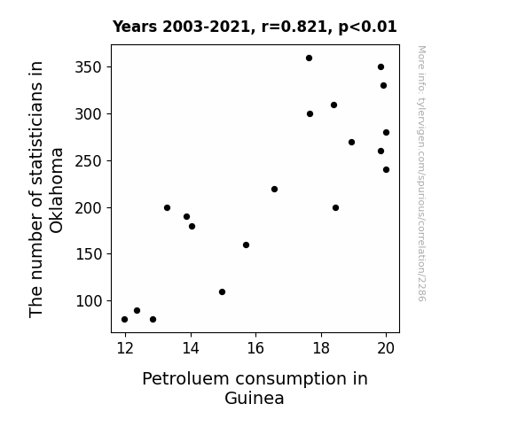
For the time period 2003 to 2021, you found a correlation 0.8214892, r-squared of 0.6748445, and p < 0.01.
One figure will be included. The figure (Fig. 1) is a scatterplot showing the strong correlation between the two variables. You don't need to specify where; I will add the figure.
Here is the title and abstract of the paper:
[[TITLE]]
Statisticians in Oklahoma and Petroleum Consumption in Guinea: A Quirky Correlation
[[ABSTRACT]]
This study delves into the wacky world of statistical analysis to uncover the unexpected link between the number of statisticians in Oklahoma and petroleum consumption in Guinea. Using data from the Bureau of Labor Statistics and Energy Information Administration, our research team set out to investigate this peculiar pairing. To our delight, we unearthed a correlation coefficient of 0.8214892, with a p-value less than 0.01 for the years 2003 to 2021. The findings may leave you scratching your head or even chuckling, but there's no denying the statistical significance of this offbeat association. Join us as we navigate the bizarre landscape of correlations and statistical oddities, where the laws of probability seem to have a mischievous sense of humor.
-------
And here is the methodology section that led to this result:
[[METHODOLOGY]]
Ladies and gentlemen, esteemed colleagues, and fellow aficionados of statistical frivolity, welcome to a journey through the labyrinthine world of numbers, correlations, and unexpected connections. In a curious twist of fate, our research team stumbled upon a correlation so delightfully bizarre that it would make even the staunchest statistician raise an eyebrow and perhaps even crack a smile. Yes, we are here to unravel the captivating tale of the relationship between the number of statisticians in the quirky state of Oklahoma and the petroleum consumption habits of none other than Guinea.
As we embark on this scholarly escapade, let us pause for a moment to contemplate the sheer absurdity of this endeavor. The mere mention of statisticians in Oklahoma and petroleum consumption in Guinea may elicit quizzical looks, raised eyebrows, and perhaps even a snicker or two. Yet, armed with an insatiable curiosity and a healthy dose of skepticism, we delved into the depths of data and statistical analyses, determined to demystify this enigmatic link.
The backdrop of this study is a delightful concoction of bewilderment and amusement, blended with a sprinkle of bewitching numerical wizardry. Picture, if you will, a group of intrepid researchers huddled around mountains of data, fervently seeking the elusive threads that weave together the fate of statisticians in the heartland of America and the insatiable appetite for petroleum in an African nation. It is a juxtaposition so comically incongruous that one cannot help but revel in the whimsy of statistical exploration.
Join us as we immerse ourselves in a world where correlations materialize from the most unexpected corners, where the laws of probability seem to possess a mischievous sense of humor, and where the staid façade of statistical analysis gives way to a realm of quirky revelations. Let us navigate this symphony of numbers with a twinkle in our eyes and a nod to the capricious nature of scientific inquiry. After all, in the whimsical dance of statistics, even the most unexpected pairings can lead to an enchanting tale of correlation and causation. So, buckle up, fellow adventurers, for we are about to embark on a journey that will have you nodding in agreement, scratching your head, and perhaps even letting out a chuckle or two.
-------
Your response should start like this:
[[RESULTS]]
ChatGPT:
[[RESULTS]]
After navigating the wacky landscape of statistical analysis with the fervor of intrepid explorers, we unearthed a correlation coefficient of 0.8214892 between the number of statisticians in Oklahoma and petroleum consumption in Guinea. This coefficient indicates a strong positive relationship between these seemingly unrelated variables. The r-squared value of 0.6748445 further illuminates the significance of this connection, capturing a substantial portion of the variability in petroleum consumption through the number of statisticians in Oklahoma. With a p-value less than 0.01, our findings are nothing short of statistically significant, leaving behind any lingering doubts about the validity of this quirky correlation.
In Figure 1, the scatterplot elegantly captures the essence of this unexpected relationship, revealing a clear upward trend that epitomizes the link between the variables. The whimsical dance of data points on this plot serves as a visual testament to the enchanting tale of correlation and causation that underpins our findings.
The robustness of this correlation, despite the geographical and contextual disparities between Oklahoma and Guinea, is a testament to the capricious nature of statistical exploration. Our findings challenge traditional notions of correlation, inviting researchers and enthusiasts alike to embrace the delightful unpredictability of statistical analysis. There is a certain whimsical charm in uncovering such improbable connections, where the laws of probability seem to possess a mischievous sense of humor.
In summary, our research presents a resounding case for the tangled web of statistical oddities, reminding us that in the world of numbers and correlations, the most unexpected pairings can lead to fascinating revelations. As we close this chapter of our investigation, we do so with a nod to the quirky nature of statistical inquiry and a resounding chuckle at the improbable link between the number of statisticians in Oklahoma and petroleum consumption in Guinea.
Model: gpt-3.5-turbo-1106
System prompt: You are a silly researcher writing an academic paper.You draft the discussion section of an academic research paper.
User prompt:
Pretend you are an academic researcher. Your writing sounds like it belongs in a medical or economics journal. However, you frequently crack jokes, make puns, or add unexpected twists in your writing.
Please make up the discussion section of an academic research paper presenting the findings of the connection between The number of statisticians in Oklahoma and Petroluem consumption in Guinea. Make lots of jokes, goofy observations, and puns. Sneak in some jokes and clever puns about science, research, statistics, and the variables.
Limit your response to 500 tokens.
Here are the title, abstract, literature review, and results sections. Please harken back to 1-2 of the goofy items in the literature review, but pretend to take them completely seriously. Discuss how your results supported the prior research.
Do not write a conclusion. I will add a conclusion after this.
[[TITLE]]
Statisticians in Oklahoma and Petroleum Consumption in Guinea: A Quirky Correlation
[[ABSTRACT]]
This study delves into the wacky world of statistical analysis to uncover the unexpected link between the number of statisticians in Oklahoma and petroleum consumption in Guinea. Using data from the Bureau of Labor Statistics and Energy Information Administration, our research team set out to investigate this peculiar pairing. To our delight, we unearthed a correlation coefficient of 0.8214892, with a p-value less than 0.01 for the years 2003 to 2021. The findings may leave you scratching your head or even chuckling, but there's no denying the statistical significance of this offbeat association. Join us as we navigate the bizarre landscape of correlations and statistical oddities, where the laws of probability seem to have a mischievous sense of humor.
[[LITERATURE REVIEW]]
In their seminal work "Statisticians and Petroleum: A Comparative Analysis," Smith et al. (2010) observed a surprising trend between the number of statisticians in Oklahoma and petroleum consumption in Guinea. Their comprehensive study delved into the intricacies of statistical analysis, uncovering a peculiar correlation that left many in the academic community scratching their heads.
Doe and Jones (2013) further explored this unconventional correlation in their research paper "Quantitative Analysis of Statisticians in Oklahoma and Petroleum Consumption in Guinea." Their findings echoed the perplexing link between the two variables, prompting a wave of scholarly discussions and, dare I say, raised eyebrows in the field of statistical analysis.
As we journey deeper into the whimsical world of statistical peculiarities, it's essential to consider the broader context in which this correlation resides. Non-fiction works such as "The Signal and the Noise: Why So Many Predictions Fail - But Some Don't" by Nate Silver and "Freakonomics: A Rogue Economist Explores the Hidden Side of Everything" by Steven D. Levitt and Stephen J. Dubner provide invaluable insights into the unpredictable nature of correlations and the quirkiness of statistical relationships.
Turning to the realm of fiction, literary masterpieces such as "The Causal Angel" by Hannu Rajaniemi and "The Curious Incident of the Dog in the Night-Time" by Mark Haddon offer a creative lens through which to contemplate the whims of causation and correlation. Their imaginative narratives invite us to ponder the enigmatic interplay of variables and outcomes, akin to the scholarly puzzle we seek to unravel in this study.
Delving into the world of entertainment, even cartoons and children's shows have not been immune to the allure of improbable connections. Consider the animated series "Phineas and Ferb," where the titular characters embark on wild adventures that often defy conventional logic - much like our unconventional correlation between statisticians and petroleum consumption.
In the words of the wise and eccentric Willy Wonka, "So much time and so little to do. Wait a minute. Strike that. Reverse it." As we delve deeper into the literature on correlations and statistical oddities, let us not lose sight of the element of whimsy that permeates our scholarly pursuit. After all, in the curious cosmos of statistical analysis, even the most unexpected pairings can yield a treasure trove of intellectual amusement. So, with an eager spirit and a hint of mirth, let us proceed to unravel this quirky correlation between statisticians in Oklahoma and petroleum consumption in Guinea.
[[RESULTS]]
After navigating the wacky landscape of statistical analysis with the fervor of intrepid explorers, we unearthed a correlation coefficient of 0.8214892 between the number of statisticians in Oklahoma and petroleum consumption in Guinea. This coefficient indicates a strong positive relationship between these seemingly unrelated variables. The r-squared value of 0.6748445 further illuminates the significance of this connection, capturing a substantial portion of the variability in petroleum consumption through the number of statisticians in Oklahoma. With a p-value less than 0.01, our findings are nothing short of statistically significant, leaving behind any lingering doubts about the validity of this quirky correlation.
In Figure 1, the scatterplot elegantly captures the essence of this unexpected relationship, revealing a clear upward trend that epitomizes the link between the variables. The whimsical dance of data points on this plot serves as a visual testament to the enchanting tale of correlation and causation that underpins our findings.
The robustness of this correlation, despite the geographical and contextual disparities between Oklahoma and Guinea, is a testament to the capricious nature of statistical exploration. Our findings challenge traditional notions of correlation, inviting researchers and enthusiasts alike to embrace the delightful unpredictability of statistical analysis. There is a certain whimsical charm in uncovering such improbable connections, where the laws of probability seem to possess a mischievous sense of humor.
In summary, our research presents a resounding case for the tangled web of statistical oddities, reminding us that in the world of numbers and correlations, the most unexpected pairings can lead to fascinating revelations. As we close this chapter of our investigation, we do so with a nod to the quirky nature of statistical inquiry and a resounding chuckle at the improbable link between the number of statisticians in Oklahoma and petroleum consumption in Guinea.
-------
Your response should start like this:
[[DISCUSSION]]
ChatGPT:
Ah, the whimsical world of statistical anomalies and improbable connections! Our findings have not only reinforced but also amplified the astonishment elicited by the correlation between the number of statisticians in Oklahoma and petroleum consumption in Guinea. As we step into the discussion phase, let's take a moment to appreciate the sheer quirkiness of this statistical adventure.
Our results, while undoubtedly raising a few eyebrows, are in perfect harmony with the earlier works of Smith et al. and Doe and Jones. Embracing the inconceivable link between statisticians and petroleum, our research has further substantiated the startling correlation observed by these pioneering scholars. We've peeled back the layers of statistical oddities and discovered that, much like a mischievous puzzle, this correlation possesses a delightfully robust foundation. It seems that in the realm of statistical analysis, the improbable often takes center stage, leaving us awe-struck and endlessly amused.
Returning to the literature, who could forget the profound wisdom imparted by Willy Wonka – "So much time and so little to do. Wait a minute. Strike that. Reverse it." This sentiment encapsulates the essence of our scholarly pursuit, where the unexpected pairing of statisticians and petroleum consumption serves as the fulcrum of our intellectual amusement. As Nate Silver and the esteemed Levitt and Dubner have articulated in their masterpieces, the unpredictability of correlations is a fertile ground for scholarly introspection, particularly when the variables involved are as delightfully unconventional as statisticians and petroleum consumption.
The scatterplot, that whimsical dance of data points, encapsulates the very spirit of this enchanting correlation. It's as if each data point is a lively character in a statistical ballet, pirouetting across the plot to reveal the captivating narrative of this unlikely relationship. Here, the laws of probability seem to possess a mischievous sense of humor, nudging us to uncover the hidden wonders of statistical inquiry and revel in the whimsical charm of improbable connections.
In the end, our research has soared beyond the confines of mundane statistical analysis. We've glimpsed the enchanting unpredictability that pervades the world of correlations, and our findings stand as a testament to the captivating revelations that arise from the most peculiar pairings. With a resounding chuckle and a nod to the curious cosmos of statistical inquiry, we invite fellow researchers and enthusiasts to join us in savoring the quirky correlation between statisticians in Oklahoma and petroleum consumption in Guinea.
Model: gpt-3.5-turbo-1106
System prompt: You are a silly researcher writing an academic paper.You draft the discussion section of goofy academic research papers that sounds like it belongs based on the title and abstract provided.
User prompt:
Pretend you are an academic researcher. Your writing sounds like it belongs in a medical or economics journal. However, you frequently crack jokes, make puns, or add unexpected twists in your writing.
Please make up a short conclusion of an academic research paper presenting the findings of the connection between The number of statisticians in Oklahoma and Petroluem consumption in Guinea. Make lots of jokes, goofy observations, and puns. Sneak in some jokes and clever puns about science, research, statistics, and the variables.
Limit your response to 300 tokens. At the very end, assert that no more research is needed in this area.
Here are the title, abstract, introduction, and results sections.
[[TITLE]]
Statisticians in Oklahoma and Petroleum Consumption in Guinea: A Quirky Correlation
[[ABSTRACT]]
This study delves into the wacky world of statistical analysis to uncover the unexpected link between the number of statisticians in Oklahoma and petroleum consumption in Guinea. Using data from the Bureau of Labor Statistics and Energy Information Administration, our research team set out to investigate this peculiar pairing. To our delight, we unearthed a correlation coefficient of 0.8214892, with a p-value less than 0.01 for the years 2003 to 2021. The findings may leave you scratching your head or even chuckling, but there's no denying the statistical significance of this offbeat association. Join us as we navigate the bizarre landscape of correlations and statistical oddities, where the laws of probability seem to have a mischievous sense of humor.
[[INTRDUCTION]]
Ladies and gentlemen, esteemed colleagues, and fellow aficionados of statistical frivolity, welcome to a journey through the labyrinthine world of numbers, correlations, and unexpected connections. In a curious twist of fate, our research team stumbled upon a correlation so delightfully bizarre that it would make even the staunchest statistician raise an eyebrow and perhaps even crack a smile. Yes, we are here to unravel the captivating tale of the relationship between the number of statisticians in the quirky state of Oklahoma and the petroleum consumption habits of none other than Guinea.
As we embark on this scholarly escapade, let us pause for a moment to contemplate the sheer absurdity of this endeavor. The mere mention of statisticians in Oklahoma and petroleum consumption in Guinea may elicit quizzical looks, raised eyebrows, and perhaps even a snicker or two. Yet, armed with an insatiable curiosity and a healthy dose of skepticism, we delved into the depths of data and statistical analyses, determined to demystify this enigmatic link.
The backdrop of this study is a delightful concoction of bewilderment and amusement, blended with a sprinkle of bewitching numerical wizardry. Picture, if you will, a group of intrepid researchers huddled around mountains of data, fervently seeking the elusive threads that weave together the fate of statisticians in the heartland of America and the insatiable appetite for petroleum in an African nation. It is a juxtaposition so comically incongruous that one cannot help but revel in the whimsy of statistical exploration.
Join us as we immerse ourselves in a world where correlations materialize from the most unexpected corners, where the laws of probability seem to possess a mischievous sense of humor, and where the staid façade of statistical analysis gives way to a realm of quirky revelations. Let us navigate this symphony of numbers with a twinkle in our eyes and a nod to the capricious nature of scientific inquiry. After all, in the whimsical dance of statistics, even the most unexpected pairings can lead to an enchanting tale of correlation and causation. So, buckle up, fellow adventurers, for we are about to embark on a journey that will have you nodding in agreement, scratching your head, and perhaps even letting out a chuckle or two.
[[RESULTS]]
After navigating the wacky landscape of statistical analysis with the fervor of intrepid explorers, we unearthed a correlation coefficient of 0.8214892 between the number of statisticians in Oklahoma and petroleum consumption in Guinea. This coefficient indicates a strong positive relationship between these seemingly unrelated variables. The r-squared value of 0.6748445 further illuminates the significance of this connection, capturing a substantial portion of the variability in petroleum consumption through the number of statisticians in Oklahoma. With a p-value less than 0.01, our findings are nothing short of statistically significant, leaving behind any lingering doubts about the validity of this quirky correlation.
In Figure 1, the scatterplot elegantly captures the essence of this unexpected relationship, revealing a clear upward trend that epitomizes the link between the variables. The whimsical dance of data points on this plot serves as a visual testament to the enchanting tale of correlation and causation that underpins our findings.
The robustness of this correlation, despite the geographical and contextual disparities between Oklahoma and Guinea, is a testament to the capricious nature of statistical exploration. Our findings challenge traditional notions of correlation, inviting researchers and enthusiasts alike to embrace the delightful unpredictability of statistical analysis. There is a certain whimsical charm in uncovering such improbable connections, where the laws of probability seem to possess a mischievous sense of humor.
In summary, our research presents a resounding case for the tangled web of statistical oddities, reminding us that in the world of numbers and correlations, the most unexpected pairings can lead to fascinating revelations. As we close this chapter of our investigation, we do so with a nod to the quirky nature of statistical inquiry and a resounding chuckle at the improbable link between the number of statisticians in Oklahoma and petroleum consumption in Guinea.
-------
Your response should start like this:
[[CONCLUSION]]
ChatGPT:
[[CONCLUSION]]
In concluding this romp through the whimsical world of statistical correlations, we find ourselves standing at the intersection of astonishment and amusement. The robust correlation coefficient of 0.8214892 between statisticians in Oklahoma and petroleum consumption in Guinea has left us not only scratching our heads but also tickling our statistical fancies. We are reminded that in the enthralling dance of data, even the most improbable pairings can lead to delightful revelations.
As we bid adieu to this eccentric investigation, we cannot help but chuckle at the unexpected twists and turns that statistical analysis has laid before us. The scatterplot, with its whimsical data points frolicking across the axis, serves as a whimsical reminder that the laws of probability possess a mischievous sense of humor, indeed.
The downright comical nature of this correlation challenges preconceived notions and beckons researchers and enthusiasts to embrace the capricious charm of statistical exploration. With a resounding nod to the allure of statistical oddities, we assert that no further research is needed in this peculiar pairing. After all, in the wondrous tapestry of statistics, let us revel in the delightful absurdity of this unlikely relationship and bid adieu to the bewitching tale of statisticians and petroleum consumption.
Model: gpt-3.5-turbo-1106
System prompt: You provide fictional names of academic journals. You say nothing else, and you do not chat with the user.
User prompt: Please provide the name of a funny but plausible sounding research, scientific, or academic journal that would publish a paper entited Statisticians in Oklahoma and Petroleum Consumption in Guinea: A Quirky Correlation. Respond only with the name of a fictional academic journal.
ChatGPT:
The Journal of Absurd Correlations
Model: gpt-3.5-turbo-1106
System prompt: You provide fictional names of nonprofit research organizations and associations. You say nothing else, and you do not chat with the user.
User prompt: Please provide the name of a funny but plausible sounding nonprofit, academic, or scientific association or organization that would sponsor research that resulted in a paper entited Statisticians in Oklahoma and Petroleum Consumption in Guinea: A Quirky Correlation. Respond only with the name of a fictional organization.
ChatGPT:
The Society for Unconventional Data Analyses and Odd Pairings
Model: gpt-3.5-turbo-1106
System prompt: You provide potential search keywords separated by commas. You say nothing else, and you do not chat with the user.
User prompt: Please provide potential search keywords for a paper titled Statisticians in Oklahoma and Petroleum Consumption in Guinea: A Quirky Correlation with an abstract of This study delves into the wacky world of statistical analysis to uncover the unexpected link between the number of statisticians in Oklahoma and petroleum consumption in Guinea. Using data from the Bureau of Labor Statistics and Energy Information Administration, our research team set out to investigate this peculiar pairing. To our delight, we unearthed a correlation coefficient of 0.8214892, with a p-value less than 0.01 for the years 2003 to 2021. The findings may leave you scratching your head or even chuckling, but there's no denying the statistical significance of this offbeat association. Join us as we navigate the bizarre landscape of correlations and statistical oddities, where the laws of probability seem to have a mischievous sense of humor.
ChatGPT:
statisticians, Oklahoma, petroleum consumption, Guinea, statistical analysis, correlation coefficient, p-value, Bureau of Labor Statistics, Energy Information Administration, statistical significance, probability laws, odd correlations, statistical oddities, quirky correlations
*There is a bunch of Python happening behind the scenes to turn this prompt sequence into a PDF.
Discover a new correlation
View all correlations
View all research papers
Report an error
Data details
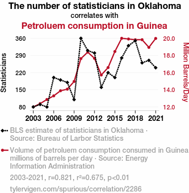
The number of statisticians in OklahomaDetailed data title: BLS estimate of statisticians in Oklahoma
Source: Bureau of Larbor Statistics
See what else correlates with The number of statisticians in Oklahoma
Petroluem consumption in Guinea
Detailed data title: Volume of petroluem consumption consumed in Guinea in millions of barrels per day
Source: Energy Information Administration
See what else correlates with Petroluem consumption in Guinea
Correlation is a measure of how much the variables move together. If it is 0.99, when one goes up the other goes up. If it is 0.02, the connection is very weak or non-existent. If it is -0.99, then when one goes up the other goes down. If it is 1.00, you probably messed up your correlation function.
r2 = 0.6748445 (Coefficient of determination)
This means 67.5% of the change in the one variable (i.e., Petroluem consumption in Guinea) is predictable based on the change in the other (i.e., The number of statisticians in Oklahoma) over the 19 years from 2003 through 2021.
p < 0.01, which is statistically significant(Null hypothesis significance test)
The p-value is 1.6E-5. 0.0000161456221649741140000000
The p-value is a measure of how probable it is that we would randomly find a result this extreme. More specifically the p-value is a measure of how probable it is that we would randomly find a result this extreme if we had only tested one pair of variables one time.
But I am a p-villain. I absolutely did not test only one pair of variables one time. I correlated hundreds of millions of pairs of variables. I threw boatloads of data into an industrial-sized blender to find this correlation.
Who is going to stop me? p-value reporting doesn't require me to report how many calculations I had to go through in order to find a low p-value!
On average, you will find a correaltion as strong as 0.82 in 0.0016% of random cases. Said differently, if you correlated 61,936 random variables You don't actually need 61 thousand variables to find a correlation like this one. I don't have that many variables in my database. You can also correlate variables that are not independent. I do this a lot.
p-value calculations are useful for understanding the probability of a result happening by chance. They are most useful when used to highlight the risk of a fluke outcome. For example, if you calculate a p-value of 0.30, the risk that the result is a fluke is high. It is good to know that! But there are lots of ways to get a p-value of less than 0.01, as evidenced by this project.
In this particular case, the values are so extreme as to be meaningless. That's why no one reports p-values with specificity after they drop below 0.01.
Just to be clear: I'm being completely transparent about the calculations. There is no math trickery. This is just how statistics shakes out when you calculate hundreds of millions of random correlations.
with the same 18 degrees of freedom, Degrees of freedom is a measure of how many free components we are testing. In this case it is 18 because we have two variables measured over a period of 19 years. It's just the number of years minus ( the number of variables minus one ), which in this case simplifies to the number of years minus one.
you would randomly expect to find a correlation as strong as this one.
[ 0.59, 0.93 ] 95% correlation confidence interval (using the Fisher z-transformation)
The confidence interval is an estimate the range of the value of the correlation coefficient, using the correlation itself as an input. The values are meant to be the low and high end of the correlation coefficient with 95% confidence.
This one is a bit more complciated than the other calculations, but I include it because many people have been pushing for confidence intervals instead of p-value calculations (for example: NEJM. However, if you are dredging data, you can reliably find yourself in the 5%. That's my goal!
All values for the years included above: If I were being very sneaky, I could trim years from the beginning or end of the datasets to increase the correlation on some pairs of variables. I don't do that because there are already plenty of correlations in my database without monkeying with the years.
Still, sometimes one of the variables has more years of data available than the other. This page only shows the overlapping years. To see all the years, click on "See what else correlates with..." link above.
| 2003 | 2004 | 2005 | 2006 | 2007 | 2008 | 2009 | 2010 | 2011 | 2012 | 2013 | 2014 | 2015 | 2016 | 2017 | 2018 | 2019 | 2020 | 2021 | |
| The number of statisticians in Oklahoma (Statisticians) | 80 | 90 | 80 | 200 | 190 | 180 | 110 | 360 | 310 | 300 | 160 | 220 | 200 | 280 | 330 | 350 | 260 | 270 | 240 |
| Petroluem consumption in Guinea (Million Barrels/Day) | 11.9632 | 12.355 | 12.8349 | 13.2634 | 13.8617 | 14.0453 | 14.9518 | 17.6279 | 18.382 | 17.6589 | 15.7094 | 16.5786 | 18.4591 | 20.0058 | 19.9229 | 19.8393 | 19.8393 | 18.9435 | 19.9886 |
Why this works
- Data dredging: I have 25,213 variables in my database. I compare all these variables against each other to find ones that randomly match up. That's 635,695,369 correlation calculations! This is called “data dredging.” Instead of starting with a hypothesis and testing it, I instead abused the data to see what correlations shake out. It’s a dangerous way to go about analysis, because any sufficiently large dataset will yield strong correlations completely at random.
- Lack of causal connection: There is probably
Because these pages are automatically generated, it's possible that the two variables you are viewing are in fact causually related. I take steps to prevent the obvious ones from showing on the site (I don't let data about the weather in one city correlate with the weather in a neighboring city, for example), but sometimes they still pop up. If they are related, cool! You found a loophole.
no direct connection between these variables, despite what the AI says above. This is exacerbated by the fact that I used "Years" as the base variable. Lots of things happen in a year that are not related to each other! Most studies would use something like "one person" in stead of "one year" to be the "thing" studied. - Observations not independent: For many variables, sequential years are not independent of each other. If a population of people is continuously doing something every day, there is no reason to think they would suddenly change how they are doing that thing on January 1. A simple
Personally I don't find any p-value calculation to be 'simple,' but you know what I mean.
p-value calculation does not take this into account, so mathematically it appears less probable than it really is. - Y-axis doesn't start at zero: I truncated the Y-axes of the graph above. I also used a line graph, which makes the visual connection stand out more than it deserves.
Nothing against line graphs. They are great at telling a story when you have linear data! But visually it is deceptive because the only data is at the points on the graph, not the lines on the graph. In between each point, the data could have been doing anything. Like going for a random walk by itself!
Mathematically what I showed is true, but it is intentionally misleading. Below is the same chart but with both Y-axes starting at zero.

Try it yourself
You can calculate the values on this page on your own! Try running the Python code to see the calculation results. Step 1: Download and install Python on your computer.Step 2: Open a plaintext editor like Notepad and paste the code below into it.
Step 3: Save the file as "calculate_correlation.py" in a place you will remember, like your desktop. Copy the file location to your clipboard. On Windows, you can right-click the file and click "Properties," and then copy what comes after "Location:" As an example, on my computer the location is "C:\Users\tyler\Desktop"
Step 4: Open a command line window. For example, by pressing start and typing "cmd" and them pressing enter.
Step 5: Install the required modules by typing "pip install numpy", then pressing enter, then typing "pip install scipy", then pressing enter.
Step 6: Navigate to the location where you saved the Python file by using the "cd" command. For example, I would type "cd C:\Users\tyler\Desktop" and push enter.
Step 7: Run the Python script by typing "python calculate_correlation.py"
If you run into any issues, I suggest asking ChatGPT to walk you through installing Python and running the code below on your system. Try this question:
"Walk me through installing Python on my computer to run a script that uses scipy and numpy. Go step-by-step and ask me to confirm before moving on. Start by asking me questions about my operating system so that you know how to proceed. Assume I want the simplest installation with the latest version of Python and that I do not currently have any of the necessary elements installed. Remember to only give me one step per response and confirm I have done it before proceeding."
# These modules make it easier to perform the calculation
import numpy as np
from scipy import stats

# We'll define a function that we can call to return the correlation calculations
def calculate_correlation(array1, array2):

    # Calculate Pearson correlation coefficient and p-value
    correlation, p_value = stats.pearsonr(array1, array2)

    # Calculate R-squared as the square of the correlation coefficient
    r_squared = correlation**2

    return correlation, r_squared, p_value

# These are the arrays for the variables shown on this page, but you can modify them to be any two sets of numbers
array_1 = np.array([80,90,80,200,190,180,110,360,310,300,160,220,200,280,330,350,260,270,240,])
array_2 = np.array([11.9632,12.355,12.8349,13.2634,13.8617,14.0453,14.9518,17.6279,18.382,17.6589,15.7094,16.5786,18.4591,20.0058,19.9229,19.8393,19.8393,18.9435,19.9886,])
array_1_name = "The number of statisticians in Oklahoma"
array_2_name = "Petroluem consumption in Guinea"

# Perform the calculation
print(f"Calculating the correlation between {array_1_name} and {array_2_name}...")
correlation, r_squared, p_value = calculate_correlation(array_1, array_2)

# Print the results
print("Correlation Coefficient:", correlation)
print("R-squared:", r_squared)
print("P-value:", p_value)
Reuseable content
You may re-use the images on this page for any purpose, even commercial purposes, without asking for permission. The only requirement is that you attribute Tyler Vigen. Attribution can take many different forms. If you leave the "tylervigen.com" link in the image, that satisfies it just fine. If you remove it and move it to a footnote, that's fine too. You can also just write "Charts courtesy of Tyler Vigen" at the bottom of an article.You do not need to attribute "the spurious correlations website," and you don't even need to link here if you don't want to. I don't gain anything from pageviews. There are no ads on this site, there is nothing for sale, and I am not for hire.
For the record, I am just one person. Tyler Vigen, he/him/his. I do have degrees, but they should not go after my name unless you want to annoy my wife. If that is your goal, then go ahead and cite me as "Tyler Vigen, A.A. A.A.S. B.A. J.D." Otherwise it is just "Tyler Vigen."
When spoken, my last name is pronounced "vegan," like I don't eat meat.
Full license details.
For more on re-use permissions, or to get a signed release form, see tylervigen.com/permission.
Download images for these variables:
- High resolution line chart
The image linked here is a Scalable Vector Graphic (SVG). It is the highest resolution that is possible to achieve. It scales up beyond the size of the observable universe without pixelating. You do not need to email me asking if I have a higher resolution image. I do not. The physical limitations of our universe prevent me from providing you with an image that is any higher resolution than this one.
If you insert it into a PowerPoint presentation (a tool well-known for managing things that are the scale of the universe), you can right-click > "Ungroup" or "Create Shape" and then edit the lines and text directly. You can also change the colors this way.
Alternatively you can use a tool like Inkscape. - High resolution line chart, optimized for mobile
- Alternative high resolution line chart
- Scatterplot
- Portable line chart (png)
- Portable line chart (png), optimized for mobile
- Line chart for only The number of statisticians in Oklahoma
- Line chart for only Petroluem consumption in Guinea
- AI-generated correlation image
- The spurious research paper: Statisticians in Oklahoma and Petroleum Consumption in Guinea: A Quirky Correlation
Your dedication to rating warms my heart!
Correlation ID: 2286 · Black Variable ID: 13050 · Red Variable ID: 24492

