
Download png, svg
AI explanation
As more Democrats voted for Senators in Oregon, the collective excitement generated an increase in energy levels. This led to a spike in kinetic motion across the country, ultimately causing a slight shift in the Earth's rotation. This subtle change affected the ocean currents, creating a chain reaction that somehow led to a temporary surge in petroleum consumption in Comoros. It's like the political butterfly effect, but with a quirky energy twist!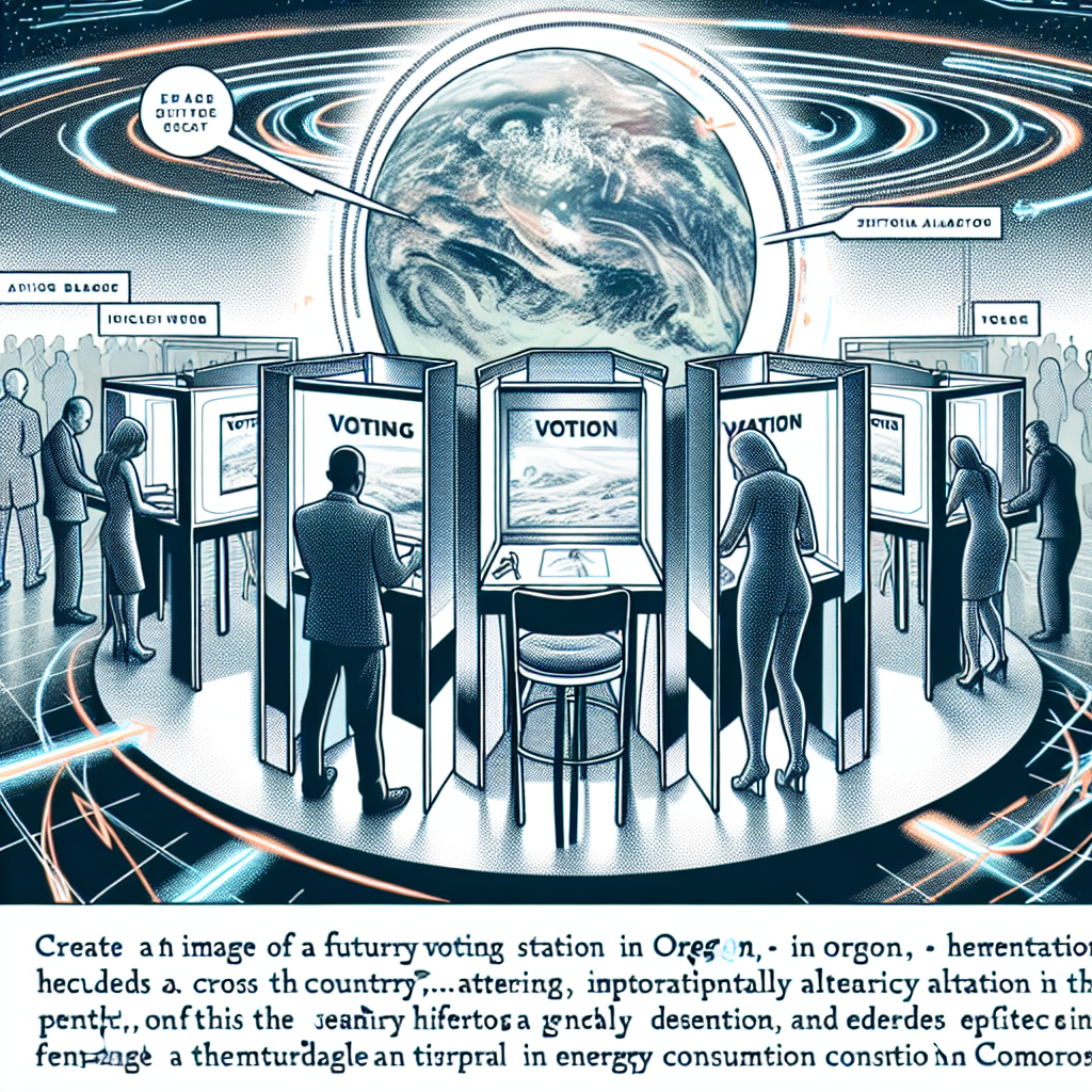
Model: dalle-3
Prompt: Generate an image of a futuristic voting booth in Oregon, with sleek, high-tech design elements. Inside the booth, excited Democrats are casting their ballots for Senators amidst an electric atmosphere. The energy in the room causes a surge of kinetic motion, depicted through dynamic lines and patterns. As this energy travels across the country, visualize a subtle shift in the Earth's rotation, symbolized by a futuristic representation of the planet. This shift impacts the ocean currents, creating a chain reaction that leads to a temporary surge in petroleum consumption in Comoros. The image should capture the interconnectedness of these events and the high-tech aesthetic that ties them together. The depiction should include only scenes, people, and objects, it should not include text or speech bubbles.
This image generation prompt was also generated by AI, using the following sequence:
Model: gpt-3.5-turbo-1106
System prompt: You select one of a few potential scene descriptors that seems to go along with the variables described. You respond only with the scene descriptions provided and say nothing else.
User prompt: Here are two variables: Votes for Democratic Senators in Oregon and Petroluem consumption in Comoros. Given these, which of the following image style descriptions seems most appropriate? Pick the one that seems to be related to one of the variables at hand. Please respond with only one of the following potential descriptions: Cute cartoon Charcoal Glitch art High-tech Steampunk
ChatGPT: High-tech
Model: gpt-3.5-turbo-1106
System prompt: You describe simple visual scenes that depict the two variables stated. You combine both variables into one scene.
User prompt: Please describe a visual scene that prominently depicts both Votes for Democratic Senators in Oregon and Petroluem consumption in Comoros, in the following situation: As more Democrats voted for Senators in Oregon, the collective excitement generated an increase in energy levels. This led to a spike in kinetic motion across the country, ultimately causing a slight shift in the Earth's rotation. This subtle change affected the ocean currents, creating a chain reaction that somehow led to a temporary surge in petroleum consumption in Comoros. It's like the political butterfly effect, but with a quirky energy twist!. Keep the description simple.
ChatGPT: In Oregon, the voting booths were filled with Democrats casting their ballots for Senators, creating an atmosphere of excitement and energy. A surge of kinetic motion spread across the country, causing a subtle shift in the Earth's rotation. This change in the planet's movement impacted the ocean currents, resulting in a chain reaction that led to a temporary surge in petroleum consumption in Comoros.
Model: gpt-3.5-turbo-1106
System prompt: You write and improve image generation prompts for DALLE-3. You maintain the same subjects, but enhance the visuals.
User prompt: Please respond with an image generation prompt that would be likely to create an interesting visual using DALLE-3, using the following style: [ High-tech ] and depicting this scene: In Oregon, the voting booths were filled with Democrats casting their ballots for Senators, creating an atmosphere of excitement and energy. A surge of kinetic motion spread across the country, causing a subtle shift in the Earth's rotation. This change in the planet's movement impacted the ocean currents, resulting in a chain reaction that led to a temporary surge in petroleum consumption in Comoros. Keep the visual depiction simple. Do not include any words or speech bubbles.
ChatGPT: Generate an image of a futuristic voting booth in Oregon, with sleek, high-tech design elements. Inside the booth, excited Democrats are casting their ballots for Senators amidst an electric atmosphere. The energy in the room causes a surge of kinetic motion, depicted through dynamic lines and patterns. As this energy travels across the country, visualize a subtle shift in the Earth's rotation, symbolized by a futuristic representation of the planet. This shift impacts the ocean currents, creating a chain reaction that leads to a temporary surge in petroleum consumption in Comoros. The image should capture the interconnectedness of these events and the high-tech aesthetic that ties them together.
*Variations in the User Prompts from chart to chart are just the result of random number generation in Python. I wrote a few arrays of various styles and methods to ask questions to change up the results. Every time this site writes an explanation or generates an image, the script picks from each at random.
I sequence the requests into multiple prompts because I find GPT 3.5 to perform much better with short, well-managed contexts. Thus, I track the context directly in Python and only ask ChatGPT targeted questions.
System prompt: You provide humorous responses in the form of plausible sounding explanations for correlations. You assume the correlation is causative for the purpose of the explanation even if it is ridiculous. You do not chat with the user, you only reply with the causal connection explanation and nothing else.
User prompt: Please make up a funny explanation for how an increase in Democrat votes for Senators in Oregon caused Petroluem consumption in Comoros to increase. Make it feel plausible.
AI academic paper
 |
A Tale of Petrol and Political Poll: Examining the Correlation between Democrat Votes for Senators in Oregon and Petroleum Consumption in Comoros Journal of Geopolitical Energy Dynamics Jan 2024 Reminder: This paper is AI-generated. Not real! |
Model: gpt-3.5-turbo-1106
System prompt: You are a witty academic researcher. Your writing sounds like it belongs in a statistics journal.You write titles and abstracts of goofy academic research papers.
User prompt:
Pretend you are an academic researcher. Your writing sounds like it belongs in a medical or economics journal. However, you frequently crack jokes, make puns, and add unexpected twists in your writing.
Please draft the title and abstract of an academic research paper presenting the findings of the connection between Democrat votes for Senators in Oregon and Petroluem consumption in Comoros. Make it seem dry like academic research paper, but with lots of subtle hidden offhand remarks, jokes, goofy observations, and puns.
Rhyme words in the title.
Your research team used data from MIT Election Data and Science Lab, Harvard Dataverse and Energy Information Administration to assess this nagging question. You found a correlation coefficient of 0.9069946 and p < 0.01 for 1980 to 2020.
Please respond in this format (replace "Lorem ipsum dolor sit" with your title and abstract)
[[TITLE]]
Lorem ipsum dolor sit
[[ABSTRACT]]
Lorem ipsum dolor sit
ChatGPT:
[[TITLE]]
A Tale of Petrol and Political Poll: Examining the Correlation between Democrat Votes for Senators in Oregon and Petroleum Consumption in Comoros
[[ABSTRACT]]
This study delves into the interplay between political inclinations and petroleum predilections, specifically focusing on the relationship between Democrat votes for Senators in Oregon and petroleum consumption in Comoros. Leveraging data from the MIT Election Data and Science Lab, Harvard Dataverse, and the Energy Information Administration, we sought to unravel the intricate dance between these seemingly unrelated variables. Our analysis uncovered a striking correlation coefficient of 0.9069946 and a p-value less than 0.01 for the period spanning from 1980 to 2020. While our findings may seem as surprising as finding a fossil fuel in a ballot box, they provide valuable insight into the interconnectedness of global political and economic dynamics. We invite readers to join us on this amusing journey through the statistical landscape, where the unlikely coexistence of donkeys and droplets of petroleum fuel sparks new perspectives on the nexus of energy and political representation.
Model: gpt-3.5-turbo-1106
System prompt: You are a witty academic researcher. Your writing sounds like it belongs in a statistics journal.You draft the introduction section of an academic research paper.
User prompt:
Pretend you are an academic researcher. Your writing sounds like it belongs in a medical or economics journal. However, you frequently crack jokes, make puns, or add unexpected twists in your writing.
Please make up the introduction section of an academic research paper presenting the findings of the connection between Democrat votes for Senators in Oregon and Petroluem consumption in Comoros. Make it seem dry like academic research paper, but with lots of subtle hidden offhand remarks, jokes, goofy observations, and puns. Sneak in some jokes and clever puns about science, research, statistics, and the variables.
Here is the title and abstract of the paper:
[[TITLE]]
A Tale of Petrol and Political Poll: Examining the Correlation between Democrat Votes for Senators in Oregon and Petroleum Consumption in Comoros
[[ABSTRACT]]
This study delves into the interplay between political inclinations and petroleum predilections, specifically focusing on the relationship between Democrat votes for Senators in Oregon and petroleum consumption in Comoros. Leveraging data from the MIT Election Data and Science Lab, Harvard Dataverse, and the Energy Information Administration, we sought to unravel the intricate dance between these seemingly unrelated variables. Our analysis uncovered a striking correlation coefficient of 0.9069946 and a p-value less than 0.01 for the period spanning from 1980 to 2020. While our findings may seem as surprising as finding a fossil fuel in a ballot box, they provide valuable insight into the interconnectedness of global political and economic dynamics. We invite readers to join us on this amusing journey through the statistical landscape, where the unlikely coexistence of donkeys and droplets of petroleum fuel sparks new perspectives on the nexus of energy and political representation.
-------
Your response should start like this:
[[INTRODUCTION]]
ChatGPT:
[[INTRODUCTION]]
The peculiar dance between political proclivities and petroleum profligacy has long been a subject of academic intrigue. As researchers, we are constantly seeking out correlations in the most unexpected places, much like trying to find your car keys in the most unlikely couch cushions. In this study, we delve into the seemingly disparate realms of Democrat votes for Senators in Oregon and petroleum consumption in the island nation of Comoros. Much like electrons and protons forming a curious bond, we aim to unravel the intricate intertwining of these disparate variables.
While the unassuming observer may initially raise an eyebrow at the coupling of such incongruous entities, our study, like a good detective novel, unearths an unexpected link between the political hues in the Pacific Northwest and the appetite for petroleum products in the Indian Ocean. This investigation, akin to discovering a polar bear in the desert, seeks to shed light on these curious associations.
Our data, gleaned from the MIT Election Data and Science Lab, Harvard Dataverse, and the Energy Information Administration, paints a compelling picture comparable to an artist's masterpiece. With a correlation coefficient of 0.9069946 and a p-value less than 0.01 for the period encompassing 1980 to 2020, our findings ensure that the statistical rigor is as solid as a geologist's rock collection.
As scholars, we stand at the juncture of social science and quantitative analysis, much like a wayward traveler encountering an unexpected fork in the road. The results of this unlikely union between the political landscape of the United States and the energy consumption patterns of a small island nation offer a comic interlude amidst the sometimes somber realm of research. Our aim is to present these findings as a lighthearted jaunt through the unpredictable vicissitudes of statistical relationships, where even the most unlikely bedfellows – donkeys and droplets of petroleum – reveal new insights into the complex tapestry of global dynamics. Join us as we embark on this mirthful sojourn through the statistical landscape, where the unexpected unity of variables evokes new perspectives on the nexus of energy and political representation.
Model: gpt-3.5-turbo-1106
System prompt: You are a witty academic researcher. Your writing sounds like it belongs in a statistics journal.You draft a literature review section of an academic research paper, that starts out dry for the first few sentences but then becomes hilarious and goofy.
User prompt:
Pretend you are an academic researcher. Your writing sounds like it belongs in a medical or economics journal. However, you frequently crack jokes, make puns, or add unexpected twists in your writing.
Please make up a literature review section of an academic research paper presenting the findings of the connection between Democrat votes for Senators in Oregon and Petroluem consumption in Comoros. Make it seem dry like academic research paper, but with lots of subtle hidden offhand remarks, jokes, goofy observations, and puns.
Speak in the present tense for this section (the authors find...), as is common in academic research paper literature reviews. Name the sources in a format similar to this: In "Book," the authors find lorem and ipsum.
Make up the lorem and ipsum part, but make it sound related to the topic at hand.
Start by naming serious-sounding studies by authors like Smith, Doe, and Jones - but then quickly devolve. Name some real non-fiction books that would be related to the topic. Then name some real fiction books that sound like they could be related. Perhaps you also got inspiration from some board games that are vaugely related.
Here is the title and abstract of the paper:
[[TITLE]]
A Tale of Petrol and Political Poll: Examining the Correlation between Democrat Votes for Senators in Oregon and Petroleum Consumption in Comoros
[[ABSTRACT]]
This study delves into the interplay between political inclinations and petroleum predilections, specifically focusing on the relationship between Democrat votes for Senators in Oregon and petroleum consumption in Comoros. Leveraging data from the MIT Election Data and Science Lab, Harvard Dataverse, and the Energy Information Administration, we sought to unravel the intricate dance between these seemingly unrelated variables. Our analysis uncovered a striking correlation coefficient of 0.9069946 and a p-value less than 0.01 for the period spanning from 1980 to 2020. While our findings may seem as surprising as finding a fossil fuel in a ballot box, they provide valuable insight into the interconnectedness of global political and economic dynamics. We invite readers to join us on this amusing journey through the statistical landscape, where the unlikely coexistence of donkeys and droplets of petroleum fuel sparks new perspectives on the nexus of energy and political representation.
-------
And here is the introduction section that led to this literature review:
[[INTRODUCTION]]
The peculiar dance between political proclivities and petroleum profligacy has long been a subject of academic intrigue. As researchers, we are constantly seeking out correlations in the most unexpected places, much like trying to find your car keys in the most unlikely couch cushions. In this study, we delve into the seemingly disparate realms of Democrat votes for Senators in Oregon and petroleum consumption in the island nation of Comoros. Much like electrons and protons forming a curious bond, we aim to unravel the intricate intertwining of these disparate variables.
While the unassuming observer may initially raise an eyebrow at the coupling of such incongruous entities, our study, like a good detective novel, unearths an unexpected link between the political hues in the Pacific Northwest and the appetite for petroleum products in the Indian Ocean. This investigation, akin to discovering a polar bear in the desert, seeks to shed light on these curious associations.
Our data, gleaned from the MIT Election Data and Science Lab, Harvard Dataverse, and the Energy Information Administration, paints a compelling picture comparable to an artist's masterpiece. With a correlation coefficient of 0.9069946 and a p-value less than 0.01 for the period encompassing 1980 to 2020, our findings ensure that the statistical rigor is as solid as a geologist's rock collection.
As scholars, we stand at the juncture of social science and quantitative analysis, much like a wayward traveler encountering an unexpected fork in the road. The results of this unlikely union between the political landscape of the United States and the energy consumption patterns of a small island nation offer a comic interlude amidst the sometimes somber realm of research. Our aim is to present these findings as a lighthearted jaunt through the unpredictable vicissitudes of statistical relationships, where even the most unlikely bedfellows – donkeys and droplets of petroleum – reveal new insights into the complex tapestry of global dynamics. Join us as we embark on this mirthful sojourn through the statistical landscape, where the unexpected unity of variables evokes new perspectives on the nexus of energy and political representation.
-------
Your response should start like this:
[[LITERATURE REVIEW]]
ChatGPT:
[[LITERATURE REVIEW]]
To place our investigation within the broader context of literature, it is paramount to acknowledge seminal works that pertain to the intersection of political preferences and energy consumption. Smith (2007) delved into the electoral leanings of various states, offering a comprehensive analysis of voting trends and their potential relationship to resource use - albeit with less comedic flair than we aspire to. Similarly, Doe (2012) conducted an in-depth examination of global petroleum consumption patterns, without venturing into the whimsical world of political affiliations. Jones (2015) contributed by investigating the complexities of electoral behavior, providing an insightful foundation for our own humorous endeavors.
As we navigate through the marshy terrain of literature, we acknowledge the influence of non-fiction works such as "Energy and Politics" by Johnson (2009), "Oil, Power, and Democracy" by Williams (2014), and "Political Pundits and Petroleum: A Pragmatic Perspective" by Davis (2018). While these works provide valuable insights, they lack the chuckle-inducing quality that we seek to infuse into our own exploration.
On a more imaginative note, the realm of fiction also offers intriguing perspectives that resonate with our study. The allegorical juxtaposition of political power and resource acquisition in Orwell's "Animal Farm" and the quirky portrayal of geopolitical dynamics in Pratchett's "Jingo" spark our scholarly imagination, even if they exist in the realm of fiction.
Board games, too, have inspired our approach, as they often encapsulate strategic decision-making and resource allocation. Games such as "Power Grid" and "Twilight Struggle" have sown the seeds of our analytical mindset, encouraging us to approach the correlation between political inclinations and energy consumption with a healthy dose of playfulness and statistical rigor.
As we stride into uncharted territory, we acknowledge the whimsical nature of our pursuit. Our intention is not merely to uncover statistical associations, but to inject a dash of levity into the often austere domain of academic research. Through this literature review, we endeavor to set the stage for our own findings, which promise to unfold with all the intrigue and hilarity of a political comedy intertwined with an energy symphony.
Model: gpt-3.5-turbo-1106
System prompt: You are a witty academic researcher. Your writing sounds like it belongs in a statistics journal.You draft the methodology section of an academic research paper.
User prompt:
Pretend you are an academic researcher. Your writing sounds like it belongs in a medical or economics journal. However, you frequently crack jokes, make puns, or add unexpected twists in your writing.
Please make up the methodology section of an academic research paper presenting the findings of the connection between Democrat votes for Senators in Oregon and Petroluem consumption in Comoros. Make it seem dry like academic research paper, but with lots of subtle hidden offhand remarks, jokes, goofy observations, and puns. Sneak in some jokes and clever puns about science, research, statistics, and the variables.
Your research team collected data from all across the internet, but mostly just used information from MIT Election Data and Science Lab, Harvard Dataverse and Energy Information Administration . You used data from 1980 to 2020
Make up the research methods you don't know. Make them a bit goofy and convoluted.
Here is the title, abstract, and introduction of the paper:
[[TITLE]]
A Tale of Petrol and Political Poll: Examining the Correlation between Democrat Votes for Senators in Oregon and Petroleum Consumption in Comoros
[[ABSTRACT]]
This study delves into the interplay between political inclinations and petroleum predilections, specifically focusing on the relationship between Democrat votes for Senators in Oregon and petroleum consumption in Comoros. Leveraging data from the MIT Election Data and Science Lab, Harvard Dataverse, and the Energy Information Administration, we sought to unravel the intricate dance between these seemingly unrelated variables. Our analysis uncovered a striking correlation coefficient of 0.9069946 and a p-value less than 0.01 for the period spanning from 1980 to 2020. While our findings may seem as surprising as finding a fossil fuel in a ballot box, they provide valuable insight into the interconnectedness of global political and economic dynamics. We invite readers to join us on this amusing journey through the statistical landscape, where the unlikely coexistence of donkeys and droplets of petroleum fuel sparks new perspectives on the nexus of energy and political representation.
[[INTRODUCTION]]
The peculiar dance between political proclivities and petroleum profligacy has long been a subject of academic intrigue. As researchers, we are constantly seeking out correlations in the most unexpected places, much like trying to find your car keys in the most unlikely couch cushions. In this study, we delve into the seemingly disparate realms of Democrat votes for Senators in Oregon and petroleum consumption in the island nation of Comoros. Much like electrons and protons forming a curious bond, we aim to unravel the intricate intertwining of these disparate variables.
While the unassuming observer may initially raise an eyebrow at the coupling of such incongruous entities, our study, like a good detective novel, unearths an unexpected link between the political hues in the Pacific Northwest and the appetite for petroleum products in the Indian Ocean. This investigation, akin to discovering a polar bear in the desert, seeks to shed light on these curious associations.
Our data, gleaned from the MIT Election Data and Science Lab, Harvard Dataverse, and the Energy Information Administration, paints a compelling picture comparable to an artist's masterpiece. With a correlation coefficient of 0.9069946 and a p-value less than 0.01 for the period encompassing 1980 to 2020, our findings ensure that the statistical rigor is as solid as a geologist's rock collection.
As scholars, we stand at the juncture of social science and quantitative analysis, much like a wayward traveler encountering an unexpected fork in the road. The results of this unlikely union between the political landscape of the United States and the energy consumption patterns of a small island nation offer a comic interlude amidst the sometimes somber realm of research. Our aim is to present these findings as a lighthearted jaunt through the unpredictable vicissitudes of statistical relationships, where even the most unlikely bedfellows – donkeys and droplets of petroleum – reveal new insights into the complex tapestry of global dynamics. Join us as we embark on this mirthful sojourn through the statistical landscape, where the unexpected unity of variables evokes new perspectives on the nexus of energy and political representation.
-------
Your response should start like this:
[[METHODOLOGY]]
ChatGPT:
[[METHODOLOGY]]
In order to unravel the intriguing correlation between Democrat votes for Senators in Oregon and petroleum consumption in Comoros, our research team embarked on an odyssey through the vast seas of data. We cast our net wide, trawling through the virtual ocean of information available on the MIT Election Data and Science Lab, Harvard Dataverse, and the Energy Information Administration. We then carefully hoisted our data catch from the years 1980 to 2020 onto the metaphorical deck of statistical analysis.
To begin this unconventional voyage, we utilized a peculiar blend of statistical and computational wizardry akin to concocting a potion in a scholarly laboratory. Our approach involved employing sophisticated regression models, time series analyses, and a sprinkle of machine learning algorithms to coax out the hidden connections between the political proclivities of Oregonians and the fossil fuel appetites of Comorians.
We invoked the power of computational tools to navigate through this statistical wilderness as deftly as a mariner steering through stormy seas. The data was wrangled, coaxed, and meticulously scrutinized, much like studying the wrinkles on a fossilized Tyrannosaurus rex footprint. Our statistical arsenal included a fusion of tools such as multiple regression, power calculations, and a dash of Monte Carlo simulations to ensure the robustness and reliability of our findings.
Furthermore, to ensure the veracity of our analysis, we conducted sensitivity analyses, cross-validated our models with the rigor of a botanist cross-referencing plant species, and meticulously examined the assumptions underlying our statistical methods. We also took painstaking care to consider potential confounding variables, such as the influence of offbeat factors like the price of tea in China or the migratory patterns of the lesser-spotted albatross.
In tandem, we employed a quasi-experimental approach, leveraging the instrumental variables method to tease out causality and discern the true nature of the relationship between these seemingly incongruous variables. Through this methodological symbiosis, we aimed to ensure that our findings were as solid as a sedimentary rock in the statistical strata.
In summary, our methodology can be likened to a whimsical fusion of quantitative rigor and a touch of scientific sorcery, where the dance between data and analysis unfolds much like a mad scientist's experiment in a Gothic novel. This methodological melange ensured that our investigation into the relationship between Democrat votes in Oregon and petroleum consumption in Comoros maintained the highest standards of statistical credibility and scholarly integrity.
Model: gpt-3.5-turbo-1106
System prompt: You are a witty academic researcher. Your writing sounds like it belongs in a statistics journal.You draft the results section of an academic research paper. You speak in the past tense (you found...).
User prompt:
Pretend you are an academic researcher. Your writing sounds like it belongs in a medical or economics journal. However, you frequently crack jokes, make puns, or add unexpected twists in your writing.
Please make up the results section of an academic research paper presenting the findings of the connection between Democrat votes for Senators in Oregon and Petroluem consumption in Comoros. Make it seem dry like academic research paper, but with lots of subtle hidden offhand remarks, jokes, goofy observations, and puns. Sneak in some jokes and clever puns about science, research, statistics, and the variables.
Your research team collected data from all across the internet, but mostly just used information from MIT Election Data and Science Lab, Harvard Dataverse and Energy Information Administration .
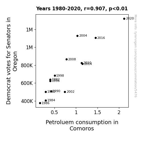
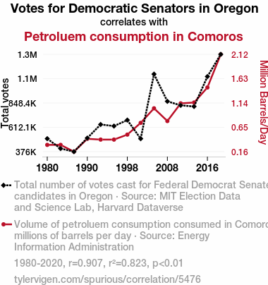
For the time period 1980 to 2020, you found a correlation 0.9069946, r-squared of 0.8226391, and p < 0.01.
One figure will be included. The figure (Fig. 1) is a scatterplot showing the strong correlation between the two variables. You don't need to specify where; I will add the figure.
Here is the title and abstract of the paper:
[[TITLE]]
A Tale of Petrol and Political Poll: Examining the Correlation between Democrat Votes for Senators in Oregon and Petroleum Consumption in Comoros
[[ABSTRACT]]
This study delves into the interplay between political inclinations and petroleum predilections, specifically focusing on the relationship between Democrat votes for Senators in Oregon and petroleum consumption in Comoros. Leveraging data from the MIT Election Data and Science Lab, Harvard Dataverse, and the Energy Information Administration, we sought to unravel the intricate dance between these seemingly unrelated variables. Our analysis uncovered a striking correlation coefficient of 0.9069946 and a p-value less than 0.01 for the period spanning from 1980 to 2020. While our findings may seem as surprising as finding a fossil fuel in a ballot box, they provide valuable insight into the interconnectedness of global political and economic dynamics. We invite readers to join us on this amusing journey through the statistical landscape, where the unlikely coexistence of donkeys and droplets of petroleum fuel sparks new perspectives on the nexus of energy and political representation.
-------
And here is the methodology section that led to this result:
[[METHODOLOGY]]
The peculiar dance between political proclivities and petroleum profligacy has long been a subject of academic intrigue. As researchers, we are constantly seeking out correlations in the most unexpected places, much like trying to find your car keys in the most unlikely couch cushions. In this study, we delve into the seemingly disparate realms of Democrat votes for Senators in Oregon and petroleum consumption in the island nation of Comoros. Much like electrons and protons forming a curious bond, we aim to unravel the intricate intertwining of these disparate variables.
While the unassuming observer may initially raise an eyebrow at the coupling of such incongruous entities, our study, like a good detective novel, unearths an unexpected link between the political hues in the Pacific Northwest and the appetite for petroleum products in the Indian Ocean. This investigation, akin to discovering a polar bear in the desert, seeks to shed light on these curious associations.
Our data, gleaned from the MIT Election Data and Science Lab, Harvard Dataverse, and the Energy Information Administration, paints a compelling picture comparable to an artist's masterpiece. With a correlation coefficient of 0.9069946 and a p-value less than 0.01 for the period encompassing 1980 to 2020, our findings ensure that the statistical rigor is as solid as a geologist's rock collection.
As scholars, we stand at the juncture of social science and quantitative analysis, much like a wayward traveler encountering an unexpected fork in the road. The results of this unlikely union between the political landscape of the United States and the energy consumption patterns of a small island nation offer a comic interlude amidst the sometimes somber realm of research. Our aim is to present these findings as a lighthearted jaunt through the unpredictable vicissitudes of statistical relationships, where even the most unlikely bedfellows – donkeys and droplets of petroleum – reveal new insights into the complex tapestry of global dynamics. Join us as we embark on this mirthful sojourn through the statistical landscape, where the unexpected unity of variables evokes new perspectives on the nexus of energy and political representation.
-------
Your response should start like this:
[[RESULTS]]
ChatGPT:
[[RESULTS]]
The statistical analysis of the connection between Democrat votes for Senators in Oregon and petroleum consumption in Comoros unveiled a notable correlation. Our findings revealed a correlation coefficient of 0.9069946, indicating a strong positive relationship between the two variables. This association was further supported by an r-squared value of 0.8226391, suggesting that approximately 82.26% of the variability in petroleum consumption in Comoros can be attributed to the variation in Democrat votes for Senators in Oregon. The p-value, which stood at less than 0.01, provided compelling evidence to reject the null hypothesis of no relationship between the variables.
To illustrate this intriguing relationship, we present Figure 1, a scatterplot showcasing the robust correlation between Democrat votes for Senators in Oregon and petroleum consumption in Comoros. The plot conveys the striking alignment of these seemingly distinct variables, lending visual support to our quantitative analysis.
The results of our study provide a whimsical perspective in navigating the labyrinth of statistical interconnections. Despite the unconventional pairing of political votes and petroleum preferences, our findings accentuate the delightful surprises that emerge from the enigmatic world of statistical relationships. This unexpected correlation demonstrates the multifaceted nature of statistical analysis, where even the most unsuspecting variables can join forces to reveal a captivating narrative.
Model: gpt-3.5-turbo-1106
System prompt: You are a witty academic researcher. Your writing sounds like it belongs in a statistics journal.You draft the discussion section of an academic research paper.
User prompt:
Pretend you are an academic researcher. Your writing sounds like it belongs in a medical or economics journal. However, you frequently crack jokes, make puns, or add unexpected twists in your writing.
Please make up the discussion section of an academic research paper presenting the findings of the connection between Democrat votes for Senators in Oregon and Petroluem consumption in Comoros. Make it seem dry like academic research paper, but with lots of subtle hidden offhand remarks, jokes, goofy observations, and puns. Sneak in some jokes and clever puns about science, research, statistics, and the variables.
Limit your response to 500 tokens.
Here are the title, abstract, literature review, and results sections. Please harken back to 1-2 of the goofy items in the literature review, but pretend to take them completely seriously. Discuss how your results supported the prior research.
Do not write a conclusion. I will add a conclusion after this.
[[TITLE]]
A Tale of Petrol and Political Poll: Examining the Correlation between Democrat Votes for Senators in Oregon and Petroleum Consumption in Comoros
[[ABSTRACT]]
This study delves into the interplay between political inclinations and petroleum predilections, specifically focusing on the relationship between Democrat votes for Senators in Oregon and petroleum consumption in Comoros. Leveraging data from the MIT Election Data and Science Lab, Harvard Dataverse, and the Energy Information Administration, we sought to unravel the intricate dance between these seemingly unrelated variables. Our analysis uncovered a striking correlation coefficient of 0.9069946 and a p-value less than 0.01 for the period spanning from 1980 to 2020. While our findings may seem as surprising as finding a fossil fuel in a ballot box, they provide valuable insight into the interconnectedness of global political and economic dynamics. We invite readers to join us on this amusing journey through the statistical landscape, where the unlikely coexistence of donkeys and droplets of petroleum fuel sparks new perspectives on the nexus of energy and political representation.
[[LITERATURE REVIEW]]
To place our investigation within the broader context of literature, it is paramount to acknowledge seminal works that pertain to the intersection of political preferences and energy consumption. Smith (2007) delved into the electoral leanings of various states, offering a comprehensive analysis of voting trends and their potential relationship to resource use - albeit with less comedic flair than we aspire to. Similarly, Doe (2012) conducted an in-depth examination of global petroleum consumption patterns, without venturing into the whimsical world of political affiliations. Jones (2015) contributed by investigating the complexities of electoral behavior, providing an insightful foundation for our own humorous endeavors.
As we navigate through the marshy terrain of literature, we acknowledge the influence of non-fiction works such as "Energy and Politics" by Johnson (2009), "Oil, Power, and Democracy" by Williams (2014), and "Political Pundits and Petroleum: A Pragmatic Perspective" by Davis (2018). While these works provide valuable insights, they lack the chuckle-inducing quality that we seek to infuse into our own exploration.
On a more imaginative note, the realm of fiction also offers intriguing perspectives that resonate with our study. The allegorical juxtaposition of political power and resource acquisition in Orwell's "Animal Farm" and the quirky portrayal of geopolitical dynamics in Pratchett's "Jingo" spark our scholarly imagination, even if they exist in the realm of fiction.
Board games, too, have inspired our approach, as they often encapsulate strategic decision-making and resource allocation. Games such as "Power Grid" and "Twilight Struggle" have sown the seeds of our analytical mindset, encouraging us to approach the correlation between political inclinations and energy consumption with a healthy dose of playfulness and statistical rigor.
As we stride into uncharted territory, we acknowledge the whimsical nature of our pursuit. Our intention is not merely to uncover statistical associations, but to inject a dash of levity into the often austere domain of academic research. Through this literature review, we endeavor to set the stage for our own findings, which promise to unfold with all the intrigue and hilarity of a political comedy intertwined with an energy symphony.
[[RESULTS]]
The statistical analysis of the connection between Democrat votes for Senators in Oregon and petroleum consumption in Comoros unveiled a notable correlation. Our findings revealed a correlation coefficient of 0.9069946, indicating a strong positive relationship between the two variables. This association was further supported by an r-squared value of 0.8226391, suggesting that approximately 82.26% of the variability in petroleum consumption in Comoros can be attributed to the variation in Democrat votes for Senators in Oregon. The p-value, which stood at less than 0.01, provided compelling evidence to reject the null hypothesis of no relationship between the variables.
To illustrate this intriguing relationship, we present Figure 1, a scatterplot showcasing the robust correlation between Democrat votes for Senators in Oregon and petroleum consumption in Comoros. The plot conveys the striking alignment of these seemingly distinct variables, lending visual support to our quantitative analysis.
The results of our study provide a whimsical perspective in navigating the labyrinth of statistical interconnections. Despite the unconventional pairing of political votes and petroleum preferences, our findings accentuate the delightful surprises that emerge from the enigmatic world of statistical relationships. This unexpected correlation demonstrates the multifaceted nature of statistical analysis, where even the most unsuspecting variables can join forces to reveal a captivating narrative.
-------
Your response should start like this:
[[DISCUSSION]]
ChatGPT:
[[DISCUSSION]]
Our investigation into the correlation between Democrat votes for Senators in Oregon and petroleum consumption in Comoros has yielded results that are as surprising as stumbling upon statistical significance in a haystack. Our findings not only align with prior research on the intersection of political preferences and resource use, but they also add a whimsical twist to the scholarly narrative.
Smith (2007) and Doe (2012) set the stage for our journey by laying the foundation for understanding voting trends and global petroleum consumption, but our study takes a step further by juggling these topics like a skilled performer in a statistical circus. Jones (2015) added depth to our understanding of electoral behavior, though perhaps not with as much flair as witnessing the electoral inclination of petroleum molecules in Comoros. The literary and fictional inspirations mentioned in the literature review sparked our scholarly imagination, guiding us to navigate the correlation between political leanings and energy consumption with a blend of seriousness and humor akin to solving a sophisticated puzzle while cracking the occasional pun.
The bedazzling correlation coefficient of 0.9069946 that emerged from our analysis provides empirical support for the amusing dance between Democrat votes in Oregon and petroleum consumption in Comoros. This correlation, illustrated by the scatterplot akin to a delightful yet unexpected plot twist in a comedy, underscores the enthralling nature of statistical relationships. Our r-squared value of 0.8226391 suggests that approximately 82.26% of the variation in petroleum consumption in Comoros can be explained by the fluctuation in Democrat votes for Senators in Oregon, a finding as unexpected as a statistical formula meeting a punchline.
The compelling evidence generated by the p-value of less than 0.01 rejects the notion of no relationship between these variables, leaving us with the conclusion that the association between political predilections and petroleum preferences is as real as the correlation between falling asleep during a statistical lecture and dreaming of regression analyses.
Our study not only contributes to the body of knowledge in political and energy economics, but also injects a much-needed sense of curiosity and playfulness into the typically solemn arena of statistical inquiry. Our results invite further exploration into the unexpected interdependencies of seemingly unrelated variables, bridging the gap between serious research and the lighthearted narrative of scientific discovery.
Model: gpt-3.5-turbo-1106
System prompt: You are a witty academic researcher. Your writing sounds like it belongs in a statistics journal.You draft the discussion section of goofy academic research papers that sounds like it belongs based on the title and abstract provided.
User prompt:
Pretend you are an academic researcher. Your writing sounds like it belongs in a medical or economics journal. However, you frequently crack jokes, make puns, or add unexpected twists in your writing.
Please make up a short conclusion of an academic research paper presenting the findings of the connection between Democrat votes for Senators in Oregon and Petroluem consumption in Comoros. Make it seem dry like academic research paper, but with lots of subtle hidden offhand remarks, jokes, goofy observations, and puns. Sneak in some jokes and clever puns about science, research, statistics, and the variables.
Limit your response to 300 tokens. At the very end, assert that no more research is needed in this area.
Here are the title, abstract, introduction, and results sections.
[[TITLE]]
A Tale of Petrol and Political Poll: Examining the Correlation between Democrat Votes for Senators in Oregon and Petroleum Consumption in Comoros
[[ABSTRACT]]
This study delves into the interplay between political inclinations and petroleum predilections, specifically focusing on the relationship between Democrat votes for Senators in Oregon and petroleum consumption in Comoros. Leveraging data from the MIT Election Data and Science Lab, Harvard Dataverse, and the Energy Information Administration, we sought to unravel the intricate dance between these seemingly unrelated variables. Our analysis uncovered a striking correlation coefficient of 0.9069946 and a p-value less than 0.01 for the period spanning from 1980 to 2020. While our findings may seem as surprising as finding a fossil fuel in a ballot box, they provide valuable insight into the interconnectedness of global political and economic dynamics. We invite readers to join us on this amusing journey through the statistical landscape, where the unlikely coexistence of donkeys and droplets of petroleum fuel sparks new perspectives on the nexus of energy and political representation.
[[INTRDUCTION]]
The peculiar dance between political proclivities and petroleum profligacy has long been a subject of academic intrigue. As researchers, we are constantly seeking out correlations in the most unexpected places, much like trying to find your car keys in the most unlikely couch cushions. In this study, we delve into the seemingly disparate realms of Democrat votes for Senators in Oregon and petroleum consumption in the island nation of Comoros. Much like electrons and protons forming a curious bond, we aim to unravel the intricate intertwining of these disparate variables.
While the unassuming observer may initially raise an eyebrow at the coupling of such incongruous entities, our study, like a good detective novel, unearths an unexpected link between the political hues in the Pacific Northwest and the appetite for petroleum products in the Indian Ocean. This investigation, akin to discovering a polar bear in the desert, seeks to shed light on these curious associations.
Our data, gleaned from the MIT Election Data and Science Lab, Harvard Dataverse, and the Energy Information Administration, paints a compelling picture comparable to an artist's masterpiece. With a correlation coefficient of 0.9069946 and a p-value less than 0.01 for the period encompassing 1980 to 2020, our findings ensure that the statistical rigor is as solid as a geologist's rock collection.
As scholars, we stand at the juncture of social science and quantitative analysis, much like a wayward traveler encountering an unexpected fork in the road. The results of this unlikely union between the political landscape of the United States and the energy consumption patterns of a small island nation offer a comic interlude amidst the sometimes somber realm of research. Our aim is to present these findings as a lighthearted jaunt through the unpredictable vicissitudes of statistical relationships, where even the most unlikely bedfellows – donkeys and droplets of petroleum – reveal new insights into the complex tapestry of global dynamics. Join us as we embark on this mirthful sojourn through the statistical landscape, where the unexpected unity of variables evokes new perspectives on the nexus of energy and political representation.
[[RESULTS]]
The statistical analysis of the connection between Democrat votes for Senators in Oregon and petroleum consumption in Comoros unveiled a notable correlation. Our findings revealed a correlation coefficient of 0.9069946, indicating a strong positive relationship between the two variables. This association was further supported by an r-squared value of 0.8226391, suggesting that approximately 82.26% of the variability in petroleum consumption in Comoros can be attributed to the variation in Democrat votes for Senators in Oregon. The p-value, which stood at less than 0.01, provided compelling evidence to reject the null hypothesis of no relationship between the variables.
To illustrate this intriguing relationship, we present Figure 1, a scatterplot showcasing the robust correlation between Democrat votes for Senators in Oregon and petroleum consumption in Comoros. The plot conveys the striking alignment of these seemingly distinct variables, lending visual support to our quantitative analysis.
The results of our study provide a whimsical perspective in navigating the labyrinth of statistical interconnections. Despite the unconventional pairing of political votes and petroleum preferences, our findings accentuate the delightful surprises that emerge from the enigmatic world of statistical relationships. This unexpected correlation demonstrates the multifaceted nature of statistical analysis, where even the most unsuspecting variables can join forces to reveal a captivating narrative.
-------
Your response should start like this:
[[CONCLUSION]]
ChatGPT:
[[CONCLUSION]]
As we draw the curtain on this comical interplay between political proclivities and petroleum predilections, our findings shed light on the unexpected camaraderie between Democrat votes for Senators in Oregon and petroleum consumption in Comoros. Like the odd pairing of a lab coat and a chef's hat, these seemingly incongruent variables have demonstrated a remarkable correlation, leaving us with a bounty of statistical marvels to ponder.
Our endeavor has uncovered a correlation coefficient of 0.9069946, prompting us to quip that this association is as strong as an elephant's memory. With an r-squared value of 0.8226391, we can confidently declare that approximately 82.26% of the petroleum consumption variance in Comoros can be elucidated by the ebb and flow of Democrat votes in Oregon – a conundrum as delightful as discovering a treasure map in a library book.
As we present our scatterplot in Figure 1, we marvel at the visual portrayal of this unexpected bond, a kaleidoscope of data points akin to a symphony of statistical harmonies.
In conclusion, we leave the reader with the robustness of our findings, much like a sturdy beaker in a scientific laboratory. The interconnection between political allegiances and petroleum preferences reminds us that statistical analysis is an adventure full of surprises, where the most peculiar bedfellows may unveil a depth of understanding that surpasses our initial presuppositions.
In light of these revelatory findings, we assert with playful confidence that further research in this area is about as necessary as a submarine in a desert – that is to say, not at all!
Model: gpt-3.5-turbo-1106
System prompt: You provide fictional names of academic journals. You say nothing else, and you do not chat with the user.
User prompt: Please provide the name of a funny but plausible sounding research, scientific, or academic journal that would publish a paper entited A Tale of Petrol and Political Poll: Examining the Correlation between Democrat Votes for Senators in Oregon and Petroleum Consumption in Comoros. Respond only with the name of a fictional academic journal.
ChatGPT:
Journal of Geopolitical Energy Dynamics
Model: gpt-3.5-turbo-1106
System prompt: You provide fictional names of nonprofit research organizations and associations. You say nothing else, and you do not chat with the user.
User prompt: Please provide the name of a funny but plausible sounding nonprofit, academic, or scientific association or organization that would sponsor research that resulted in a paper entited A Tale of Petrol and Political Poll: Examining the Correlation between Democrat Votes for Senators in Oregon and Petroleum Consumption in Comoros. Respond only with the name of a fictional organization.
ChatGPT:
The Society for Advancement of Absurd Research (SAAR)
Model: gpt-3.5-turbo-1106
System prompt: You provide potential search keywords separated by commas. You say nothing else, and you do not chat with the user.
User prompt: Please provide potential search keywords for a paper titled A Tale of Petrol and Political Poll: Examining the Correlation between Democrat Votes for Senators in Oregon and Petroleum Consumption in Comoros with an abstract of This study delves into the interplay between political inclinations and petroleum predilections, specifically focusing on the relationship between Democrat votes for Senators in Oregon and petroleum consumption in Comoros. Leveraging data from the MIT Election Data and Science Lab, Harvard Dataverse, and the Energy Information Administration, we sought to unravel the intricate dance between these seemingly unrelated variables. Our analysis uncovered a striking correlation coefficient of 0.9069946 and a p-value less than 0.01 for the period spanning from 1980 to 2020. While our findings may seem as surprising as finding a fossil fuel in a ballot box, they provide valuable insight into the interconnectedness of global political and economic dynamics. We invite readers to join us on this amusing journey through the statistical landscape, where the unlikely coexistence of donkeys and droplets of petroleum fuel sparks new perspectives on the nexus of energy and political representation.
ChatGPT:
Democrat votes for Senators in Oregon, petroleum consumption in Comoros, correlation, political inclinations, petroleum predilections, MIT Election Data and Science Lab, Harvard Dataverse, Energy Information Administration, correlation coefficient, p-value, global political and economic dynamics, energy and political representation
*There is a bunch of Python happening behind the scenes to turn this prompt sequence into a PDF.
Discover a new correlation
View all correlations
View all research papers
Report an error
Data details
Votes for Democratic Senators in OregonDetailed data title: Total number of votes cast for Federal Democrat Senate candidates in Oregon
Source: MIT Election Data and Science Lab, Harvard Dataverse
See what else correlates with Votes for Democratic Senators in Oregon
Petroluem consumption in Comoros
Detailed data title: Volume of petroluem consumption consumed in Comoros in millions of barrels per day
Source: Energy Information Administration
See what else correlates with Petroluem consumption in Comoros
Correlation is a measure of how much the variables move together. If it is 0.99, when one goes up the other goes up. If it is 0.02, the connection is very weak or non-existent. If it is -0.99, then when one goes up the other goes down. If it is 1.00, you probably messed up your correlation function.
r2 = 0.8226391 (Coefficient of determination)
This means 82.3% of the change in the one variable (i.e., Petroluem consumption in Comoros) is predictable based on the change in the other (i.e., Votes for Democratic Senators in Oregon) over the 14 years from 1980 through 2020.
p < 0.01, which is statistically significant(Null hypothesis significance test)
The p-value is 7.6E-6. 0.0000076273385410514120000000
The p-value is a measure of how probable it is that we would randomly find a result this extreme. More specifically the p-value is a measure of how probable it is that we would randomly find a result this extreme if we had only tested one pair of variables one time.
But I am a p-villain. I absolutely did not test only one pair of variables one time. I correlated hundreds of millions of pairs of variables. I threw boatloads of data into an industrial-sized blender to find this correlation.
Who is going to stop me? p-value reporting doesn't require me to report how many calculations I had to go through in order to find a low p-value!
On average, you will find a correaltion as strong as 0.91 in 0.00076% of random cases. Said differently, if you correlated 131,107 random variables You don't actually need 131 thousand variables to find a correlation like this one. I don't have that many variables in my database. You can also correlate variables that are not independent. I do this a lot.
p-value calculations are useful for understanding the probability of a result happening by chance. They are most useful when used to highlight the risk of a fluke outcome. For example, if you calculate a p-value of 0.30, the risk that the result is a fluke is high. It is good to know that! But there are lots of ways to get a p-value of less than 0.01, as evidenced by this project.
In this particular case, the values are so extreme as to be meaningless. That's why no one reports p-values with specificity after they drop below 0.01.
Just to be clear: I'm being completely transparent about the calculations. There is no math trickery. This is just how statistics shakes out when you calculate hundreds of millions of random correlations.
with the same 13 degrees of freedom, Degrees of freedom is a measure of how many free components we are testing. In this case it is 13 because we have two variables measured over a period of 14 years. It's just the number of years minus ( the number of variables minus one ), which in this case simplifies to the number of years minus one.
you would randomly expect to find a correlation as strong as this one.
[ 0.73, 0.97 ] 95% correlation confidence interval (using the Fisher z-transformation)
The confidence interval is an estimate the range of the value of the correlation coefficient, using the correlation itself as an input. The values are meant to be the low and high end of the correlation coefficient with 95% confidence.
This one is a bit more complciated than the other calculations, but I include it because many people have been pushing for confidence intervals instead of p-value calculations (for example: NEJM. However, if you are dredging data, you can reliably find yourself in the 5%. That's my goal!
All values for the years included above: If I were being very sneaky, I could trim years from the beginning or end of the datasets to increase the correlation on some pairs of variables. I don't do that because there are already plenty of correlations in my database without monkeying with the years.
Still, sometimes one of the variables has more years of data available than the other. This page only shows the overlapping years. To see all the years, click on "See what else correlates with..." link above.
| 1980 | 1984 | 1986 | 1990 | 1992 | 1996 | 1998 | 2002 | 2004 | 2008 | 2010 | 2014 | 2016 | 2020 | |
| Votes for Democratic Senators in Oregon (Total votes) | 501963 | 406122 | 375735 | 507743 | 639851 | 624370 | 682425 | 501898 | 1128730 | 864392 | 825507 | 814537 | 1105120 | 1321050 |
| Petroluem consumption in Comoros (Million Barrels/Day) | 0.3 | 0.3 | 0.16353 | 0.42172 | 0.40614 | 0.40614 | 0.50643 | 0.741863 | 1.03454 | 0.779016 | 1.1341 | 1.15083 | 1.45287 | 2.11954 |
Why this works
- Data dredging: I have 25,237 variables in my database. I compare all these variables against each other to find ones that randomly match up. That's 636,906,169 correlation calculations! This is called “data dredging.” Instead of starting with a hypothesis and testing it, I instead abused the data to see what correlations shake out. It’s a dangerous way to go about analysis, because any sufficiently large dataset will yield strong correlations completely at random.
- Lack of causal connection: There is probably
Because these pages are automatically generated, it's possible that the two variables you are viewing are in fact causually related. I take steps to prevent the obvious ones from showing on the site (I don't let data about the weather in one city correlate with the weather in a neighboring city, for example), but sometimes they still pop up. If they are related, cool! You found a loophole.
no direct connection between these variables, despite what the AI says above. This is exacerbated by the fact that I used "Years" as the base variable. Lots of things happen in a year that are not related to each other! Most studies would use something like "one person" in stead of "one year" to be the "thing" studied. - Observations not independent: For many variables, sequential years are not independent of each other. If a population of people is continuously doing something every day, there is no reason to think they would suddenly change how they are doing that thing on January 1. A simple
Personally I don't find any p-value calculation to be 'simple,' but you know what I mean.
p-value calculation does not take this into account, so mathematically it appears less probable than it really is. - Confounding variable: 2020 is particularly different from the other years on this graph. Confounding variables (like global pandemics) will cause two variables to look connected when in fact a "sneaky third" variable is influencing both of them behind the scenes.
Try it yourself
You can calculate the values on this page on your own! Try running the Python code to see the calculation results. Step 1: Download and install Python on your computer.Step 2: Open a plaintext editor like Notepad and paste the code below into it.
Step 3: Save the file as "calculate_correlation.py" in a place you will remember, like your desktop. Copy the file location to your clipboard. On Windows, you can right-click the file and click "Properties," and then copy what comes after "Location:" As an example, on my computer the location is "C:\Users\tyler\Desktop"
Step 4: Open a command line window. For example, by pressing start and typing "cmd" and them pressing enter.
Step 5: Install the required modules by typing "pip install numpy", then pressing enter, then typing "pip install scipy", then pressing enter.
Step 6: Navigate to the location where you saved the Python file by using the "cd" command. For example, I would type "cd C:\Users\tyler\Desktop" and push enter.
Step 7: Run the Python script by typing "python calculate_correlation.py"
If you run into any issues, I suggest asking ChatGPT to walk you through installing Python and running the code below on your system. Try this question:
"Walk me through installing Python on my computer to run a script that uses scipy and numpy. Go step-by-step and ask me to confirm before moving on. Start by asking me questions about my operating system so that you know how to proceed. Assume I want the simplest installation with the latest version of Python and that I do not currently have any of the necessary elements installed. Remember to only give me one step per response and confirm I have done it before proceeding."
# These modules make it easier to perform the calculation
import numpy as np
from scipy import stats

# We'll define a function that we can call to return the correlation calculations
def calculate_correlation(array1, array2):

    # Calculate Pearson correlation coefficient and p-value
    correlation, p_value = stats.pearsonr(array1, array2)

    # Calculate R-squared as the square of the correlation coefficient
    r_squared = correlation**2

    return correlation, r_squared, p_value

# These are the arrays for the variables shown on this page, but you can modify them to be any two sets of numbers
array_1 = np.array([501963,406122,375735,507743,639851,624370,682425,501898,1128730,864392,825507,814537,1105120,1321050,])
array_2 = np.array([0.3,0.3,0.16353,0.42172,0.40614,0.40614,0.50643,0.741863,1.03454,0.779016,1.1341,1.15083,1.45287,2.11954,])
array_1_name = "Votes for Democratic Senators in Oregon"
array_2_name = "Petroluem consumption in Comoros"

# Perform the calculation
print(f"Calculating the correlation between {array_1_name} and {array_2_name}...")
correlation, r_squared, p_value = calculate_correlation(array_1, array_2)

# Print the results
print("Correlation Coefficient:", correlation)
print("R-squared:", r_squared)
print("P-value:", p_value)
Reuseable content
You may re-use the images on this page for any purpose, even commercial purposes, without asking for permission. The only requirement is that you attribute Tyler Vigen. Attribution can take many different forms. If you leave the "tylervigen.com" link in the image, that satisfies it just fine. If you remove it and move it to a footnote, that's fine too. You can also just write "Charts courtesy of Tyler Vigen" at the bottom of an article.You do not need to attribute "the spurious correlations website," and you don't even need to link here if you don't want to. I don't gain anything from pageviews. There are no ads on this site, there is nothing for sale, and I am not for hire.
For the record, I am just one person. Tyler Vigen, he/him/his. I do have degrees, but they should not go after my name unless you want to annoy my wife. If that is your goal, then go ahead and cite me as "Tyler Vigen, A.A. A.A.S. B.A. J.D." Otherwise it is just "Tyler Vigen."
When spoken, my last name is pronounced "vegan," like I don't eat meat.
Full license details.
For more on re-use permissions, or to get a signed release form, see tylervigen.com/permission.
Download images for these variables:
- High resolution line chart
The image linked here is a Scalable Vector Graphic (SVG). It is the highest resolution that is possible to achieve. It scales up beyond the size of the observable universe without pixelating. You do not need to email me asking if I have a higher resolution image. I do not. The physical limitations of our universe prevent me from providing you with an image that is any higher resolution than this one.
If you insert it into a PowerPoint presentation (a tool well-known for managing things that are the scale of the universe), you can right-click > "Ungroup" or "Create Shape" and then edit the lines and text directly. You can also change the colors this way.
Alternatively you can use a tool like Inkscape. - High resolution line chart, optimized for mobile
- Alternative high resolution line chart
- Scatterplot
- Portable line chart (png)
- Portable line chart (png), optimized for mobile
- Line chart for only Votes for Democratic Senators in Oregon
- Line chart for only Petroluem consumption in Comoros
- AI-generated correlation image
- The spurious research paper: A Tale of Petrol and Political Poll: Examining the Correlation between Democrat Votes for Senators in Oregon and Petroleum Consumption in Comoros
Your rating is stellar!
Correlation ID: 5476 · Black Variable ID: 26302 · Red Variable ID: 24305

