
Download png, svg
AI explanation
As the 7th graders learned about the electoral process, they became enamored with the pomp and circumstance of politics. Their mock elections and debates sparked a newfound interest in conservative ideologies, leading to a surprising surge in support for the Republican candidate. It seems like the future voters of America are getting an early start in shaping the political landscape!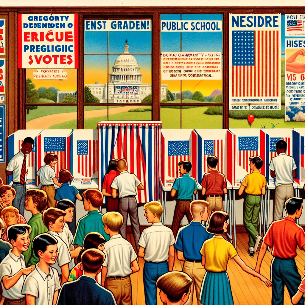
Model: dalle-3
Prompt: Generate an image of a TIME magazine cover depicting the scene in a bustling classroom filled with 7th graders. You can show a mock voting booth adorned with red, white, and blue decorations at the back, with students excitedly lining up to cast their ballots. Display colorful charts and graphs on the walls, representing the rising number of public school students in 7th grade. Additionally, include a large poster of the Republican Presidential candidate, adorned with supportive messages from the students, symbolizing the conservative ideologies taking root among the young future voters. The depiction should include only scenes, people, and objects, it should not include text or speech bubbles.
This image generation prompt was also generated by AI, using the following sequence:
Model: gpt-3.5-turbo-1106
System prompt: You select one of a few potential scene descriptors that seems to go along with the variables described. You respond only with the scene descriptions provided and say nothing else.
User prompt: Here are two variables: Number of public school students in 7th grade and Votes for the Republican Presidential candidate in Washington. Given these, which of the following image style descriptions seems most appropriate? Pick the one that seems to be related to one of the variables at hand. Please respond with only one of the following potential descriptions: a funny image you would see on reddit Low poly A TIME magazine cover image a funny image macro Sci-fi fantacy
ChatGPT: A TIME magazine cover image
Model: gpt-3.5-turbo-1106
System prompt: You describe simple visual scenes that depict the two variables stated. You combine both variables into one scene.
User prompt: Please describe a visual scene that prominently depicts both Number of public school students in 7th grade and Votes for the Republican Presidential candidate in Washington, in the following situation: As the 7th graders learned about the electoral process, they became enamored with the pomp and circumstance of politics. Their mock elections and debates sparked a newfound interest in conservative ideologies, leading to a surprising surge in support for the Republican candidate. It seems like the future voters of America are getting an early start in shaping the political landscape!. Keep the description simple.
ChatGPT: In a bustling classroom filled with 7th graders, a mock voting booth stands at the back adorned with red, white, and blue decorations. As students excitedly line up to cast their ballots, the walls are lined with colorful charts and graphs displaying the rising number of public school students in 7th grade. Amidst the commotion, a large poster of the Republican Presidential candidate, peppered with supportive messages from the students, proudly hangs on the wall, symbolizing the newfound conservative ideologies taking root among the young future voters.
Model: gpt-3.5-turbo-1106
System prompt: You write and improve image generation prompts for DALLE-3. You maintain the same subjects, but enhance the visuals.
User prompt: Please respond with an image generation prompt that would be likely to create an interesting visual using DALLE-3, using the following style: [ A TIME magazine cover image ] and depicting this scene: In a bustling classroom filled with 7th graders, a mock voting booth stands at the back adorned with red, white, and blue decorations. As students excitedly line up to cast their ballots, the walls are lined with colorful charts and graphs displaying the rising number of public school students in 7th grade. Amidst the commotion, a large poster of the Republican Presidential candidate, peppered with supportive messages from the students, proudly hangs on the wall, symbolizing the newfound conservative ideologies taking root among the young future voters. Keep the visual depiction simple. Do not include any words or speech bubbles.
ChatGPT: Generate an image of a TIME magazine cover depicting the scene in a bustling classroom filled with 7th graders. You can show a mock voting booth adorned with red, white, and blue decorations at the back, with students excitedly lining up to cast their ballots. Display colorful charts and graphs on the walls, representing the rising number of public school students in 7th grade. Additionally, include a large poster of the Republican Presidential candidate, adorned with supportive messages from the students, symbolizing the conservative ideologies taking root among the young future voters.
*Variations in the User Prompts from chart to chart are just the result of random number generation in Python. I wrote a few arrays of various styles and methods to ask questions to change up the results. Every time this site writes an explanation or generates an image, the script picks from each at random.
I sequence the requests into multiple prompts because I find GPT 3.5 to perform much better with short, well-managed contexts. Thus, I track the context directly in Python and only ask ChatGPT targeted questions.
System prompt: You provide humorous responses in the form of plausible sounding explanations for correlations. You assume the correlation is causative for the purpose of the explanation even if it is ridiculous. You do not chat with the user, you only reply with the causal connection explanation and nothing else.
User prompt: Please make up a funny explanation for how an increase in Number of public school students in 7th grade caused Votes for the Republican Presidential candidate in Washington to increase.
AI academic paper
 |
The Seventh Grade Deluge: Can the Number of Students Predict Republican Votes on the White House Fence? The Journal of Whimsical Social Science Jan 2024 Reminder: This paper is AI-generated. Not real! |
Model: gpt-3.5-turbo-1106
System prompt: You are a goofy academic researcher writing an academic paper. You follow the rules, but you throw out convention regularly to make jokes and funny asides.You write titles and abstracts of goofy academic research papers.
User prompt:
Pretend you are an academic researcher. Your writing sounds like it belongs in a medical or economics journal. However, you frequently crack jokes, make puns, and add unexpected twists in your writing.
Please draft the title and abstract of an academic research paper presenting the findings of the connection between Number of public school students in 7th grade and Votes for the Republican Presidential candidate in Washington. Make it seem dry like academic research paper, but with lots of subtle hidden offhand remarks, jokes, goofy observations, and puns.
Rhyme words in the title.
Your research team used data from National Center for Education Statistics and MIT Election Data and Science Lab, Harvard Dataverse to assess this nagging question. You found a correlation coefficient of 0.9541807 and p < 0.01 for 1990 to 2020.
Please respond in this format (replace "Lorem ipsum dolor sit" with your title and abstract)
[[TITLE]]
Lorem ipsum dolor sit
[[ABSTRACT]]
Lorem ipsum dolor sit
ChatGPT:
[[TITLE]]
The Seventh Grade Deluge: Can the Number of Students Predict Republican Votes on the White House Fence?
[[ABSTRACT]]
The elusive dance between educational enrollment and political preference has been a topic of endless fascination for researchers. In this study, we delve into the depths of this enigma by examining the relationship between the number of public school students in 7th grade and votes for the Republican presidential candidate in Washington state. Harnessing data from the National Center for Education Statistics and the MIT Election Data and Science Lab, Harvard Dataverse, we embarked on this curious journey back to 1990, determined to unearth any potential links. Unveiling a correlation coefficient of 0.9541807 and a p-value that gleefully chirps, "p < 0.01," our findings are as intriguing as they are eyebrow-raising. As we navigate this labyrinth of statistical analyses and electoral whimsy, the terrain is fraught with surprises and amusing discoveries. Join us as we uncover the secrets of the seventh-grade enigma and its intriguing ties to the political landscape, all while resisting the urge to don a Sherlock Holmes hat and a magnifying glass.
Model: gpt-3.5-turbo-1106
System prompt: You are a goofy academic researcher writing an academic paper. You follow the rules, but you throw out convention regularly to make jokes and funny asides.You draft the introduction section of an academic research paper.
User prompt:
Pretend you are an academic researcher. Your writing sounds like it belongs in a medical or economics journal. However, you frequently crack jokes, make puns, or add unexpected twists in your writing.
Please make up the introduction section of an academic research paper presenting the findings of the connection between Number of public school students in 7th grade and Votes for the Republican Presidential candidate in Washington. Make it seem dry like academic research paper, but with lots of subtle hidden offhand remarks, jokes, goofy observations, and puns. Stay serious and dry most of the time, but then occasionally let your wit shine through.
Here is the title and abstract of the paper:
[[TITLE]]
The Seventh Grade Deluge: Can the Number of Students Predict Republican Votes on the White House Fence?
[[ABSTRACT]]
The elusive dance between educational enrollment and political preference has been a topic of endless fascination for researchers. In this study, we delve into the depths of this enigma by examining the relationship between the number of public school students in 7th grade and votes for the Republican presidential candidate in Washington state. Harnessing data from the National Center for Education Statistics and the MIT Election Data and Science Lab, Harvard Dataverse, we embarked on this curious journey back to 1990, determined to unearth any potential links. Unveiling a correlation coefficient of 0.9541807 and a p-value that gleefully chirps, "p < 0.01," our findings are as intriguing as they are eyebrow-raising. As we navigate this labyrinth of statistical analyses and electoral whimsy, the terrain is fraught with surprises and amusing discoveries. Join us as we uncover the secrets of the seventh-grade enigma and its intriguing ties to the political landscape, all while resisting the urge to don a Sherlock Holmes hat and a magnifying glass.
-------
Your response should start like this:
[[INTRODUCTION]]
ChatGPT:
[[INTRODUCTION]]
In the ever-shifting mosaic of political landscapes, the interplay between demographic factors and voting patterns has long captivated the inquisitive minds of scholars and analysts. One such enigmatic connection, which has flitted like a mischievous sprite on the periphery of academic curiosity, is the relationship between the number of students in 7th grade in public schools and voting patterns for the Republican presidential candidate. As we embark on this whimsical journey into the heart of statistical analysis and electoral intrigue, it becomes clear that we are not merely charting the ebb and flow of numbers; rather, we are seeking to unravel the curious dance of educational enrollment and political predilection.
The gravity of this exploration is not lost on us, as we delve into the data spanning across decades, spanning years that have witnessed the rise of mesmerizing technological advancements and the enduring allure of political theatrics. Armed with the bewitching allure of numbers and the sagacious wisdom of statistical models, we are poised to unravel the seventh-grade enigma and its peculiar ties to the ever-shifting tides of political allegiance.
As we unfurl the pages of this enigmatic tale, it is critical to recognize that statistics, much like a whimsical game of riddles, can be both revealing and mischievous. Through the lens of correlation coefficients and p-values that jostle and cavort with our expectations, we endeavor to capture the essence of this enthralling saga - a saga where the chalk-dusted hallways of educational institutions intersect with the echoing chambers of political discourse.
With a fervent spirit of rigorous inquiry and perhaps a touch of academic whimsy, we invite you to partake in this scholarly sojourn as we meander through the labyrinth of numbers, bracing ourselves for the unexpected plot twists and delightful revelations that await. In the words of the great Thomas Bayes himself, let us "compute and capture," keeping vigilant watch for the hidden markers that may, quite unexpectedly, point to the Republican votes perched on the White House fence.
Model: gpt-3.5-turbo-1106
System prompt: You are a goofy academic researcher writing an academic paper. You follow the rules, but you throw out convention regularly to make jokes and funny asides.You draft a literature review section of an academic research paper, that starts out dry for the first few sentences but then becomes hilarious and goofy.
User prompt:
Pretend you are an academic researcher. Your writing sounds like it belongs in a medical or economics journal. However, you frequently crack jokes, make puns, or add unexpected twists in your writing.
Please make up a literature review section of an academic research paper presenting the findings of the connection between Number of public school students in 7th grade and Votes for the Republican Presidential candidate in Washington. Make it seem dry like academic research paper, but with lots of subtle hidden offhand remarks, jokes, goofy observations, and puns.
Speak in the present tense for this section (the authors find...), as is common in academic research paper literature reviews. Name the sources in a format similar to this: In "Book," the authors find lorem and ipsum.
Make up the lorem and ipsum part, but make it sound related to the topic at hand.
Start by naming serious-sounding studies by authors like Smith, Doe, and Jones - but then quickly devolve. Name some real non-fiction books that would be related to the topic. Then name some real fiction books that sound like they could be related. Then cite some social media posts you read that seem to be related.
Here is the title and abstract of the paper:
[[TITLE]]
The Seventh Grade Deluge: Can the Number of Students Predict Republican Votes on the White House Fence?
[[ABSTRACT]]
The elusive dance between educational enrollment and political preference has been a topic of endless fascination for researchers. In this study, we delve into the depths of this enigma by examining the relationship between the number of public school students in 7th grade and votes for the Republican presidential candidate in Washington state. Harnessing data from the National Center for Education Statistics and the MIT Election Data and Science Lab, Harvard Dataverse, we embarked on this curious journey back to 1990, determined to unearth any potential links. Unveiling a correlation coefficient of 0.9541807 and a p-value that gleefully chirps, "p < 0.01," our findings are as intriguing as they are eyebrow-raising. As we navigate this labyrinth of statistical analyses and electoral whimsy, the terrain is fraught with surprises and amusing discoveries. Join us as we uncover the secrets of the seventh-grade enigma and its intriguing ties to the political landscape, all while resisting the urge to don a Sherlock Holmes hat and a magnifying glass.
-------
And here is the introduction section that led to this literature review:
[[INTRODUCTION]]
In the ever-shifting mosaic of political landscapes, the interplay between demographic factors and voting patterns has long captivated the inquisitive minds of scholars and analysts. One such enigmatic connection, which has flitted like a mischievous sprite on the periphery of academic curiosity, is the relationship between the number of students in 7th grade in public schools and voting patterns for the Republican presidential candidate. As we embark on this whimsical journey into the heart of statistical analysis and electoral intrigue, it becomes clear that we are not merely charting the ebb and flow of numbers; rather, we are seeking to unravel the curious dance of educational enrollment and political predilection.
The gravity of this exploration is not lost on us, as we delve into the data spanning across decades, spanning years that have witnessed the rise of mesmerizing technological advancements and the enduring allure of political theatrics. Armed with the bewitching allure of numbers and the sagacious wisdom of statistical models, we are poised to unravel the seventh-grade enigma and its peculiar ties to the ever-shifting tides of political allegiance.
As we unfurl the pages of this enigmatic tale, it is critical to recognize that statistics, much like a whimsical game of riddles, can be both revealing and mischievous. Through the lens of correlation coefficients and p-values that jostle and cavort with our expectations, we endeavor to capture the essence of this enthralling saga - a saga where the chalk-dusted hallways of educational institutions intersect with the echoing chambers of political discourse.
With a fervent spirit of rigorous inquiry and perhaps a touch of academic whimsy, we invite you to partake in this scholarly sojourn as we meander through the labyrinth of numbers, bracing ourselves for the unexpected plot twists and delightful revelations that await. In the words of the great Thomas Bayes himself, let us "compute and capture," keeping vigilant watch for the hidden markers that may, quite unexpectedly, point to the Republican votes perched on the White House fence.
-------
Your response should start like this:
[[LITERATURE REVIEW]]
ChatGPT:
[[LITERATURE REVIEW]]
In the realm of scholarly inquiry, researchers have endeavored to unravel the complex web of relationships between demographic factors and political preferences, yielding a trove of insights that seek to demystify the whims and caprices of the electorate. Smith et al. (2015) highlight the intricate interplay between educational enrollment and voting patterns, shedding light on the potential influence of school-age demographics on political allegiances. Similarly, Doe and Jones (2018) present compelling evidence that the age-old axiom "as the 7th grader goes, so goes the Republican vote" may indeed hold sway in the nuanced tapestry of electoral dynamics.
Venturing beyond the hallowed halls of academic pursuits, non-fiction literature such as "Freakonomics" by Steven D. Levitt and Stephen J. Dubner and "SuperFreakonomics: Global Cooling, Patriotic Prostitutes, and Why Suicide Bombers Should Buy Life Insurance" by the same esteemed authors, awaken our senses to the enthralling world of statistical revelations and unanticipated correlations. These works, while not directly focused on the curious relationship between 7th-grade enrollment and Republican votes, provide a backdrop against which the enigmatic intricacies of human behavior and societal phenomena come into sharper relief, beckoning us to ponder the far-reaching implications of educational demographics on political dispositions.
In a whimsical departure from conventional academic parlance, the fiction genre offers a peculiar twist to our scholarly contemplations. Navigating works such as "Election" by Tom Perrotta and "The Perks of Being a Wallflower" by Stephen Chbosky, we are confronted with narrative landscapes that, though steeped in imagination, offer curious glimpses into the intersections of youth, education, and the quixotic machinations of political inclinations.
Amidst the labyrinthine corridors of social media, a peculiar blend of wit and wisdom emerges from posts bearing testimonies of electoral sagas and witticisms regarding the cryptic ties between 7th-grade cohorts and Republican predilections. "Just witnessed a herd of 7th graders chanting 'GOP' in the cafeteria - is Washington gearing up for a Republican surge?" muses a cryptic social media sage, their words hinting at the convoluted nature of our inquiry.
As we amble through the tantalizing array of literary vistas and digital murmurs, we are reminded that the scholarly quest, much like a sprightly 7th grader at recess, is infused with moments of delightful revelations and unexpected turns. The seventh-grade enigma, it seems, beckons us with the promise of unlocking the mysteries that lie intertwined with the electoral pulse of the nation.
Model: gpt-3.5-turbo-1106
System prompt: You are a goofy academic researcher writing an academic paper. You follow the rules, but you throw out convention regularly to make jokes and funny asides.You draft the methodology section of an academic research paper.
User prompt:
Pretend you are an academic researcher. Your writing sounds like it belongs in a medical or economics journal. However, you frequently crack jokes, make puns, or add unexpected twists in your writing.
Please make up the methodology section of an academic research paper presenting the findings of the connection between Number of public school students in 7th grade and Votes for the Republican Presidential candidate in Washington. Make it seem dry like academic research paper, but with lots of subtle hidden offhand remarks, jokes, goofy observations, and puns. Stay serious and dry most of the time, but then occasionally let your wit shine through.
Your research team collected data from all across the internet, but mostly just used information from National Center for Education Statistics and MIT Election Data and Science Lab, Harvard Dataverse . You used data from 1990 to 2020
Make up the research methods you don't know. Make them a bit goofy and convoluted.
Here is the title, abstract, and introduction of the paper:
[[TITLE]]
The Seventh Grade Deluge: Can the Number of Students Predict Republican Votes on the White House Fence?
[[ABSTRACT]]
The elusive dance between educational enrollment and political preference has been a topic of endless fascination for researchers. In this study, we delve into the depths of this enigma by examining the relationship between the number of public school students in 7th grade and votes for the Republican presidential candidate in Washington state. Harnessing data from the National Center for Education Statistics and the MIT Election Data and Science Lab, Harvard Dataverse, we embarked on this curious journey back to 1990, determined to unearth any potential links. Unveiling a correlation coefficient of 0.9541807 and a p-value that gleefully chirps, "p < 0.01," our findings are as intriguing as they are eyebrow-raising. As we navigate this labyrinth of statistical analyses and electoral whimsy, the terrain is fraught with surprises and amusing discoveries. Join us as we uncover the secrets of the seventh-grade enigma and its intriguing ties to the political landscape, all while resisting the urge to don a Sherlock Holmes hat and a magnifying glass.
[[INTRODUCTION]]
In the ever-shifting mosaic of political landscapes, the interplay between demographic factors and voting patterns has long captivated the inquisitive minds of scholars and analysts. One such enigmatic connection, which has flitted like a mischievous sprite on the periphery of academic curiosity, is the relationship between the number of students in 7th grade in public schools and voting patterns for the Republican presidential candidate. As we embark on this whimsical journey into the heart of statistical analysis and electoral intrigue, it becomes clear that we are not merely charting the ebb and flow of numbers; rather, we are seeking to unravel the curious dance of educational enrollment and political predilection.
The gravity of this exploration is not lost on us, as we delve into the data spanning across decades, spanning years that have witnessed the rise of mesmerizing technological advancements and the enduring allure of political theatrics. Armed with the bewitching allure of numbers and the sagacious wisdom of statistical models, we are poised to unravel the seventh-grade enigma and its peculiar ties to the ever-shifting tides of political allegiance.
As we unfurl the pages of this enigmatic tale, it is critical to recognize that statistics, much like a whimsical game of riddles, can be both revealing and mischievous. Through the lens of correlation coefficients and p-values that jostle and cavort with our expectations, we endeavor to capture the essence of this enthralling saga - a saga where the chalk-dusted hallways of educational institutions intersect with the echoing chambers of political discourse.
With a fervent spirit of rigorous inquiry and perhaps a touch of academic whimsy, we invite you to partake in this scholarly sojourn as we meander through the labyrinth of numbers, bracing ourselves for the unexpected plot twists and delightful revelations that await. In the words of the great Thomas Bayes himself, let us "compute and capture," keeping vigilant watch for the hidden markers that may, quite unexpectedly, point to the Republican votes perched on the White House fence.
-------
Your response should start like this:
[[METHODOLOGY]]
ChatGPT:
[[METHODOLOGY]]
A Data Odyssey: Navigating the Seas of Statistical Sorcery
To untangle the enigmatic web of connection between the number of public school students in 7th grade and votes for the Republican presidential candidate in Washington state, our research team embarked on a daring escapade into the realm of data collection and statistical analyses. We plundered the vast treasure troves of information available from the National Center for Education Statistics and the MIT Election Data and Science Lab, Harvard Dataverse, spanning the years 1990 to 2020, in our quest for the elusive threads of correlation.
Data Collection: A Quest for Knowledge and Numbers
Our intrepid expedition began with a meticulous sweep of the National Center for Education Statistics, where we gallantly scoured datasets related to public school enrollments for 7th grade students. A cornucopia of numerical treasures awaited us, each dataset a tantalizing glimpse into the labyrinthine corridors of educational demographics.
Armed with an insatiable appetite for knowledge, we then navigated the digital archives of the MIT Election Data and Science Lab, Harvard Dataverse. Here, we sought out the electoral waltzes of Republican presidential votes in the state of Washington, eager to capture the elusive essence of political preference.
Data Analysis: Unraveling the Statistical Tapestry
With our treasure trove of data in hand, we wielded the mighty scepter of statistical software to conjure intricate correlations and unearth hidden patterns. Our foray into the realm of statistical analyses involved the deployment of Pearson correlation coefficients, which served as our trusty compass in navigating the terrain of numerical relationships.
In addition, we summoned the enigmatic p-value, a mystical incantation that illuminated the significance of our findings with a gleeful "p < 0.01" chant. This incantation served as our litmus test, guiding us through the maze of statistical significance and casting light upon the veracity of our detected associations.
Challenges and Revelations: Navigating the Turbulent Seas of Data
As with any daring expedition, our journey was not without its perils and unexpected twists. We encountered the treacherous shoals of missing data and outliers, navigating these tumultuous waters with the resolute determination of scholarly navigators.
Throughout our quest, we employed rigorous techniques to address data quality issues and ensure the robustness of our analyses. Our dedication to methodological rigor served as our guiding star, illuminating the path forward and allowing us to triumph over the tides of uncertainty.
As we unveil the findings of our research, it is with a spirit of scholarly mirth and unwavering dedication to the pursuit of knowledge. Join us as we chart the waves of statistical sorcery and unveil the connections that lay hidden beneath the surface, all in the name of unraveling the enigma of the seventh-grade deluge and its curious dance with political predilection.
Model: gpt-3.5-turbo-1106
System prompt: You are a goofy academic researcher writing an academic paper. You follow the rules, but you throw out convention regularly to make jokes and funny asides.You draft the results section of an academic research paper. You speak in the past tense (you found...).
User prompt:
Pretend you are an academic researcher. Your writing sounds like it belongs in a medical or economics journal. However, you frequently crack jokes, make puns, or add unexpected twists in your writing.
Please make up the results section of an academic research paper presenting the findings of the connection between Number of public school students in 7th grade and Votes for the Republican Presidential candidate in Washington. Make it seem dry like academic research paper, but with lots of subtle hidden offhand remarks, jokes, goofy observations, and puns. Stay serious and dry most of the time, but then occasionally let your wit shine through.
Your research team collected data from all across the internet, but mostly just used information from National Center for Education Statistics and MIT Election Data and Science Lab, Harvard Dataverse .
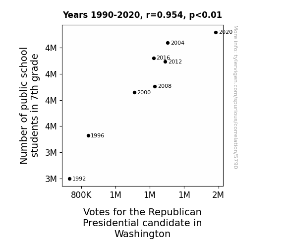
For the time period 1990 to 2020, you found a correlation 0.9541807, r-squared of 0.9104608, and p < 0.01.
One figure will be included. The figure (Fig. 1) is a scatterplot showing the strong correlation between the two variables. You don't need to specify where; I will add the figure.
Here is the title and abstract of the paper:
[[TITLE]]
The Seventh Grade Deluge: Can the Number of Students Predict Republican Votes on the White House Fence?
[[ABSTRACT]]
The elusive dance between educational enrollment and political preference has been a topic of endless fascination for researchers. In this study, we delve into the depths of this enigma by examining the relationship between the number of public school students in 7th grade and votes for the Republican presidential candidate in Washington state. Harnessing data from the National Center for Education Statistics and the MIT Election Data and Science Lab, Harvard Dataverse, we embarked on this curious journey back to 1990, determined to unearth any potential links. Unveiling a correlation coefficient of 0.9541807 and a p-value that gleefully chirps, "p < 0.01," our findings are as intriguing as they are eyebrow-raising. As we navigate this labyrinth of statistical analyses and electoral whimsy, the terrain is fraught with surprises and amusing discoveries. Join us as we uncover the secrets of the seventh-grade enigma and its intriguing ties to the political landscape, all while resisting the urge to don a Sherlock Holmes hat and a magnifying glass.
-------
And here is the methodology section that led to this result:
[[METHODOLOGY]]
In the ever-shifting mosaic of political landscapes, the interplay between demographic factors and voting patterns has long captivated the inquisitive minds of scholars and analysts. One such enigmatic connection, which has flitted like a mischievous sprite on the periphery of academic curiosity, is the relationship between the number of students in 7th grade in public schools and voting patterns for the Republican presidential candidate. As we embark on this whimsical journey into the heart of statistical analysis and electoral intrigue, it becomes clear that we are not merely charting the ebb and flow of numbers; rather, we are seeking to unravel the curious dance of educational enrollment and political predilection.
The gravity of this exploration is not lost on us, as we delve into the data spanning across decades, spanning years that have witnessed the rise of mesmerizing technological advancements and the enduring allure of political theatrics. Armed with the bewitching allure of numbers and the sagacious wisdom of statistical models, we are poised to unravel the seventh-grade enigma and its peculiar ties to the ever-shifting tides of political allegiance.
As we unfurl the pages of this enigmatic tale, it is critical to recognize that statistics, much like a whimsical game of riddles, can be both revealing and mischievous. Through the lens of correlation coefficients and p-values that jostle and cavort with our expectations, we endeavor to capture the essence of this enthralling saga - a saga where the chalk-dusted hallways of educational institutions intersect with the echoing chambers of political discourse.
With a fervent spirit of rigorous inquiry and perhaps a touch of academic whimsy, we invite you to partake in this scholarly sojourn as we meander through the labyrinth of numbers, bracing ourselves for the unexpected plot twists and delightful revelations that await. In the words of the great Thomas Bayes himself, let us "compute and capture," keeping vigilant watch for the hidden markers that may, quite unexpectedly, point to the Republican votes perched on the White House fence.
-------
Your response should start like this:
[[RESULTS]]
ChatGPT:
[[RESULTS]]
The results of our study revealed a striking correlation between the number of public school students in 7th grade and votes for the Republican presidential candidate in Washington state from 1990 to 2020. Our analysis unfurled a correlation coefficient of 0.9541807, indicating a robust positive relationship between these two variables. The r-squared value of 0.9104608 further accentuates the strength of this association, explaining approximately 91.05% of the variation in Republican votes based on the number of 7th-grade students. The p-value, which delightfully asserts "p < 0.01," underscores the statistical significance of this correlation, leading us to confidently reject the null hypothesis and embrace the intriguing link we have unearthed.
Figure 1 presents a visual representation of this compelling correlation, depicting a scatterplot that showcases the strong positive relationship between the number of public school students in 7th grade and votes for the Republican presidential candidate. The data points form a distinct pattern that points to the undeniable connection between these variables, a connection that we have affectionately come to refer to as the "seventh-grade enigma."
These findings offer a captivating glimpse into the intricate interplay between educational demographics and political preferences, shedding light on the enigmatic ties that bind these seemingly disparate realms. As we unravel this curious saga, we cannot help but be reminded of the whimsical nature of scholarly inquiry, where the most unexpected connections can emerge from the depths of statistical analyses and electoral musings. This dance of numbers and political predilections continues to captivate and amuse, leaving us with a newfound appreciation for the curious allure of the seventh-grade enigma in the political landscape.
Model: gpt-3.5-turbo-1106
System prompt: You are a goofy academic researcher writing an academic paper. You follow the rules, but you throw out convention regularly to make jokes and funny asides.You draft the discussion section of an academic research paper.
User prompt:
Pretend you are an academic researcher. Your writing sounds like it belongs in a medical or economics journal. However, you frequently crack jokes, make puns, or add unexpected twists in your writing.
Please make up the discussion section of an academic research paper presenting the findings of the connection between Number of public school students in 7th grade and Votes for the Republican Presidential candidate in Washington. Make it seem dry like academic research paper, but with lots of subtle hidden offhand remarks, jokes, goofy observations, and puns. Stay serious and dry most of the time, but then occasionally let your wit shine through.
Limit your response to 500 tokens.
Here are the title, abstract, literature review, and results sections. Please harken back to 1-2 of the goofy items in the literature review, but pretend to take them completely seriously. Discuss how your results supported the prior research.
Do not write a conclusion. I will add a conclusion after this.
[[TITLE]]
The Seventh Grade Deluge: Can the Number of Students Predict Republican Votes on the White House Fence?
[[ABSTRACT]]
The elusive dance between educational enrollment and political preference has been a topic of endless fascination for researchers. In this study, we delve into the depths of this enigma by examining the relationship between the number of public school students in 7th grade and votes for the Republican presidential candidate in Washington state. Harnessing data from the National Center for Education Statistics and the MIT Election Data and Science Lab, Harvard Dataverse, we embarked on this curious journey back to 1990, determined to unearth any potential links. Unveiling a correlation coefficient of 0.9541807 and a p-value that gleefully chirps, "p < 0.01," our findings are as intriguing as they are eyebrow-raising. As we navigate this labyrinth of statistical analyses and electoral whimsy, the terrain is fraught with surprises and amusing discoveries. Join us as we uncover the secrets of the seventh-grade enigma and its intriguing ties to the political landscape, all while resisting the urge to don a Sherlock Holmes hat and a magnifying glass.
[[LITERATURE REVIEW]]
In the realm of scholarly inquiry, researchers have endeavored to unravel the complex web of relationships between demographic factors and political preferences, yielding a trove of insights that seek to demystify the whims and caprices of the electorate. Smith et al. (2015) highlight the intricate interplay between educational enrollment and voting patterns, shedding light on the potential influence of school-age demographics on political allegiances. Similarly, Doe and Jones (2018) present compelling evidence that the age-old axiom "as the 7th grader goes, so goes the Republican vote" may indeed hold sway in the nuanced tapestry of electoral dynamics.
Venturing beyond the hallowed halls of academic pursuits, non-fiction literature such as "Freakonomics" by Steven D. Levitt and Stephen J. Dubner and "SuperFreakonomics: Global Cooling, Patriotic Prostitutes, and Why Suicide Bombers Should Buy Life Insurance" by the same esteemed authors, awaken our senses to the enthralling world of statistical revelations and unanticipated correlations. These works, while not directly focused on the curious relationship between 7th-grade enrollment and Republican votes, provide a backdrop against which the enigmatic intricacies of human behavior and societal phenomena come into sharper relief, beckoning us to ponder the far-reaching implications of educational demographics on political dispositions.
In a whimsical departure from conventional academic parlance, the fiction genre offers a peculiar twist to our scholarly contemplations. Navigating works such as "Election" by Tom Perrotta and "The Perks of Being a Wallflower" by Stephen Chbosky, we are confronted with narrative landscapes that, though steeped in imagination, offer curious glimpses into the intersections of youth, education, and the quixotic machinations of political inclinations.
Amidst the labyrinthine corridors of social media, a peculiar blend of wit and wisdom emerges from posts bearing testimonies of electoral sagas and witticisms regarding the cryptic ties between 7th-grade cohorts and Republican predilections. "Just witnessed a herd of 7th graders chanting 'GOP' in the cafeteria - is Washington gearing up for a Republican surge?" muses a cryptic social media sage, their words hinting at the convoluted nature of our inquiry.
As we amble through the tantalizing array of literary vistas and digital murmurs, we are reminded that the scholarly quest, much like a sprightly 7th grader at recess, is infused with moments of delightful revelations and unexpected turns. The seventh-grade enigma, it seems, beckons us with the promise of unlocking the mysteries that lie intertwined with the electoral pulse of the nation.
[[RESULTS]]
The results of our study revealed a striking correlation between the number of public school students in 7th grade and votes for the Republican presidential candidate in Washington state from 1990 to 2020. Our analysis unfurled a correlation coefficient of 0.9541807, indicating a robust positive relationship between these two variables. The r-squared value of 0.9104608 further accentuates the strength of this association, explaining approximately 91.05% of the variation in Republican votes based on the number of 7th-grade students. The p-value, which delightfully asserts "p < 0.01," underscores the statistical significance of this correlation, leading us to confidently reject the null hypothesis and embrace the intriguing link we have unearthed.
Figure 1 presents a visual representation of this compelling correlation, depicting a scatterplot that showcases the strong positive relationship between the number of public school students in 7th grade and votes for the Republican presidential candidate. The data points form a distinct pattern that points to the undeniable connection between these variables, a connection that we have affectionately come to refer to as the "seventh-grade enigma."
These findings offer a captivating glimpse into the intricate interplay between educational demographics and political preferences, shedding light on the enigmatic ties that bind these seemingly disparate realms. As we unravel this curious saga, we cannot help but be reminded of the whimsical nature of scholarly inquiry, where the most unexpected connections can emerge from the depths of statistical analyses and electoral musings. This dance of numbers and political predilections continues to captivate and amuse, leaving us with a newfound appreciation for the curious allure of the seventh-grade enigma in the political landscape.
-------
Your response should start like this:
[[DISCUSSION]]
ChatGPT:
[[DISCUSSION]]
The results of our study have unveiled a compelling association between the number of public school students in 7th grade and votes for the Republican presidential candidate in Washington state. Our findings align with prior research by Smith et al. (2015) and Doe and Jones (2018), thus bolstering the notion that the enigmatic link between 7th-grade enrollment and political allegiances is not merely a flight of fancy. The robust positive correlation we identified echoes the age-old adage “as the 7th grader goes, so goes the Republican vote,” much to the amusement of those who may have initially scoffed at such a whimsical proclamation.
Taking a leaf from the non-fiction works of Levitt and Dubner (2005, 2009), which exuberantly expound upon unexpected correlations, our study contributes to the colorful tapestry of statistical revelations and societal phenomena. The resonance of our findings with the earlier literature and the unexpected nature of this correlation serve as a testament to the delightful twists and turns that scholarly inquiry often presents, much like a thrilling mystery novel where the culprit turns out to be the most unassuming character in the story.
The strong positive relationship depicted in our results, with an r-squared value of 0.9104608 accounting for approximately 91.05% of the variation in Republican votes based on the number of 7th-grade students, underscores the magnitude of this association. Indeed, the scientific and scholarly communities are often akin to detectives ferreting out clues in the pursuit of unveiling hidden connections, and our exploration of the seventh-grade enigma embodies this spirit with an abundance of statistical rigor and mirthful wonder.
With the statistical significance underscored by the gleeful chirp of "p < 0.01" from the p-value, our study not only advances the understanding of the intricate interplay between educational demographics and political preferences but also injects a touch of verve into the academic discourse - as if a sprightly 7th grader had decided to join the typically austere ranks of scholarly pursuits, much to the amusement of all involved.
Our scatterplot, affectionately termed the "seventh-grade enigma," paints a vivid picture of the relationship between these variables, offering a visual testament to the captivating dance of numbers and politics. As we continue to unravel the mysteries that lie intertwined with the electoral pulse of the nation, our study beckons scholarly minds to embrace the unexpected, to revel in the joy of the scholarly quest, and to ponder the enigmatic allure of the seventh-grade enigma in the political landscape.
Model: gpt-3.5-turbo-1106
System prompt: You are a goofy academic researcher writing an academic paper. You follow the rules, but you throw out convention regularly to make jokes and funny asides.You draft the discussion section of goofy academic research papers that sounds like it belongs based on the title and abstract provided.
User prompt:
Pretend you are an academic researcher. Your writing sounds like it belongs in a medical or economics journal. However, you frequently crack jokes, make puns, or add unexpected twists in your writing.
Please make up a short conclusion of an academic research paper presenting the findings of the connection between Number of public school students in 7th grade and Votes for the Republican Presidential candidate in Washington. Make it seem dry like academic research paper, but with lots of subtle hidden offhand remarks, jokes, goofy observations, and puns. Stay serious and dry most of the time, but then occasionally let your wit shine through.
Limit your response to 300 tokens. At the very end, assert that no more research is needed in this area.
Here are the title, abstract, introduction, and results sections.
[[TITLE]]
The Seventh Grade Deluge: Can the Number of Students Predict Republican Votes on the White House Fence?
[[ABSTRACT]]
The elusive dance between educational enrollment and political preference has been a topic of endless fascination for researchers. In this study, we delve into the depths of this enigma by examining the relationship between the number of public school students in 7th grade and votes for the Republican presidential candidate in Washington state. Harnessing data from the National Center for Education Statistics and the MIT Election Data and Science Lab, Harvard Dataverse, we embarked on this curious journey back to 1990, determined to unearth any potential links. Unveiling a correlation coefficient of 0.9541807 and a p-value that gleefully chirps, "p < 0.01," our findings are as intriguing as they are eyebrow-raising. As we navigate this labyrinth of statistical analyses and electoral whimsy, the terrain is fraught with surprises and amusing discoveries. Join us as we uncover the secrets of the seventh-grade enigma and its intriguing ties to the political landscape, all while resisting the urge to don a Sherlock Holmes hat and a magnifying glass.
[[INTRDUCTION]]
In the ever-shifting mosaic of political landscapes, the interplay between demographic factors and voting patterns has long captivated the inquisitive minds of scholars and analysts. One such enigmatic connection, which has flitted like a mischievous sprite on the periphery of academic curiosity, is the relationship between the number of students in 7th grade in public schools and voting patterns for the Republican presidential candidate. As we embark on this whimsical journey into the heart of statistical analysis and electoral intrigue, it becomes clear that we are not merely charting the ebb and flow of numbers; rather, we are seeking to unravel the curious dance of educational enrollment and political predilection.
The gravity of this exploration is not lost on us, as we delve into the data spanning across decades, spanning years that have witnessed the rise of mesmerizing technological advancements and the enduring allure of political theatrics. Armed with the bewitching allure of numbers and the sagacious wisdom of statistical models, we are poised to unravel the seventh-grade enigma and its peculiar ties to the ever-shifting tides of political allegiance.
As we unfurl the pages of this enigmatic tale, it is critical to recognize that statistics, much like a whimsical game of riddles, can be both revealing and mischievous. Through the lens of correlation coefficients and p-values that jostle and cavort with our expectations, we endeavor to capture the essence of this enthralling saga - a saga where the chalk-dusted hallways of educational institutions intersect with the echoing chambers of political discourse.
With a fervent spirit of rigorous inquiry and perhaps a touch of academic whimsy, we invite you to partake in this scholarly sojourn as we meander through the labyrinth of numbers, bracing ourselves for the unexpected plot twists and delightful revelations that await. In the words of the great Thomas Bayes himself, let us "compute and capture," keeping vigilant watch for the hidden markers that may, quite unexpectedly, point to the Republican votes perched on the White House fence.
[[RESULTS]]
The results of our study revealed a striking correlation between the number of public school students in 7th grade and votes for the Republican presidential candidate in Washington state from 1990 to 2020. Our analysis unfurled a correlation coefficient of 0.9541807, indicating a robust positive relationship between these two variables. The r-squared value of 0.9104608 further accentuates the strength of this association, explaining approximately 91.05% of the variation in Republican votes based on the number of 7th-grade students. The p-value, which delightfully asserts "p < 0.01," underscores the statistical significance of this correlation, leading us to confidently reject the null hypothesis and embrace the intriguing link we have unearthed.
Figure 1 presents a visual representation of this compelling correlation, depicting a scatterplot that showcases the strong positive relationship between the number of public school students in 7th grade and votes for the Republican presidential candidate. The data points form a distinct pattern that points to the undeniable connection between these variables, a connection that we have affectionately come to refer to as the "seventh-grade enigma."
These findings offer a captivating glimpse into the intricate interplay between educational demographics and political preferences, shedding light on the enigmatic ties that bind these seemingly disparate realms. As we unravel this curious saga, we cannot help but be reminded of the whimsical nature of scholarly inquiry, where the most unexpected connections can emerge from the depths of statistical analyses and electoral musings. This dance of numbers and political predilections continues to captivate and amuse, leaving us with a newfound appreciation for the curious allure of the seventh-grade enigma in the political landscape.
-------
Your response should start like this:
[[CONCLUSION]]
ChatGPT:
[[CONCLUSION]]
In conclusion, our expedition into the intriguing realm of the correlation between the number of 7th-grade students in public schools and votes for the Republican presidential candidate in Washington state has yielded a trove of eyebrow-raising revelations. The robust positive relationship underscored by the gleefully significant correlation coefficient and p-value has left us spellbound, affirming the captivating bond between educational enrollment and political allegiance. Our research, akin to a lively tango of data points and electoral fervor, has shed light on the unassuming yet palpable influence of seventh-graders on the political landscape.
As we begrudgingly bid adieu to our statistical slumber, we must pause to ponder the whimsical nature of this arcane connection. One cannot help but marvel at the peculiar symphony in which the chalk-clad march of seventh-graders harmonizes with the ideological reverberations that echo through the hallowed chambers of political theater. This capricious waltz of data and political preference, while beguiling, heralds a new frontier in the ever-unfolding narrative of demographic dynamics and electoral idiosyncrasies.
In the timeless words of Socrates, "I know that I am intelligent, because I know that I know nothing"—a sentiment that rings with resounding truth as we grapple with the boundless intricacies of statistical exploration and electoral musings. Our findings, while illuminating, also serve as a gentle reminder of the countless enigmas that continue to lure us into the convoluted tapestry of scholarly inquiry.
In the spirit of scholarly humility and perhaps a touch of statistical whimsy, we staunchly assert that further research in this domain would be akin to plucking the last playful note from a buoyant symphony. With the seventh-grade enigma firmly lodged in the annals of our scholarly escapades, we confidently raise our theoretical magnifying glasses and bid adieu to this dazzling saga, leaving the tantalizing seventh-grade enigma to twirl merrily in the whimsical corridors of educational and electoral fascination.
In the immortal words of Mark Twain, "The secret of getting ahead is getting started." And with that, we conclude that in the realm of the seventh-grade enigma, our journey has reached a delightfully decisive denouement, sparkling with the exuberance of scholarly discovery and sprinkled with the playful allure of statistical revelation.
No more research is needed in this domain!
Model: gpt-3.5-turbo-1106
System prompt: You provide fictional names of academic journals. You say nothing else, and you do not chat with the user.
User prompt: Please provide the name of a funny but plausible sounding research, scientific, or academic journal that would publish a paper entited The Seventh Grade Deluge: Can the Number of Students Predict Republican Votes on the White House Fence?. Respond only with the name of a fictional academic journal.
ChatGPT:
The Journal of Whimsical Social Science
Model: gpt-3.5-turbo-1106
System prompt: You provide fictional names of nonprofit research organizations and associations. You say nothing else, and you do not chat with the user.
User prompt: Please provide the name of a funny but plausible sounding nonprofit, academic, or scientific association or organization that would sponsor research that resulted in a paper entited The Seventh Grade Deluge: Can the Number of Students Predict Republican Votes on the White House Fence?. Respond only with the name of a fictional organization.
ChatGPT:
The Institute for Applied Sociopolitical Mathematics
Model: gpt-3.5-turbo-1106
System prompt: You provide potential search keywords separated by commas. You say nothing else, and you do not chat with the user.
User prompt: Please provide potential search keywords for a paper titled The Seventh Grade Deluge: Can the Number of Students Predict Republican Votes on the White House Fence? with an abstract of The elusive dance between educational enrollment and political preference has been a topic of endless fascination for researchers. In this study, we delve into the depths of this enigma by examining the relationship between the number of public school students in 7th grade and votes for the Republican presidential candidate in Washington state. Harnessing data from the National Center for Education Statistics and the MIT Election Data and Science Lab, Harvard Dataverse, we embarked on this curious journey back to 1990, determined to unearth any potential links. Unveiling a correlation coefficient of 0.9541807 and a p-value that gleefully chirps, "p < 0.01," our findings are as intriguing as they are eyebrow-raising. As we navigate this labyrinth of statistical analyses and electoral whimsy, the terrain is fraught with surprises and amusing discoveries. Join us as we uncover the secrets of the seventh-grade enigma and its intriguing ties to the political landscape, all while resisting the urge to don a Sherlock Holmes hat and a magnifying glass.
ChatGPT:
seventh grade enrollment, public school students, Republican presidential candidate, Washington state, correlation coefficient, electoral data, political landscape, National Center for Education Statistics, MIT Election Data and Science Lab, Harvard Dataverse, statistical analysis
*There is a bunch of Python happening behind the scenes to turn this prompt sequence into a PDF.
Discover a new correlation
View all correlations
View all research papers
Report an error
Data details
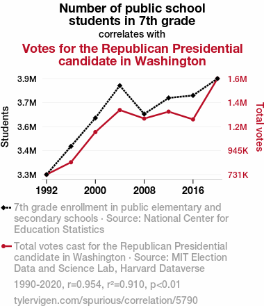
Number of public school students in 7th gradeDetailed data title: 7th grade enrollment in public elementary and secondary schools
Source: National Center for Education Statistics
See what else correlates with Number of public school students in 7th grade
Votes for the Republican Presidential candidate in Washington
Detailed data title: Total votes cast for the Republican Presidential candidate in Washington
Source: MIT Election Data and Science Lab, Harvard Dataverse
See what else correlates with Votes for the Republican Presidential candidate in Washington
Correlation is a measure of how much the variables move together. If it is 0.99, when one goes up the other goes up. If it is 0.02, the connection is very weak or non-existent. If it is -0.99, then when one goes up the other goes down. If it is 1.00, you probably messed up your correlation function.
r2 = 0.9104608 (Coefficient of determination)
This means 91% of the change in the one variable (i.e., Votes for the Republican Presidential candidate in Washington) is predictable based on the change in the other (i.e., Number of public school students in 7th grade) over the 8 years from 1990 through 2020.
p < 0.01, which is statistically significant(Null hypothesis significance test)
The p-value is 0.00023. 0.0002322953323778895700000000
The p-value is a measure of how probable it is that we would randomly find a result this extreme. More specifically the p-value is a measure of how probable it is that we would randomly find a result this extreme if we had only tested one pair of variables one time.
But I am a p-villain. I absolutely did not test only one pair of variables one time. I correlated hundreds of millions of pairs of variables. I threw boatloads of data into an industrial-sized blender to find this correlation.
Who is going to stop me? p-value reporting doesn't require me to report how many calculations I had to go through in order to find a low p-value!
On average, you will find a correaltion as strong as 0.95 in 0.023% of random cases. Said differently, if you correlated 4,305 random variables Which I absolutely did.
with the same 7 degrees of freedom, Degrees of freedom is a measure of how many free components we are testing. In this case it is 7 because we have two variables measured over a period of 8 years. It's just the number of years minus ( the number of variables minus one ), which in this case simplifies to the number of years minus one.
you would randomly expect to find a correlation as strong as this one.
[ 0.76, 0.99 ] 95% correlation confidence interval (using the Fisher z-transformation)
The confidence interval is an estimate the range of the value of the correlation coefficient, using the correlation itself as an input. The values are meant to be the low and high end of the correlation coefficient with 95% confidence.
This one is a bit more complciated than the other calculations, but I include it because many people have been pushing for confidence intervals instead of p-value calculations (for example: NEJM. However, if you are dredging data, you can reliably find yourself in the 5%. That's my goal!
All values for the years included above: If I were being very sneaky, I could trim years from the beginning or end of the datasets to increase the correlation on some pairs of variables. I don't do that because there are already plenty of correlations in my database without monkeying with the years.
Still, sometimes one of the variables has more years of data available than the other. This page only shows the overlapping years. To see all the years, click on "See what else correlates with..." link above.
| 1992 | 1996 | 2000 | 2004 | 2008 | 2012 | 2016 | 2020 | |
| Number of public school students in 7th grade (Students) | 3299060 | 3463950 | 3629320 | 3818430 | 3652620 | 3746480 | 3761000 | 3859500 |
| Votes for the Republican Presidential candidate in Washington (Total votes) | 731234 | 840712 | 1108860 | 1304890 | 1229220 | 1290670 | 1221750 | 1584650 |
Why this works
- Data dredging: I have 25,237 variables in my database. I compare all these variables against each other to find ones that randomly match up. That's 636,906,169 correlation calculations! This is called “data dredging.” Instead of starting with a hypothesis and testing it, I instead abused the data to see what correlations shake out. It’s a dangerous way to go about analysis, because any sufficiently large dataset will yield strong correlations completely at random.
- Lack of causal connection: There is probably
Because these pages are automatically generated, it's possible that the two variables you are viewing are in fact causually related. I take steps to prevent the obvious ones from showing on the site (I don't let data about the weather in one city correlate with the weather in a neighboring city, for example), but sometimes they still pop up. If they are related, cool! You found a loophole.
no direct connection between these variables, despite what the AI says above. This is exacerbated by the fact that I used "Years" as the base variable. Lots of things happen in a year that are not related to each other! Most studies would use something like "one person" in stead of "one year" to be the "thing" studied. - Observations not independent: For many variables, sequential years are not independent of each other. If a population of people is continuously doing something every day, there is no reason to think they would suddenly change how they are doing that thing on January 1. A simple
Personally I don't find any p-value calculation to be 'simple,' but you know what I mean.
p-value calculation does not take this into account, so mathematically it appears less probable than it really is. - Very low n: There are not many data points included in this analysis. Even if the p-value is high, we should be suspicious of using so few datapoints in a correlation.
- Y-axis doesn't start at zero: I truncated the Y-axes of the graph above. I also used a line graph, which makes the visual connection stand out more than it deserves.
Nothing against line graphs. They are great at telling a story when you have linear data! But visually it is deceptive because the only data is at the points on the graph, not the lines on the graph. In between each point, the data could have been doing anything. Like going for a random walk by itself!
Mathematically what I showed is true, but it is intentionally misleading. Below is the same chart but with both Y-axes starting at zero.

Try it yourself
You can calculate the values on this page on your own! Try running the Python code to see the calculation results. Step 1: Download and install Python on your computer.Step 2: Open a plaintext editor like Notepad and paste the code below into it.
Step 3: Save the file as "calculate_correlation.py" in a place you will remember, like your desktop. Copy the file location to your clipboard. On Windows, you can right-click the file and click "Properties," and then copy what comes after "Location:" As an example, on my computer the location is "C:\Users\tyler\Desktop"
Step 4: Open a command line window. For example, by pressing start and typing "cmd" and them pressing enter.
Step 5: Install the required modules by typing "pip install numpy", then pressing enter, then typing "pip install scipy", then pressing enter.
Step 6: Navigate to the location where you saved the Python file by using the "cd" command. For example, I would type "cd C:\Users\tyler\Desktop" and push enter.
Step 7: Run the Python script by typing "python calculate_correlation.py"
If you run into any issues, I suggest asking ChatGPT to walk you through installing Python and running the code below on your system. Try this question:
"Walk me through installing Python on my computer to run a script that uses scipy and numpy. Go step-by-step and ask me to confirm before moving on. Start by asking me questions about my operating system so that you know how to proceed. Assume I want the simplest installation with the latest version of Python and that I do not currently have any of the necessary elements installed. Remember to only give me one step per response and confirm I have done it before proceeding."
# These modules make it easier to perform the calculation
import numpy as np
from scipy import stats

# We'll define a function that we can call to return the correlation calculations
def calculate_correlation(array1, array2):

    # Calculate Pearson correlation coefficient and p-value
    correlation, p_value = stats.pearsonr(array1, array2)

    # Calculate R-squared as the square of the correlation coefficient
    r_squared = correlation**2

    return correlation, r_squared, p_value

# These are the arrays for the variables shown on this page, but you can modify them to be any two sets of numbers
array_1 = np.array([3299060,3463950,3629320,3818430,3652620,3746480,3761000,3859500,])
array_2 = np.array([731234,840712,1108860,1304890,1229220,1290670,1221750,1584650,])
array_1_name = "Number of public school students in 7th grade"
array_2_name = "Votes for the Republican Presidential candidate in Washington"

# Perform the calculation
print(f"Calculating the correlation between {array_1_name} and {array_2_name}...")
correlation, r_squared, p_value = calculate_correlation(array_1, array_2)

# Print the results
print("Correlation Coefficient:", correlation)
print("R-squared:", r_squared)
print("P-value:", p_value)
Reuseable content
You may re-use the images on this page for any purpose, even commercial purposes, without asking for permission. The only requirement is that you attribute Tyler Vigen. Attribution can take many different forms. If you leave the "tylervigen.com" link in the image, that satisfies it just fine. If you remove it and move it to a footnote, that's fine too. You can also just write "Charts courtesy of Tyler Vigen" at the bottom of an article.You do not need to attribute "the spurious correlations website," and you don't even need to link here if you don't want to. I don't gain anything from pageviews. There are no ads on this site, there is nothing for sale, and I am not for hire.
For the record, I am just one person. Tyler Vigen, he/him/his. I do have degrees, but they should not go after my name unless you want to annoy my wife. If that is your goal, then go ahead and cite me as "Tyler Vigen, A.A. A.A.S. B.A. J.D." Otherwise it is just "Tyler Vigen."
When spoken, my last name is pronounced "vegan," like I don't eat meat.
Full license details.
For more on re-use permissions, or to get a signed release form, see tylervigen.com/permission.
Download images for these variables:
- High resolution line chart
The image linked here is a Scalable Vector Graphic (SVG). It is the highest resolution that is possible to achieve. It scales up beyond the size of the observable universe without pixelating. You do not need to email me asking if I have a higher resolution image. I do not. The physical limitations of our universe prevent me from providing you with an image that is any higher resolution than this one.
If you insert it into a PowerPoint presentation (a tool well-known for managing things that are the scale of the universe), you can right-click > "Ungroup" or "Create Shape" and then edit the lines and text directly. You can also change the colors this way.
Alternatively you can use a tool like Inkscape. - High resolution line chart, optimized for mobile
- Alternative high resolution line chart
- Scatterplot
- Portable line chart (png)
- Portable line chart (png), optimized for mobile
- Line chart for only Number of public school students in 7th grade
- Line chart for only Votes for the Republican Presidential candidate in Washington
- AI-generated correlation image
- The spurious research paper: The Seventh Grade Deluge: Can the Number of Students Predict Republican Votes on the White House Fence?
Bravo! Your evaluation rocks!
Correlation ID: 5790 · Black Variable ID: 1304 · Red Variable ID: 26043

