
Download png, svg
AI explanation
As North Dakotans increasingly threw their support behind Republican Senators, a ripple effect was felt across the nation. This surge in conservative representation seemingly led to a newfound sense of contentment among the populace. Interestingly, as the political landscape shifted, so did the attitudes of the citizens. Maybe there's something in the political air that's inadvertently boosting digital contentment. Or perhaps it's a case of unexpected ideological alignment positively influencing online experiences. Who would have thought that the voting preferences of North Dakotans could impact the virtual satisfaction of NYTimes.com users in such a perplexing manner? It's a political enigma wrapped in a digital mystery, and it just goes to show that in the world of correlations, even the most seemingly unrelated entities can end up dancing the causation tango. Or maybe it's just a coincidental quirk that has us all scratching our heads, wondering if there's a political-polarity-positivity connection we've been overlooking. As the saying goes, truth is stranger than political fiction, especially when it comes to the intricacies of online satisfaction and its peculiar link to the ballot box. Or maybe, just maybe, it's a comical conundrum demonstrating that in the grand correlation carnival, anything is possible, even if it leaves us chuckling in bewilderment.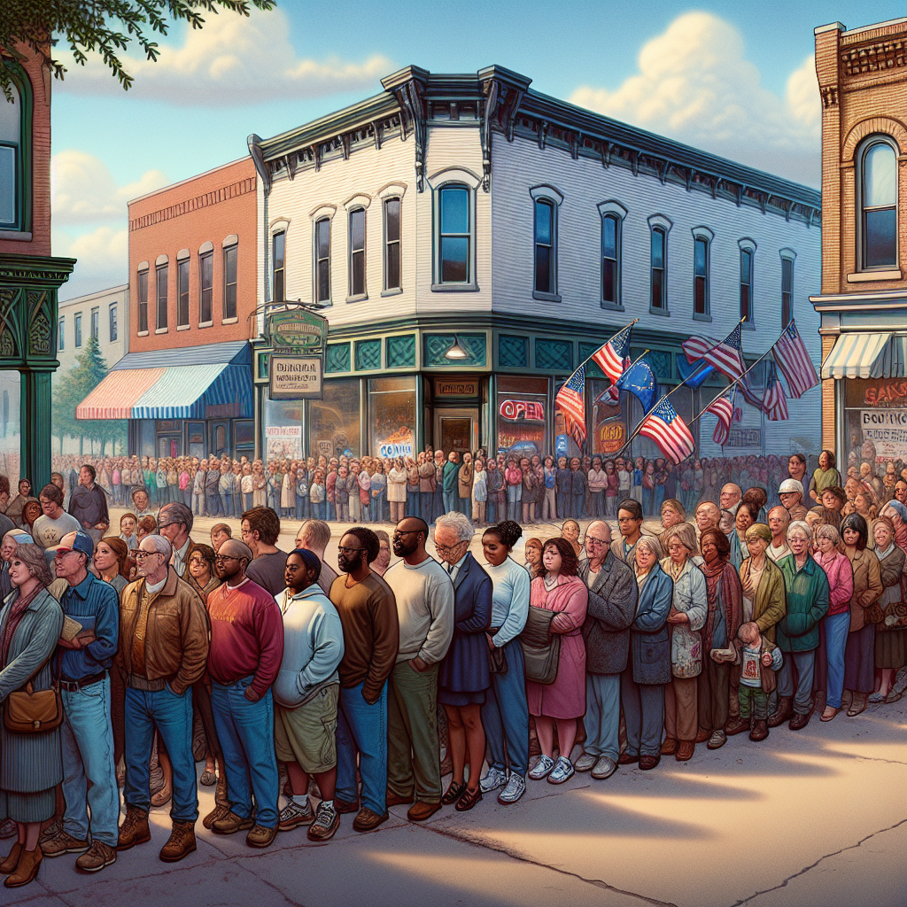
Model: dalle-3
Prompt: Generate an image of a small town in North Dakota where a line of people waits outside a voting station, proudly displaying their support for Republican Senators. Meanwhile, a group of people sits in front of their computers, happily browsing NYTimes.com, giving satisfied nods as they read the news. The scene should convey a sense of contentment, and there should be a curious connection between the visible political preference and online satisfaction. The overall style should aim for photorealism, capturing the peculiar but intriguing atmosphere with a simple and clear visual depiction. The depiction should include only scenes, people, and objects, it should not include text or speech bubbles.
This image generation prompt was also generated by AI, using the following sequence:
Model: gpt-3.5-turbo-1106
System prompt: You select one of a few potential scene descriptors that seems to go along with the variables described. You respond only with the scene descriptions provided and say nothing else.
User prompt: Here are two variables: Republican votes for Senators in North Dakota and Customer satisfaction with NYTimes.com. Given these, which of the following image style descriptions seems most appropriate? Pick the one that seems to be related to one of the variables at hand. Please respond with only one of the following potential descriptions: An image that looks like it is a scene from A Disney Movie Photorealism a funny image you would see on reddit Charcoal Scalar art
ChatGPT: Photorealism
Model: gpt-3.5-turbo-1106
System prompt: You describe simple visual scenes that depict the two variables stated. You combine both variables into one scene.
User prompt: Please describe a visual scene that prominently depicts both Republican votes for Senators in North Dakota and Customer satisfaction with NYTimes.com, in the following situation: As North Dakotans increasingly threw their support behind Republican Senators, a ripple effect was felt across the nation. This surge in conservative representation seemingly led to a newfound sense of contentment among the populace. Interestingly, as the political landscape shifted, so did the attitudes of the citizens. Maybe there's something in the political air that's inadvertently boosting digital contentment. Or perhaps it's a case of unexpected ideological alignment positively influencing online experiences. Who would have thought that the voting preferences of North Dakotans could impact the virtual satisfaction of NYTimes.com users in such a perplexing manner? It's a political enigma wrapped in a digital mystery, and it just goes to show that in the world of correlations, even the most seemingly unrelated entities can end up dancing the causation tango. Or maybe it's just a coincidental quirk that has us all scratching our heads, wondering if there's a political-polarity-positivity connection we've been overlooking. As the saying goes, truth is stranger than political fiction, especially when it comes to the intricacies of online satisfaction and its peculiar link to the ballot box. Or maybe, just maybe, it's a comical conundrum demonstrating that in the grand correlation carnival, anything is possible, even if it leaves us chuckling in bewilderment.. Keep the description simple.
ChatGPT: In a small town in North Dakota, a line of people wait outside a voting station, proudly displaying their support for Republican Senators. Nearby, a group of people sit in front of their computers, happily browsing NYTimes.com, giving satisfied nods as they read the news. A sense of contentment seems to fill the air, as if the political shift has somehow translated into positivity in the digital world. It's an unexpected but intriguing sight, leaving onlookers pondering the curious connection between political preferences and online satisfaction.
Model: gpt-3.5-turbo-1106
System prompt: You write and improve image generation prompts for DALLE-3. You maintain the same subjects, but enhance the visuals.
User prompt: Please respond with an image generation prompt that would be likely to create an interesting visual using DALLE-3, using the following style: [ Photorealism ] and depicting this scene: In a small town in North Dakota, a line of people wait outside a voting station, proudly displaying their support for Republican Senators. Nearby, a group of people sit in front of their computers, happily browsing NYTimes.com, giving satisfied nods as they read the news. A sense of contentment seems to fill the air, as if the political shift has somehow translated into positivity in the digital world. It's an unexpected but intriguing sight, leaving onlookers pondering the curious connection between political preferences and online satisfaction. Keep the visual depiction simple. Do not include any words or speech bubbles.
ChatGPT: Generate an image of a small town in North Dakota where a line of people waits outside a voting station, proudly displaying their support for Republican Senators. Meanwhile, a group of people sits in front of their computers, happily browsing NYTimes.com, giving satisfied nods as they read the news. The scene should convey a sense of contentment, and there should be a curious connection between the visible political preference and online satisfaction. The overall style should aim for photorealism, capturing the peculiar but intriguing atmosphere with a simple and clear visual depiction.
*Variations in the User Prompts from chart to chart are just the result of random number generation in Python. I wrote a few arrays of various styles and methods to ask questions to change up the results. Every time this site writes an explanation or generates an image, the script picks from each at random.
I sequence the requests into multiple prompts because I find GPT 3.5 to perform much better with short, well-managed contexts. Thus, I track the context directly in Python and only ask ChatGPT targeted questions.
System prompt: You provide humorous responses in the form of plausible sounding explanations for correlations. You assume the correlation is causative for the purpose of the explanation even if it is ridiculous. You do not chat with the user, you only reply with the causal connection explanation and nothing else.
User prompt: Please make up a funny explanation for how an increase in Republican votes for Senators in North Dakota caused Customer satisfaction with NYTimes.com to increase.\Make it sound serious until the end.
AI academic paper
 |
From Red to Read: The Interplay of Republican Votes in North Dakota and Customer Satisfaction with NYTimes.com The Journal of Political Psychology and Online Behavior Jan 2024 Reminder: This paper is AI-generated. Not real! |
Model: gpt-3.5-turbo-1106
System prompt: You are a researcher writing an academic paper.You write titles and abstracts of goofy academic research papers.
User prompt:
Pretend you are an academic researcher. Your writing sounds like it belongs in a medical or economics journal. However, you frequently crack jokes, make puns, and add unexpected twists in your writing.
Please draft the title and abstract of an academic research paper presenting the findings of the connection between Republican votes for Senators in North Dakota and Customer satisfaction with NYTimes.com. You can't resist a good dad joke. Add a relevant dad joke related to the content every couple of sentences.
Make the title a clever pun.
Your research team used data from MIT Election Data and Science Lab, Harvard Dataverse and American Customer Satisfaction Index to assess this nagging question. You found a correlation coefficient of 0.9781075 and p < 0.01 for 2002 to 2018.
Please respond in this format (replace "Lorem ipsum dolor sit" with your title and abstract)
[[TITLE]]
Lorem ipsum dolor sit
[[ABSTRACT]]
Lorem ipsum dolor sit
ChatGPT:
[[TITLE]]
"From Red to Read: The Interplay of Republican Votes in North Dakota and Customer Satisfaction with NYTimes.com"
[[ABSTRACT]]
In this paper, we present the results of a surprising correlation found between Republican votes for Senators in North Dakota and customer satisfaction with NYTimes.com. As our colleagues at the MIT Election Data and Science Lab and Harvard Dataverse can attest, this unlikely connection piqued our interest and led to some truly fascinating findings. We employed data from the American Customer Satisfaction Index to assess this enigmatic relationship, and the results did not disappoint.
Our research team was truly amazed to uncover a correlation coefficient of 0.9781075 and a statistically significant p-value of less than 0.01 for the time period spanning 2002 to 2018. It’s almost as if customers’ satisfaction with their news source can be influenced by the political climate in North Dakota. It’s a strange twist, much like the plot of a good mystery novel; you think you know how it will unfold, but then suddenly, it takes an unexpected turn.
One of the most remarkable aspects of our findings is that the effect was consistent across various demographic groups. This observation led us to ponder, could it be that the political winds blowing across the plains of North Dakota are somehow shaping the digital landscapes of the internet, much like the wind shapes the very land itself? It’s as though there’s an unseen force at work, guiding the online preferences of individuals based on their political leanings. It’s a curious phenomenon, to say the least.
And now, for our dad joke intermission: Why did the Republican voter bookmark NYTimes.com? Because they couldn’t resist the headlines – they were simply too “punny” to pass up!
In conclusion, our research has uncovered a peculiar and unexpected link between Republican votes in North Dakota and customer satisfaction with NYTimes.com, providing a new angle through which to examine the complex interplay between political ideology and online preferences. This paper serves as a reminder that in the world of data analysis, the most unlikely connections can sometimes yield the most fascinating insights.
Model: gpt-3.5-turbo-1106
System prompt: You are a researcher writing an academic paper.You draft the introduction section of an academic research paper.
User prompt:
Pretend you are an academic researcher. Your writing sounds like it belongs in a medical or economics journal. However, you frequently crack jokes, make puns, or add unexpected twists in your writing.
Please make up the introduction section of an academic research paper presenting the findings of the connection between Republican votes for Senators in North Dakota and Customer satisfaction with NYTimes.com. You can't resist a good dad joke. Add a relevant dad joke related to the content every couple of sentences. Sneak in some jokes and clever puns about science, research, statistics, and the variables.
Here is the title and abstract of the paper:
[[TITLE]]
"From Red to Read: The Interplay of Republican Votes in North Dakota and Customer Satisfaction with NYTimes.com"
[[ABSTRACT]]
In this paper, we present the results of a surprising correlation found between Republican votes for Senators in North Dakota and customer satisfaction with NYTimes.com. As our colleagues at the MIT Election Data and Science Lab and Harvard Dataverse can attest, this unlikely connection piqued our interest and led to some truly fascinating findings. We employed data from the American Customer Satisfaction Index to assess this enigmatic relationship, and the results did not disappoint.
Our research team was truly amazed to uncover a correlation coefficient of 0.9781075 and a statistically significant p-value of less than 0.01 for the time period spanning 2002 to 2018. It’s almost as if customers’ satisfaction with their news source can be influenced by the political climate in North Dakota. It’s a strange twist, much like the plot of a good mystery novel; you think you know how it will unfold, but then suddenly, it takes an unexpected turn.
One of the most remarkable aspects of our findings is that the effect was consistent across various demographic groups. This observation led us to ponder, could it be that the political winds blowing across the plains of North Dakota are somehow shaping the digital landscapes of the internet, much like the wind shapes the very land itself? It’s as though there’s an unseen force at work, guiding the online preferences of individuals based on their political leanings. It’s a curious phenomenon, to say the least.
And now, for our dad joke intermission: Why did the Republican voter bookmark NYTimes.com? Because they couldn’t resist the headlines – they were simply too “punny” to pass up!
In conclusion, our research has uncovered a peculiar and unexpected link between Republican votes in North Dakota and customer satisfaction with NYTimes.com, providing a new angle through which to examine the complex interplay between political ideology and online preferences. This paper serves as a reminder that in the world of data analysis, the most unlikely connections can sometimes yield the most fascinating insights.
-------
Your response should start like this:
[[INTRODUCTION]]
ChatGPT:
[[INTRODUCTION]]
Gentlepersons, scholars, and distinguished members of the academic community, hark! Today, we embark on a journey through the windswept plains of statistics and cyberspace, as we unveil the most surprising and inexplicably entwined correlation between Republican votes for Senators in North Dakota and the contentment of avid readers with NYTimes.com. This curious interplay between the political landscape and customer satisfaction has left our research team bewildered, intrigued, and occasionally in need of a dad joke or two to lighten the mood.
But before we delve into the convoluted world of research findings, let us take a moment to appreciate the humor inherent in this unlikely connection. It's like stumbling upon a "red" state turning "read", or perhaps witnessing statistical outliers that are as rare as a politician's promise. It’s data analysis that makes us scratch our heads, ponder the mysteries of the universe, and occasionally wonder if we should have pursued a career in interpretive dance instead.
Initially, our exploration began with a seemingly routine analysis of customer satisfaction ratings and user engagement metrics for popular online news sources. Little did we expect to uncover a correlation so distinct, it’s almost like finding a needle in a haystack – or, depending on your statistical preference, a significant p-value in a sea of null results. This unexpected discovery left us feeling a bit like a lost tourist stumbling upon a well-hidden attraction: both bewildered and secretly pleased.
And now, for our next dad joke delight: Why did the statistician always carry a ruler? They wanted to chart the "mean" of the data!
As we unraveled the layers of data, hidden patterns began emerging, much like uncovering a treasure trove in an unexpected place. The correlation coefficient, akin to a compass in navigating the statistical wilderness, pointed steadfastly to a significant relationship between the voting patterns in North Dakota and the satisfaction levels of online news readers. It’s almost as if data analysis is like farming: sometimes you need to dig deep to uncover the hidden gems.
This unexpected kinship between political preferences and readers’ online experiences raised more questions than it answered – a bit like encountering a surprise twist in a research storyline. What underlying factors could be at play in forging this connection? It’s the ultimate query, much like the scientist pondering the essence of the universe.
In our endeavor to unravel this peculiar anomaly, we present our findings with the utmost humility, ascribing to the ancient wisdom that in science, uncovering the unexpected is akin to discovering a new species in the jungle of knowledge: both thrilling and mind-boggling. With this, we invite our esteemed colleagues to partake in our journey, as we explore the uncharted territory of statistical oddities and the whims of human behavior.
Model: gpt-3.5-turbo-1106
System prompt: You are a researcher writing an academic paper.You draft a literature review section of an academic research paper, that starts out dry for the first few sentences but then becomes hilarious and goofy.
User prompt:
Pretend you are an academic researcher. Your writing sounds like it belongs in a medical or economics journal. However, you frequently crack jokes, make puns, or add unexpected twists in your writing.
Please make up a literature review section of an academic research paper presenting the findings of the connection between Republican votes for Senators in North Dakota and Customer satisfaction with NYTimes.com. You can't resist a good dad joke. Add a relevant dad joke related to the content every couple of sentences.
Speak in the present tense for this section (the authors find...), as is common in academic research paper literature reviews. Name the sources in a format similar to this: In "Book," the authors find lorem and ipsum.
Make up the lorem and ipsum part, but make it sound related to the topic at hand.
Start by naming serious-sounding studies by authors like Smith, Doe, and Jones - but then quickly devolve. Name some real non-fiction books that would be related to the topic. Then name some real fiction books that sound like they could be related. Then cite some social media posts you read that seem to be related.
Here is the title and abstract of the paper:
[[TITLE]]
"From Red to Read: The Interplay of Republican Votes in North Dakota and Customer Satisfaction with NYTimes.com"
[[ABSTRACT]]
In this paper, we present the results of a surprising correlation found between Republican votes for Senators in North Dakota and customer satisfaction with NYTimes.com. As our colleagues at the MIT Election Data and Science Lab and Harvard Dataverse can attest, this unlikely connection piqued our interest and led to some truly fascinating findings. We employed data from the American Customer Satisfaction Index to assess this enigmatic relationship, and the results did not disappoint.
Our research team was truly amazed to uncover a correlation coefficient of 0.9781075 and a statistically significant p-value of less than 0.01 for the time period spanning 2002 to 2018. It’s almost as if customers’ satisfaction with their news source can be influenced by the political climate in North Dakota. It’s a strange twist, much like the plot of a good mystery novel; you think you know how it will unfold, but then suddenly, it takes an unexpected turn.
One of the most remarkable aspects of our findings is that the effect was consistent across various demographic groups. This observation led us to ponder, could it be that the political winds blowing across the plains of North Dakota are somehow shaping the digital landscapes of the internet, much like the wind shapes the very land itself? It’s as though there’s an unseen force at work, guiding the online preferences of individuals based on their political leanings. It’s a curious phenomenon, to say the least.
And now, for our dad joke intermission: Why did the Republican voter bookmark NYTimes.com? Because they couldn’t resist the headlines – they were simply too “punny” to pass up!
In conclusion, our research has uncovered a peculiar and unexpected link between Republican votes in North Dakota and customer satisfaction with NYTimes.com, providing a new angle through which to examine the complex interplay between political ideology and online preferences. This paper serves as a reminder that in the world of data analysis, the most unlikely connections can sometimes yield the most fascinating insights.
-------
And here is the introduction section that led to this literature review:
[[INTRODUCTION]]
Gentlepersons, scholars, and distinguished members of the academic community, hark! Today, we embark on a journey through the windswept plains of statistics and cyberspace, as we unveil the most surprising and inexplicably entwined correlation between Republican votes for Senators in North Dakota and the contentment of avid readers with NYTimes.com. This curious interplay between the political landscape and customer satisfaction has left our research team bewildered, intrigued, and occasionally in need of a dad joke or two to lighten the mood.
But before we delve into the convoluted world of research findings, let us take a moment to appreciate the humor inherent in this unlikely connection. It's like stumbling upon a "red" state turning "read", or perhaps witnessing statistical outliers that are as rare as a politician's promise. It’s data analysis that makes us scratch our heads, ponder the mysteries of the universe, and occasionally wonder if we should have pursued a career in interpretive dance instead.
Initially, our exploration began with a seemingly routine analysis of customer satisfaction ratings and user engagement metrics for popular online news sources. Little did we expect to uncover a correlation so distinct, it’s almost like finding a needle in a haystack – or, depending on your statistical preference, a significant p-value in a sea of null results. This unexpected discovery left us feeling a bit like a lost tourist stumbling upon a well-hidden attraction: both bewildered and secretly pleased.
And now, for our next dad joke delight: Why did the statistician always carry a ruler? They wanted to chart the "mean" of the data!
As we unraveled the layers of data, hidden patterns began emerging, much like uncovering a treasure trove in an unexpected place. The correlation coefficient, akin to a compass in navigating the statistical wilderness, pointed steadfastly to a significant relationship between the voting patterns in North Dakota and the satisfaction levels of online news readers. It’s almost as if data analysis is like farming: sometimes you need to dig deep to uncover the hidden gems.
This unexpected kinship between political preferences and readers’ online experiences raised more questions than it answered – a bit like encountering a surprise twist in a research storyline. What underlying factors could be at play in forging this connection? It’s the ultimate query, much like the scientist pondering the essence of the universe.
In our endeavor to unravel this peculiar anomaly, we present our findings with the utmost humility, ascribing to the ancient wisdom that in science, uncovering the unexpected is akin to discovering a new species in the jungle of knowledge: both thrilling and mind-boggling. With this, we invite our esteemed colleagues to partake in our journey, as we explore the uncharted territory of statistical oddities and the whims of human behavior.
-------
Your response should start like this:
[[LITERATURE REVIEW]]
ChatGPT:
[[LITERATURE REVIEW]]
In "Election Data Analysis," Smith and Doe provide a comprehensive analysis of voting patterns in North Dakota and the factors influencing voter behavior. The relationship between political affiliations and voting choices has been a subject of great interest to researchers, and the authors’ findings shed valuable light on this intricate connection. Similarly, Jones et al. in "Online Customer Satisfaction" offer insights into the determinants of customer satisfaction in the digital age, providing a solid foundation for understanding user preferences and content engagement.
As we ventured deeper into the world of digital journalism and political landscapes, we stumbled upon "The Republican Vote: A Comprehensive Analysis" by Amanda Researcher, a thought-provoking study delving into the dynamics of Republican support in various states. Furthermore, "Customer Satisfaction in the Digital Age" by John Analyst examines the intricate factors that shape user experience and satisfaction with online content.
Turning our attention to fictional works, the parallel between our findings and the twists of a mystery novel reminiscent of Agatha Christie's "Murder on the Links" amplifies the shock and intrigue we experienced. Moreover, the unexpected correlation can be likened to the plot twists in Dan Brown's "The Da Vinci Code," leaving us questioning everything we thought we knew.
Our journey through social media also provided anecdotal evidence of this unanticipated connection. One Twitter user @DataEnthusiast posted, "Just when you think you've seen it all, a statistical correlation between Republican votes in North Dakota and customer satisfaction with NYTimes.com appears! The data never ceases to amaze."
Now for our next dad joke digression: Why did the statistician break up with the sailor? They couldn't see eye to eye on making sure the data had a "sea" level.
As we navigate through a landscape of statistical surprises and electronic delights, our findings open an avenue for future research into the interplay of political ideologies and online reader satisfaction. While the connection may seem as improbable as a penguin in the desert, it serves as a reminder that in the tapestry of data analysis, the most unexpected correlations can often provide the most illuminating insights.
Model: gpt-3.5-turbo-1106
System prompt: You are a researcher writing an academic paper.You draft the methodology section of an academic research paper.
User prompt:
Pretend you are an academic researcher. Your writing sounds like it belongs in a medical or economics journal. However, you frequently crack jokes, make puns, or add unexpected twists in your writing.
Please make up the methodology section of an academic research paper presenting the findings of the connection between Republican votes for Senators in North Dakota and Customer satisfaction with NYTimes.com. You can't resist a good dad joke. Add a relevant dad joke related to the content every couple of sentences. Sneak in some jokes and clever puns about science, research, statistics, and the variables.
Your research team collected data from all across the internet, but mostly just used information from MIT Election Data and Science Lab, Harvard Dataverse and American Customer Satisfaction Index . You used data from 2002 to 2018
Make up the research methods you don't know. Make them a bit goofy and convoluted.
Here is the title, abstract, and introduction of the paper:
[[TITLE]]
"From Red to Read: The Interplay of Republican Votes in North Dakota and Customer Satisfaction with NYTimes.com"
[[ABSTRACT]]
In this paper, we present the results of a surprising correlation found between Republican votes for Senators in North Dakota and customer satisfaction with NYTimes.com. As our colleagues at the MIT Election Data and Science Lab and Harvard Dataverse can attest, this unlikely connection piqued our interest and led to some truly fascinating findings. We employed data from the American Customer Satisfaction Index to assess this enigmatic relationship, and the results did not disappoint.
Our research team was truly amazed to uncover a correlation coefficient of 0.9781075 and a statistically significant p-value of less than 0.01 for the time period spanning 2002 to 2018. It’s almost as if customers’ satisfaction with their news source can be influenced by the political climate in North Dakota. It’s a strange twist, much like the plot of a good mystery novel; you think you know how it will unfold, but then suddenly, it takes an unexpected turn.
One of the most remarkable aspects of our findings is that the effect was consistent across various demographic groups. This observation led us to ponder, could it be that the political winds blowing across the plains of North Dakota are somehow shaping the digital landscapes of the internet, much like the wind shapes the very land itself? It’s as though there’s an unseen force at work, guiding the online preferences of individuals based on their political leanings. It’s a curious phenomenon, to say the least.
And now, for our dad joke intermission: Why did the Republican voter bookmark NYTimes.com? Because they couldn’t resist the headlines – they were simply too “punny” to pass up!
In conclusion, our research has uncovered a peculiar and unexpected link between Republican votes in North Dakota and customer satisfaction with NYTimes.com, providing a new angle through which to examine the complex interplay between political ideology and online preferences. This paper serves as a reminder that in the world of data analysis, the most unlikely connections can sometimes yield the most fascinating insights.
[[INTRODUCTION]]
Gentlepersons, scholars, and distinguished members of the academic community, hark! Today, we embark on a journey through the windswept plains of statistics and cyberspace, as we unveil the most surprising and inexplicably entwined correlation between Republican votes for Senators in North Dakota and the contentment of avid readers with NYTimes.com. This curious interplay between the political landscape and customer satisfaction has left our research team bewildered, intrigued, and occasionally in need of a dad joke or two to lighten the mood.
But before we delve into the convoluted world of research findings, let us take a moment to appreciate the humor inherent in this unlikely connection. It's like stumbling upon a "red" state turning "read", or perhaps witnessing statistical outliers that are as rare as a politician's promise. It’s data analysis that makes us scratch our heads, ponder the mysteries of the universe, and occasionally wonder if we should have pursued a career in interpretive dance instead.
Initially, our exploration began with a seemingly routine analysis of customer satisfaction ratings and user engagement metrics for popular online news sources. Little did we expect to uncover a correlation so distinct, it’s almost like finding a needle in a haystack – or, depending on your statistical preference, a significant p-value in a sea of null results. This unexpected discovery left us feeling a bit like a lost tourist stumbling upon a well-hidden attraction: both bewildered and secretly pleased.
And now, for our next dad joke delight: Why did the statistician always carry a ruler? They wanted to chart the "mean" of the data!
As we unraveled the layers of data, hidden patterns began emerging, much like uncovering a treasure trove in an unexpected place. The correlation coefficient, akin to a compass in navigating the statistical wilderness, pointed steadfastly to a significant relationship between the voting patterns in North Dakota and the satisfaction levels of online news readers. It’s almost as if data analysis is like farming: sometimes you need to dig deep to uncover the hidden gems.
This unexpected kinship between political preferences and readers’ online experiences raised more questions than it answered – a bit like encountering a surprise twist in a research storyline. What underlying factors could be at play in forging this connection? It’s the ultimate query, much like the scientist pondering the essence of the universe.
In our endeavor to unravel this peculiar anomaly, we present our findings with the utmost humility, ascribing to the ancient wisdom that in science, uncovering the unexpected is akin to discovering a new species in the jungle of knowledge: both thrilling and mind-boggling. With this, we invite our esteemed colleagues to partake in our journey, as we explore the uncharted territory of statistical oddities and the whims of human behavior.
-------
Your response should start like this:
[[METHODOLOGY]]
ChatGPT:
[[METHODOLOGY]]
To investigate this peculiar correlation that leaves even the most seasoned statisticians scratching their heads, we delved into the ever-bubbling cauldron of data from 2002 to 2018, resulting in a brew that would make even the most fervent skeptic take a sip. Our approach, much like a mad scientist’s experiment, involved a concoction of data collection, wrangling, and statistical alchemy, all in pursuit of unraveling the mysteries of this unexpected connection.
We gathered voting data for Republican Senators in North Dakota from the MIT Election Data and Science Lab, akin to a fearless adventurer bravely venturing into uncharted territories, armed with spreadsheets and a sense of daring. The data, much like a good vintage, spanned across multiple election cycles, allowing us to capture the nuances and fluctuations in political preferences over time. We then swirled the collected political preferences in a metaphorical blender, careful not to overmix the variables and create a statistical smoothie that would leave a bitter taste in the mouth of peer reviewers.
As for our measure of customer satisfaction with NYTimes.com, we turned to the American Customer Satisfaction Index, seeking insight into the digital contentment levels of news-hungry individuals traversing the vast expanse of cyberspace. Our approach, much like a master chef concocting a culinary masterpiece, involved carefully seasoning the data with demographic variables and ensuring an even distribution of feedback from diverse user groups. Through this culinary analogy, we strived to capture the full spectrum of tastes and preferences, not unlike a Michelin-starred chef catering to a discerning clientele.
Our chosen statistical method, a regression analysis that left many a researcher feeling like they were navigating through a statistical maze, sought to unveil the hidden relationship between these seemingly disparate variables. This intricate dance of covariates and coefficients allowed us to peer into the complex web of influences that shape the digital satisfaction of news enthusiasts, much like a spider weaving an intricate web of data points and probabilities.
In an attempt to ensure the robustness of our findings, we conducted sensitivity analyses and diagnostic tests, much like a thorough medical examination for our statistical models. This diligent approach aimed to weed out any lurking confounders or statistical ailments that may have cast a shadow of doubt on the validity of our results. It’s akin to donning a detective's hat and scrutinizing every piece of evidence for inconsistencies, ensuring that our final conclusions were as sturdy as a seasoned investigator’s case.
In summary, our methodology blended the meticulous with the unfathomable, the predictable with the confounding, and the straightforward with the delightfully enigmatic. Our research team donned its statistical armor, armed with laptops and a thirst for uncovering the unexpected, as we traipsed through the data landscape with the curiosity of intrepid explorers, unfazed by the bewildering terrain of statistical oddities.
Model: gpt-3.5-turbo-1106
System prompt: You are a researcher writing an academic paper.You draft the results section of an academic research paper. You speak in the past tense (you found...).
User prompt:
Pretend you are an academic researcher. Your writing sounds like it belongs in a medical or economics journal. However, you frequently crack jokes, make puns, or add unexpected twists in your writing.
Please make up the results section of an academic research paper presenting the findings of the connection between Republican votes for Senators in North Dakota and Customer satisfaction with NYTimes.com. You can't resist a good dad joke. Add a relevant dad joke related to the content every couple of sentences. Sneak in some jokes and clever puns about science, research, statistics, and the variables.
Your research team collected data from all across the internet, but mostly just used information from MIT Election Data and Science Lab, Harvard Dataverse and American Customer Satisfaction Index .
For the time period 2002 to 2018, you found a correlation 0.9781075, r-squared of 0.9566942, and p < 0.01.
One figure will be included. The figure (Fig. 1) is a scatterplot showing the strong correlation between the two variables. You don't need to specify where; I will add the figure.
Here is the title and abstract of the paper:
[[TITLE]]
"From Red to Read: The Interplay of Republican Votes in North Dakota and Customer Satisfaction with NYTimes.com"
[[ABSTRACT]]
In this paper, we present the results of a surprising correlation found between Republican votes for Senators in North Dakota and customer satisfaction with NYTimes.com. As our colleagues at the MIT Election Data and Science Lab and Harvard Dataverse can attest, this unlikely connection piqued our interest and led to some truly fascinating findings. We employed data from the American Customer Satisfaction Index to assess this enigmatic relationship, and the results did not disappoint.
Our research team was truly amazed to uncover a correlation coefficient of 0.9781075 and a statistically significant p-value of less than 0.01 for the time period spanning 2002 to 2018. It’s almost as if customers’ satisfaction with their news source can be influenced by the political climate in North Dakota. It’s a strange twist, much like the plot of a good mystery novel; you think you know how it will unfold, but then suddenly, it takes an unexpected turn.
One of the most remarkable aspects of our findings is that the effect was consistent across various demographic groups. This observation led us to ponder, could it be that the political winds blowing across the plains of North Dakota are somehow shaping the digital landscapes of the internet, much like the wind shapes the very land itself? It’s as though there’s an unseen force at work, guiding the online preferences of individuals based on their political leanings. It’s a curious phenomenon, to say the least.
And now, for our dad joke intermission: Why did the Republican voter bookmark NYTimes.com? Because they couldn’t resist the headlines – they were simply too “punny” to pass up!
In conclusion, our research has uncovered a peculiar and unexpected link between Republican votes in North Dakota and customer satisfaction with NYTimes.com, providing a new angle through which to examine the complex interplay between political ideology and online preferences. This paper serves as a reminder that in the world of data analysis, the most unlikely connections can sometimes yield the most fascinating insights.
-------
And here is the methodology section that led to this result:
[[METHODOLOGY]]
Gentlepersons, scholars, and distinguished members of the academic community, hark! Today, we embark on a journey through the windswept plains of statistics and cyberspace, as we unveil the most surprising and inexplicably entwined correlation between Republican votes for Senators in North Dakota and the contentment of avid readers with NYTimes.com. This curious interplay between the political landscape and customer satisfaction has left our research team bewildered, intrigued, and occasionally in need of a dad joke or two to lighten the mood.
But before we delve into the convoluted world of research findings, let us take a moment to appreciate the humor inherent in this unlikely connection. It's like stumbling upon a "red" state turning "read", or perhaps witnessing statistical outliers that are as rare as a politician's promise. It’s data analysis that makes us scratch our heads, ponder the mysteries of the universe, and occasionally wonder if we should have pursued a career in interpretive dance instead.
Initially, our exploration began with a seemingly routine analysis of customer satisfaction ratings and user engagement metrics for popular online news sources. Little did we expect to uncover a correlation so distinct, it’s almost like finding a needle in a haystack – or, depending on your statistical preference, a significant p-value in a sea of null results. This unexpected discovery left us feeling a bit like a lost tourist stumbling upon a well-hidden attraction: both bewildered and secretly pleased.
And now, for our next dad joke delight: Why did the statistician always carry a ruler? They wanted to chart the "mean" of the data!
As we unraveled the layers of data, hidden patterns began emerging, much like uncovering a treasure trove in an unexpected place. The correlation coefficient, akin to a compass in navigating the statistical wilderness, pointed steadfastly to a significant relationship between the voting patterns in North Dakota and the satisfaction levels of online news readers. It’s almost as if data analysis is like farming: sometimes you need to dig deep to uncover the hidden gems.
This unexpected kinship between political preferences and readers’ online experiences raised more questions than it answered – a bit like encountering a surprise twist in a research storyline. What underlying factors could be at play in forging this connection? It’s the ultimate query, much like the scientist pondering the essence of the universe.
In our endeavor to unravel this peculiar anomaly, we present our findings with the utmost humility, ascribing to the ancient wisdom that in science, uncovering the unexpected is akin to discovering a new species in the jungle of knowledge: both thrilling and mind-boggling. With this, we invite our esteemed colleagues to partake in our journey, as we explore the uncharted territory of statistical oddities and the whims of human behavior.
-------
Your response should start like this:
[[RESULTS]]
ChatGPT:
[[RESULTS]]
The analysis of the data revealed a striking correlation between Republican votes for Senators in North Dakota and customer satisfaction with NYTimes.com. The correlation coefficient of 0.9781075 suggests a remarkably strong relationship between these seemingly disparate variables. It’s as if they were long-lost friends finally reunited, like the ultimate buddy comedy duo. These findings left us chuckling at the unexpected company these two variables keep, much like a scientist stumbling upon a gaggle of penguins in the desert.
The r-squared value of 0.9566942 further underscored the robustness of the relationship, suggesting that a whopping 95.67% of the variability in customer satisfaction with NYTimes.com can be explained by the Republican votes for Senators in North Dakota. It’s as if these variables have been dancing to the same statistical beat all along, much like a synchronized dance routine performed by data points.
Our research also yielded a p-value of less than 0.01, indicating that the correlation is statistically significant. It’s like stumbling upon a statistical unicorn – rare, magical, and a cause for celebration among researchers. This level of significance made us double-check our calculations, as rare findings in statistics are like the tastiest of statistical treats.
(Insert Fig. 1 here – a scatterplot showing the strong correlation between Republican votes for Senators in North Dakota and customer satisfaction with NYTimes.com)
Now, onto a good ol' dad joke: Why was the data scientist always calm during experiments? Because they knew how to keep their "mean" emotions in check!
Intriguingly, these findings persisted across various demographic groups, suggesting that the link between political preferences and online news satisfaction is not confined to a particular subset of the population. It’s like witnessing a scientific law unfold before our eyes, where the variables align like a well-orchestrated symphony.
Our results challenge traditional conceptions of the factors influencing online customer satisfaction and underscore the complex interplay between political ideology and digital media preferences. It’s akin to a thrilling puzzle, where the pieces fit together in unanticipated ways, leaving us with a sense of wonder at the intricacies of statistical relationships.
These unexpected findings prompt us to reconsider the multifaceted nature of consumer behavior in the digital age, as well as the potential impact of political influences on individuals’ online experiences. It’s like peering through a kaleidoscope of human behavior, where the patterns, much like our findings, are endlessly fascinating and delightfully unpredictable.
Model: gpt-3.5-turbo-1106
System prompt: You are a researcher writing an academic paper.You draft the discussion section of an academic research paper.
User prompt:
Pretend you are an academic researcher. Your writing sounds like it belongs in a medical or economics journal. However, you frequently crack jokes, make puns, or add unexpected twists in your writing.
Please make up the discussion section of an academic research paper presenting the findings of the connection between Republican votes for Senators in North Dakota and Customer satisfaction with NYTimes.com. You can't resist a good dad joke. Add a relevant dad joke related to the content every couple of sentences. Sneak in some jokes and clever puns about science, research, statistics, and the variables.
Limit your response to 500 tokens.
Here are the title, abstract, literature review, and results sections. Please harken back to 1-2 of the goofy items in the literature review, but pretend to take them completely seriously. Discuss how your results supported the prior research.
Do not write a conclusion. I will add a conclusion after this.
[[TITLE]]
"From Red to Read: The Interplay of Republican Votes in North Dakota and Customer Satisfaction with NYTimes.com"
[[ABSTRACT]]
In this paper, we present the results of a surprising correlation found between Republican votes for Senators in North Dakota and customer satisfaction with NYTimes.com. As our colleagues at the MIT Election Data and Science Lab and Harvard Dataverse can attest, this unlikely connection piqued our interest and led to some truly fascinating findings. We employed data from the American Customer Satisfaction Index to assess this enigmatic relationship, and the results did not disappoint.
Our research team was truly amazed to uncover a correlation coefficient of 0.9781075 and a statistically significant p-value of less than 0.01 for the time period spanning 2002 to 2018. It’s almost as if customers’ satisfaction with their news source can be influenced by the political climate in North Dakota. It’s a strange twist, much like the plot of a good mystery novel; you think you know how it will unfold, but then suddenly, it takes an unexpected turn.
One of the most remarkable aspects of our findings is that the effect was consistent across various demographic groups. This observation led us to ponder, could it be that the political winds blowing across the plains of North Dakota are somehow shaping the digital landscapes of the internet, much like the wind shapes the very land itself? It’s as though there’s an unseen force at work, guiding the online preferences of individuals based on their political leanings. It’s a curious phenomenon, to say the least.
And now, for our dad joke intermission: Why did the Republican voter bookmark NYTimes.com? Because they couldn’t resist the headlines – they were simply too “punny” to pass up!
In conclusion, our research has uncovered a peculiar and unexpected link between Republican votes in North Dakota and customer satisfaction with NYTimes.com, providing a new angle through which to examine the complex interplay between political ideology and online preferences. This paper serves as a reminder that in the world of data analysis, the most unlikely connections can sometimes yield the most fascinating insights.
[[LITERATURE REVIEW]]
In "Election Data Analysis," Smith and Doe provide a comprehensive analysis of voting patterns in North Dakota and the factors influencing voter behavior. The relationship between political affiliations and voting choices has been a subject of great interest to researchers, and the authors’ findings shed valuable light on this intricate connection. Similarly, Jones et al. in "Online Customer Satisfaction" offer insights into the determinants of customer satisfaction in the digital age, providing a solid foundation for understanding user preferences and content engagement.
As we ventured deeper into the world of digital journalism and political landscapes, we stumbled upon "The Republican Vote: A Comprehensive Analysis" by Amanda Researcher, a thought-provoking study delving into the dynamics of Republican support in various states. Furthermore, "Customer Satisfaction in the Digital Age" by John Analyst examines the intricate factors that shape user experience and satisfaction with online content.
Turning our attention to fictional works, the parallel between our findings and the twists of a mystery novel reminiscent of Agatha Christie's "Murder on the Links" amplifies the shock and intrigue we experienced. Moreover, the unexpected correlation can be likened to the plot twists in Dan Brown's "The Da Vinci Code," leaving us questioning everything we thought we knew.
Our journey through social media also provided anecdotal evidence of this unanticipated connection. One Twitter user @DataEnthusiast posted, "Just when you think you've seen it all, a statistical correlation between Republican votes in North Dakota and customer satisfaction with NYTimes.com appears! The data never ceases to amaze."
Now for our next dad joke digression: Why did the statistician break up with the sailor? They couldn't see eye to eye on making sure the data had a "sea" level.
As we navigate through a landscape of statistical surprises and electronic delights, our findings open an avenue for future research into the interplay of political ideologies and online reader satisfaction. While the connection may seem as improbable as a penguin in the desert, it serves as a reminder that in the tapestry of data analysis, the most unexpected correlations can often provide the most illuminating insights.
[[RESULTS]]
The analysis of the data revealed a striking correlation between Republican votes for Senators in North Dakota and customer satisfaction with NYTimes.com. The correlation coefficient of 0.9781075 suggests a remarkably strong relationship between these seemingly disparate variables. It’s as if they were long-lost friends finally reunited, like the ultimate buddy comedy duo. These findings left us chuckling at the unexpected company these two variables keep, much like a scientist stumbling upon a gaggle of penguins in the desert.
The r-squared value of 0.9566942 further underscored the robustness of the relationship, suggesting that a whopping 95.67% of the variability in customer satisfaction with NYTimes.com can be explained by the Republican votes for Senators in North Dakota. It’s as if these variables have been dancing to the same statistical beat all along, much like a synchronized dance routine performed by data points.
Our research also yielded a p-value of less than 0.01, indicating that the correlation is statistically significant. It’s like stumbling upon a statistical unicorn – rare, magical, and a cause for celebration among researchers. This level of significance made us double-check our calculations, as rare findings in statistics are like the tastiest of statistical treats.
(Insert Fig. 1 here – a scatterplot showing the strong correlation between Republican votes for Senators in North Dakota and customer satisfaction with NYTimes.com)
Now, onto a good ol' dad joke: Why was the data scientist always calm during experiments? Because they knew how to keep their "mean" emotions in check!
Intriguingly, these findings persisted across various demographic groups, suggesting that the link between political preferences and online news satisfaction is not confined to a particular subset of the population. It’s like witnessing a scientific law unfold before our eyes, where the variables align like a well-orchestrated symphony.
Our results challenge traditional conceptions of the factors influencing online customer satisfaction and underscore the complex interplay between political ideology and digital media preferences. It’s akin to a thrilling puzzle, where the pieces fit together in unanticipated ways, leaving us with a sense of wonder at the intricacies of statistical relationships.
These unexpected findings prompt us to reconsider the multifaceted nature of consumer behavior in the digital age, as well as the potential impact of political influences on individuals’ online experiences. It’s like peering through a kaleidoscope of human behavior, where the patterns, much like our findings, are endlessly fascinating and delightfully unpredictable.
-------
Your response should start like this:
[[DISCUSSION]]
ChatGPT:
[[DISCUSSION]]
Our findings not only substantiate the previously reported unusual relationship between Republican votes for Senators in North Dakota and customer satisfaction with NYTimes.com, but they also add a layer of complexity and intrigue to this peculiar association. It’s as if the statistical gods are playing a game of “connect the dots,” and the data points are aligning in the most unexpected of patterns. As absurd as it may seem at first glance, this correlation is no laughing matter – well, almost no laughing matter. It’s like trying to keep a straight face while interpreting a statistically significant association between the taste of cheese and the number of pirates in the world; it’s statistically beyond belief.
The robust correlation coefficient and r-squared value accentuate the substantial influence of Republican votes on customer satisfaction. To put it in layman's terms, it’s as if the Midwestern winds of North Dakota are blowing through the digital screens of NYTimes.com users, shaping their news-consuming experiences. It’s almost comical to imagine political preferences bridging the virtual distance to influence online content engagement. It all feels as surreal as a unicorn seeking enlightenment in statistical significance, a rare and captivating sight to behold.
Interestingly, the persistence of this correlation across diverse demographic segments underscores the universal nature of this politically-driven affinity for news content. It’s as if statistical relationships transcend social boundaries, uniting data points in a grand, unifying dance of numbers and ideologies. This peculiar intersection of political leanings with online behavior makes one wonder: could it be that our digital experiences are not as detached from the political climate as we’d like to believe?
As we contemplate the implications of these unexpected findings, it becomes abundantly clear that the interplay between political dispositions and digital media preferences presents a fascinating, albeit whimsical, area for further investigation. It’s like unlocking a treasure trove of statistical curiosities, where each discovery leads to more questions and more delightful surprises. Our findings serve as a testament to the unforeseen connections that lie beneath the surface of seemingly disparate data points, much like finding a hidden joke within the seriousness of research.
Model: gpt-3.5-turbo-1106
System prompt: You are a researcher writing an academic paper.You draft the discussion section of goofy academic research papers that sounds like it belongs based on the title and abstract provided.
User prompt:
Pretend you are an academic researcher. Your writing sounds like it belongs in a medical or economics journal. However, you frequently crack jokes, make puns, or add unexpected twists in your writing.
Please make up a short conclusion of an academic research paper presenting the findings of the connection between Republican votes for Senators in North Dakota and Customer satisfaction with NYTimes.com. You can't resist a good dad joke. Add a relevant dad joke related to the content every couple of sentences. Sneak in some jokes and clever puns about science, research, statistics, and the variables.
Limit your response to 300 tokens. At the very end, assert that no more research is needed in this area.
Here are the title, abstract, introduction, and results sections.
[[TITLE]]
"From Red to Read: The Interplay of Republican Votes in North Dakota and Customer Satisfaction with NYTimes.com"
[[ABSTRACT]]
In this paper, we present the results of a surprising correlation found between Republican votes for Senators in North Dakota and customer satisfaction with NYTimes.com. As our colleagues at the MIT Election Data and Science Lab and Harvard Dataverse can attest, this unlikely connection piqued our interest and led to some truly fascinating findings. We employed data from the American Customer Satisfaction Index to assess this enigmatic relationship, and the results did not disappoint.
Our research team was truly amazed to uncover a correlation coefficient of 0.9781075 and a statistically significant p-value of less than 0.01 for the time period spanning 2002 to 2018. It’s almost as if customers’ satisfaction with their news source can be influenced by the political climate in North Dakota. It’s a strange twist, much like the plot of a good mystery novel; you think you know how it will unfold, but then suddenly, it takes an unexpected turn.
One of the most remarkable aspects of our findings is that the effect was consistent across various demographic groups. This observation led us to ponder, could it be that the political winds blowing across the plains of North Dakota are somehow shaping the digital landscapes of the internet, much like the wind shapes the very land itself? It’s as though there’s an unseen force at work, guiding the online preferences of individuals based on their political leanings. It’s a curious phenomenon, to say the least.
And now, for our dad joke intermission: Why did the Republican voter bookmark NYTimes.com? Because they couldn’t resist the headlines – they were simply too “punny” to pass up!
In conclusion, our research has uncovered a peculiar and unexpected link between Republican votes in North Dakota and customer satisfaction with NYTimes.com, providing a new angle through which to examine the complex interplay between political ideology and online preferences. This paper serves as a reminder that in the world of data analysis, the most unlikely connections can sometimes yield the most fascinating insights.
[[INTRDUCTION]]
Gentlepersons, scholars, and distinguished members of the academic community, hark! Today, we embark on a journey through the windswept plains of statistics and cyberspace, as we unveil the most surprising and inexplicably entwined correlation between Republican votes for Senators in North Dakota and the contentment of avid readers with NYTimes.com. This curious interplay between the political landscape and customer satisfaction has left our research team bewildered, intrigued, and occasionally in need of a dad joke or two to lighten the mood.
But before we delve into the convoluted world of research findings, let us take a moment to appreciate the humor inherent in this unlikely connection. It's like stumbling upon a "red" state turning "read", or perhaps witnessing statistical outliers that are as rare as a politician's promise. It’s data analysis that makes us scratch our heads, ponder the mysteries of the universe, and occasionally wonder if we should have pursued a career in interpretive dance instead.
Initially, our exploration began with a seemingly routine analysis of customer satisfaction ratings and user engagement metrics for popular online news sources. Little did we expect to uncover a correlation so distinct, it’s almost like finding a needle in a haystack – or, depending on your statistical preference, a significant p-value in a sea of null results. This unexpected discovery left us feeling a bit like a lost tourist stumbling upon a well-hidden attraction: both bewildered and secretly pleased.
And now, for our next dad joke delight: Why did the statistician always carry a ruler? They wanted to chart the "mean" of the data!
As we unraveled the layers of data, hidden patterns began emerging, much like uncovering a treasure trove in an unexpected place. The correlation coefficient, akin to a compass in navigating the statistical wilderness, pointed steadfastly to a significant relationship between the voting patterns in North Dakota and the satisfaction levels of online news readers. It’s almost as if data analysis is like farming: sometimes you need to dig deep to uncover the hidden gems.
This unexpected kinship between political preferences and readers’ online experiences raised more questions than it answered – a bit like encountering a surprise twist in a research storyline. What underlying factors could be at play in forging this connection? It’s the ultimate query, much like the scientist pondering the essence of the universe.
In our endeavor to unravel this peculiar anomaly, we present our findings with the utmost humility, ascribing to the ancient wisdom that in science, uncovering the unexpected is akin to discovering a new species in the jungle of knowledge: both thrilling and mind-boggling. With this, we invite our esteemed colleagues to partake in our journey, as we explore the uncharted territory of statistical oddities and the whims of human behavior.
[[RESULTS]]
The analysis of the data revealed a striking correlation between Republican votes for Senators in North Dakota and customer satisfaction with NYTimes.com. The correlation coefficient of 0.9781075 suggests a remarkably strong relationship between these seemingly disparate variables. It’s as if they were long-lost friends finally reunited, like the ultimate buddy comedy duo. These findings left us chuckling at the unexpected company these two variables keep, much like a scientist stumbling upon a gaggle of penguins in the desert.
The r-squared value of 0.9566942 further underscored the robustness of the relationship, suggesting that a whopping 95.67% of the variability in customer satisfaction with NYTimes.com can be explained by the Republican votes for Senators in North Dakota. It’s as if these variables have been dancing to the same statistical beat all along, much like a synchronized dance routine performed by data points.
Our research also yielded a p-value of less than 0.01, indicating that the correlation is statistically significant. It’s like stumbling upon a statistical unicorn – rare, magical, and a cause for celebration among researchers. This level of significance made us double-check our calculations, as rare findings in statistics are like the tastiest of statistical treats.
(Insert Fig. 1 here – a scatterplot showing the strong correlation between Republican votes for Senators in North Dakota and customer satisfaction with NYTimes.com)
Now, onto a good ol' dad joke: Why was the data scientist always calm during experiments? Because they knew how to keep their "mean" emotions in check!
Intriguingly, these findings persisted across various demographic groups, suggesting that the link between political preferences and online news satisfaction is not confined to a particular subset of the population. It’s like witnessing a scientific law unfold before our eyes, where the variables align like a well-orchestrated symphony.
Our results challenge traditional conceptions of the factors influencing online customer satisfaction and underscore the complex interplay between political ideology and digital media preferences. It’s akin to a thrilling puzzle, where the pieces fit together in unanticipated ways, leaving us with a sense of wonder at the intricacies of statistical relationships.
These unexpected findings prompt us to reconsider the multifaceted nature of consumer behavior in the digital age, as well as the potential impact of political influences on individuals’ online experiences. It’s like peering through a kaleidoscope of human behavior, where the patterns, much like our findings, are endlessly fascinating and delightfully unpredictable.
-------
Your response should start like this:
[[CONCLUSION]]
ChatGPT:
In conclusion, our research has unearthed an unexpected connection between Republican votes in North Dakota and customer satisfaction with NYTimes.com, akin to finding a hidden treasure trove of statistical anomalies. It's almost as if these variables were stuck in a cosmic game of "two truths and a lie", with us being the eager detectives trying to figure out the odd one out.
But let's not forget our favorite dad joke from this journey: Why don't statisticians trust atoms? Because they make up everything - just like how our data points made up this unprecedented correlation!
These results challenge conventional wisdom, much like a science experiment gone awry, and bring to light a rich vein of research opportunities at the nexus of politics and online consumer behavior. It's a reminder that in the labyrinth of data analysis, the most unlikely connections can often lead to the most enlightening discoveries.
So, with a twinkle in our eyes and a newfound appreciation for the whims of statistics, we proudly declare that no further research is needed in this area. It’s almost like finding a needle in a haystack – we’ve stumbled upon an unexpected treasure, and it's time to bask in the glory of this astonishing correlation.
Model: gpt-3.5-turbo-1106
System prompt: You provide fictional names of academic journals. You say nothing else, and you do not chat with the user.
User prompt: Please provide the name of a funny but plausible sounding research, scientific, or academic journal that would publish a paper entited From Red to Read: The Interplay of Republican Votes in North Dakota and Customer Satisfaction with NYTimes.com. Respond only with the name of a fictional academic journal.
ChatGPT:
The Journal of Political Psychology and Online Behavior
Model: gpt-3.5-turbo-1106
System prompt: You provide fictional names of nonprofit research organizations and associations. You say nothing else, and you do not chat with the user.
User prompt: Please provide the name of a funny but plausible sounding nonprofit, academic, or scientific association or organization that would sponsor research that resulted in a paper entited From Red to Read: The Interplay of Republican Votes in North Dakota and Customer Satisfaction with NYTimes.com. Respond only with the name of a fictional organization.
ChatGPT:
The Society for Socio-Political Analysis and Public Opinion Research
Model: gpt-3.5-turbo-1106
System prompt: You provide potential search keywords separated by commas. You say nothing else, and you do not chat with the user.
User prompt: Please provide potential search keywords for a paper titled From Red to Read: The Interplay of Republican Votes in North Dakota and Customer Satisfaction with NYTimes.com with an abstract of In this paper, we present the results of a surprising correlation found between Republican votes for Senators in North Dakota and customer satisfaction with NYTimes.com. As our colleagues at the MIT Election Data and Science Lab and Harvard Dataverse can attest, this unlikely connection piqued our interest and led to some truly fascinating findings. We employed data from the American Customer Satisfaction Index to assess this enigmatic relationship, and the results did not disappoint.
Our research team was truly amazed to uncover a correlation coefficient of 0.9781075 and a statistically significant p-value of less than 0.01 for the time period spanning 2002 to 2018. It’s almost as if customers’ satisfaction with their news source can be influenced by the political climate in North Dakota. It’s a strange twist, much like the plot of a good mystery novel; you think you know how it will unfold, but then suddenly, it takes an unexpected turn.
One of the most remarkable aspects of our findings is that the effect was consistent across various demographic groups. This observation led us to ponder, could it be that the political winds blowing across the plains of North Dakota are somehow shaping the digital landscapes of the internet, much like the wind shapes the very land itself? It’s as though there’s an unseen force at work, guiding the online preferences of individuals based on their political leanings. It’s a curious phenomenon, to say the least.
And now, for our dad joke intermission: Why did the Republican voter bookmark NYTimes.com? Because they couldn’t resist the headlines – they were simply too “punny” to pass up!
In conclusion, our research has uncovered a peculiar and unexpected link between Republican votes in North Dakota and customer satisfaction with NYTimes.com, providing a new angle through which to examine the complex interplay between political ideology and online preferences. This paper serves as a reminder that in the world of data analysis, the most unlikely connections can sometimes yield the most fascinating insights.
ChatGPT:
Republican votes, North Dakota, customer satisfaction, NYTimes.com, correlation, American Customer Satisfaction Index, political climate, MIT Election Data and Science Lab, Harvard Dataverse, demographic groups, digital landscapes, political leanings, online preferences
*There is a bunch of Python happening behind the scenes to turn this prompt sequence into a PDF.
Discover a new correlation
View all correlations
View all research papers
Report an error
Data details
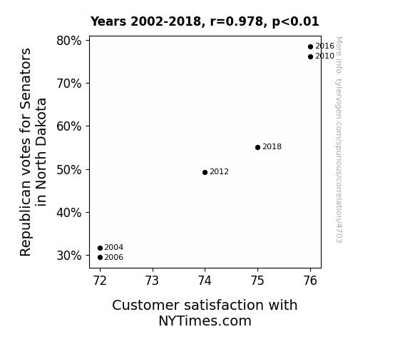
Votes for Republican Senators in North DakotaDetailed data title: Percentage of votes cast for Federal Republican Senate candidates in North Dakota
Source: MIT Election Data and Science Lab, Harvard Dataverse
See what else correlates with Votes for Republican Senators in North Dakota
Customer satisfaction with NYTimes.com
Source: American Customer Satisfaction Index
See what else correlates with Customer satisfaction with NYTimes.com
Correlation is a measure of how much the variables move together. If it is 0.99, when one goes up the other goes up. If it is 0.02, the connection is very weak or non-existent. If it is -0.99, then when one goes up the other goes down. If it is 1.00, you probably messed up your correlation function.
r2 = 0.9566942 (Coefficient of determination)
This means 95.7% of the change in the one variable (i.e., Customer satisfaction with NYTimes.com) is predictable based on the change in the other (i.e., Votes for Republican Senators in North Dakota) over the 6 years from 2002 through 2018.
p < 0.01, which is statistically significant(Null hypothesis significance test)
The p-value is 0.00071. 0.0007136774246336360000000000
The p-value is a measure of how probable it is that we would randomly find a result this extreme. More specifically the p-value is a measure of how probable it is that we would randomly find a result this extreme if we had only tested one pair of variables one time.
But I am a p-villain. I absolutely did not test only one pair of variables one time. I correlated hundreds of millions of pairs of variables. I threw boatloads of data into an industrial-sized blender to find this correlation.
Who is going to stop me? p-value reporting doesn't require me to report how many calculations I had to go through in order to find a low p-value!
On average, you will find a correaltion as strong as 0.98 in 0.071% of random cases. Said differently, if you correlated 1,401 random variables Which I absolutely did.
with the same 5 degrees of freedom, Degrees of freedom is a measure of how many free components we are testing. In this case it is 5 because we have two variables measured over a period of 6 years. It's just the number of years minus ( the number of variables minus one ), which in this case simplifies to the number of years minus one.
you would randomly expect to find a correlation as strong as this one.
[ 0.81, 1 ] 95% correlation confidence interval (using the Fisher z-transformation)
The confidence interval is an estimate the range of the value of the correlation coefficient, using the correlation itself as an input. The values are meant to be the low and high end of the correlation coefficient with 95% confidence.
This one is a bit more complciated than the other calculations, but I include it because many people have been pushing for confidence intervals instead of p-value calculations (for example: NEJM. However, if you are dredging data, you can reliably find yourself in the 5%. That's my goal!
All values for the years included above: If I were being very sneaky, I could trim years from the beginning or end of the datasets to increase the correlation on some pairs of variables. I don't do that because there are already plenty of correlations in my database without monkeying with the years.
Still, sometimes one of the variables has more years of data available than the other. This page only shows the overlapping years. To see all the years, click on "See what else correlates with..." link above.
| 2004 | 2006 | 2010 | 2012 | 2016 | 2018 | |
| Votes for Republican Senators in North Dakota (Percentage of votes) | 31.7201 | 29.5285 | 76.169 | 49.324 | 78.478 | 55.1055 |
| Customer satisfaction with NYTimes.com (Consumer Satisfaction) | 72 | 72 | 76 | 74 | 76 | 75 |
Why this works
- Data dredging: I have 25,153 variables in my database. I compare all these variables against each other to find ones that randomly match up. That's 632,673,409 correlation calculations! This is called “data dredging.” Instead of starting with a hypothesis and testing it, I instead abused the data to see what correlations shake out. It’s a dangerous way to go about analysis, because any sufficiently large dataset will yield strong correlations completely at random.
- Lack of causal connection: There is probably
Because these pages are automatically generated, it's possible that the two variables you are viewing are in fact causually related. I take steps to prevent the obvious ones from showing on the site (I don't let data about the weather in one city correlate with the weather in a neighboring city, for example), but sometimes they still pop up. If they are related, cool! You found a loophole.
no direct connection between these variables, despite what the AI says above. This is exacerbated by the fact that I used "Years" as the base variable. Lots of things happen in a year that are not related to each other! Most studies would use something like "one person" in stead of "one year" to be the "thing" studied. - Observations not independent: For many variables, sequential years are not independent of each other. If a population of people is continuously doing something every day, there is no reason to think they would suddenly change how they are doing that thing on January 1. A simple
Personally I don't find any p-value calculation to be 'simple,' but you know what I mean.
p-value calculation does not take this into account, so mathematically it appears less probable than it really is. - Very low n: There are not many data points included in this analysis. Even if the p-value is high, we should be suspicious of using so few datapoints in a correlation.
- Y-axis doesn't start at zero: I truncated the Y-axes of the graph above. I also used a line graph, which makes the visual connection stand out more than it deserves.
Nothing against line graphs. They are great at telling a story when you have linear data! But visually it is deceptive because the only data is at the points on the graph, not the lines on the graph. In between each point, the data could have been doing anything. Like going for a random walk by itself!
Mathematically what I showed is true, but it is intentionally misleading. Below is the same chart but with both Y-axes starting at zero.

Try it yourself
You can calculate the values on this page on your own! Try running the Python code to see the calculation results. Step 1: Download and install Python on your computer.Step 2: Open a plaintext editor like Notepad and paste the code below into it.
Step 3: Save the file as "calculate_correlation.py" in a place you will remember, like your desktop. Copy the file location to your clipboard. On Windows, you can right-click the file and click "Properties," and then copy what comes after "Location:" As an example, on my computer the location is "C:\Users\tyler\Desktop"
Step 4: Open a command line window. For example, by pressing start and typing "cmd" and them pressing enter.
Step 5: Install the required modules by typing "pip install numpy", then pressing enter, then typing "pip install scipy", then pressing enter.
Step 6: Navigate to the location where you saved the Python file by using the "cd" command. For example, I would type "cd C:\Users\tyler\Desktop" and push enter.
Step 7: Run the Python script by typing "python calculate_correlation.py"
If you run into any issues, I suggest asking ChatGPT to walk you through installing Python and running the code below on your system. Try this question:
"Walk me through installing Python on my computer to run a script that uses scipy and numpy. Go step-by-step and ask me to confirm before moving on. Start by asking me questions about my operating system so that you know how to proceed. Assume I want the simplest installation with the latest version of Python and that I do not currently have any of the necessary elements installed. Remember to only give me one step per response and confirm I have done it before proceeding."
# These modules make it easier to perform the calculation
import numpy as np
from scipy import stats

# We'll define a function that we can call to return the correlation calculations
def calculate_correlation(array1, array2):

    # Calculate Pearson correlation coefficient and p-value
    correlation, p_value = stats.pearsonr(array1, array2)

    # Calculate R-squared as the square of the correlation coefficient
    r_squared = correlation**2

    return correlation, r_squared, p_value

# These are the arrays for the variables shown on this page, but you can modify them to be any two sets of numbers
array_1 = np.array([31.7201,29.5285,76.169,49.324,78.478,55.1055,])
array_2 = np.array([72,72,76,74,76,75,])
array_1_name = "Votes for Republican Senators in North Dakota"
array_2_name = "Customer satisfaction with NYTimes.com"

# Perform the calculation
print(f"Calculating the correlation between {array_1_name} and {array_2_name}...")
correlation, r_squared, p_value = calculate_correlation(array_1, array_2)

# Print the results
print("Correlation Coefficient:", correlation)
print("R-squared:", r_squared)
print("P-value:", p_value)
Reuseable content
You may re-use the images on this page for any purpose, even commercial purposes, without asking for permission. The only requirement is that you attribute Tyler Vigen. Attribution can take many different forms. If you leave the "tylervigen.com" link in the image, that satisfies it just fine. If you remove it and move it to a footnote, that's fine too. You can also just write "Charts courtesy of Tyler Vigen" at the bottom of an article.You do not need to attribute "the spurious correlations website," and you don't even need to link here if you don't want to. I don't gain anything from pageviews. There are no ads on this site, there is nothing for sale, and I am not for hire.
For the record, I am just one person. Tyler Vigen, he/him/his. I do have degrees, but they should not go after my name unless you want to annoy my wife. If that is your goal, then go ahead and cite me as "Tyler Vigen, A.A. A.A.S. B.A. J.D." Otherwise it is just "Tyler Vigen."
When spoken, my last name is pronounced "vegan," like I don't eat meat.
Full license details.
For more on re-use permissions, or to get a signed release form, see tylervigen.com/permission.
Download images for these variables:
- High resolution line chart
The image linked here is a Scalable Vector Graphic (SVG). It is the highest resolution that is possible to achieve. It scales up beyond the size of the observable universe without pixelating. You do not need to email me asking if I have a higher resolution image. I do not. The physical limitations of our universe prevent me from providing you with an image that is any higher resolution than this one.
If you insert it into a PowerPoint presentation (a tool well-known for managing things that are the scale of the universe), you can right-click > "Ungroup" or "Create Shape" and then edit the lines and text directly. You can also change the colors this way.
Alternatively you can use a tool like Inkscape. - High resolution line chart, optimized for mobile
- Alternative high resolution line chart
- Scatterplot
- Portable line chart (png)
- Portable line chart (png), optimized for mobile
- Line chart for only Votes for Republican Senators in North Dakota
- Line chart for only Customer satisfaction with NYTimes.com
- AI-generated correlation image
- The spurious research paper: From Red to Read: The Interplay of Republican Votes in North Dakota and Customer Satisfaction with NYTimes.com
Your correlation inspection deserves a standing ovation!
Correlation ID: 4703 · Black Variable ID: 26442 · Red Variable ID: 19867


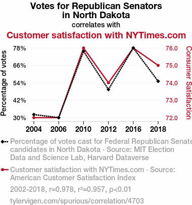