spurious correlations
discover · random · spurious scholar
← previous page · next page →
. The chart goes from 2010 to 2023, and the two variables track closely in value over that time.")

View details about correlation #2,734
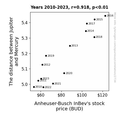
Jovian Juxtaposition: Jupiter's Journey and Beer Stocks
As the gulf widened, investors found themselves reaching for more BUDs. The gravitational pull of profitability shifted, creating a stellar performance for the beer giant. With more space between the planets, BUD stock was able to eclipse the competition. As above, so below – the celestial dance of the planets brewed up hoppy returns for shareholders. It seems even in the vast expanse of the cosmos, Jupiter and Mercury were keg-fully influencing the earthly markets. This just goes to show, when it comes to BUD stock, the sky's the limit – or in this case, the solar system!

What else correlates?
The distance between Jupiter and Mercury · all planets
Anheuser-Busch InBev's stock price (BUD) · all stocks
The distance between Jupiter and Mercury · all planets
Anheuser-Busch InBev's stock price (BUD) · all stocks


View details about correlation #1,840
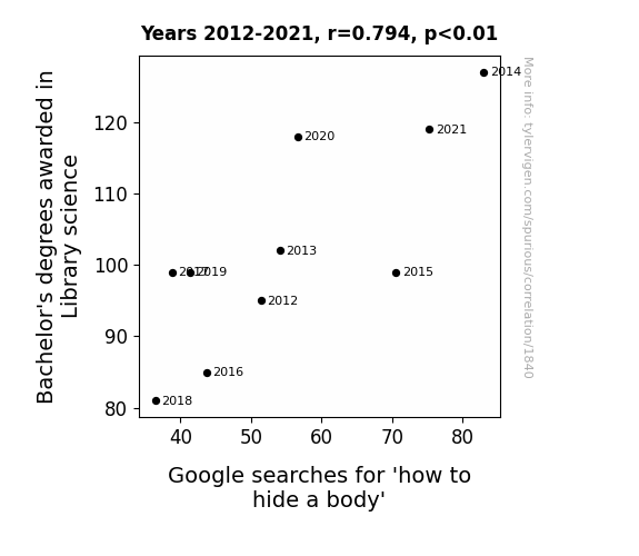
Shh, Let's Dewey This Quietly: The Correlation Between Library Science Degrees and Google Searches for 'How to Hide a Body'
As more library science graduates entered the workforce, they sought to revolutionize traditional methods of categorization and storage. Their expertise in archival systems and information organization led to a rise in unconventional hiding spots for bodies, utilizing the Dewey Decimal System for morbid efficiency. The graduates' deep understanding of cataloging techniques may have sparked a macabre interest in creating a 'catalog of concealment,' ultimately leading to an alarming spike in the search for clandestine corpse-concealing strategies. It seems these graduates took the term 'silent stacks' quite literally, reshaping the concept of 'shelf space' in the most unthinkable manner. Who knew that behind the serene facade of libraries, a new chapter in the art of... cover-up would unfold? The unexpected lesson here: never underestimate the deadly power of knowledge neatly tucked away in the minds of librarians. We can only hope that their penchant for literary concealment doesn't land this explanation in the "crime" section of the internet's search history.


View details about correlation #2,423
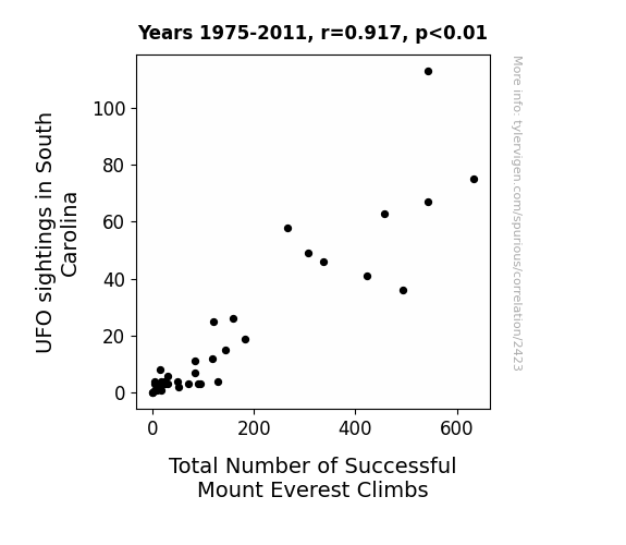
The E.T. Connection: Exploring the Relationship Between UFO Sightings in South Carolina and Total Number of Successful Mount Everest Climbs
The aliens were big fans of extreme sports and decided to start an intergalactic Mount Everest fan club, providing secret technological assistance to climbers. Who knew that E.T. was an adrenaline junkie?


View details about correlation #5,955
Popularity of the 'Y U No' Meme: A Meme-ticulous Examination of its Link to the Labor Market in Nebraska
As the 'y u no' meme gained popularity, it sparked a wave of introspection and questioning in Nebraska. People couldn't help but wonder 'y u no' understand the importance of financial responsibility. This led to a dramatic increase in loan interviews and clerks in Nebraska, as the meme inadvertently became a catalyst for prompting individuals to seek out loans and financial guidance. It's as if the meme was saying, 'Y u no manage your money better? Y u no apply for that loan?' and Nebraskans took it to heart, flooding the offices with loan inquiries. After all, when the internet speaks, apparently Nebraskans listen, especially when it comes to their personal finances.


What else correlates?
Popularity of the 'y u no' meme · all memes
The number of loan interviewers and clerks in Nebraska · all cccupations
Popularity of the 'y u no' meme · all memes
The number of loan interviewers and clerks in Nebraska · all cccupations


View details about correlation #1,362
Stirring Up a Storm: Exploring the Correlation Between Butter Consumption and Wind Power Generation in Lithuania
As butter consumption increased, people naturally became more gaseous, creating a higher demand for wind power in Lithuania. The connection is quite a-moo-sing! More butter, more tootin’, more wind power spoutin’ in Lithuania! The correlation is udderly undeniable!


What else correlates?
Butter consumption · all food
Wind power generated in Lithuania · all energy
Butter consumption · all food
Wind power generated in Lithuania · all energy


View details about correlation #1,532
Sleep in Law Enforcement: A Correlational Investigation of Bachelor's Degrees Awarded and Google Searches for 'Sleepwalking'
As more officers received their degrees, they also started sleepwalking through crime scenes to truly grasp the evidence. And sadly, this led to an increase in sleepwalking incidents among the general public.


What else correlates?
Bachelor's degrees awarded in law enforcement · all education
Google searches for 'sleepwalking' · all google searches
Bachelor's degrees awarded in law enforcement · all education
Google searches for 'sleepwalking' · all google searches


View details about correlation #1,205
Dissolution and Disney: Divorce Rates in the United Kingdom and Theatrical Tales of Tangled Ties
As the saying goes, 'happily ever after' took on a whole new meaning in the UK. It seems that as couples were splitting up less, they were sticking around to watch more heartwarming rom-coms instead of seeking solace in animated fairy tales. So, as divorce rates plummeted, Disney realized there were 'less separations, more animations' happening. It's a tale as old as time - love conquers all, even box office numbers!


What else correlates?
Divorce rates in the United Kingdom · all weird & wacky
Disney movies released · all films & actors
Divorce rates in the United Kingdom · all weird & wacky
Disney movies released · all films & actors


View details about correlation #4,953
Kori-lation or Coincidence: Exploring the Link Between the Popularity of the Name Kori and the 'Pepe' Meme
Perhaps babies named Kori were just naturally drawn to the joy and laughter that the 'pepe' meme brought to the world. As if the sound of the name itself had a magical influence on internet humor trends, it's as if Kori whispered a secret message to anyone who heard it: "Embrace the frog, find the meme-ning of life. Rebbit into the world of internet culture, and you shall find your pepe-tual source of amusement." Before you knew it, Kori and 'pepe' became the un-frog-ettable duo of the decade, hopping their way into the hearts and screens of people everywhere. It's like they say, when life gives you Kori, you find the pepe in every situation!

What else correlates?
Popularity of the first name Kori · all first names
Popularity of the 'pepe' meme · all memes
Popularity of the first name Kori · all first names
Popularity of the 'pepe' meme · all memes


View details about correlation #2,996
Air We Grow: Exploring the Relationship Between Air Pollution in Dayton and the Genetic Counselor Population in Ohio
As air quality improved in Dayton, the local population found themselves with a new lease on life. With the prevalent smog no longer stifling their senses, they were able to see things more clearly - including the fact that they didn't need as much genetic counseling as they thought. The cleaner air led to cleaner genetic outcomes, leaving fewer Ohioans in need of professional genetic guidance. In essence, as the pollution dissipated, so did the perceived need for genetic counselors in the state. It's a case of environmental wellness inadvertently leading to a reduction in genetic wellness professionals.


What else correlates?
Air pollution in Dayton · all weather
The number of genetic counselors in Ohio · all cccupations
Air pollution in Dayton · all weather
The number of genetic counselors in Ohio · all cccupations


View details about correlation #1,598
The Illuminating Link: Solar Power in Argentina and the Curious Case of 'Do Vaccines Work' Google Searches
As solar power in Argentina increased, the influx of renewable energy somehow supercharged the internet, leading to a surge in overall health knowledge. This, in turn, prompted more people to research and understand the effectiveness of vaccines. So, in a shocking twist, it seems like the sun isn't just good for vitamin D but also for sparking an interest in vaccination efficacy.


What else correlates?
Solar power generated in Argentina · all energy
Google searches for 'do vaccines work' · all google searches
Solar power generated in Argentina · all energy
Google searches for 'do vaccines work' · all google searches


View details about correlation #5,818
Brake for Liberty: A Statistical Analysis of the Relationship Between Libertarian Votes in Florida and Automotive Recalls for Parking Brake Issues
As the rhetoric about freedom and minimal government intervention revved up, it inadvertently applied the brakes to the automotive industry's attention to detail. This led to a swell in parking brake malfunctions as manufacturers were seemingly inspired by the concept of limited regulation. Remember, when it comes to elections and automotive safety, sometimes the correlation is truly parking brake-thtaking.


View details about correlation #5,126
The Puzzling Popularity: Probing the Pinpointed Pairing of the 'Cicada 3301' Meme and LEMMiNO YouTube Likes
The intense 'buzz' around the 'cicada 3301' meme attracted more 'followers', leading to a 'swarm' of new viewers for LEMMiNO's videos. This unexpected 'discovery' of his content 'planted' the seeds for a surge in likes, creating a 'chirping' good time for all involved. In essence, the 'cicada 3301' meme really 'bugged' people to engage with LEMMiNO's videos, igniting a 'flap' of activity and proving that sometimes, the internet truly can be a 'hive' of entertainment.


What else correlates?
Popularity of the 'cicada 3301' meme · all memes
Total likes of LEMMiNO YouTube videos · all YouTube
Popularity of the 'cicada 3301' meme · all memes
Total likes of LEMMiNO YouTube videos · all YouTube


View details about correlation #1,830
Cruisin' for an Associative Degree: The Popularity of the Name Cruz and Its Correlation with Nursing Education Awards
More people named Cruz inspired by 70s and 80s TV detective shows. Chose the nursing field to crack the case of the mysterious ailments and solve the riddles of the human body.


What else correlates?
Popularity of the first name Cruz · all first names
Associates degrees awarded in Nursing · all education
Popularity of the first name Cruz · all first names
Associates degrees awarded in Nursing · all education


View details about correlation #4,260
The Baroque Obama Browsing Bonanza: Bizarre Bond with Missouri's Furniture Finishers
Baroque Obama was known for his exquisite taste in furniture, and as interest in his fine taste waned, so did the demand for expert furniture finishers in Missouri. It seems that even presidential search engine popularity can have a ripple effect on local furniture craftsmanship. Remember, a well-finished chair may just depend on who the nation is searching for!


What else correlates?
Google searches for 'Baroque Obama' · all google searches
The number of furniture finishers in Missouri · all cccupations
Google searches for 'Baroque Obama' · all google searches
The number of furniture finishers in Missouri · all cccupations


View details about correlation #5,845
The Watson Connection: Emma's Movies and Michigan's Senators
As Emma Watson graced the silver screen, her magical performances unknowingly charmed viewers in Michigan. Her on-screen presence sparked a wave of empathy and understanding, drawing people to embrace the values espoused by the Democratic party. Unbeknownst to her, each movie acted as a subtle campaign for democratic principles, swaying the electorate in favor of Democratic senators. As her filmography expanded, so did the support for Democratic candidates, as if her cinematic aura had a bewitching effect on the political landscape of Michigan.


What else correlates?
The number of movies Emma Watson appeared in · all films & actors
Votes for Democratic Senators in Michigan · all elections
The number of movies Emma Watson appeared in · all films & actors
Votes for Democratic Senators in Michigan · all elections


View details about correlation #1,133
Saturn's Sojourn and HP Satisfaction: A Cosmic Correlation
As the gap widened, Saturn sent out posi-tive vibes symbolizing the need for a brand new HP space station. This led to out-of-this-world customer satisfaction as they were over the moon with the stellar products.


What else correlates?
The distance between Saturn and the Sun · all planets
Customer satisfaction with HP · all weird & wacky
The distance between Saturn and the Sun · all planets
Customer satisfaction with HP · all weird & wacky


View details about correlation #1,887
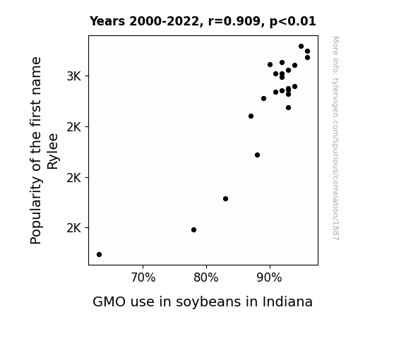
The Rylee-GMO Swoon: A Statistical Tune on Indiana Soybeans
As more babies were named Rylee, the demand for baby food containing soy products skyrocketed. This led to a greater need for genetically modified soybeans in Indiana to keep up with the Rylee-fueled baby food craze. It seems like the name Rylee has really bean sprouting some unexpected consequences! Who would have thought that a popular baby name could soy directly influence agricultural practices in such a corny way?

What else correlates?
Popularity of the first name Rylee · all first names
GMO use in soybeans in Indiana · all food
Popularity of the first name Rylee · all first names
GMO use in soybeans in Indiana · all food


View details about correlation #4,876
Fueling the Fire: The Correlation Between 'Call Me Maybe' Memes and Kerosene Consumption in Panama
As the 'call me maybe' meme faded into oblivion, people just weren't feeling the same spark and connection anymore. With lesser demand for romantic rendezvous, the need for kerosene-fueled candlelit dinners in Panama waned, leading to a noticeable decrease in kerosene usage. Who knew that a meme could have such a wick-ed impact on the kerosene market in Panama!


What else correlates?
Popularity of the 'call me maybe' meme · all memes
Kerosene used in Panama · all energy
Popularity of the 'call me maybe' meme · all memes
Kerosene used in Panama · all energy
. The chart goes from 2008 to 2023, and the two variables track closely in value over that time.")

View details about correlation #1,639
Searchin' for Suspicion: The SUS-picious Connection Between Google Searches for 'That is SUS' and MSCI Stock Price
Teenagers are the primary demographic for both Among Us (the popular game with the catchphrase "that is sus") and MSCI Inc. stock, leading to a surge in stock interest whenever there's a spike in gaming slang usage. It's a case of 'meme power' driving the stock market, as investors subconsciously yolo their way into MSCI every time they hear the word 'sus' being susprisingly used in everyday conversations. It's a real 'imposter syndrome' for traditional market analysts, but hey, at least MSCI stock is venting all the way to the moon!


What else correlates?
Google searches for 'that is sus' · all google searches
MSCI Inc.'s stock price (MSCI) · all stocks
Google searches for 'that is sus' · all google searches
MSCI Inc.'s stock price (MSCI) · all stocks


View details about correlation #2,364
The Cosmic Connection: Jupiter's Distance and Degrees in Family and Consumer Sciences/Human Sciences
As Jupiter crept closer, its gravitational pull messed with our ability to sew straight seams and perfectly fold fitted sheets. So, many potential recipients failed to meet the high standards necessary to earn their degrees in Family and Consumer Sciences/Human Sciences. Essentially, Jupiter's proximity created a cosmic ripple effect, leading to a shortage of qualified homemakers and family professionals.


What else correlates?
The distance between Jupiter and Earth · all planets
Bachelor's degrees awarded in consumer sciences · all education
The distance between Jupiter and Earth · all planets
Bachelor's degrees awarded in consumer sciences · all education
Why this works
- Data dredging: I have 25,237 variables in my database. I compare all these variables against each other to find ones that randomly match up. That's 636,906,169 correlation calculations! This is called “data dredging.”
Fun fact: the chart used on the wikipedia page to demonstrate data dredging is also from me. I've been being naughty with data since 2014.
Instead of starting with a hypothesis and testing it, I instead tossed a bunch of data in a blender to see what correlations would shake out. It’s a dangerous way to go about analysis, because any sufficiently large dataset will yield strong correlations completely at random. - Lack of causal connection: There is probably no direct connection between these variables, despite what the AI says above.
Because these pages are automatically generated, it's possible that the two variables you are viewing are in fact causually related. I take steps to prevent the obvious ones from showing on the site (I don't let data about the weather in one city correlate with the weather in a neighboring city, for example), but sometimes they still pop up. If they are related, cool! You found a loophole.
This is exacerbated by the fact that I used "Years" as the base variable. Lots of things happen in a year that are not related to each other! Most studies would use something like "one person" in stead of "one year" to be the "thing" studied. - Observations not independent: For many variables, sequential years are not independent of each other. You will often see trend-lines form. If a population of people is continuously doing something every day, there is no reason to think they would suddenly change how they are doing that thing on January 1. A naive p-value calculation does not take this into account.
You will calculate a lower chance of "randomly" achieving the result than represents reality.
To be more specific: p-value tests are probability values, where you are calculating the probability of achieving a result at least as extreme as you found completely by chance. When calculating a p-value, you need to assert how many "degrees of freedom" your variable has. I count each year (minus one) as a "degree of freedom," but this is misleading for continuous variables.
This kind of thing can creep up on you pretty easily when using p-values, which is why it's best to take it as "one of many" inputs that help you assess the results of your analysis.
- Y-axes doesn't start at zero: I truncated the Y-axes of the graphs above. I also used a line graph, which makes the visual connection stand out more than it deserves.
Nothing against line graphs. They are great at telling a story when you have linear data! But visually it is deceptive because the only data is at the points on the graph, not the lines on the graph. In between each point, the data could have been doing anything. Like going for a random walk by itself!
Mathematically what I showed is true, but it is intentionally misleading. If you click on any of the charts that abuse this, you can scroll down to see a version that starts at zero. - Confounding variable: Confounding variables (like global pandemics) will cause two variables to look connected when in fact a "sneaky third" variable is influencing both of them behind the scenes.
- Outliers: Some datasets here have outliers which drag up the correlation.
In concept, "outlier" just means "way different than the rest of your dataset." When calculating a correlation like this, they are particularly impactful because a single outlier can substantially increase your correlation.
Because this page is automatically generated, I don't know whether any of the charts displayed on it have outliers. I'm just a footnote. ¯\_(ツ)_/¯
I intentionally mishandeled outliers, which makes the correlation look extra strong. - Low n: There are not many data points included in some of these charts.
You can do analyses with low ns! But you shouldn't data dredge with a low n.
Even if the p-value is high, we should be suspicious of using so few datapoints in a correlation.
Pro-tip: click on any correlation to see:
- Detailed data sources
- Prompts for the AI-generated content
- Explanations of each of the calculations (correlation, p-value)
- Python code to calculate it yourself