spurious correlations
discover · random · spurious scholar
← previous page · next page →


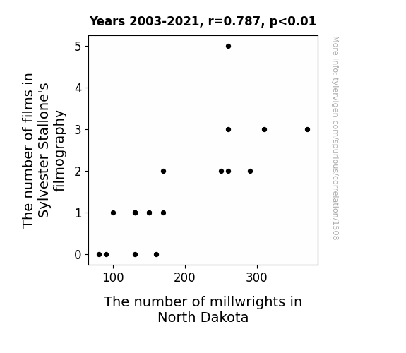
View details about correlation #1,508


View details about correlation #5,139

What else correlates?
Popularity of the first name Alaina · all first names
Popularity of the 'trollface' meme · all memes
Popularity of the first name Alaina · all first names
Popularity of the 'trollface' meme · all memes


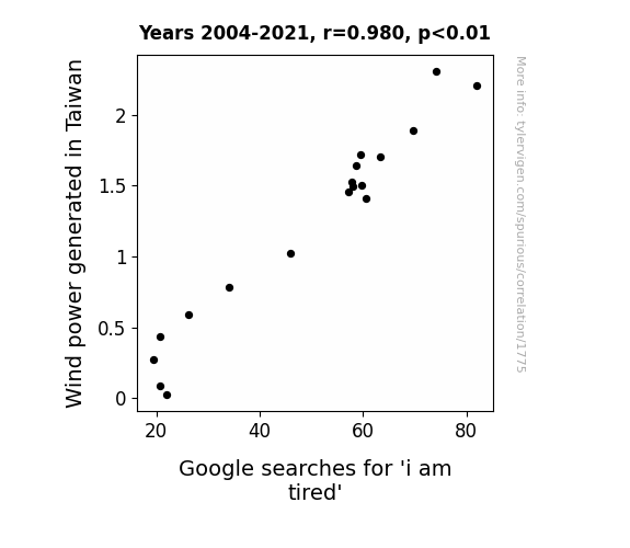
View details about correlation #1,775
What else correlates?
Wind power generated in Taiwan · all energy
Google searches for 'i am tired' · all google searches
Wind power generated in Taiwan · all energy
Google searches for 'i am tired' · all google searches


View details about correlation #5,861


View details about correlation #4,622

What else correlates?
How cool Matt Parker's YouTube video titles are · all YouTube
Arson in North Dakota · all random state specific
How cool Matt Parker's YouTube video titles are · all YouTube
Arson in North Dakota · all random state specific


View details about correlation #2,845

What else correlates?
American cheese consumption · all food
US edible fishery product imports · all food
American cheese consumption · all food
US edible fishery product imports · all food


View details about correlation #5,918

What else correlates?
Associates degrees awarded in Emergency medical tech · all education
Miss America's age · all weird & wacky
Associates degrees awarded in Emergency medical tech · all education
Miss America's age · all weird & wacky


View details about correlation #5,850

What else correlates?
Air quality in Union City, Tennessee · all weather
The number of movies Orlando Bloom appeared in · all films & actors
Air quality in Union City, Tennessee · all weather
The number of movies Orlando Bloom appeared in · all films & actors
. The chart goes from 2010 to 2023, and the two variables track closely in value over that time.")

View details about correlation #2,725

What else correlates?
The distance between Jupiter and Venus · all planets
Anheuser-Busch InBev's stock price (BUD) · all stocks
The distance between Jupiter and Venus · all planets
Anheuser-Busch InBev's stock price (BUD) · all stocks


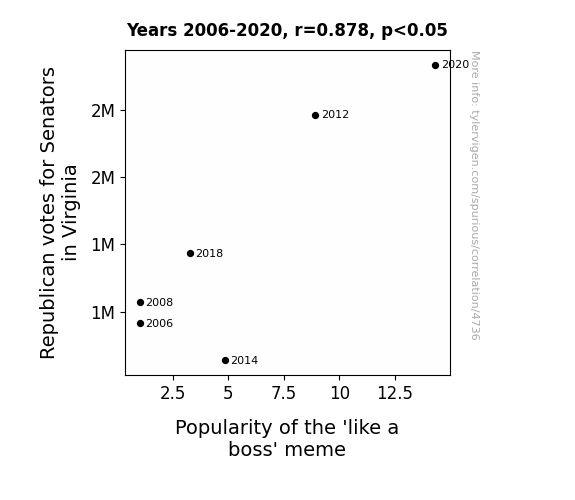
View details about correlation #4,736
What else correlates?
Votes for Republican Senators in Virginia · all elections
Popularity of the 'like a boss' meme · all memes
Votes for Republican Senators in Virginia · all elections
Popularity of the 'like a boss' meme · all memes


View details about correlation #2,716

What else correlates?
Bachelor's degrees awarded in Engineering · all education
Electricity generation in Cambodia · all energy
Bachelor's degrees awarded in Engineering · all education
Electricity generation in Cambodia · all energy


View details about correlation #2,204

What else correlates?
Pirate attacks globally · all weird & wacky
Google searches for 'download firefox' · all google searches
Pirate attacks globally · all weird & wacky
Google searches for 'download firefox' · all google searches


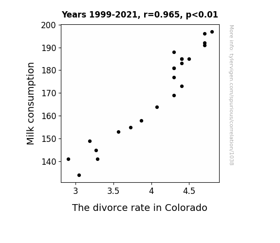
View details about correlation #1,038
What else correlates?
Milk consumption · all food
The divorce rate in Colorado · all random state specific
Milk consumption · all food
The divorce rate in Colorado · all random state specific
. The chart goes from 2011 to 2021, and the two variables track closely in value over that time.")

View details about correlation #2,103

What else correlates?
Air pollution in Sioux City, Iowa · all weather
Tesla's stock price (TSLA) · all stocks
Air pollution in Sioux City, Iowa · all weather
Tesla's stock price (TSLA) · all stocks


View details about correlation #3,081
What else correlates?
Master's degrees awarded in Transportation · all education
The number of cartographers in New Mexico · all cccupations
Master's degrees awarded in Transportation · all education
The number of cartographers in New Mexico · all cccupations


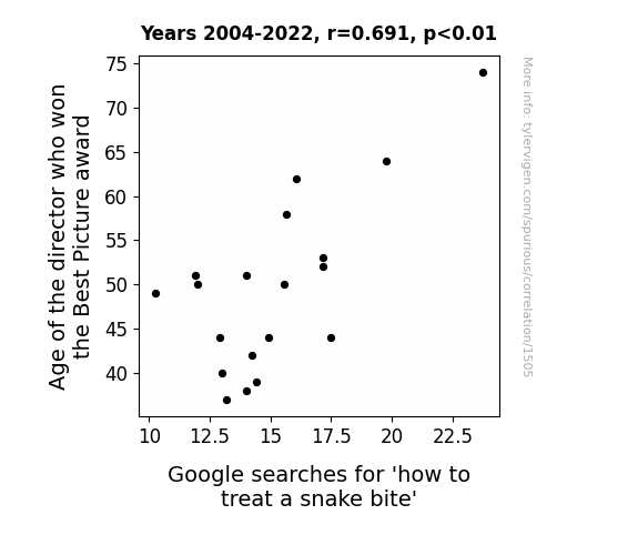
View details about correlation #1,505


View details about correlation #2,048
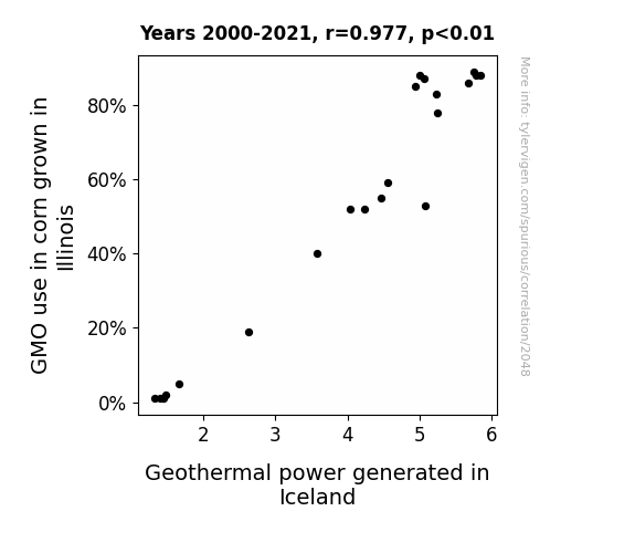
What else correlates?
GMO use in corn grown in Illinois · all food
Geothermal power generated in Iceland · all energy
GMO use in corn grown in Illinois · all food
Geothermal power generated in Iceland · all energy


View details about correlation #1,211
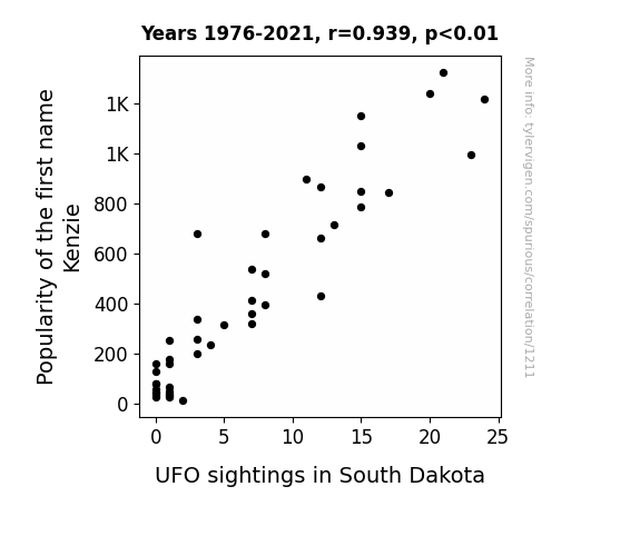
What else correlates?
Popularity of the first name Kenzie · all first names
UFO sightings in South Dakota · all random state specific
Popularity of the first name Kenzie · all first names
UFO sightings in South Dakota · all random state specific


View details about correlation #3,072
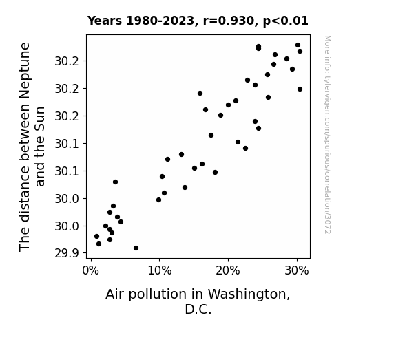
What else correlates?
The distance between Neptune and the Sun · all planets
Air pollution in Washington, D.C. · all weather
The distance between Neptune and the Sun · all planets
Air pollution in Washington, D.C. · all weather


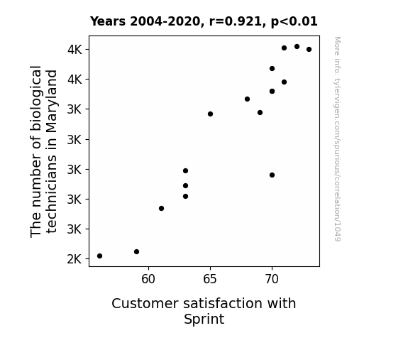
View details about correlation #1,049
What else correlates?
The number of biological technicians in Maryland · all cccupations
Customer satisfaction with Sprint · all weird & wacky
The number of biological technicians in Maryland · all cccupations
Customer satisfaction with Sprint · all weird & wacky
Why this works
- Data dredging: I have 25,237 variables in my database. I compare all these variables against each other to find ones that randomly match up. That's 636,906,169 correlation calculations! This is called “data dredging.”
Fun fact: the chart used on the wikipedia page to demonstrate data dredging is also from me. I've been being naughty with data since 2014.
Instead of starting with a hypothesis and testing it, I instead tossed a bunch of data in a blender to see what correlations would shake out. It’s a dangerous way to go about analysis, because any sufficiently large dataset will yield strong correlations completely at random. - Lack of causal connection: There is probably no direct connection between these variables, despite what the AI says above.
Because these pages are automatically generated, it's possible that the two variables you are viewing are in fact causually related. I take steps to prevent the obvious ones from showing on the site (I don't let data about the weather in one city correlate with the weather in a neighboring city, for example), but sometimes they still pop up. If they are related, cool! You found a loophole.
This is exacerbated by the fact that I used "Years" as the base variable. Lots of things happen in a year that are not related to each other! Most studies would use something like "one person" in stead of "one year" to be the "thing" studied. - Observations not independent: For many variables, sequential years are not independent of each other. You will often see trend-lines form. If a population of people is continuously doing something every day, there is no reason to think they would suddenly change how they are doing that thing on January 1. A naive p-value calculation does not take this into account.
You will calculate a lower chance of "randomly" achieving the result than represents reality.
To be more specific: p-value tests are probability values, where you are calculating the probability of achieving a result at least as extreme as you found completely by chance. When calculating a p-value, you need to assert how many "degrees of freedom" your variable has. I count each year (minus one) as a "degree of freedom," but this is misleading for continuous variables.
This kind of thing can creep up on you pretty easily when using p-values, which is why it's best to take it as "one of many" inputs that help you assess the results of your analysis.
- Y-axes doesn't start at zero: I truncated the Y-axes of the graphs above. I also used a line graph, which makes the visual connection stand out more than it deserves.
Nothing against line graphs. They are great at telling a story when you have linear data! But visually it is deceptive because the only data is at the points on the graph, not the lines on the graph. In between each point, the data could have been doing anything. Like going for a random walk by itself!
Mathematically what I showed is true, but it is intentionally misleading. If you click on any of the charts that abuse this, you can scroll down to see a version that starts at zero. - Confounding variable: Confounding variables (like global pandemics) will cause two variables to look connected when in fact a "sneaky third" variable is influencing both of them behind the scenes.
- Outliers: Some datasets here have outliers which drag up the correlation.
In concept, "outlier" just means "way different than the rest of your dataset." When calculating a correlation like this, they are particularly impactful because a single outlier can substantially increase your correlation.
Because this page is automatically generated, I don't know whether any of the charts displayed on it have outliers. I'm just a footnote. ¯\_(ツ)_/¯
I intentionally mishandeled outliers, which makes the correlation look extra strong. - Low n: There are not many data points included in some of these charts.
You can do analyses with low ns! But you shouldn't data dredge with a low n.
Even if the p-value is high, we should be suspicious of using so few datapoints in a correlation.
Pro-tip: click on any correlation to see:
- Detailed data sources
- Prompts for the AI-generated content
- Explanations of each of the calculations (correlation, p-value)
- Python code to calculate it yourself