spurious correlations
random · discover · next page →
don't miss spurious scholar,
where each of these is an academic paper
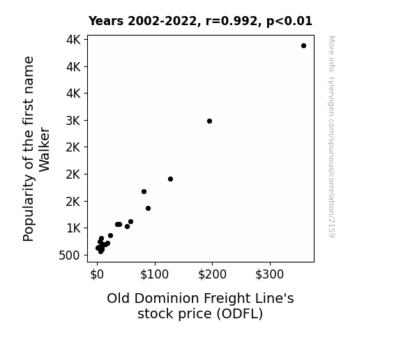
. The chart goes from 2002 to 2022, and the two variables track closely in value over that time.")

View details about correlation #2,159
What else correlates?
Popularity of the first name Walker · all first names
Old Dominion Freight Line's stock price (ODFL) · all stocks
Popularity of the first name Walker · all first names
Old Dominion Freight Line's stock price (ODFL) · all stocks


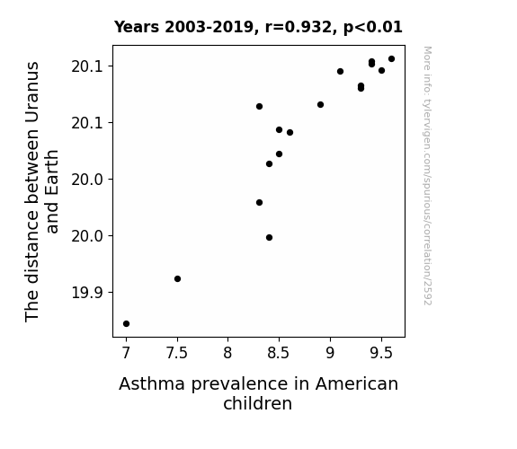
View details about correlation #2,592
What else correlates?
The distance between Uranus and Earth · all planets
Asthma prevalence in American children · all weird & wacky
The distance between Uranus and Earth · all planets
Asthma prevalence in American children · all weird & wacky
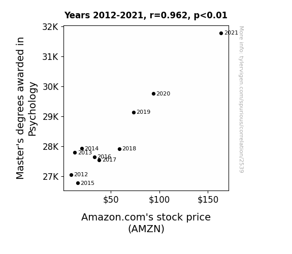
. The chart goes from 2012 to 2021, and the two variables track closely in value over that time.")

View details about correlation #2,539
What else correlates?
Master's degrees awarded in Psychology · all education
Amazon.com's stock price (AMZN) · all stocks
Master's degrees awarded in Psychology · all education
Amazon.com's stock price (AMZN) · all stocks


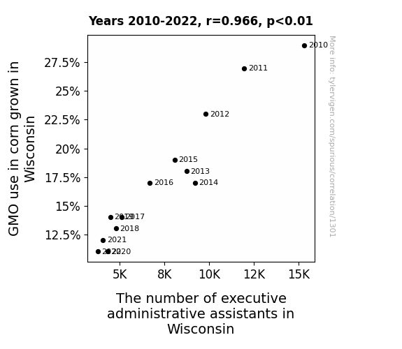
View details about correlation #1,301


View details about correlation #5,133
What else correlates?
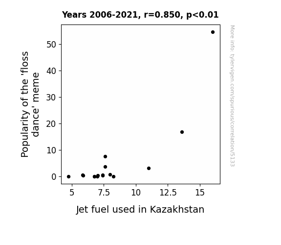
Popularity of the 'floss dance' meme · all memes
Jet fuel used in Kazakhstan · all energy
Popularity of the 'floss dance' meme · all memes
Jet fuel used in Kazakhstan · all energy
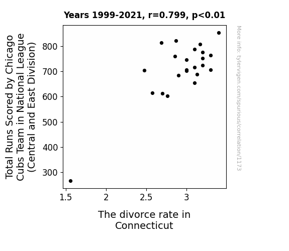
 and the second variable is The divorce rate in Connecticut. The chart goes from 1999 to 2021, and the two variables track closely in value over that time.")

View details about correlation #1,173


View details about correlation #5,827
What else correlates?
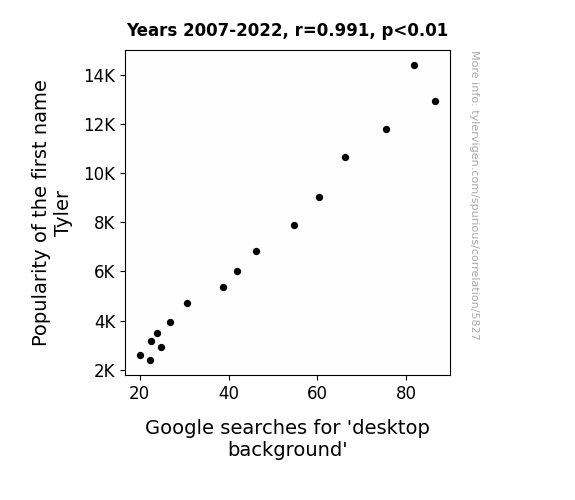
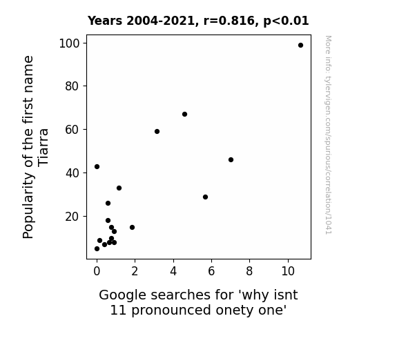
Popularity of the first name Tyler · all first names
Google searches for 'desktop background' · all google searches
Popularity of the first name Tyler · all first names
Google searches for 'desktop background' · all google searches


View details about correlation #2,284
What else correlates?
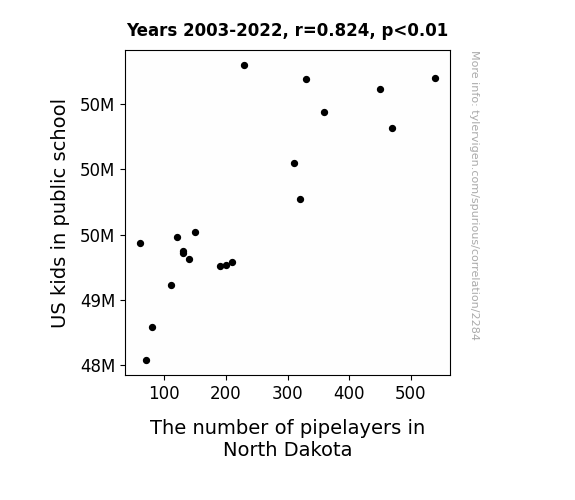
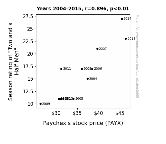
US kids in public school · all education
The number of pipelayers in North Dakota · all cccupations
US kids in public school · all education
The number of pipelayers in North Dakota · all cccupations
. The chart goes from 2004 to 2015, and the two variables track closely in value over that time.")

View details about correlation #2,695
What else correlates?
Season rating of "Two and a Half Men" · all films & actors
Paychex's stock price (PAYX) · all stocks
Season rating of "Two and a Half Men" · all films & actors
Paychex's stock price (PAYX) · all stocks


View details about correlation #5,909

What else correlates?
GDP per capita in Canada · all weird & wacky
Season wins for the San Francisco 49ers · all sports
GDP per capita in Canada · all weird & wacky
Season wins for the San Francisco 49ers · all sports


View details about correlation #1,035
What else correlates?
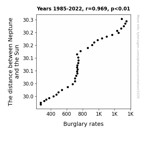
The distance between Neptune and the Sun · all planets
Burglary rates in the US · all random state specific
The distance between Neptune and the Sun · all planets
Burglary rates in the US · all random state specific


View details about correlation #1,951
What else correlates?
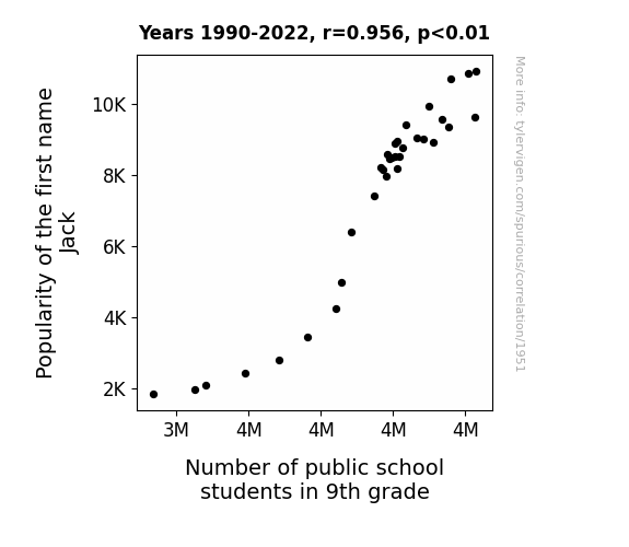
Popularity of the first name Jack · all first names
Number of public school students in 9th grade · all education
Popularity of the first name Jack · all first names
Number of public school students in 9th grade · all education
. The chart goes from 2008 to 2023, and the two variables track closely in value over that time.")

View details about correlation #2,694
What else correlates?
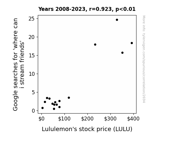
Google searches for 'where can i stream friends' · all google searches
Lululemon's stock price (LULU) · all stocks
Google searches for 'where can i stream friends' · all google searches
Lululemon's stock price (LULU) · all stocks


View details about correlation #1,370
What else correlates?
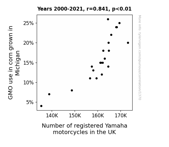
GMO use in corn grown in Michigan · all food
Number of registered Yamaha motorcycles in the UK · all weird & wacky
GMO use in corn grown in Michigan · all food
Number of registered Yamaha motorcycles in the UK · all weird & wacky


View details about correlation #5,931
What else correlates?
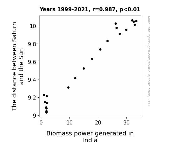
The distance between Saturn and the Sun · all planets
Biomass power generated in India · all energy
The distance between Saturn and the Sun · all planets
Biomass power generated in India · all energy


View details about correlation #2,674
What else correlates?
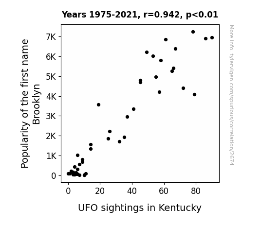
Popularity of the first name Brooklyn · all first names
UFO sightings in Kentucky · all random state specific
Popularity of the first name Brooklyn · all first names
UFO sightings in Kentucky · all random state specific


View details about correlation #2,948
What else correlates?
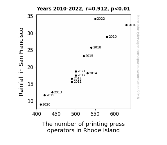
Rainfall in San Francisco · all weather
The number of printing press operators in Rhode Island · all cccupations
Rainfall in San Francisco · all weather
The number of printing press operators in Rhode Island · all cccupations


View details about correlation #5,959
What else correlates?
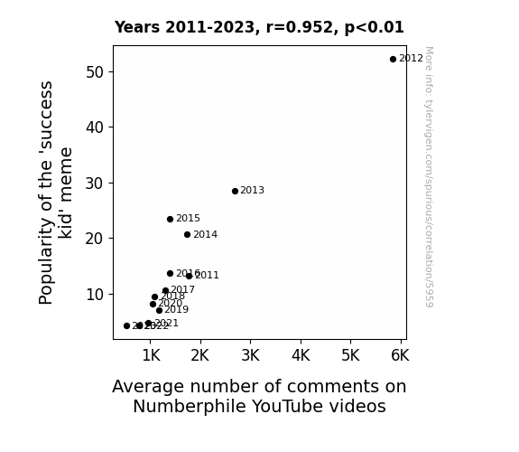
Popularity of the 'success kid' meme · all memes
Average number of comments on Numberphile YouTube videos · all YouTube
Popularity of the 'success kid' meme · all memes
Average number of comments on Numberphile YouTube videos · all YouTube


View details about correlation #2,310
What else correlates?
The distance between Uranus and Saturn · all planets
Nuclear power generation in Brazil · all energy
The distance between Uranus and Saturn · all planets
Nuclear power generation in Brazil · all energy


View details about correlation #1,218
What else correlates?
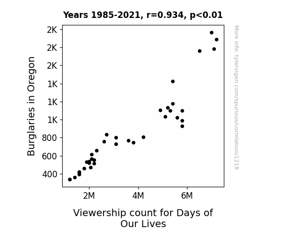
Burglaries in Oregon · all random state specific
Viewership count for Days of Our Lives · all weird & wacky
Burglaries in Oregon · all random state specific
Viewership count for Days of Our Lives · all weird & wacky


View details about correlation #1,041


View details about correlation #5,920
What else correlates?
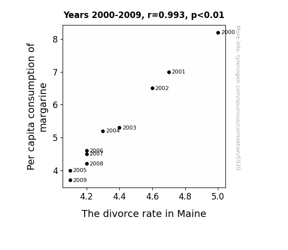
Per capita consumption of margarine · all food
The divorce rate in Maine · all random state specific
Per capita consumption of margarine · all food
The divorce rate in Maine · all random state specific
Why this works
- Data dredging: I have 25,237 variables in my database. I compare all these variables against each other to find ones that randomly match up. That's 636,906,169 correlation calculations! This is called “data dredging.”
Fun fact: the chart used on the wikipedia page to demonstrate data dredging is also from me. I've been being naughty with data since 2014.
Instead of starting with a hypothesis and testing it, I instead tossed a bunch of data in a blender to see what correlations would shake out. It’s a dangerous way to go about analysis, because any sufficiently large dataset will yield strong correlations completely at random. - Lack of causal connection: There is probably no direct connection between these variables, despite what the AI says above.
Because these pages are automatically generated, it's possible that the two variables you are viewing are in fact causually related. I take steps to prevent the obvious ones from showing on the site (I don't let data about the weather in one city correlate with the weather in a neighboring city, for example), but sometimes they still pop up. If they are related, cool! You found a loophole.
This is exacerbated by the fact that I used "Years" as the base variable. Lots of things happen in a year that are not related to each other! Most studies would use something like "one person" in stead of "one year" to be the "thing" studied. - Observations not independent: For many variables, sequential years are not independent of each other. You will often see trend-lines form. If a population of people is continuously doing something every day, there is no reason to think they would suddenly change how they are doing that thing on January 1. A naive p-value calculation does not take this into account.
You will calculate a lower chance of "randomly" achieving the result than represents reality.
To be more specific: p-value tests are probability values, where you are calculating the probability of achieving a result at least as extreme as you found completely by chance. When calculating a p-value, you need to assert how many "degrees of freedom" your variable has. I count each year (minus one) as a "degree of freedom," but this is misleading for continuous variables.
This kind of thing can creep up on you pretty easily when using p-values, which is why it's best to take it as "one of many" inputs that help you assess the results of your analysis.
- Y-axes doesn't start at zero: I truncated the Y-axes of the graphs above. I also used a line graph, which makes the visual connection stand out more than it deserves.
Nothing against line graphs. They are great at telling a story when you have linear data! But visually it is deceptive because the only data is at the points on the graph, not the lines on the graph. In between each point, the data could have been doing anything. Like going for a random walk by itself!
Mathematically what I showed is true, but it is intentionally misleading. If you click on any of the charts that abuse this, you can scroll down to see a version that starts at zero. - Confounding variable: Confounding variables (like global pandemics) will cause two variables to look connected when in fact a "sneaky third" variable is influencing both of them behind the scenes.
- Outliers: Some datasets here have outliers which drag up the correlation.
In concept, "outlier" just means "way different than the rest of your dataset." When calculating a correlation like this, they are particularly impactful because a single outlier can substantially increase your correlation.
Because this page is automatically generated, I don't know whether any of the charts displayed on it have outliers. I'm just a footnote. ¯\_(ツ)_/¯
I intentionally mishandeled outliers, which makes the correlation look extra strong. - Low n: There are not many data points included in some of these charts.
You can do analyses with low ns! But you shouldn't data dredge with a low n.
Even if the p-value is high, we should be suspicious of using so few datapoints in a correlation.
Pro-tip: click on any correlation to see:
- Detailed data sources
- Prompts for the AI-generated content
- Explanations of each of the calculations (correlation, p-value)
- Python code to calculate it yourself