spurious correlations
random · discover · next page →
don't miss spurious scholar,
where each of these is an academic paper
. The chart goes from 2002 to 2022, and the two variables track closely in value over that time.")

View details about correlation #5,901
Fruit-Fueled Fortunes: The Correlation between Annual US Household Spending on Fresh Fruits and Canadian National Railway Company's Stock Price
As US households spent more on fresh fruits, there was a higher demand for fruit transportation. This led to Canadian National Railway Company (CNI) to have more business in shipping fruits across the border. This increased revenue and projected earnings, leading to a rise in stock price. It's like the fruits of their labor were ripe for the picking!


View details about correlation #2,395
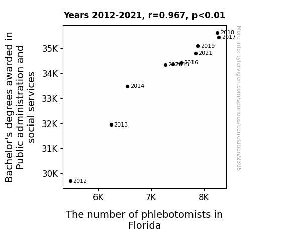
Poking into the Connection between Public Administration and Phlebotomists: A Profound Probing
As the number of public administration and social services graduates rose, there was a corresponding surge in blood drives and health initiatives. This led to a dire need for more phlebotomists in Florida, creating a vein of employment opportunities. It seems like these graduates really know how to *draw* in the workforce demand!

What else correlates?
Bachelor's degrees awarded in social services · all education
The number of phlebotomists in Florida · all cccupations
Bachelor's degrees awarded in social services · all education
The number of phlebotomists in Florida · all cccupations


View details about correlation #2,487
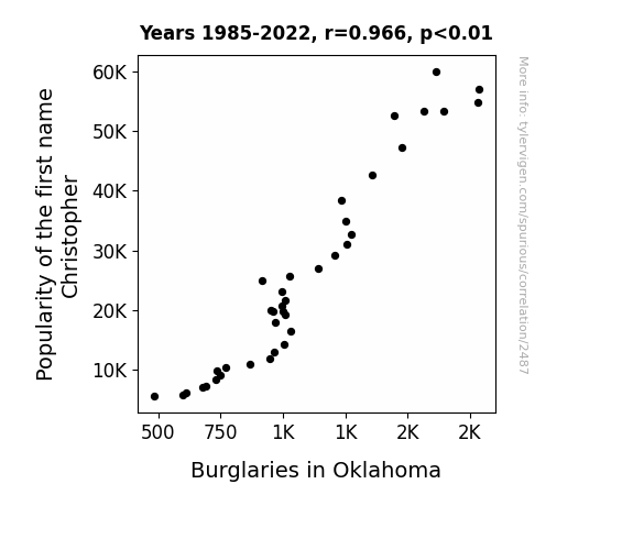
Christopher's Popularity and Burglaries in Oklahoma: A Rhyming Analysis
When there are fewer Christophers, there are fewer people asking, "Chris, for sure, did you hear something?", ultimately making it harder for burglars to fly under the radar. After all, if you can't trust a Chris, can you really trust anyone?

What else correlates?
Popularity of the first name Christopher · all first names
Burglaries in Oklahoma · all random state specific
Popularity of the first name Christopher · all first names
Burglaries in Oklahoma · all random state specific


View details about correlation #5,130
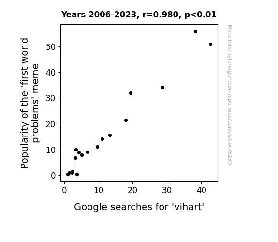
First World Problems: An Analysis of the 'Vihart' Connection
The 'first world problems' meme sparked a wave of interest in trivial, yet relatable issues, priming people to seek out similarly lighthearted content. As a pun-loving mathematician, Vi Hart's unique and quirky approach to math struck a chord with those looking for a prime source of both education and entertainment. It all adds up to a positive correlation between meme popularity and Vi Hart searches – a meme-rable connection, indeed!

What else correlates?
Popularity of the 'first world problems' meme · all memes
Google searches for 'vihart' · all google searches
Popularity of the 'first world problems' meme · all memes
Google searches for 'vihart' · all google searches
. The chart goes from 2002 to 2022, and the two variables track closely in value over that time.")

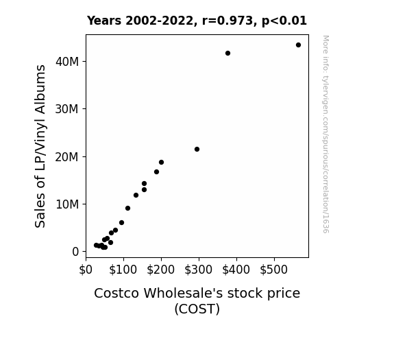
View details about correlation #1,636
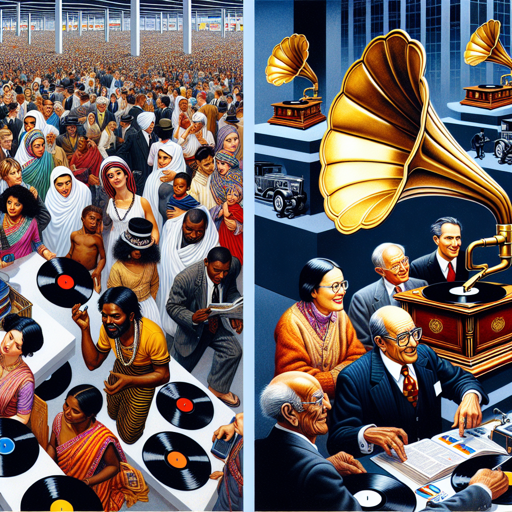
Spinning Wealth: The Groovy Relationship Between Vinyl Sales and Costco Wholesale's Stock Price
The larger album artwork acted as a form of cheap, subconscious store decoration, luring more customers into the aisles. As customers browsed for records, they ended up adding more items to their carts, ultimately boosting Costco's overall sales and stock price.
What else correlates?
Sales of LP/Vinyl Albums · all weird & wacky
Costco Wholesale's stock price (COST) · all stocks
Sales of LP/Vinyl Albums · all weird & wacky
Costco Wholesale's stock price (COST) · all stocks


View details about correlation #3,361
Education Bachelor's: More Proofreaders' Fathers? The Kansas Cadence
As the number of Education degrees dropped, there was a significant decline in grammar school attendance. This led to a surplus of unemployed proofreaders in Kansas, who found themselves at a loss for words.


What else correlates?
Bachelor's degrees awarded in Education · all education
The number of proofreaders in Kansas · all cccupations
Bachelor's degrees awarded in Education · all education
The number of proofreaders in Kansas · all cccupations


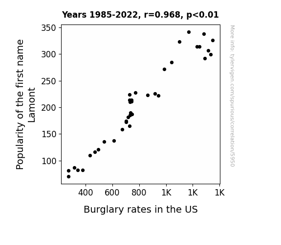
View details about correlation #5,950
Larceny and Lamont: An Analysis of the Link between the Popularity of the First Name Lamont and Burglary Rates in the United States
Fewer people named Lamont means fewer people are saying "Lamont, it's time to steal some stuff" in a sneaky, incriminating tone. And that's a lot less motivation for burglary right there!
What else correlates?
Popularity of the first name Lamont · all first names
Burglary rates in the US · all random state specific
Popularity of the first name Lamont · all first names
Burglary rates in the US · all random state specific


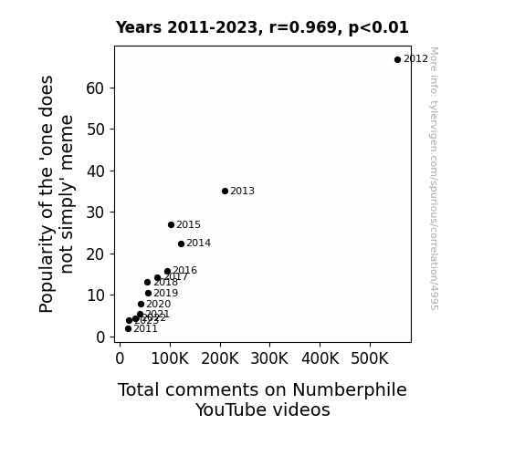
View details about correlation #4,995
One Does Not Simply Quantify Internet Culture: Exploring the Correlation Between 'One Does Not Simply' Meme Popularity and Total Comments on Numberphile YouTube Videos.
As the 'one does not simply' meme gained popularity, it sparked a wave of interest in complex and seemingly insurmountable tasks. This indirectly led to an increase in people seeking out Numberphile videos, as they were drawn to the challenge of understanding and conquering the world of numbers and mathematics. In essence, the meme inadvertently became a gateway to a newfound appreciation for numerical discussions, creating a ripple effect that boosted the total comments on Numberphile YouTube videos.

What else correlates?
Popularity of the 'one does not simply' meme · all memes
Total comments on Numberphile YouTube videos · all YouTube
Popularity of the 'one does not simply' meme · all memes
Total comments on Numberphile YouTube videos · all YouTube


View details about correlation #1,859
The Justice Judgement: A Case Study of Indiana Judges and 'The Big Bang Theory' Viewership
As the number of judges in Indiana increased, so did the viewership of "The Big Bang Theory." This is due to the little-known fact that judges have a penchant for high-brow humor and intellectual puns. With their gavel-wielding expertise, they have inadvertently ruled in favor of promoting the show, leading to a surge in viewers who just can't object to its comedic appeal. Clearly, this correlation proves that when it comes to TV preferences, the judicial system holds all the verdicts!


What else correlates?
The number of judges in Indiana · all cccupations
Viewership of "The Big Bang Theory" · all films & actors
The number of judges in Indiana · all cccupations
Viewership of "The Big Bang Theory" · all films & actors


View details about correlation #1,902
Sunny Side Up: Illuminating the Correlation Between the Name Sunny and Solar Power Generation in Egypt
As the number of Sunnys rose, so did their radiant personalities, leading to an increased demand for positivity. This surge in positivity somehow translated to a boost in solar power generation in Egypt. It's as if their sunny dispositions were literally shining a light on the potential of solar energy. It seems that with more Sunnys around, the future's looking brighter and sunnier in more ways than one!

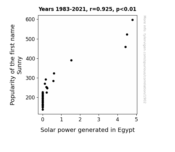
What else correlates?
Popularity of the first name Sunny · all first names
Solar power generated in Egypt · all energy
Popularity of the first name Sunny · all first names
Solar power generated in Egypt · all energy


View details about correlation #5,905
Chilling Crime: The Frozen Yogurt Factor in Violent Crime Rates
As Frozen yogurt consumption decreased, people's brains were no longer chilled to the point of committing heinous acts, leading to a decrease in violent crime rates. The lack of fro-yo-induced inner peace and tranquility meant that individuals were too busy mourning the absence of delicious, creamy goodness to engage in acts of aggression. This sparked a nationwide movement of peaceful protests, where instead of fighting, people hugged it out while licking imaginary cones of their favorite fro-yo flavors. It turns out, the real spooning happened as a form of therapy, and the only things getting whipped were toppings on a swirl of non-violence. In the end, the only thing that was iced out was an entire criminal element, as society collectively realized that the true spoonful of justice was the one they didn’t take from the fro-yo shop.

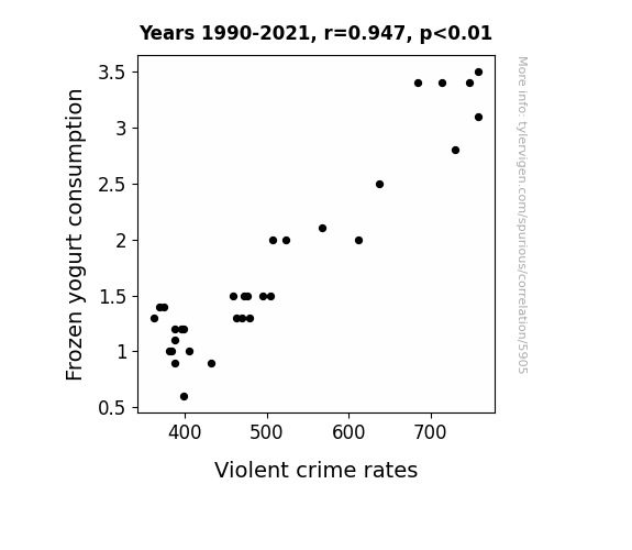
What else correlates?
Frozen yogurt consumption · all food
Violent crime rates · all random state specific
Frozen yogurt consumption · all food
Violent crime rates · all random state specific


View details about correlation #5,942
Linking London Gold Prices and Loyal Whole Foods Lovers: A Lighthearted Look at the Connection
As the shiny gold prices rose, so did the moods of the Whole Foods customers, who felt like they struck it rich with their premium groceries. It's like they say, when the bling goes up, so does the zing in your grocery shopping experience!

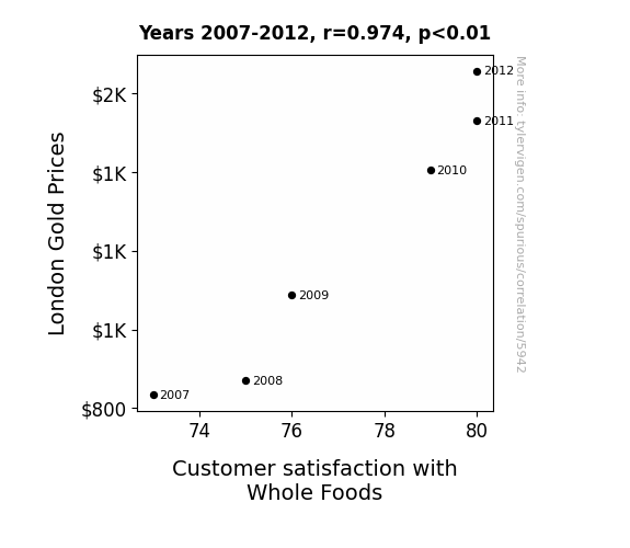
What else correlates?
London Gold Prices · all weird & wacky
Customer satisfaction with Whole Foods · all weird & wacky
London Gold Prices · all weird & wacky
Customer satisfaction with Whole Foods · all weird & wacky
. The chart goes from 2002 to 2022, and the two variables track closely in value over that time.")

View details about correlation #5,882
The Mila Kunis Effect: A Reel Connection to Stock Reel-itivity
As Kunis's filmography expanded, so did the appeal of POSCO's holdings, leading to a Kutis-effect on the stock price. It seems her performances weren't just box office hits, but also stock exchange sensations. Perhaps her stellar acting was the real steel driving force behind POSCO's market success, proving that in the world of finance, she truly is the Kunis-essential asset.

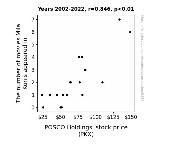
What else correlates?
The number of movies Mila Kunis appeared in · all films & actors
POSCO Holdings' stock price (PKX) · all stocks
The number of movies Mila Kunis appeared in · all films & actors
POSCO Holdings' stock price (PKX) · all stocks


View details about correlation #4,878
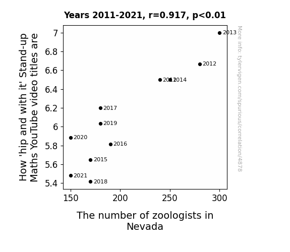
Quantifying the Rhyme: Stand-up Maths Titles and Zoologists' Delights in Nevada
As the zoologists in Nevada pack up and moose-y on out, the 'stand-up' comedian in the wildlife is dwindling. It's a case of less 'hawkward' animal puns and 'otterly' un-bear-able jokes in the video titles, leaving viewers feeling like they've been koala-fied from one-of-a-kind comedic content. After all, without the zoologists, there's simply no 'otter' way to 'seal' the deal on those rib-tickling titles. And as the saying goes, when it reins, it purrs - but in this case, it just 'quacks' under pressure. So, as the Nevada zoologists take their final 'bow-wow', the 'stand-up' maths YouTuber is left wondering how to 'toucan' play at that game without their purr-sence. It's a wild world out there, and without the zoologists, the struggle for 'panda'-monium in the comedy scene is all too real.


View details about correlation #1,472
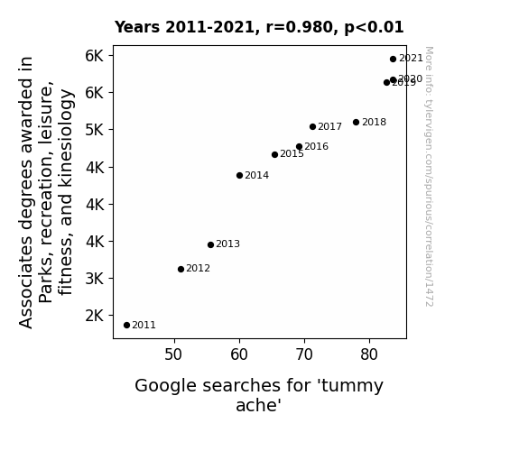
Stomach Aches and Degrees: Investigating the Link Between Fitness Education and Google Searches for 'Tummy Ache'
As more students entered the field, there was a parallel surge in highly competitive playground tag matches, leading to an epidemic of tummy-aching laughter. Maybe all those degrees were just too hard to digest.

What else correlates?
Associates degrees awarded in Parks & Recreation · all education
Google searches for 'tummy ache' · all google searches
Associates degrees awarded in Parks & Recreation · all education
Google searches for 'tummy ache' · all google searches


View details about correlation #5,107
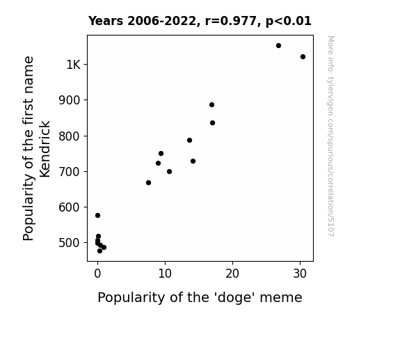
From Kendrick to Doge: Unleashing the Caninely Coincidental Correlation
Parents who named their children Kendrick were unknowingly influencing the collective consciousness to channel an inner spirit of doge-like silliness.
What else correlates?
Popularity of the first name Kendrick · all first names
Popularity of the 'doge' meme · all memes
Popularity of the first name Kendrick · all first names
Popularity of the 'doge' meme · all memes


View details about correlation #2,205
Churning the Winds: Exploring the Correlation between Butter Consumption and Wind Power Generation in the United States
As butter consumption rose, people's gas production increased, leading to greater wind power capacity in the US. This correlation may seem hard to digest, but it churns out a gouda explanation. As the saying goes, where there's a will, there's a way... and where there's wind, there's a whey!

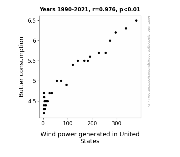
What else correlates?
Butter consumption · all food
Wind power generated in United States · all energy
Butter consumption · all food
Wind power generated in United States · all energy


View details about correlation #3,965
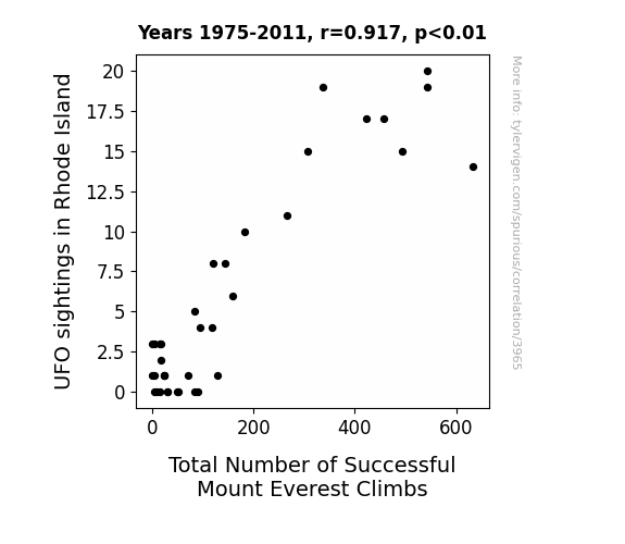
Rhode to the Top: Unidentified Flying Object Sightings and Their Relation to Successful Mount Everest Climbs
The uptick in UFO sightings over Rhode Island is actually just a cover for a top-secret government program to improve mountaineering skills. Unbeknownst to the general public, these advanced UFOs are equipped with state-of-the-art climbing technology, and they've been taking unsuspecting Rhode Islanders on impromptu mountaineering excursions in their spare time. It turns out that all those individuals who reported being abducted were actually receiving intensive high-altitude training on Mount Everest. So, while it may seem like just a strange coincidence, the truth is out there... on the summit of the world's tallest peak!


View details about correlation #5,962
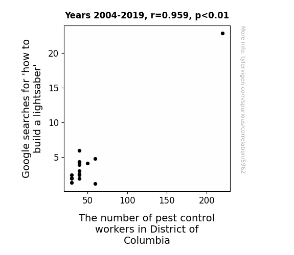
Shining a Light on Lightsaber Longings: Analyzing the Association Between Google Searches for 'How to Build a Lightsaber' and Pest Control Employment in the District of Columbia
As more people attempted to construct their own lightsabers, they unwittingly attracted a higher number of pesky creatures, leading to an unexpected demand for pest control workers in the District of Columbia. Remember, with great power comes great bug-sponsibility!


View details about correlation #5,956
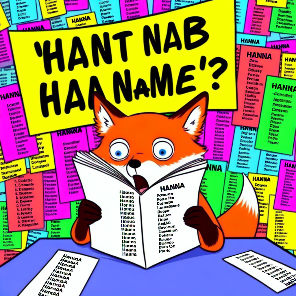
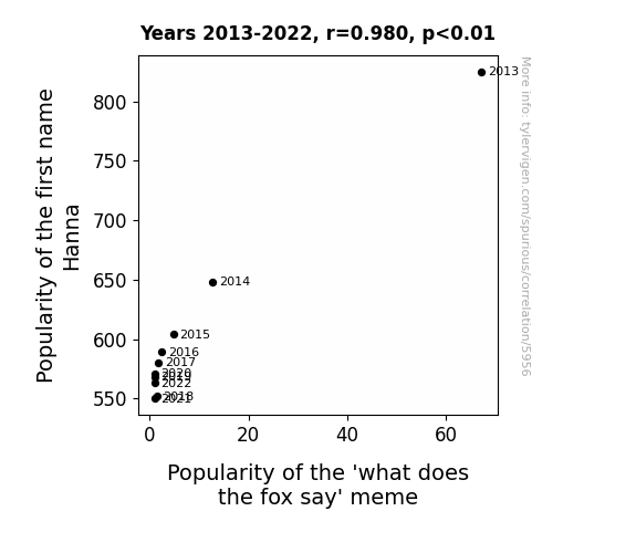
Hanna Be the One: Exploring the Relationship Between Hanna's Popularity and the 'What Does the Fox Say' Meme
Parents just weren't feeling "Hanna" as much anymore, and without the h-animal connection, the meme lost its foxy appeal. It's like the name Hanna was the sly key to keeping the meme relevant, but now it's time to say "Hanna later" to that internet sensation!
What else correlates?
Popularity of the first name Hanna · all first names
Popularity of the 'what does the fox say' meme · all memes
Popularity of the first name Hanna · all first names
Popularity of the 'what does the fox say' meme · all memes


View details about correlation #5,920
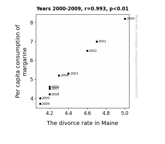
Spreading Love and Margarine: An Examination of the Butter-Splitter Correlation in Maine
Perhaps as people used less margarine, they became less slippery in their relationships. The lack of artificial spread may have kept the couples from buttering each other up, leading to a decrease in overall marital strife. That's the reality when you can't believe it's not butter - it's a recipe for marital success. Alternatively, it could be that as the margarine consumption decreased, so did the overall slickness in the state, leading to fewer instances of partners feeling like they couldn't grip the marriage.

What else correlates?
Per capita consumption of margarine · all food
The divorce rate in Maine · all random state specific
Per capita consumption of margarine · all food
The divorce rate in Maine · all random state specific
Why this works
- Data dredging: I have 25,237 variables in my database. I compare all these variables against each other to find ones that randomly match up. That's 636,906,169 correlation calculations! This is called “data dredging.”
Fun fact: the chart used on the wikipedia page to demonstrate data dredging is also from me. I've been being naughty with data since 2014.
Instead of starting with a hypothesis and testing it, I instead tossed a bunch of data in a blender to see what correlations would shake out. It’s a dangerous way to go about analysis, because any sufficiently large dataset will yield strong correlations completely at random. - Lack of causal connection: There is probably no direct connection between these variables, despite what the AI says above.
Because these pages are automatically generated, it's possible that the two variables you are viewing are in fact causually related. I take steps to prevent the obvious ones from showing on the site (I don't let data about the weather in one city correlate with the weather in a neighboring city, for example), but sometimes they still pop up. If they are related, cool! You found a loophole.
This is exacerbated by the fact that I used "Years" as the base variable. Lots of things happen in a year that are not related to each other! Most studies would use something like "one person" in stead of "one year" to be the "thing" studied. - Observations not independent: For many variables, sequential years are not independent of each other. You will often see trend-lines form. If a population of people is continuously doing something every day, there is no reason to think they would suddenly change how they are doing that thing on January 1. A naive p-value calculation does not take this into account.
You will calculate a lower chance of "randomly" achieving the result than represents reality.
To be more specific: p-value tests are probability values, where you are calculating the probability of achieving a result at least as extreme as you found completely by chance. When calculating a p-value, you need to assert how many "degrees of freedom" your variable has. I count each year (minus one) as a "degree of freedom," but this is misleading for continuous variables.
This kind of thing can creep up on you pretty easily when using p-values, which is why it's best to take it as "one of many" inputs that help you assess the results of your analysis.
- Y-axes doesn't start at zero: I truncated the Y-axes of the graphs above. I also used a line graph, which makes the visual connection stand out more than it deserves.
Nothing against line graphs. They are great at telling a story when you have linear data! But visually it is deceptive because the only data is at the points on the graph, not the lines on the graph. In between each point, the data could have been doing anything. Like going for a random walk by itself!
Mathematically what I showed is true, but it is intentionally misleading. If you click on any of the charts that abuse this, you can scroll down to see a version that starts at zero. - Confounding variable: Confounding variables (like global pandemics) will cause two variables to look connected when in fact a "sneaky third" variable is influencing both of them behind the scenes.
- Outliers: Some datasets here have outliers which drag up the correlation.
In concept, "outlier" just means "way different than the rest of your dataset." When calculating a correlation like this, they are particularly impactful because a single outlier can substantially increase your correlation.
Because this page is automatically generated, I don't know whether any of the charts displayed on it have outliers. I'm just a footnote. ¯\_(ツ)_/¯
I intentionally mishandeled outliers, which makes the correlation look extra strong. - Low n: There are not many data points included in some of these charts.
You can do analyses with low ns! But you shouldn't data dredge with a low n.
Even if the p-value is high, we should be suspicious of using so few datapoints in a correlation.
Pro-tip: click on any correlation to see:
- Detailed data sources
- Prompts for the AI-generated content
- Explanations of each of the calculations (correlation, p-value)
- Python code to calculate it yourself